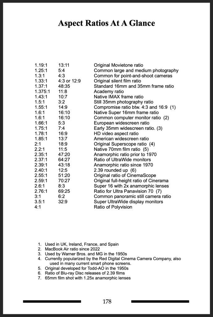
Aspect ratio is one of those topics that can be hard to explain. Part of the confusion starts with the numerical system used to describe the ratio system. It has nothing to do with lens focal lengths, or depth of field or any of the other optical explanations of a film image. (Yes, camera sensors do have a set aspect ratio but you can crop an image to any size in post production so for now I’m concentrating on talking about a display aspect ratio. And, I’m leaving out the confusion over spherical vs. anamorphic lenses for another post.)
The simplest way to explain an aspect ratio is that it is a comparison of the horizontal length of a frame to the vertical length.
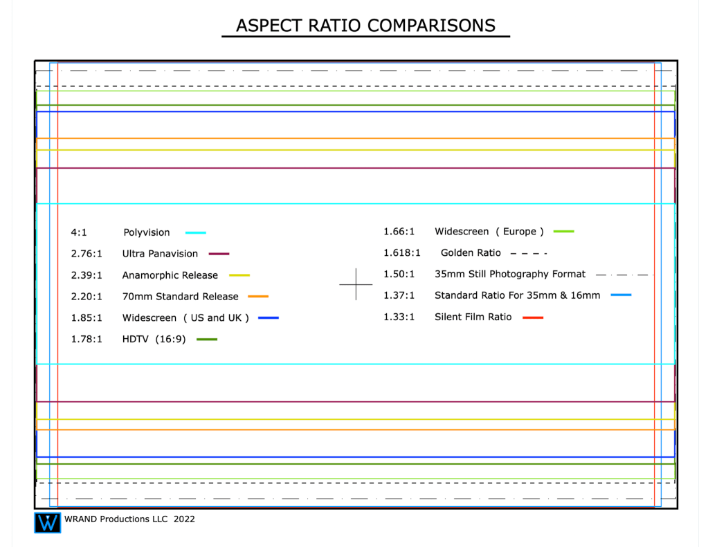
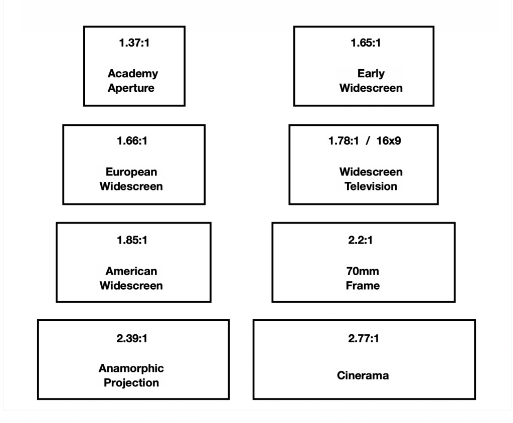
The first films, the silent ones, were shot with an aspect ratio of 1.33:1. The width of each image is 1.33 times the height.
The extreme projection aspect ratio up until now was a 4.1:1 format called Polyvision for the 1927 film, Napoleon, which was done by lining up three projectors and interlocking three 1:33 ratio film prints.
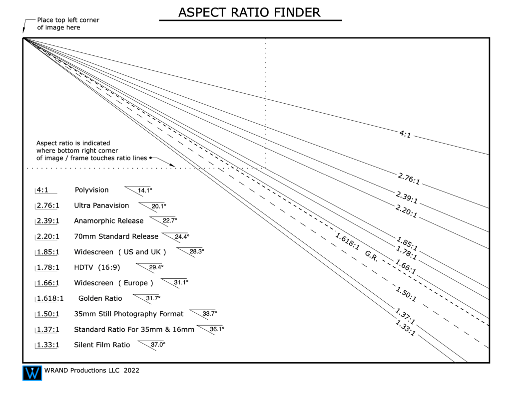
Here is a chart for determining the aspect ratio of an image.
Once television became a competitor to the movie theaters for audience eyeballs, the studios began to experiment with shooting films in wider formats to create a visual experience that TV couldn’t match because of the fixed 1.35:1 television screen size.
As filmmakers became tired of seeing their films shot in widescreen cropped for viewing on TVs, a compromise was made by changing the old 1:37 aspect ratio to 1.78. This opened up the standard screen width and changed the way even television shows were shot from the mid 1980’s.
Notice that some formats are referred to by different style or raio callout. The 1.78 format is also described as 16×9. Thus the typical smart phone screen ratio is known as 9×16 because of it’s being typically viewed as a vertical rather than horizontal image.
The best video explanation of film stock differences and aspect ratios was done by Ryan Coogler for Kodak as he talked about the different aspect ratios he used for shooting his film “Sinners”. He talks about a number of new projection systems that I didn’t know about.
Here is a video of Autumn Durald Arkapaw, the cinematographer and first woman to win the Best Cinematography Oscar, explaining how she shot the film in two different aspect ratios; IMAX and Ultra Panvision 65.
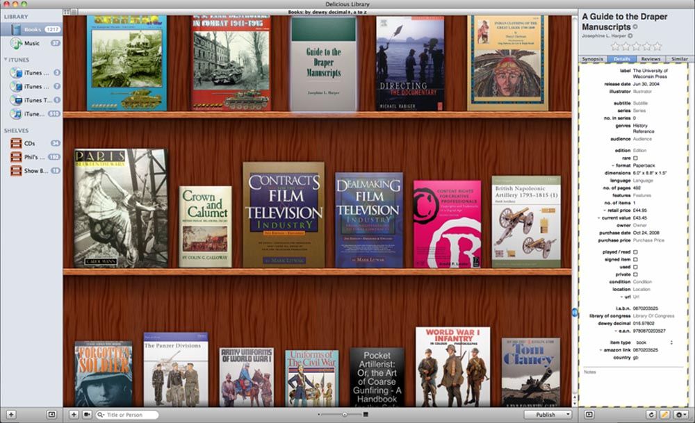
Nearly 14 years ago I posted an article about organizing your books and reference. I had found a new (at the time) app called Delicious Library which was perfect for the task. It would organize your books, DVDs, reference boxes and other assets in categories and pulled in data from Amazon as to book values, prices and print data. Unfortunately it only worked on Macs.
Several years ago the app was cut off from using Google data and it became of limited value when updating assets and books.
The old interface of Delicious Library
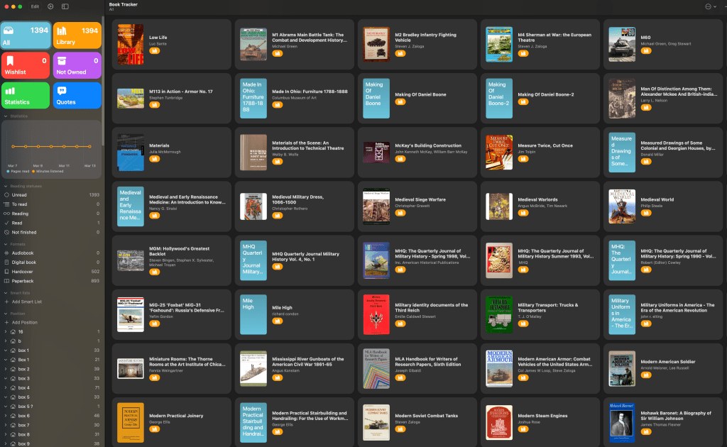
I just recently found a replacement, an app called Book Tracker. It operates similarly to Delicious Library but does not access the same amount of data that Delicious Library had access to.
Fortunately it was easy to import my library data from DL and everything came in perfectly, with the exception of the book values that were listed in DL. Unfortunately the app is also only for Mac. (Keep reading for a PC option)
The interface isn’t quite as graphic as the virtual bookshelf in DL, but Book Tracker does have a nice organization system and make it easy to sort books by a wide range of categories.
The Book Tracker interface
The app also has an iOS version that works on an iPhone that has a barcode scanner which makes it easy to add new books without doing a lot of data entry.
There is a free version but it’s only good for 5 books which isn’t very helpful. Use the free version to try it out. For the full version, there is a one-time purchase price of $20. The app for the iPhone will cost you an additional $5, but the bar scanner feature made it worth it for me.
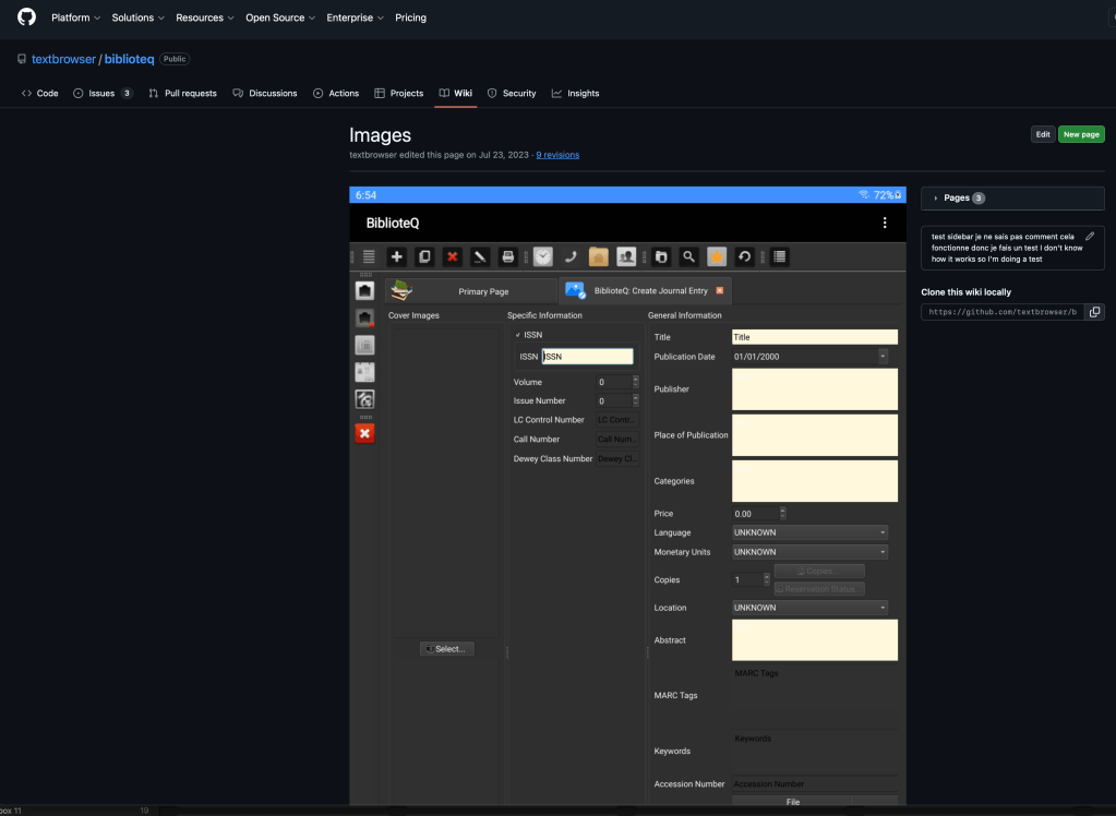
For PC users, a similar option is an app called BiblioteQ. It is a FREE open-source program that you download to your machine rather than existing in a data cloud server.
The program is updated regularly and is supported in 12 different languages. It brings in cover art from Amazon and Open Library, will support third-party bar code readers, works on Mac as well as Windows, and will import libraries from CSV files so it will also ingest a Delicious Library collection. It is also designed to organize and archive collections of music, photographs, journals, and video games.
Trains are one of those set pieces that don’t get used often anymore and reference for early period trains isn’t always easy to find. My train reference usually gets buried on a back shelf of my library and I have to unearth it when a design comes along that involves a train car or a scene that requires recreating railroad scenes.
These two books are the most complete that I’ve found when I need to create details for a train car build or most any other information on late 19th to early 20th century railroad systems.
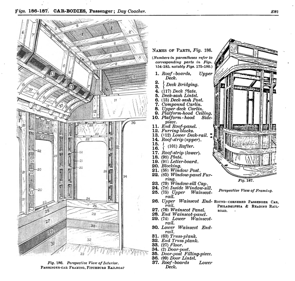
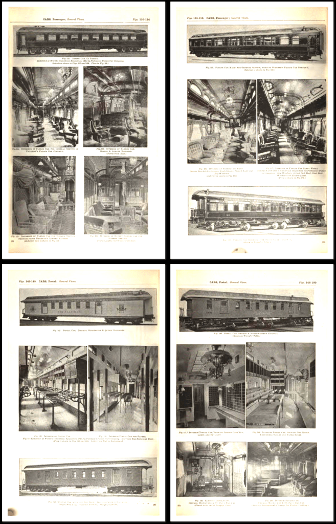
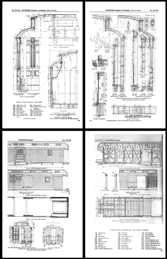
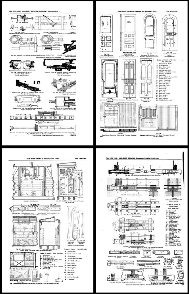
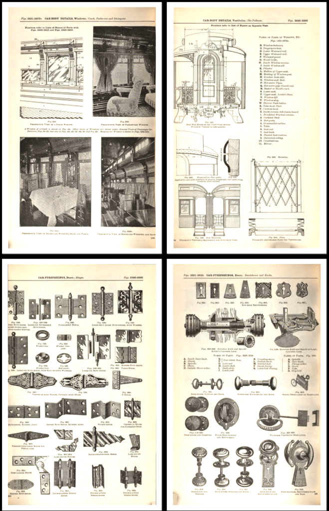
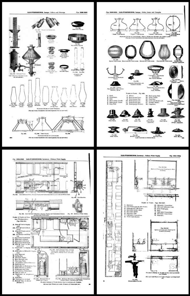
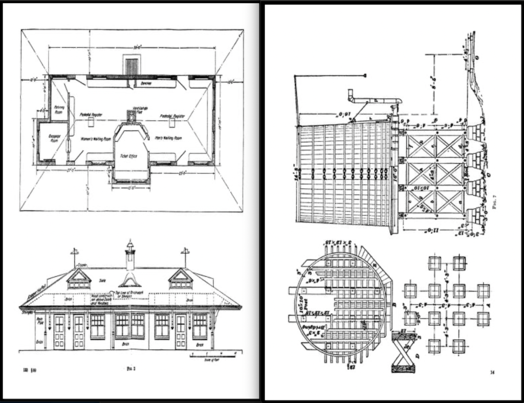
The first is The Car-Builders Dictionary, which is now in a digital format. It’s a 680 page book that includes pretty much anything I have ever needed to know about railroad cars of that period. The book includes a 200 page glossary as well as scale drawings and perspective views of almost all passenger and freight cars, including street cars, both American and English.
There are scale drawings, plans, and sections of cars to show construction and layout. There are also photographs of car interiors, and detailed illustrations of every part on the cars, both functional and cosmetic: seating, hardware, brake diagrams, truck construction, lighting, etc.
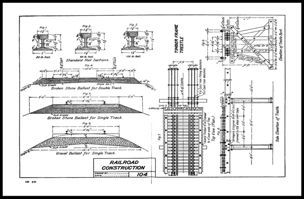
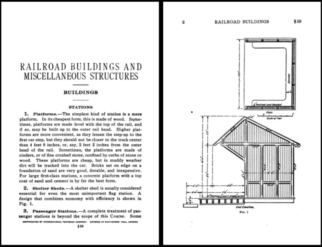
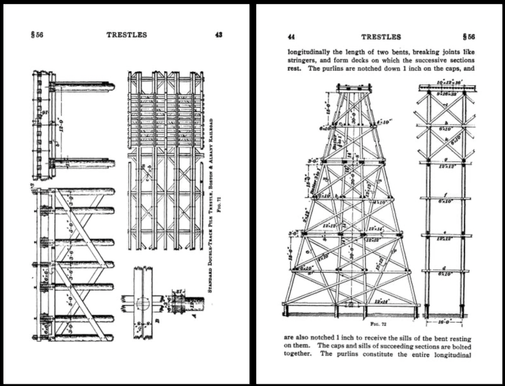
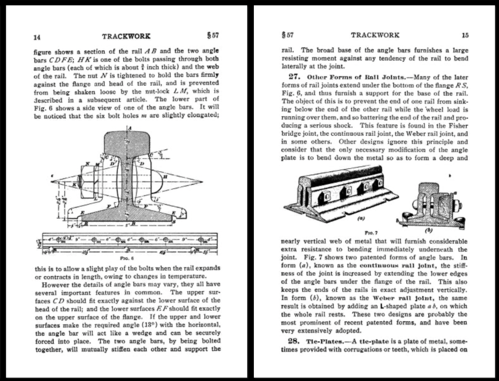
For everything else railroad related, I’d recommend the I.C.S. Reference Library, Vol. 133_Railroads, 1908. This is a 800+ page manual that covers the infrastructure of railroads, including track design and layout, covering standard track schematics, bridges, rail specs, buildings, service facilities, and sections on road and highway construction, and city surveying and survey drawings.
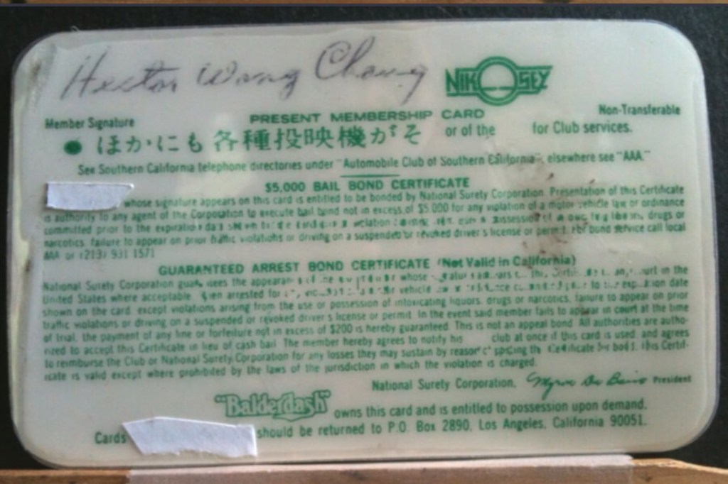
Sometimes what you hear about a famous movie prop doesn’t give you the full story.
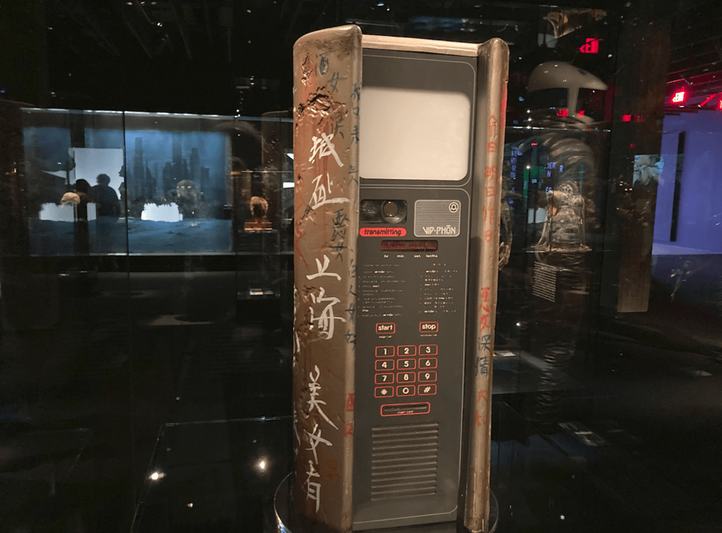
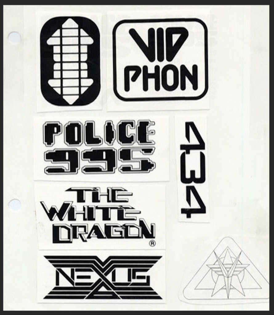
This is the real story behind the design of the Vid Phōn, the video phone booth in Ridley Scott’s film Blade Runner, that Harrison Ford’s character Decker, uses to call Rachael (Sean Young).
The Vid Phōn Hero prop. Now in the collection of the Academy Museum of Motion Pictures in Los Angeles. Syd Mead is given sole credit for the design on the signage at the Academy display but the prop was completely redesigned by Tom Southwell during pre-production.
Syd Mead did a lot of concept illustration work for the film that contributed to the futuristic look. But as is true for a lot of concept artwork, the execution of it can become problematic when it comes to translating it into a 3D ‘shootable’ reality.
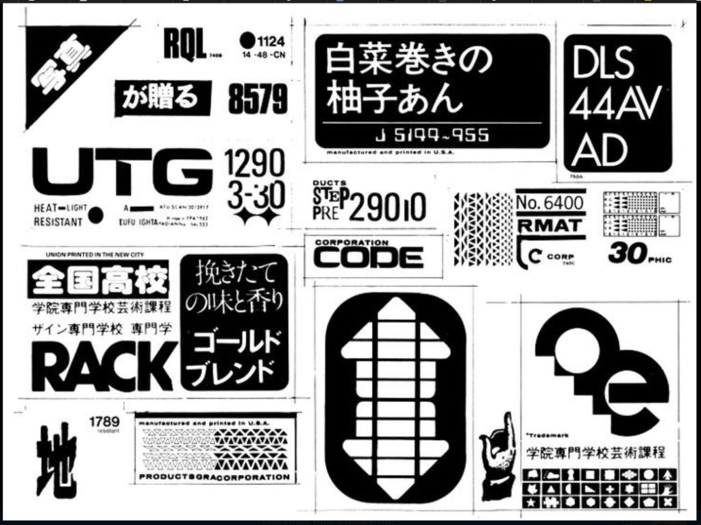
Tom Southwell, who is a Production Designer in his own right, (Disturbia, The Salton Sea) was the production illustrator on Blade Runner, as well as many other films, and designed all of the graphics for the movie. He was also called upon to design hero props for the film that not only had to work but be ‘shootable’ as well.
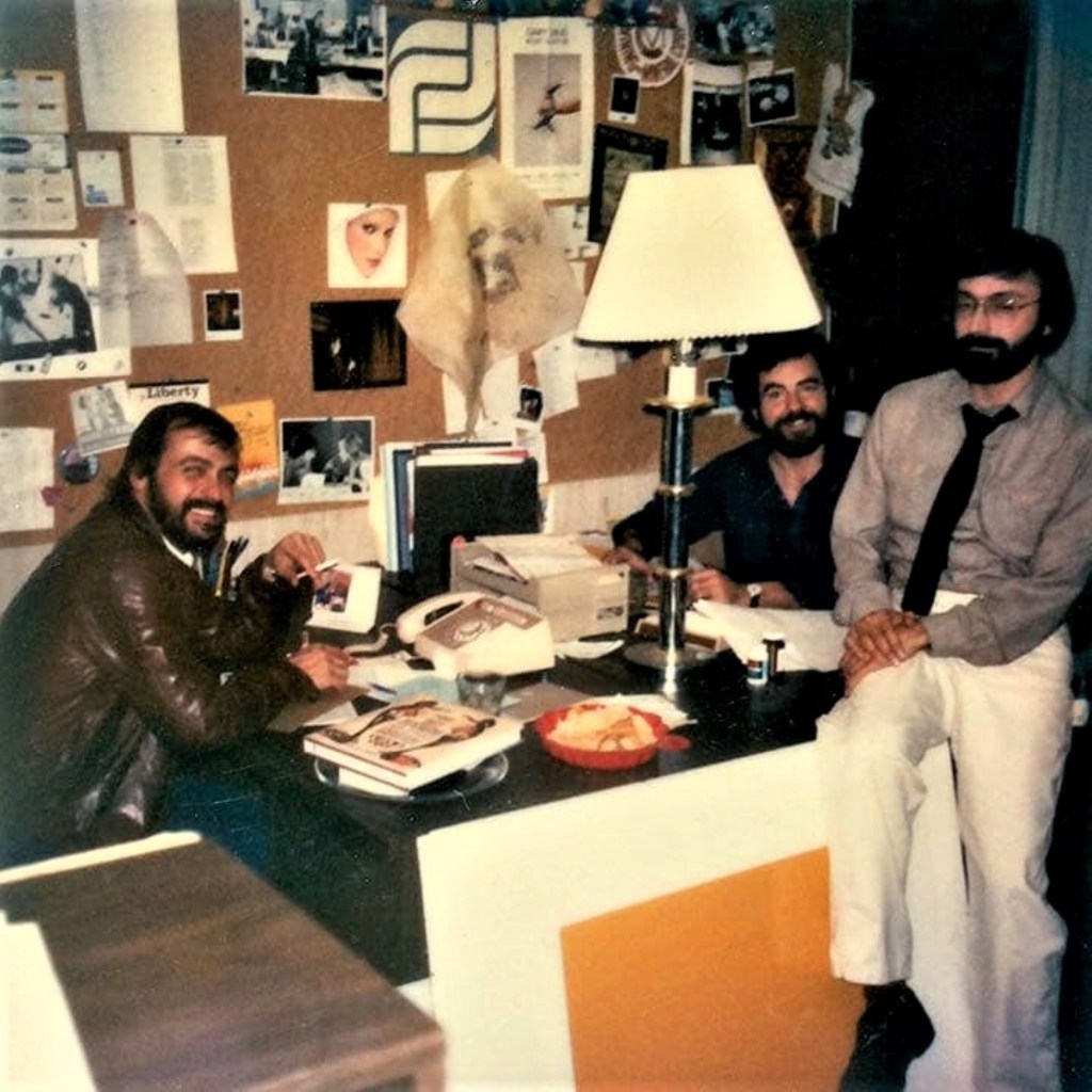
In the Art Department on Blade Runner. L to R – Production designer Larry Paull, Production Illusrator Tom Southwell, Art Director David Snyder.
This weekend, on February 28, Tom will be awarded a Lifetime Achievement Award for his work as an Illustrator and Production Designer at the Art Directors Guild Awards Banquet in Los Angeles.
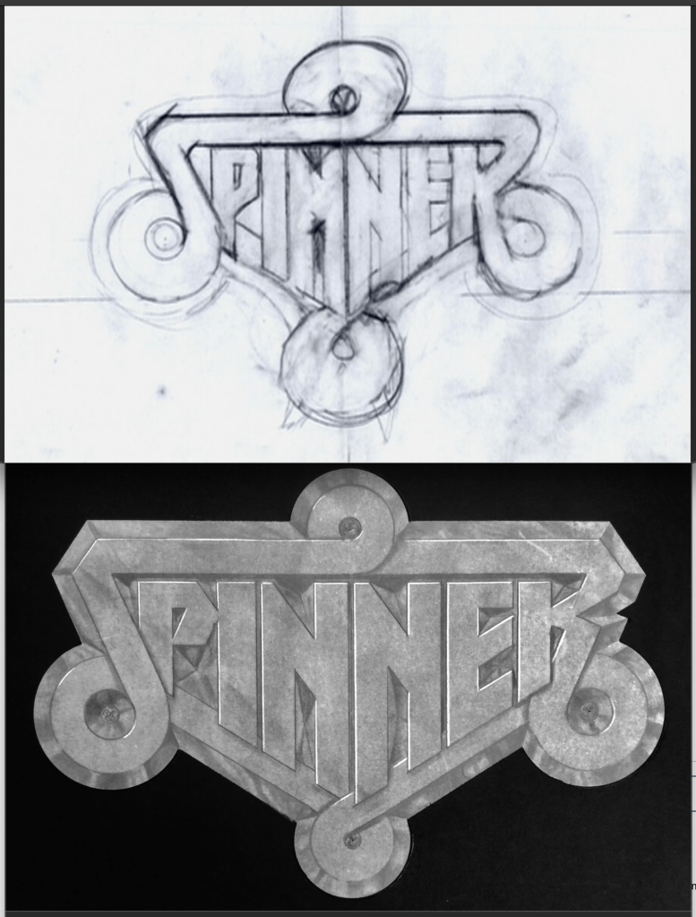
Tom’s original sketch and final logo for the Spinner CarSome of Tom’s other graphics for the film.
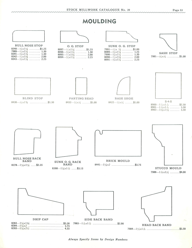
When recreating a period set from the 1800’s in particular, it’s difficult to really replicate the designs of the period because current wood moulding and millwork don’t allow for what was a common practice by designers and architects; true proportional design.
A moulding catalogue of today looks very different from the original moulding catalogues of the 1800’s. Not only because they contained a larger variety of profiles, but there was a large selection of different sizes for almost every profile that they offered.
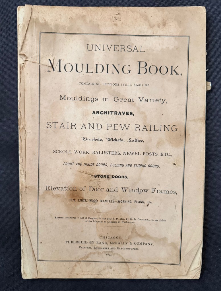
The cover of the 1874 Universal Moulding Book. One of the first millwork catalogues for wood moulding.
The oldest moulding catalogue that I own is the Universal Moulding Book from 1874. This catalogue shows over 650 moulding profiles in full size. It isn’t the first version. I know this because the catalogue states that 46 profiles have been phased out from a previous catalogue.
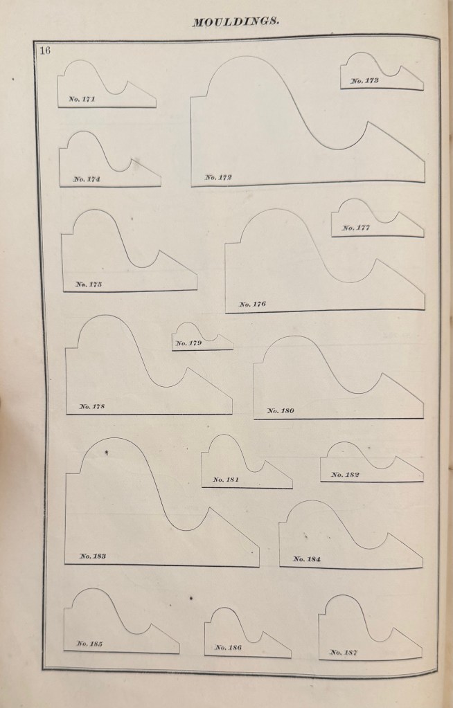
Here is a page of a profile known as a Quirked Greek Ogee and Bevel, a popular profile in the mid 19th century. Notice that there are 17 different sizes.
Why so many sizes?
Originally moulding or architectural enrichment wasn’t an afterthought. The mouldings were designed to be used in proportion to the openings that they surrounded.
In America, and England, before the Industrial Revolution, wood mouldings were made by hand. (plaster ornament was as well). With a set of planes called Hollows and Rounds, an infinite variety of moulding profiles could be created. A set of planes were designed to created 1/6th diameter arcs in increments of 1/16th inch.
My working set of hollows and rounds
Various pattern books of the period laid out the formulas for creating the mouldings according to the width of the openings. In his 1827 version of Builder’s Companion, Asher Benjamin wrote that for a door or window, the proper proportion would be found by dividing the opening into eight parts and giving one to the width of the moulding, He noted that this formula would provide a different width for different widths of doors and windows, but said that it wasn’t good to have different widths of architraves in the same room.
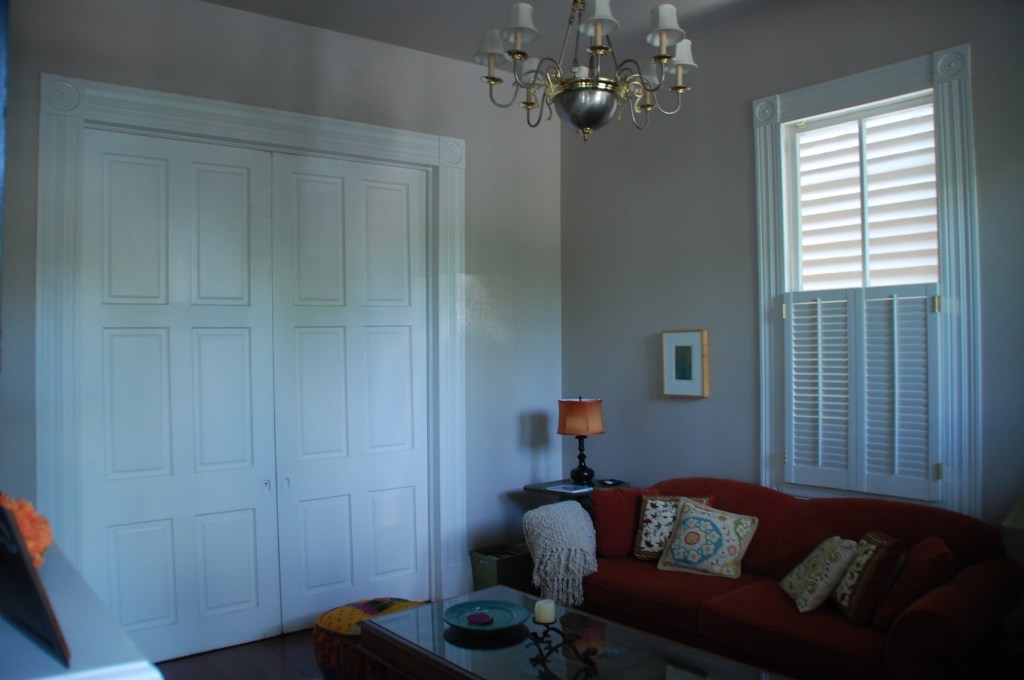
Obviously he wasn’t around to comment on this house interior……….
1839 New Orleans 4-bay townhouse
The pocket door opening in the photo is 6′ wide while the window width is about 3′ wide. You probably don’t notice that the architraves and the corner blocks are different sizes. The casing aound the doos is about 6″ in width while the window casing is less than 5″. The casing that frames the doors would look too large around the windows while the window casing width would be too diminished by the pocket door opening width.
Because the casing widths conform to the opening sizes, they look similar enough in size for their differences to be hard to recognize. The fact that they have proportional details within the overal common profile helps as well.
When the factory-made millworker begain to replace the on-site handmade moulding, they settled on a series of profile sizes that would fit most situations based on common door and window opening sizes.
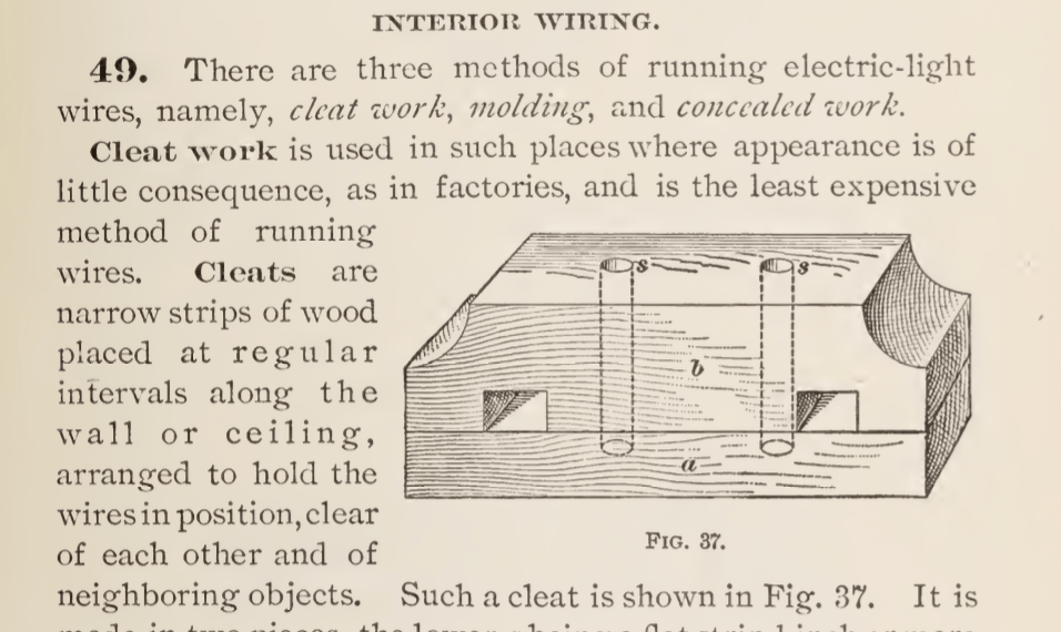
This variety of sizes began to diminish into the 20th century until around 1940, when most catalogues began to offer only a few or even just one size of each profile.
A page from the 1939 Stock Millwork Catalogue
When you have a design that requires moulding profiles that aren’t available, (which is a common problem with 19th century Victorian designs), and you aren’t able to create a built-up moulding from available profiles, you may have to have a set of custom knifes made.
If you order enough linear feet of the mould, some shops will waive the knife fee as it adds to their selection of profiles. Be sure you look into custom knifes before you discount it as being too expensive. The job is also done by CNC now rather than hand-grinding. so the actual operation is not a bid deal.
It can be tricky to identify or specify a particular wood if you’re not very knowledgable about working with it. There are hundreds of different species available and even though a small number of those are in common usage in the construction trade, narrowing it down to the ideal look you want can be frustrating.
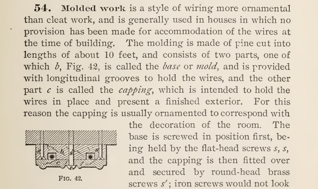
For many years a Production Designer was able to just hand a Scenic Painter a photograph and the artist would “grain” the surface to match any kind of wood they wanted. With the loss of painters who are trained in “graining”, it has become more common to find a laminated material which matches their choice or to use actual wood veneer that matches the reference.
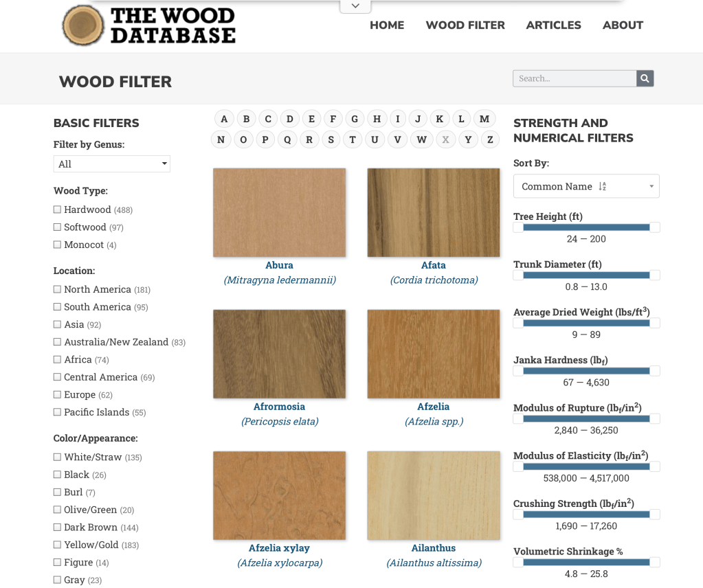
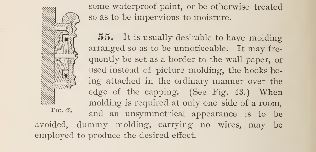
One website that I’ve found recently is a very good starting point to locate a match to a reference photo you might have or select a wood species based on your preferences of shade, color, or grain.
The Wood Database was created by Eric Meier in 2007 and now includes images and data for over 600 different wood species. You can search by name, type, location, appearance, and several other catagories.
Each species entry has a color photo of the wood showing grain pattern (depending on the cut orientation) as well as the scientific data as to hardness and shrinkage rates.
The information is also available in hardback book form, which can be ordered from the site, which features the data on over 350 wood types, including large color images of each species.
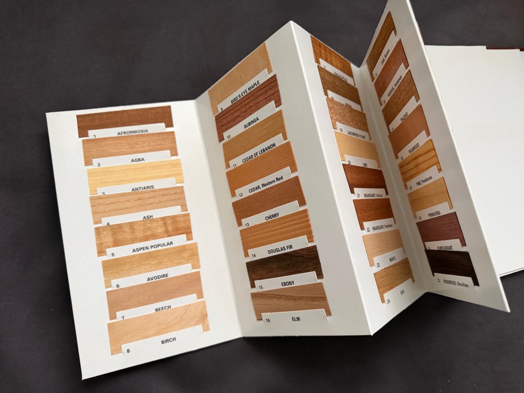
Another good reference is a book called What Wood Is That? by Herbert Edlin. The book explains basic wood characteristics and details 40 common wood types. It also includes 40 actual wood samples so that you can see a real-life sample of the types outlined.
The actual wood samples that are in What Wood Is That?
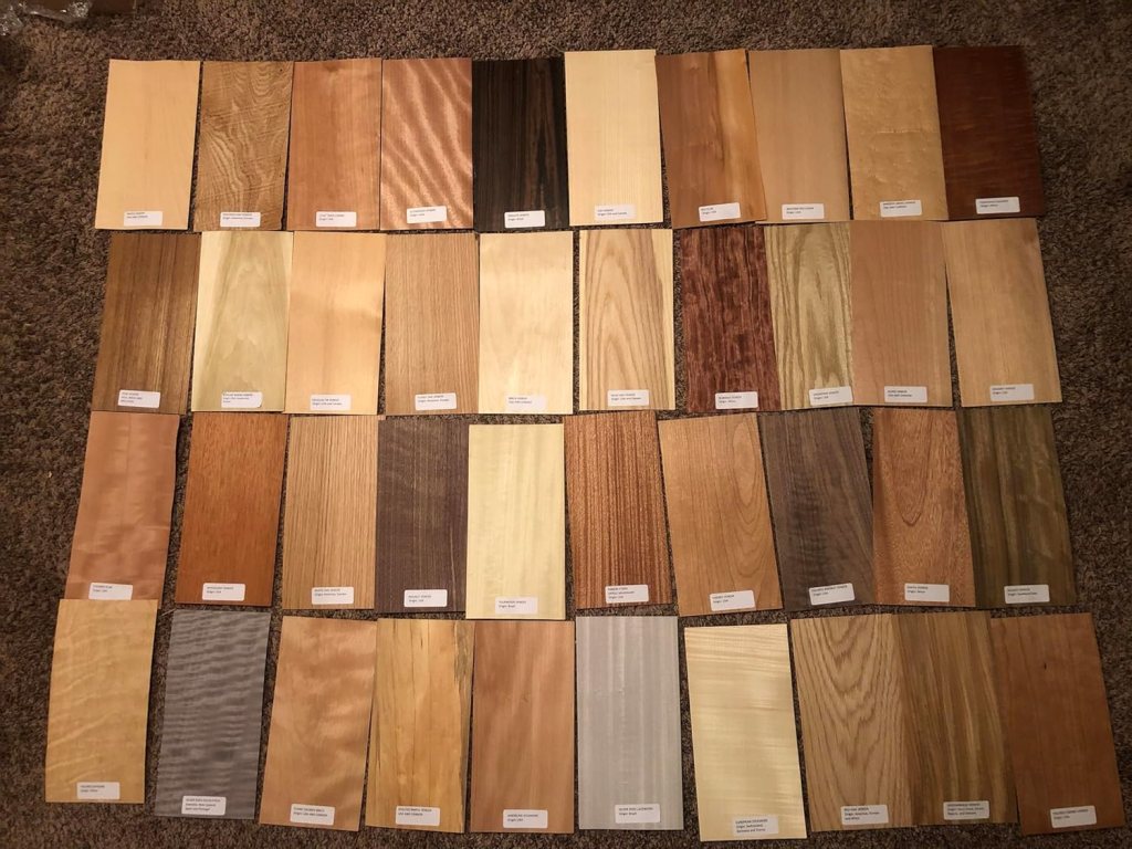
For larger wood samples to look at, I’d suggest getting a set of veneer samples like the ones below. You can find sets like the one below from various venders on Amazon. Be sure that you get a set that have labels attached for easy identification. With these, you have a piece large enough ( they are usually about 6″ x 12″) to be able to try different stains, finishes, or age to your liking.
If you are in the Los Angeles area at the end of February, The Southern California chapter of the ICAA (Institute of Classical Architecture and Art) is presenting a lecture entitled “Authenticity & Historic Design in Architectural Millwork” on February 26, from 6:00 to 8:00 PM.
The presenter will be Brent Hull, a nationally recognized expert on historic design and architectural authenticity. He will present information and inspiration from his new book “The Design and Manufacturing of Historic Millwork From 1740-1950” published by Wiley & Sons. 2025.
Hull is an award-winning master builder and expert in historically accurate architectural millwork and mouldings. For over thirty years his craftsmanship has enhanced nationally registered properties and homes across the country. Hull honed his expertise at Boston’s North Bennet Street School where he trained in the art of traditional building and historic preservation prior to founding Hull Millwork & Hull Homes in Fort Worth, Texas.
He has authored five books on historic millwork and architectural design including his most recent work, which is a follow-up to his previous book, “Historic Millwork”, published in 2003. His current book includes moulding of the mid-18th century and early 19th century periods, which weren’t covered in the earlier volume.
He will be talking about the stylistic and functional shifts that accompanied the transition from pre-industrial hand-crafted techniques to mechanized production. Hull provides a framework for identifying period-specific profiles and understanding the design logic that shaped moulding development across two centuries of American building tradition. Participants will gain practical knowledge for making informed specification decisions for restoration and classical new build projects.
If you aren’t familiar with the ICAA, they are a great resource for connecting with architects and artists who are interested in and trained in the classical arts tradition, both in restoration work and new construction that honors the early periods. They have active chapters all over the country.
Brent will be giving his presentation iat several other chapters around the country so you might check the ICAA calendar if you don’t live on the west coast.
Here is the link to the main ICAA page to find out more about the organization and learn about events in other parts of the country:
This is the second in a series of articles on the anatomy of architecture which focuses on construction details. Many of them are details that are now obsolete because of modern building methods or the evolution of designs due to changing tastes.
There is a type of moulding available today called ‘electrical molding’ which is either a formed sheet metal channel or plastic channel that is designed to hide electrical wiring on the inside surface of a wall. This simplifies electrifying a room when new outlets are needed or a new light fixture needs to be installed without cutting into a finished wall surface.
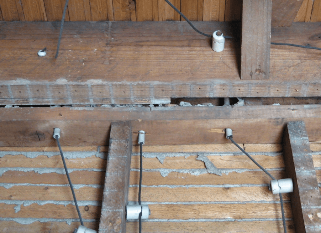
In the late 1800’s the electrification of offices and homes was becoming more popular and the current method of wiring buildings posed a problem. The method at the time was known as ‘knob and tube’. Copper wires which were covered with a rubberized fabric were strung along the unfinished side of walls, underneath floors, or on attic joists and held off the wood surface by attaching them to a line of ceramic knobs which were nailed to the wood studs. When the wiring had to pass through a stud or joist, a hole was drilled and the hole was filled with a ceramic tube for the wires to pass through.
Knob and tube wiring – photo-Laura ScudderDiagram of typical wiring showing rubberized cloth covering
The problem came when the wiring had to run inside a room interior. A cosmetic solution had to be created to hide electrical, telephone, and telegraph lines from view.
A wooden cleat to be used instead of ceramic knobs.
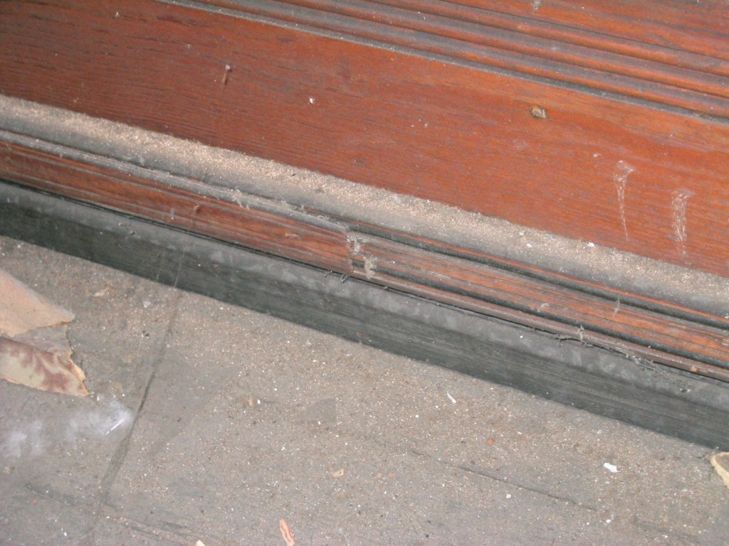
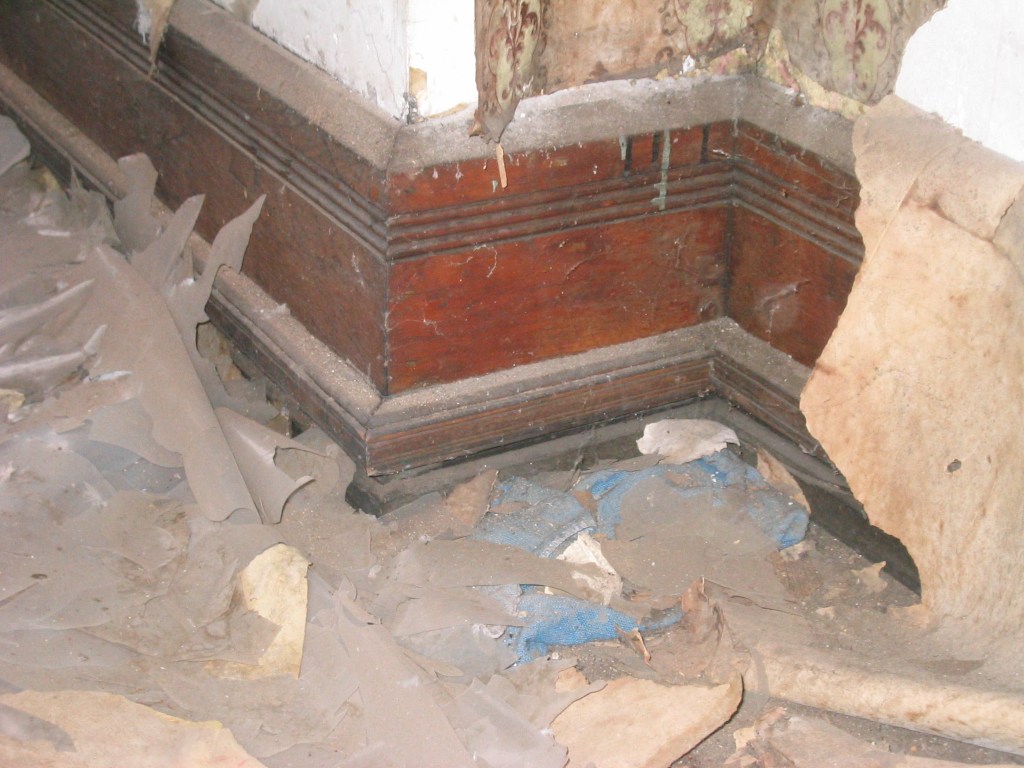
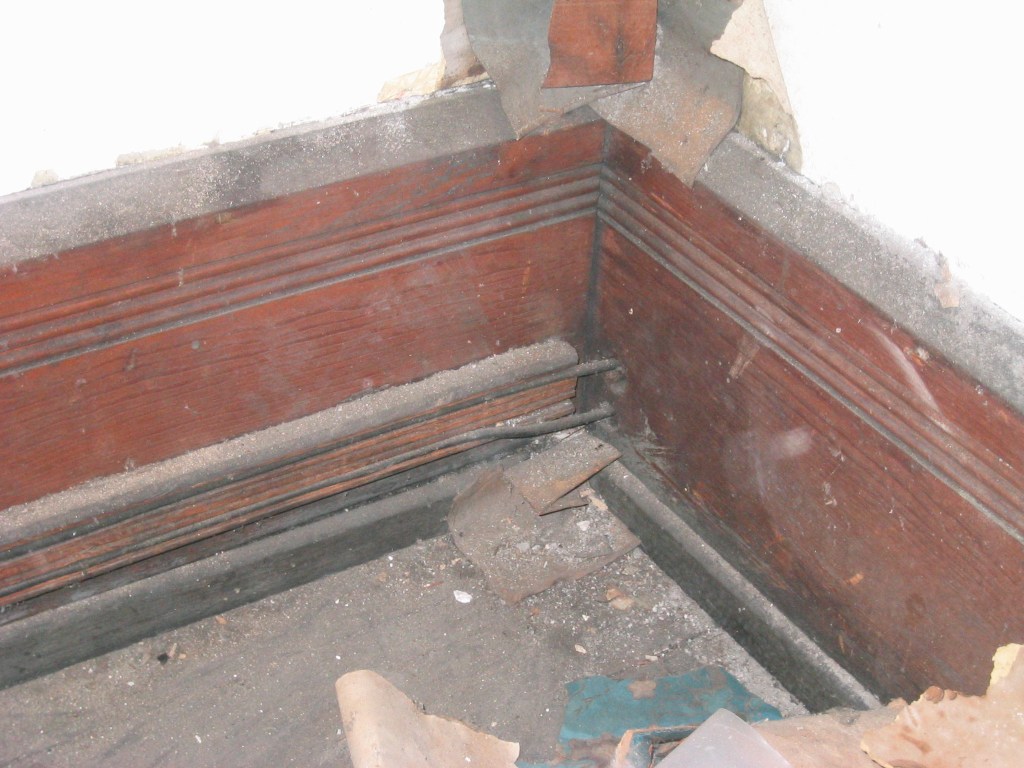
Cutting into the three-coat plaster and wood lath walls of the period to bury wiring inside them wasn’t an easy option when electrifying previously built houses. Early builders manuals suggested designs that hid the wiring inside moulding on the walls. Some suggested creating a moulding which hid the wiring at the top of a tall wainscot paneled wall, or to create a wide picture rail to serve the purpose.
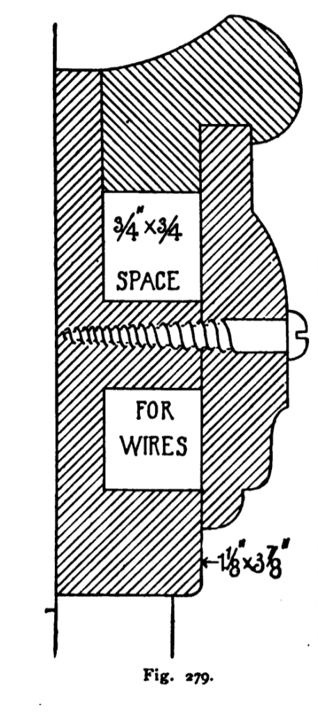
An example of electrical moulding disguised as a wide picture rail.Another example of a suggested electrical moulding capped by a picture rail mould.
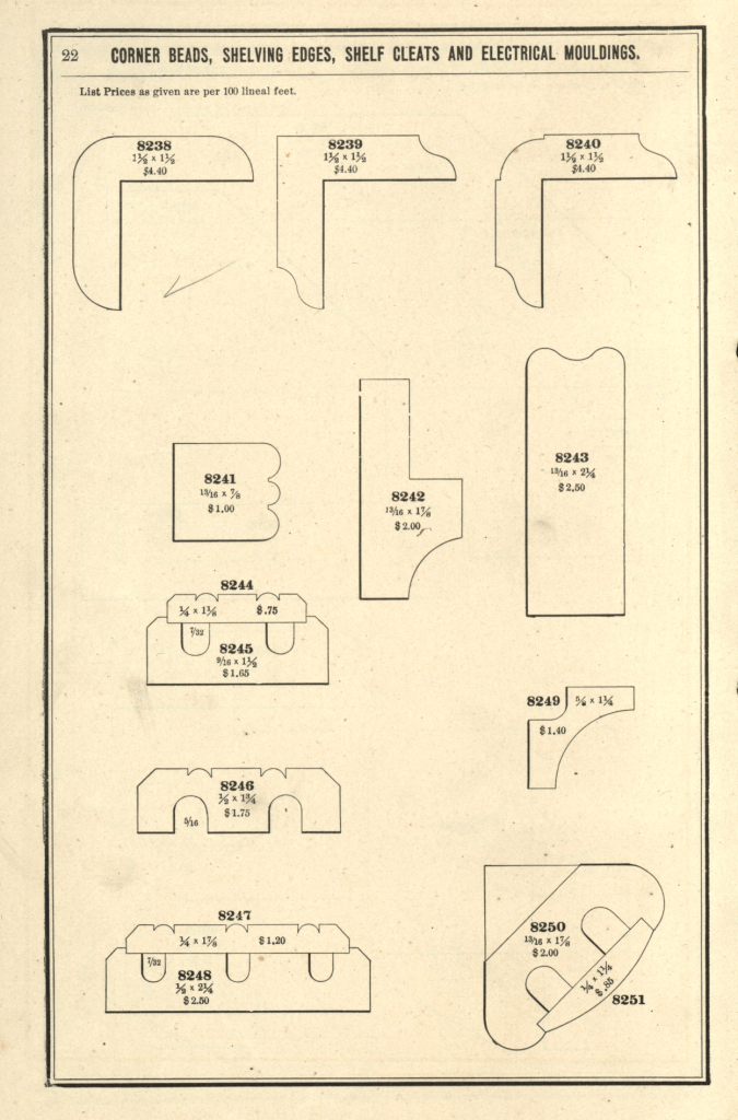
Electrical moulding doesn’t show up in a lot of the moulding catalogues from the period, but a number of them are represented in the Official Moulding Book in their 1907 to 1913 editions.
No. 8249 and 8251 were meant for either a type of cornice mould or to use to run wiring vertically at a room corner.
The three photos below are photographs I took inside an 1890 office building before it was renovated. I haven’t been ablr to find this exact mould in any catalogue yet but they are a slightly more decorative version of No. 8244 in the Official Moulding Book.
Photo – R. WilkinsPhoto – R. WilkinsPhoto – R. Wilkins
Note that the wiring runs to the next room through holes in the wall which do not have any insulators. This lack of insulators, the fragile nature of the rubberized fabric coating, and the fact that the wiring was not grounded made for serious fire hazards with the early wiring systems.
Sources:
Official Moulding Book – 1907, The Chicago Millwork and Moulding Co, Chicago, IL
Building Construction and Superitendence, F.E. Kidder, Part II, 1911, William Comstock Co. NY
Cassell’s Carpentry And Joinery, Paul Hasluck, 1908, David McKay Publisher, Phila, PA
The latest story to excite below-the-line crew members in Los Angeles is the news that Ben Affleck and Matt Damon have made a deal with Netflix for their new film, The Rip. The contract includes a stipulation that provides for a bonus to the entire crew of the production if the show performs well on the streaming platform when it is released.
This one-time bonus would be in addition to the salaries which crew members were paid during the production.
Affleck told an interviewer at the Toronto Sun, “We wanted to codify a model that included 1,200 people on the crew, as well as the cast, because we firmly believe that when everyone is investing themselves, that makes it likelier that you’re going to have something that people connect to more.”
“How this business survives and thrives going forward, we believe, is going to be fundamentally related to the fact that (filmmaking) really is a collaborative art form, so (we are) seeking to incentivize all of those folks into making the best movie possible.”
Wether this idea can be a part of other contracts at other production companies and what it’s outcome for the crew will be remains to be seen.
The idea is a revolutionary first for large-scale Hollywood studio productions, but it’s an idea that isn’t a new one. The idea had been suggested to major studio executives 40 years ago by British producer Sir David Puttnam, and it didn’t go over well.
Sir David Puttnam – Photo by Alex Westcott/TODAY
In 1985, I was a Fellow in the Directing Program at the American Film Institute. AFI was a choice place to be and it was a heady experience, especially at that time. It was a time before the internet, or DVDs with director and producer commentaries, or an endless variety of interviews and how-tos by professional filmmakers.
It’s a place where major directors and producers will show up to screen and talk about their latest productions with the school’s community. We had visits from David Lean, Steven Spielberg, John Hughes, and others . Nearly every week there was another Hollywood luminary who none of us would have met in person if not for the AFI program.
One week it was announced that the guest artist would be Oscar winning Producer David Puttnam. And, he would be guest lecturing not just for the day but for the entire week. He would be screening his new film, The Killing Fields, which was nominated for five Oscars.
Also that week, he screened three of his other films; Midnight Express, Chariots Of Fire, and Local Hero. It was a whole week of master film classes by the man who had produced them. I wish they had been recorded.
Sir David was incredibly cordial, approachable, and even self-deprecating at times. He told us that when he was producing his first film, in an effort to prove he was on top of the goings-on of the production, he would go over the budget expenditures for each week. One week he caught a suspicious cost difference and called the line producer into his office.
The line producer looked confused when Puttnam pointed to the line item listed as Focus Puller. “How would this same equipment cost a different amount every week?” he asked. He said his moment of satifaction at having rooted out financial irresponsibility quickly turned to embarrasement when the man told him that the ‘Focus Puller’ was the title of a crew position, not a piece of equipment.
He was as generous with information as he was with his time. As we watched the films he would interject stories about the production challenges they had faced, both comical and daunting. He would examine a production from nuts to bolts and would barter with a director over, for instance, how many animals they actually needed in the background for a believable scene.
Very down to earth in his presentation style, he entertained us with stories of his current meetings with studio leadership. He was being courted at the time by a studio to take over as head of the operation. They were as surprised by his attitudes toward the current Hollywood system as he was by the studios’ expectations and business plans.
They showed him various options for homes in Los Angeles, all with huge properties and large pools and they told him about the options he could have as a company car. He said he didn’t want a house with a pool and that the cars they were suggesting were ridiculously large.
He had already ruffled feather among a number of studio heads and other producers with some of his comments about the Hollywood system, which he considered to be a “me-too” attitude, as he thought that the system seemed to be content with just copying other people’s successful films.
“You can’t do creative work in an environment like that”, he told an interviewer from TimeMagazine. In one communication to Columbia’s corporate owners, Coca Cola, he said, “The medium is too powerful […] to be left solely to the tyranny of the box office”.
He also pointed out his disgust at huge actor salaries. A New York Times article stated later, “What surprised and dismayed him most about Hollywood was the amateurishness.”
Once he was installed as the new studio head at Columbia, he made it clear that he wanted to make films he would be proud of. “I would be shattered if I could not look with pride at Columbia’s pictures. That would not be true of 75% of films made in Hollywood today”, he said. The New York Times also reported that he was “enough of a realist to want to make entertaining movies, and enough of an idealist to want his films to have social value.”
He wasn’t afraid to point out mistakes that he felt had been made in what were considered audience favorites. A writer for The Hollywood Reporter in 2016 wrote that “He had slammed the ending of the blockbuster E.T. The Extra Terrestrial because he thought the alien should have stayed dead.”
On some days he would express his ideas for revitalizing the entire studio production process including changing the pay structure that was in place in Hollywood. He wanted to move some of the profits down to the people who actually made the films. He had talked to a number of individuals about a possible system where a crew member could benefit from the film’s actual profits, choosing between taking a full salary or partial salary and points on the film’s box office.He said they looked at him as if he was mad.
Sir David would take over at Columbia Pictures in September of 1986. He would stay on as head of the studio for just 13 months. After his tenure, when asked about by a writer at The Hollywood Reporter, he said “Looking back, I was a good movie producer who made the mistake of being persuaded I could run a studio. I hated almost every day of it.”
On the last day of the week that he spent with us at AFI, he didn’t rush off as you would have expected of most people of his stature. When the lecture ended, he stuck around for small-talk. A group of us lined up to say goodbye and offer our thanks for the one-of-a-kind week of instruction and advice.
I hung out toward the back, not sure of what I’d say as a proper thank you. I approached him and he displayed a big smile and held out his hand. I thanked him and then, in a prescient, self-interested moment, I blurted out my unexpected question.
“Is it true?” I asked him. “Is the industry as hard on relationships as some say it is?”
His smile faded a little and he looked at me with a kind of empathy. “Yes”, he said. “It definitely can be.”
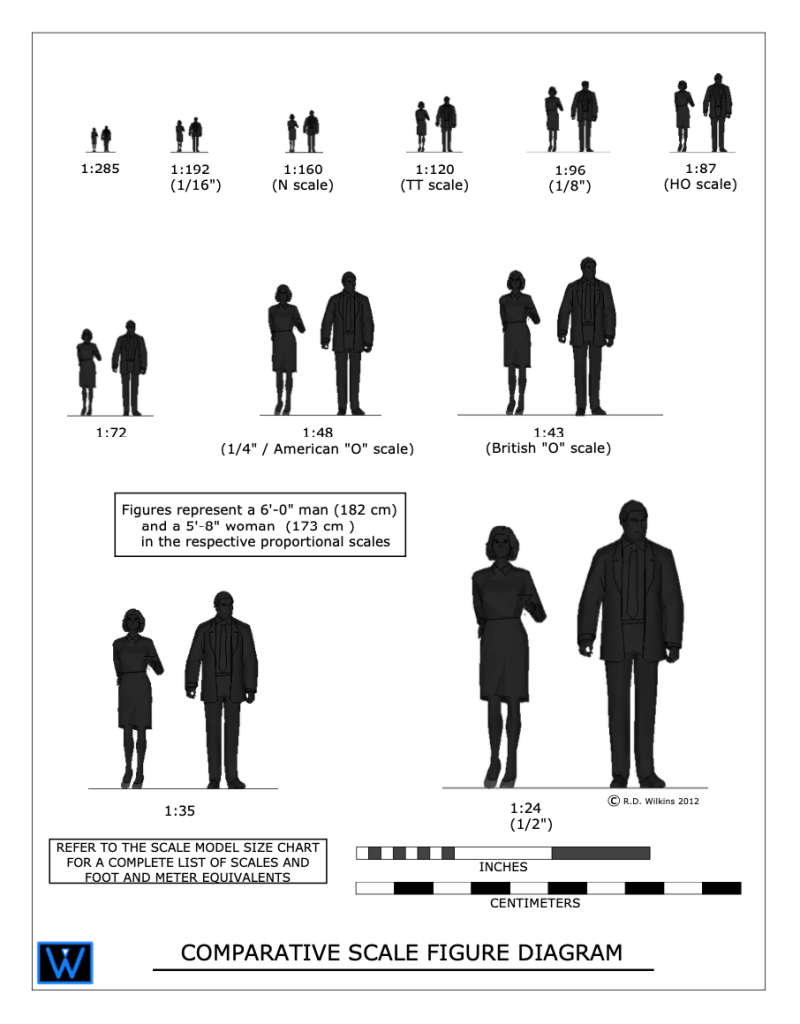
Visualization skills are something anyone can learn. You just need to understand the basics of scale. Once you familiarize yourself with the basic scales that are used in design you can start to train your brain to correctly imagine anything and visualize it in an actual space.
I created the diagram above for a blog article I wrote about model scale. The article was about choosing a proper scale for physical models rather than digital ones.
The article didn’t clearly explain what ‘scale’ is or how it’s used in technical drawings. It also didn’t explain the difference between a ‘scale unit equivalent’ and a ‘ratio’, or how to use scales to help you with visualize objects in your mind.
Drawing Scales
Drawing in scale is a way to clearly communicate the size of something, either physical or imagined, in a visual way to help the viewer understand the proportions and size of an object. Either on its own or in relation to other objects.
Some drawing scales are noted by using a measured unit and comparing it to a life-size unit, such as 1/4″ = 1′-0″, which is a popular scale for architectural drawings.
This means that 1/4″ as measured on the drawing is 1′-0″ in actual size.
On the diagram above you’ll see the use of scale ratios. Note the ratio of 1:48 has the 1/4″ scale in parenthesis. The ratio scales can be interpreted as dividing the full size unit into that number of divisions. If you divide 1 foot into 48 segments, each of those segments would be 1/4″ long. So, a drawing with a ratio of 1:96 would be the same as 1/8″=1′-0″. A scale of 1″=1′-0″ would be a ratio scale of 1:12, as there are 12 inches in a foot.
Look at your shoe. If you are an average size person, the length of your shoe is about 1 foot long (28 to 30cm if you use the metric system). If you wanted to draw the outline of the sole of your shoe in, let’s say 1/2″=1′-0″ scale, that would be an equivalent ratio of 1:24. 12 inches divided into 24 parts would each be 1/2″ long.
If you use the metric system you’re in luck. You don’t have to deal with a silly fractional system and you use a strictly ratio system for drawing scales.
Analog Is Best
A scale of 3/4″=1′-0″ is a very common scale for drawing architectural details, but not for designers who mainly work in the theater. Because of tradition, in the theatrical world, such as Broadway, the standard size of plans and elevations is 1/2″+1′-0″.
A detail of an elaborate doorway will obviously look much larger when drawn at the 3/4″ scale than at 1/2″ scale. If you are used to looking at details in one scale, the same details will look ‘wrong’ in the smaller or larger scale.
I worked with a designer who asked me to not draw details in 3/4″ scale because he was used to visualizing designs full-size while looking at them in 1/2″=1′-0″ scale. Seeing them in a larger scale was disconcerting for him while visualizing.
As far as visualizing in scale, seeing a drawing printed on paper is better than looking at it on a computer screen every time. In terms of viewing images on a computer screen, the screens will lie to you every second of every day, in all kinds of ways, particularly in regards to size comparisons.
Imagine you’re looking at a drawing of sofa that is drawn in 1/2″ scale, or 1:50 in metric, on a computer screen. On your desk is a drawing of a room plan in 1/4″ scale, or 1:25 in metric. If the sofa drawing was on paper you could easily convert the sofa in your mind to the smaller scale to imagine how it would fit in the room.
If the sofa drawing is on a screen, how can you be sure if the scale is correct? You can’t. Even if the software is telling you that the image is being presented in a scale that is true to the stated size, most people could not make the visual transformation unless they were very experienced in doing it.
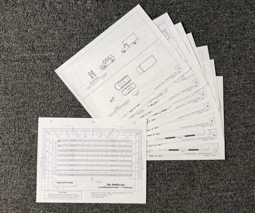
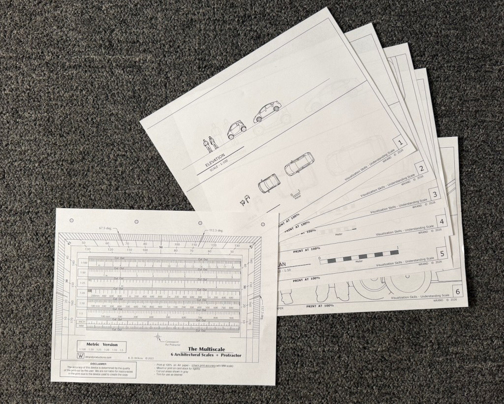
The Packets
You can download the Visualization Chart packets from the links below. If you’re in the States, you want to download the packet marked “Imperial units”. If you’re anywhere else in the world that uses the non-fractional, uncomplicated, easy-to-use measuring system known as Metric, be sure to download that one.
The packet with Imperial /foot/inch scales contains 8 sheets with 5 scales: 1/8″, 1/4″, 1/2″, 3/4″, and 1″. There is also a copy of my Multiscale in the event that you don’t own an architects scale.
Print these all at 100% on letter size paper. Be sure that the print setting is at 100!
The metric packet contains 7 sheets in 4 scales: 1:100, 1:50,1:20, and 1:10. The seventh sheet is a Multiscale in metric. The Multiscale includes the 1:25 ratio which I didn’t include in the diagrams. That ratio doesn’t seem to be much used anymore. Let me know if that isn’t the case.
Print them all on A4 paper at 100%.
Using The Diagrams
Prepare The Multiscale
Print it out at 100% and check the lower scale markings against a known ruler or measuring tape to be sure it is printed correctly.
Cutout the gray areas for ease of measurement. You can also glue it to a piece of cardstock or a file folder to make it stiffer.
Exercise #1
Get familiar with the different scales. Examine the way objects look in the Plan view from above as opposed to the Elevation views from the sides. Does either view make the object, either the people or the vehicles seem different in scale?
How do they compare to each other? Place one scale sheet beside another and notice how the perceived distance caused by the smaller scales affects your perception of their proportions differently than the larger scales.
Exercise #2 – Thinking Vertically
Pick an object that’s relatively large in size such as a sofa, a piano, TV in your room. Now using the scale on the Multiscale, draw the object on the scale Elevation sheet next to the people or the vehicle.
Notice its proportion and size compared to the things on the sheet. Does it seem smaller or larger in comparison than what you visualized in your mind before to drew it?
Take a measuring tape and measure a wall of your bedroom or living room, and draw it in scale on a sheet or another piece of paper. Now look at a framed picture or mirror or wall hanging from another room or another location. Try to imagine it on your wall. measure the piece and draw it in scale on the scale wall drawing. How does it look? Does it take up the same space that you imagined it would when you visualized it on your wall?
Exercise #3 – Thinking Horizontally
Measure your bedroom or another space of your house. Now try to visualize one of the vehicles on the scale sheets appearing inside your house. Using the Plan view of the 1/4″ sheet or the 1:50, draw the floor plan of that room in the chosen scale using the Multiscale. Using pencil, you can draw the space right on the scale sheet. Does the vehicle fit in the space you measured? If it does, does the space around it seem to be the same as what you imagined, or is the space larger than what it feels like when you are standing in it?
Exercise #4 – The Teleporter In Your Head
Take the scale floor plan you’ve drawn of your room and go to a store where they have furnishings. Now look around at things like sofas, large TVs, or beds. Take a tape measure with you or use the measurements they provide at the store. Imagine them in the space.
Test your power of scale conversion by estimating the area of the floor the objects would take up. Draw them on the plan with a pencil. You will eventually be able to estimate foot or metric increments visually on a scale drawing. In 1:50, the width of the tip of a finger is about 1 meter in scale. In 1/4″ scale, the width of a finger is about 3 scale feet. The width of a thumb is 4 feet.
When you get home, test your guess. How close were you?