This is an update to a post I made back in 2012 about standard European architectural manuals; Neufert’s and McKay’s Building Construction.
I’ve recently found digitized copies of both of these online and have posed them at the bottom of each of the descriptions below. Copies of McKay’s have been hard to find here in the States and I like having a digital copy to refer to when I’m on location. Less shipping!
Here in the US, the book we primarily turn to for all questions of an architectural nature is the AIA Architectural Graphic Standards. For our work, the third and fifth editions are the most informative because they were printed at a time when architects had to draw everything rather than order most elements pre-made. If you happen to be drawing up European architecture, though, it won’t do you much good.
In the rest of the world, the architectural book most people turn to for similar answers is Neufert’s Architectural Data. Soon to be released in it’s 40th edition, the book is printed in 18 languages and is the architectural Bible in the metric world.
Ernst Neufert
Ernst Neufert worked at the Bauhaus as chief architect under Walter Gropius and later taught at the Bauhochschule until the Nazis closed it down in the early 1930’s. Seeing the need for a book that graphically laid out the architectural standards of the time, the book was first printed in 1936 and soon became a big success. Like Graphic Standards, the book is mainly a visual reference of architectural design and space standards for the European continent.
The book has had a number of English language editions, but the 1998 International is the most useful and easiest to use for the metrically-challenged. A large number of each edition are printed so it should be fairly easy to find used copies. You may have better luck throught British booksellers than second-hand businesses here.
In Britain, The book many people refer to is McKay’s Building Construction. Originally published in three volumes over an eight year period, the recent re-publication has combined them into one book. The books are so popular in England that when they briefly went out of print, students were encourage to beg, borrow or steal to get a set.
page on hand-cut stonework
Written by W.B. McKay, who was Head of the Building Department at both Leeds and Manchester colleges, the book is particularly useful for our business as it shows and describes exactly how the various methods of construction (wood and masonry ) are carried out. Filled with hundreds of beautiful perspective drawings by McKay, the book takes up where Graphic Standards ends.
Like Neufert’s, this can be had in used editions, the most recent from 2004. I found my copy in a bookstore in New Delhi, India, so you may have to search around. This is definitely a book that is worth the search.
You’ve probably never thought about how sound can affect your stage set. Beyond trying to not create an environment that would drive the sound recordist mad, you usually don’t think about odd acoustic anomalies that might pop up that you never intended to happen. Like echoes.
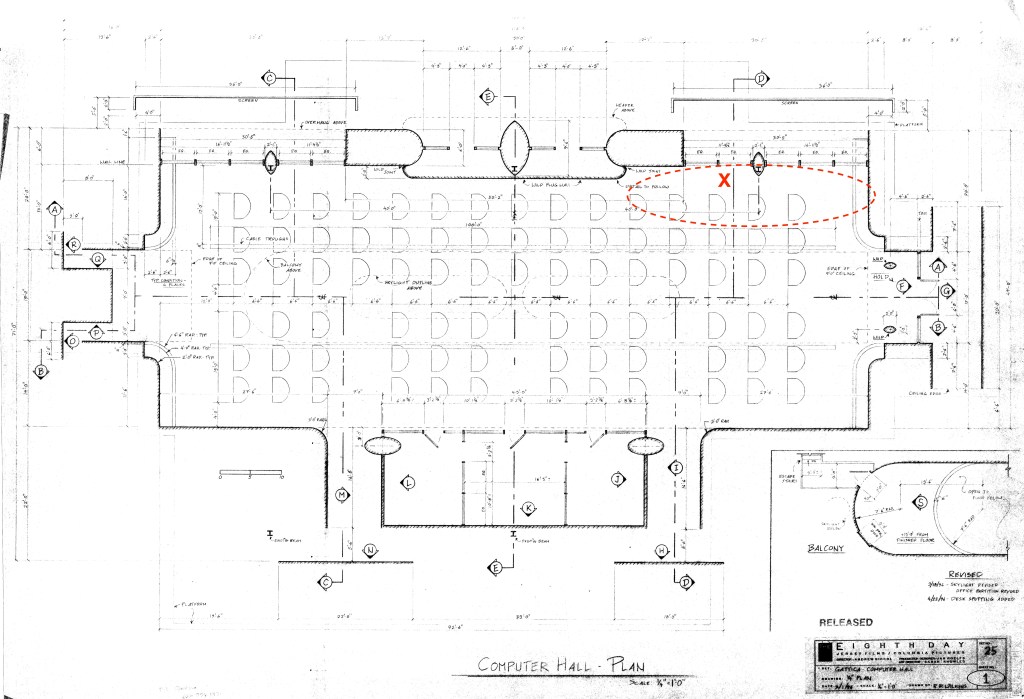
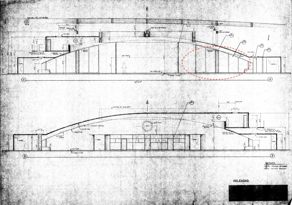
Computer Hall set – Gattaca – Columbia Pictures 1997
Yeah, echoes will bite you in the ass if you’re not careful.
On the main set for the 1997 film Gattaca, just such an anomaly occurred, and it was the cinematographer who ended up saving the day.
And what does the cinematographer have to do with sound problems? Keep reading.
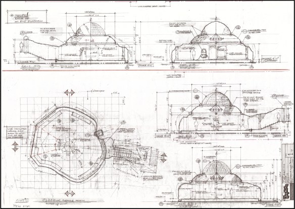
The Computer Hall set was designed by Production Designer Jan Roelfs and was inspired by the real-life location that he and Director Andrew Niccol chose for the film. The actual building chosen for the exterior of the Gattaca Aerospace Corporation was the Marin County Civic Center in California, designed by Frank Lloyd Wright. The art department flew to Marin and surveyed the interior details so that they could be matched for the set on stage, which was in a warehouse in Playa Vista.
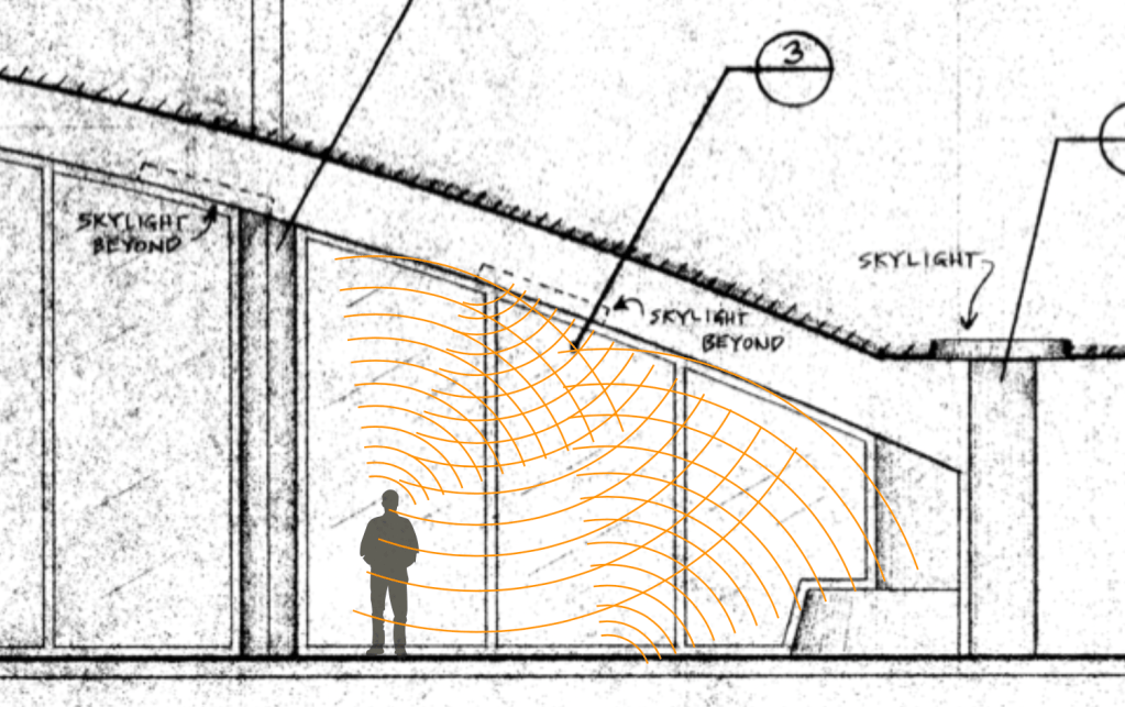
The building they had leased made for an odd sound stage, but its size made it large enough to build the sets for the film in. There were the normal problems you deal with in a structure that was never designed to be a sound stage: support posts at regular intervals, a ceiling that is not nearly as high as those in an actual sound stage. On the plan below, you can see where the oval columns were designed to hide two of the building’s I-beam columns.
These are my drawings of the plan and elevations of the set with the areas of the sound problems circled.
(One note: on the title block, you’ll notice it reads “Eighth Day”. This was the original title of the film. In pre-production, the producers learned that there was a French movie of the same name that was going to be released, and a name change was required. The writer and director Andrew Niccol decided that he would create a new title using the four letters used to identify the nucleobases of DNA: GATC.)
Turns out, theater designers had known about the sound reflective effects of elliptical and parabolic ceilings for years, as most of the western world designed theaters in the mode of the typical Italian horseshoe layout plan.
A presentation at the 2017 International Congress On Sound was focused on this phenomenon.
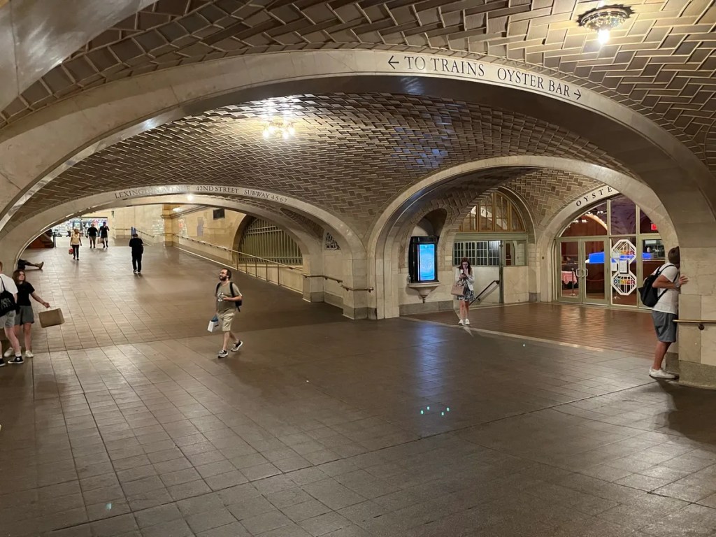
In New York City’s Grand Central Station, there is a ‘whispering gallery’ or acoustic vortex. This is an architectural phenomenon created by a number of configurations, in this case, a vaulted ceiling in the subway entrance under the terminal. A person standing in one corner of the hall intersection can whisper into the corner and the sound travels over the curved surface of the ceiling and can be heard by a person standing in the opposite corner.
New York Grand Central Station
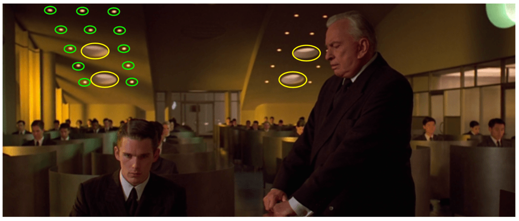
I discovered the echo one day when I was walking the set and stopped at the point in question. I saw a gnat and clapped my hands together to kill it. That’s when I heard the strange echo. Horrified, I clapped again and there was the same echo. I clapped a third time, just as Jan was walking through the set. He stopped and frowned. “Don’t do that!’, he said.
I think what was happening was that the area beneath the lower section of the ceiling of the set created a flutter echo, which was enhanced by the smooth ceiling surface. The two large skylights didn’t seem to affect this echo.
There was no carpeting or fabric to dampen the sound which would have eliminated this effect.
The solution came for the most part when the cinematographer, Slawomir Idziak, told us that he needed more practical lights in the set. This required creating dozens of new openings in the lower sections of the ceiling. These holes interrupted the acoustic waves and the echo disappeared. With the addition of the desks and the background actors, the sound reflection was minimal.
The photo below shows the original skylights in yellow, with the new lights circled in green.
The look of construction drawings for film and television has changed a lot over the years, particularly now that most drawings are done digitally with computers rather than by hand.
While many current drawing styles now incorporate photo-textures, shadows, and icons to add life to drawings beyond what is typical of architectural drawings, it’s hard for them to match the aesthetics of hand drawings.
CAD drawing from 3D model – photo textures applied
Having started as a pencil draftsman I guess I do have a bit of a personal bias, but the unique style of each person on a hand-drafted drawing was immediately recognizable to people who knew their work.
Before digital illustrations and renders of 3D models, hand-drafted drawings had to serve as a design sales tool as well as instructions for scenery construction.
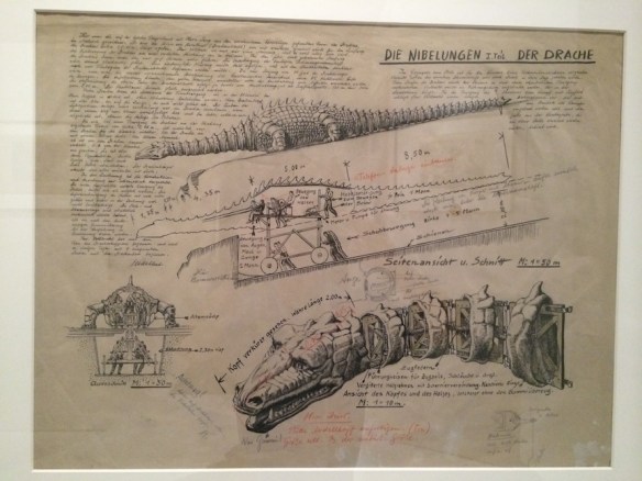
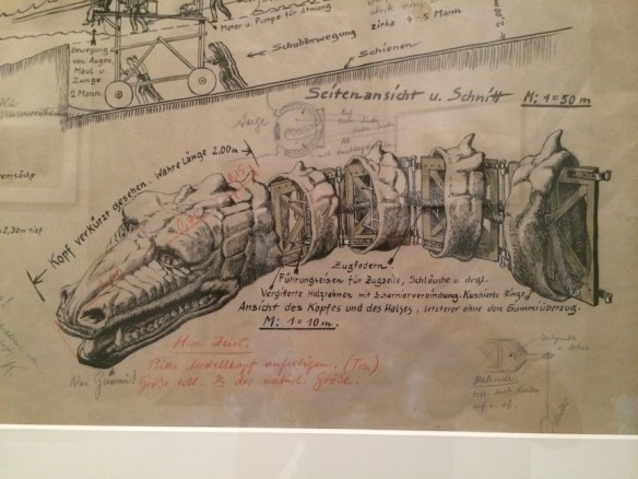
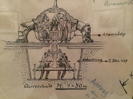
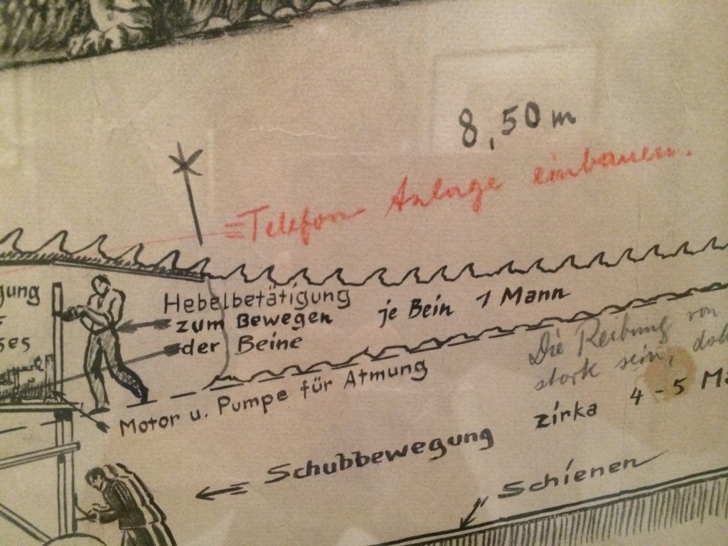
Here are some shots of a set design by Erich Kettlehut in 1923 for the UFA film, Die Nibelungen, for the scene where Siegfried kills the dragon.
The drawing was displayed as part of an exhibition of artwork from the UFA silent film period of the 1920s and 30s at the Los Angeles County Museum of Art in 2014. The drawing is from the collection of La Cinématiquè Française in Paris, France.
Note that the drawing not only provides a pictorial description of what the dragon should look like, but calls out dimensions, construction materials, how the action prop is to be operated, surrounding scenery requirements, and specific technical details of mechanical movements.
Technical drawing of the Dragon by Art Director Erich Kettelhut – ink and pencil on vellumKettelhut called out the length of the neck as well as the tension springs, framework, control cables and hoses required for the creatures fiery breath. He calls out “only rubber!” for the mouth area.The size and depth of the recessed path required for the props operators.drawing describing how each part of the dragon was to be operated by stagehands.Note in red indicates that a telephone/communication system needs to be added to the prop for the crew.
The scene where Siegfried slays the dragon in Die Niebelungen from 1923
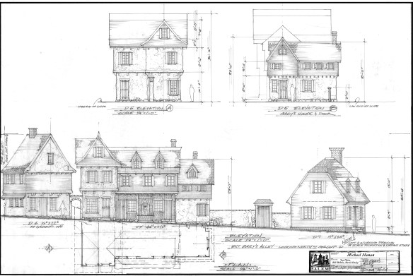
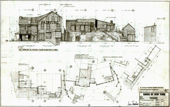
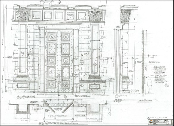
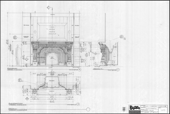
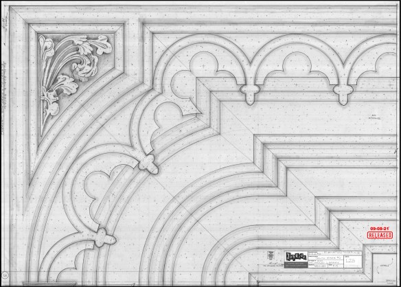
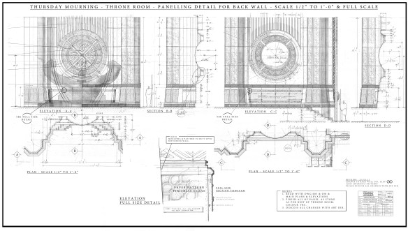
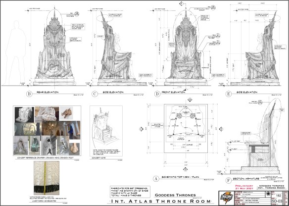
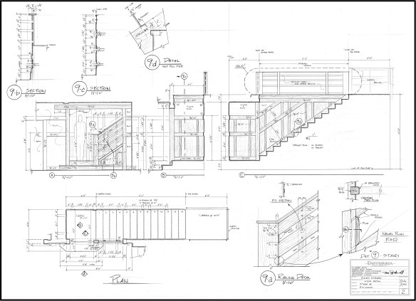
Here are a few more hand-drafted pencil drawings from more recent films:
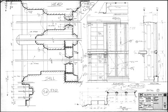
Salem – drawing by William Ladd SkinnerGangs Of New York – drawing by Luca TranchinoShazam – drawing by Greg PapaliaHaunted Mansion – drawing by Barbara MesneyHaunted Mansion – full size detail of fireplace for the plasterersThor – drawing by Oli GoodierShazam – drawing by Stella VaccaroDisturbia – drawing by RD WilkinsHaunted Mansion – drawing by Hugo SantiagoBaby’s Day Out – window detail
Jeesh, it’s been ten years since my last gift guide and I’m getting it out a little late this year, but some of the same items are still here on the list, mainly the classic tools and books that never become obsolete, (like a lot of software programs do).
I don’t receive any money from these recommendations. These are books and tools that I own and use often.
My Must-Have Tools For Film Designers
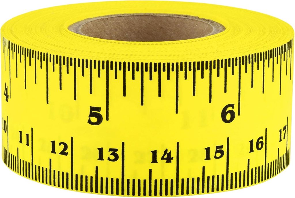
FastCap Flat Back Tape – You can not only measure round or curved surfaces but it has a blank area to write on for use as a story pole. – $10.00
Keson Pocket Rod– These are so essential for site surveys that I have four of them. They come in Architect and Engineer models. – $20.00
6″ Digital Calipers – Like these, there are many manufactures. (Avoid any priced under $20.00.) – Must-have tool for doing photo scaling (see article) – about $24.00
Equal Space Dividers – great for not only photo scaling but for designing in general. They run the gamut in price from these to these. $220 to $24.00
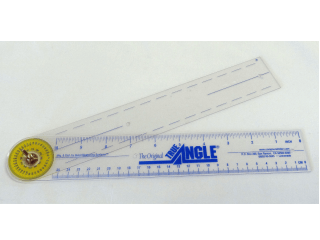
True Angle – Multi-use tool for measuring and transferring angles. lightweight. – 12″ -$16.00
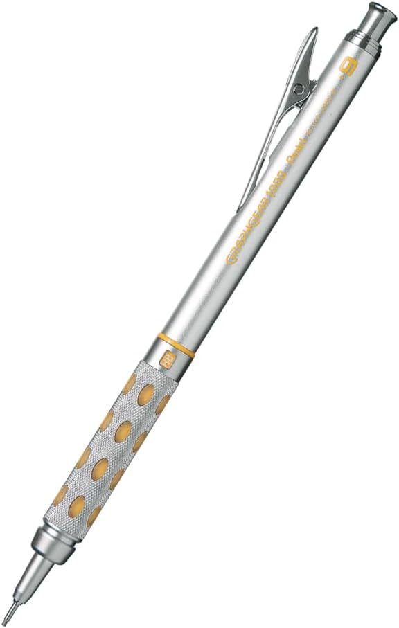
GraphGear 1000 – Mechanical pencils, my new favorite brand. These are great because the barrel sleeve retracts into the pencil to protect it. Comes in .3, .4, .5, .7, and .9mm leads. About $9.00
Compass – So many to choose from, (and a lot of crappy ones are in the mix). This one is a good all-around basic, practical compass that will last a while. $14.00
Still my favorite design and furniture book publisher. Here are my recommendations:
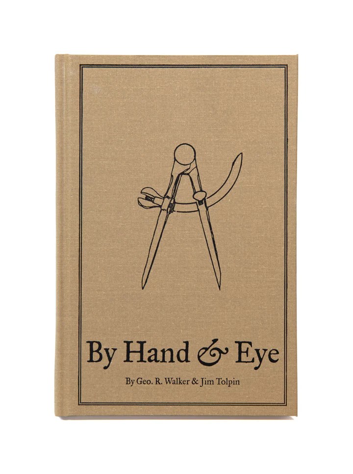
By Hand & Eye – $51.00. Another gem from Lost Art Press, this is probably one of the best design books written in the last 100 years. It outlines the world of design without a rule and using only dividers and proportional methods. I covered this in a previous post and always recommend it. Buy this and a good pair of second hand dividers from Ebay and you will completely change the way you think about design.
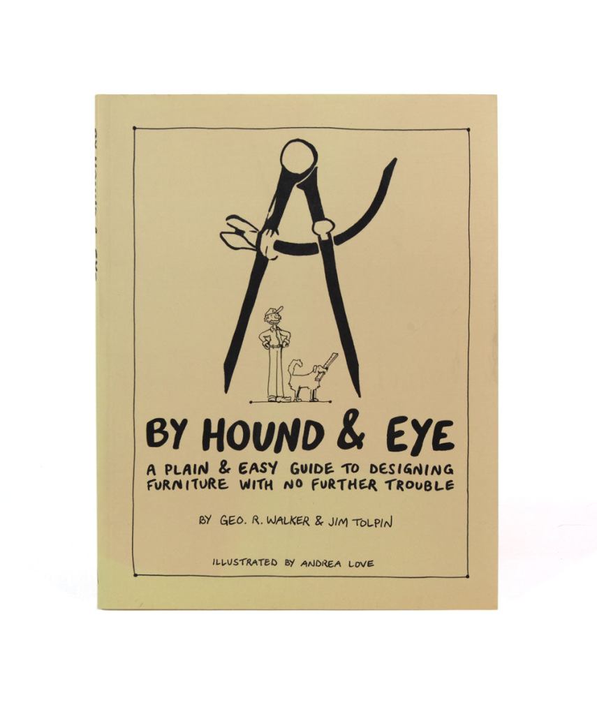
By Hound & Eye – $31.00. A companion workbook to By Hand & Eye.
A Field Guide To American Houses – Virginia Savage McAlester
Stair Builders Handbook – T.W. Love
Backstage Handbook – Paul Carter
American Cinematographers Manual – ASC Press
The VES Handbook of Visual Effects – VES Society
Designer Drafting For The Entertainment World – Patricia Woodbridge
The Classical Orders Of Architecture – Robert Chitham
Illustrated Cabinet Making – Bill Hylton
Styles Of Ornament – Alexander Speltz
McKay’s Building Construction – W.B. McKay
Neufert – Architects’ Data – Granada Publishing
Geometry Of Design – Kimberly Elam
Really, Really Last Minute Gifts
When you realize you’ve really screwed up and forgotten someone and have no time to run to the store, much less order anything, you can always gift a good app.
Log onto the Apple or Android store and gift your so-important-you-forgot-about-them friend one of these apps and your reputation will be saved:
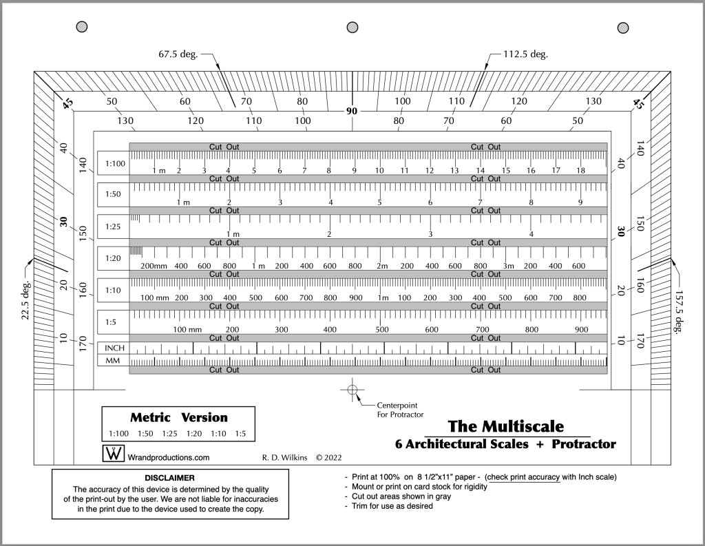
Last week I posted the Imperial version of a new tool I’ve updated recently. I promised I’d post the Metric version of the tool this week so here it is. You’ll find the Imperial version here if you missed the post.
This is one of the design books on my Top Ten list. Authors Jim Tolpin and George R. Walker examine the role of proportion in design from ancient times to the present. While the emphasis is on furniture design, they show how much of the world is governed by simple proportions, noting how ratios such as 1:2; 3:5 and 4:5 were ubiquitous in the designs of pre-industrial artisans.
This is not a recipe book but a guide to a new way of looking at design through the eyes of centuries of artists.
Published by Lost Arts Press, this is just one of a whole line of fantastic books on design and hand woodworking that they offer.
You’ll receive a link after you purchase the course to download the PDF.
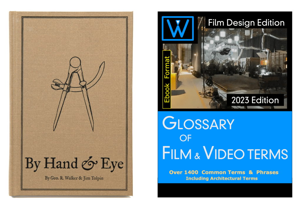
This new first edition is the only one of it’s kind; a film glossary created for film designers. Whether you are a novice or an industry professional, you’ll find useful information in this book that doesn’t exist in any other film glossary,. As well as nearly 1500 up-to-date terms on production, cameras, crew positions, post-production, legal aspects, stage equipment, and industry slang, there are hundreds of entries on architecture, hardware, set construction, and more.
The 2023 Ebook is due to be available in mid-December. Series purchasers will be the first to get the book when in becomes available and will receive a download link.
The 10-Week Course Description
This is the only time the series will be offered at this price and it will return to the normal price when the series begins on October 31.
This self-paced online series covers the fundamental skills that a Set Designer in the feature film and television industry here in Los Angeles are expected to have.
This is similar in difficulty to a one-semester graduate-level program at a university, but much of the material presented here is not covered at most colleges and is normally only available at the professional level. I’ve been developing this series for several years, basing it on classes I teach at the Art Directors Guild in Los Angeles.
Here is an outline of the material that will be covered in the series:
Week 1 – The Basics
Standard drafting conventions and symbols for set construction drawings. Set construction: typical flat construction techniques and variations.
Week 2 – Cameras & Optics
Understanding basic camera and lens terms: aspect ratios, focal length, depth of field, sensor sizes, exposure, stage lighting, using camera angle templates.
Scaling from photographs and artwork: calculating dimensions, understanding picture perspective and allowing for lens distortion.
Week 3 – Analyzing the Script / Reference Materials
How to break down a script for set design; using storyboards; techniques for estimating drawing time schedules.
References: using online, printed, and survey photo references; building a reference library on a budget.
Week 4 – Working Drawings
Step-by-step directions on creating proper construction drawings: plans and elevations; details, full-size details, and digital cut files; reflected ceilings and furniture plans; stage spotting plans, and director’s plans.
Week 5 – Door & Window Details
Diagrams and explanations of door and window construction and various adaptations for stage sets; creating accurate-looking period reconstructions; understanding, using, and sourcing hardware.
Week 6 – Stairways
The fundamentals of stair design: types of stairs, stair construction, how the choice of stair type affects design, and designing elliptical stairs.
Week 7 – Mouldings & Staff Elements
Understanding and using the Classical Orders of architecture; the proportions of mouldings based on style type; using a moulding catalog and creating built-up moulds.
Using plaster staff and compo elements in a set; designing with brick skins and textured surfaces.
Week 8 – Backings, Special Effects, & Visual Effects
Using painted and photo backings: The advantages and drawbacks of various types; creating custom backings; how to calculate correct placement distance from the set.
Special effects considerations: replicating fire, water, and wind effects; understanding legal requirements for special effects work on a sound stage; dealing with practical fireplaces.
Visual effects work: shooting with green or blue screens; using LED walls or volumes.
Week 9 – Backlots & Location Surveys
Shooting on studio backlots; shooting on location; proper surveying techniques; assembling a personal survey tool kit.
Week 10 – Physical Models
The advantages of physical study models; determining model scales; various model types and construction techniques.
Class Materials & Videos
Each week there will be tools, charts, and reference material to download as well as video instruction to help you do the exercises and create your portfolio drawings.
Along with the classes, you’ll have access to a private chat area that is only available to students of the series and alumnae who have taken courses previously. Here you’ll be able to meet other designers, discuss class material, get advice on your career, and exchange ideas and experiences from both the classes and real-world entertainment jobs.
Prerequisites:
– You must know how to draft. Drafting ability is essential to effectively completing the course and ending up with a set of professional quality working drawings. I’ll be offering a course on drafting later in 2022 to fulfill this prerequisite.
– Be familiar with CAD software – You are free to use any CAD software you are familiar with. Using software that you are still learning may make the lessons more challenging than you can handle. There is no standard drawing software in the entertainment industry as far as the Art Department is concerned. There are preferences among certain designers but one aspect of the job is a need to create files that can be used by many different other programs. 3D modeling won’t be required for any of the class projects but feel free to work that way if that is part of your usual design process.
There is a 14-day money-back guarantee from the time you begin the series if you change your mind. If you’re unsure about whether the series is right for you, you can schedule a free 15-minute discovery call to talk with me and I’ll be happy to answer any questions you might have.
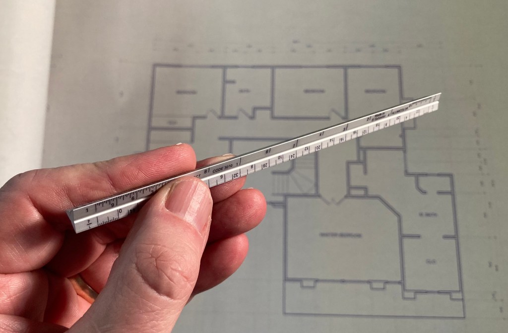
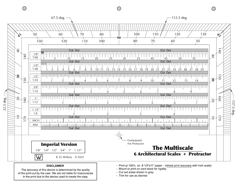
A full-size triangular architects scale isn’t the handiest thing to carry around with you.
I have those miniature versions, the cute ones that are about 6″ long and require a magnifying glass to be sure you’re reading them correctly.
It hurts my eyes to try to read the numbers on these things
After I nearly poked a hole in my chest from having one of these in my pocket, I looked for an alternative that might lessen the chances of a trip to the emergency room after falling on one of these.
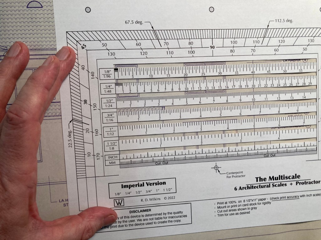
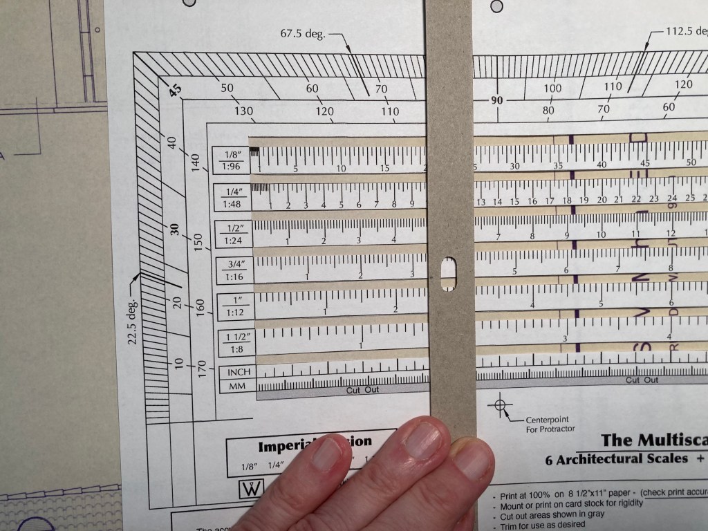
I found an 18th century drafting tool that was a combination scale and liked the concept. So, I updated and revised it to what you see here. It’s a combination of the six standard scales we use for set design and throws in a protractor as well.
A good thing about it is that it’s not engraved on brass or ivory and it fits in a binder or a book, or you can fold it up and put it in your pocket. But, it doesn’t work very well with a lot of folds in it. Best to leave it as flat as possible. Just be sure you print it out at 100%. Check it with the inch scale at the bottom against a known accurate ruler.
It’s better if you mound it to some thin card stock or manila folder material. Then cut out the little windows between the scales and you’re good to go. Heck, you can even have it printed on a transparency if you want.
Cut out the slots between the scales for use on drawings
Lay a ruler or straight edge vertically on the scales and you have a direct-reading scale conversion calculator. Next week I’ll be posting the Metric version of this tool.
A straight edge aligned vertically will allow you to do quick scale conversions.
Wrand Productions announces it’s 10-Week Set Design Fundamentals Course at a Pre-Sale price of 50% off the regular price. This is the only time the series will be offered at this price and it will return to the normal price when the series begins on October 31.
This self-paced online series covers the fundamental skills that a Set Designer in the feature film and television industry here in Los Angeles are expected to have.
This is similar in difficulty to a one-semester graduate-level program at a university, but much of the material presented here is not covered at most colleges and is normally only available at the professional level. I’ve been developing this series for several years, basing it on classes I teach at the Art Directors Guild in Los Angeles.
Here is an outline of the material that will be covered in the series:
Week 1 – The Basics
Standard drafting conventions and symbols for set construction drawings. Set construction: typical flat construction techniques and variations.
Week 2 – Cameras & Optics
Understanding basic camera and lens terms: aspect ratios, focal length, depth of field, sensor sizes, exposure, stage lighting, using camera angle templates.
Scaling from photographs and artwork: calculating dimensions, understanding picture perspective and allowing for lens distortion.
Week 3 – Analyzing the Script / Reference Materials
How to break down a script for set design; using storyboards; techniques for estimating drawing time schedules.
References: using online, printed, and survey photo references; building a reference library on a budget.
Week 4 – Working Drawings
Step-by-step directions on creating proper construction drawings: plans and elevations; details, full-size details, and digital cut files; reflected ceilings and furniture plans; stage spotting plans, and director’s plans.
Week 5 – Door & Window Details
Diagrams and explanations of door and window construction and various adaptations for stage sets; creating accurate-looking period reconstructions; understanding, using, and sourcing hardware.
Week 6 – Stairways
The fundamentals of stair design: types of stairs, stair construction, how the choice of stair type affects design, and designing elliptical stairs.
Week 7 – Mouldings & Staff Elements
Understanding and using the Classical Orders of architecture; the proportions of mouldings based on style type; using a moulding catalog and creating built-up moulds.
Using plaster staff and compo elements in a set; designing with brick skins and textured surfaces.
Week 8 – Backings, Special Effects, & Visual Effects
Using painted and photo backings: The advantages and drawbacks of various types; creating custom backings; how to calculate correct placement distance from the set.
Special effects considerations: replicating fire, water, and wind effects; understanding legal requirements for special effects work on a sound stage; dealing with practical fireplaces.
Visual effects work: shooting with green or blue screens; using LED walls or volumes.
Week 9 – Backlots & Location Surveys
Shooting on studio backlots; shooting on location; proper surveying techniques; assembling a personal survey tool kit.
Week 10 – Physical Models
The advantages of physical study models; determining model scales; various model types and construction techniques.
Class Materials & Videos
Each week there will be tools, charts, and reference material to download as well as video instruction to help you do the exercises and create your portfolio drawings.
Along with the classes, you’ll have access to a private chat area that is only available to students of the series and alumnae who have taken courses previously. Here you’ll be able to meet other designers, discuss class material, get advice on your career, and exchange ideas and experiences from both the classes and real-world entertainment jobs.
Prerequisites:
– You must know how to draft. Drafting ability is essential to effectively completing the course and ending up with a set of professional quality working drawings. I’ll be offering a course on drafting later in 2022 to fulfill this prerequisite.
– Be familiar with CAD software – You are free to use any CAD software you are familiar with. Using software that you are still learning may make the lessons more challenging than you can handle. There is no standard drawing software in the entertainment industry as far as the Art Department is concerned. There are preferences among certain designers but one aspect of the job is a need to create files that can be used by many different other programs. 3D modeling won’t be required for any of the class projects but feel free to work that way if that is part of your usual design process.
There is a 14-day money-back guarantee from the time you begin the series if you change your mind. If you’re unsure about whether the series is right for you, you can schedule a free 15-minute discovery call to talk with me and I’ll be happy to answer any questions you might have.
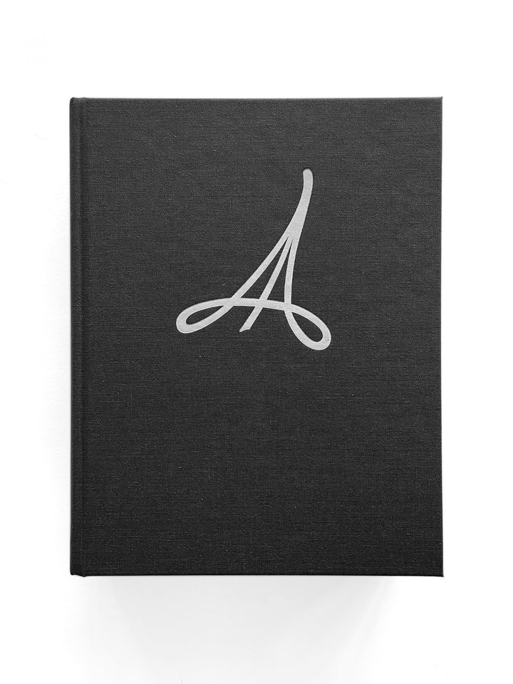
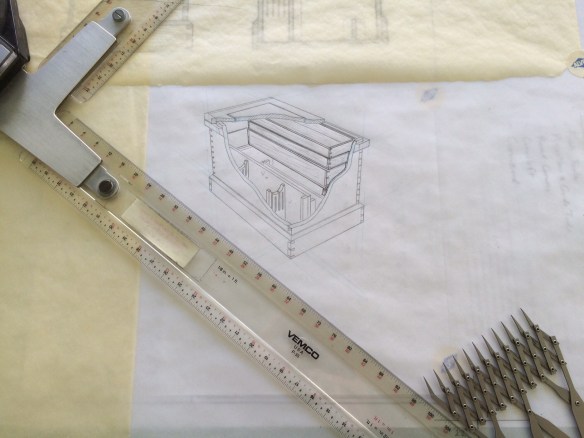
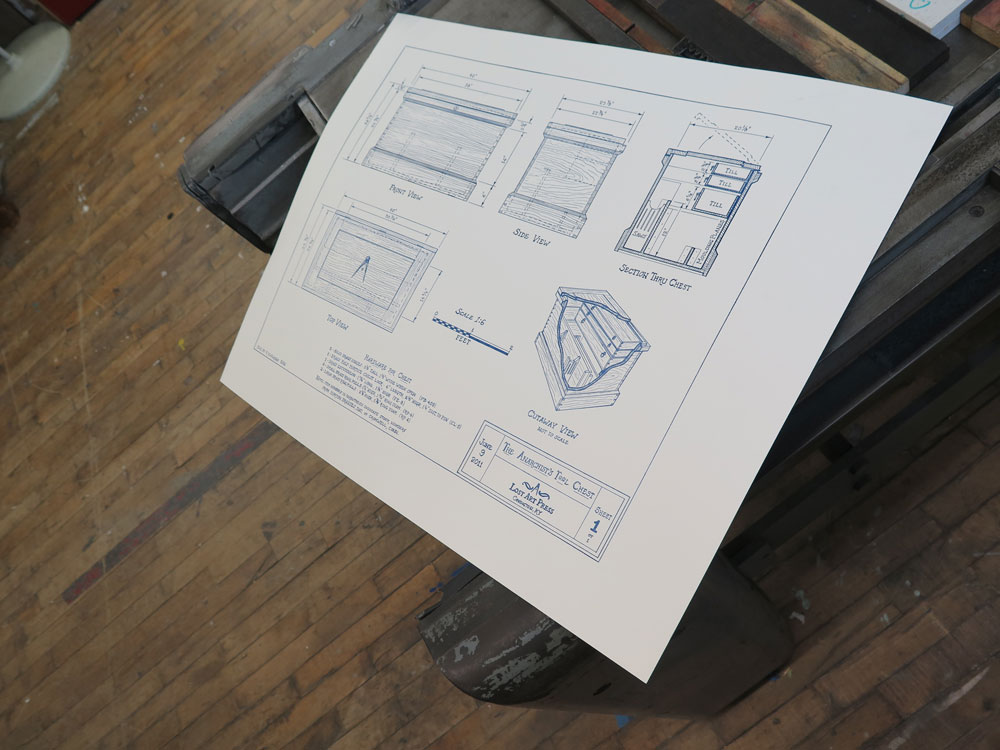
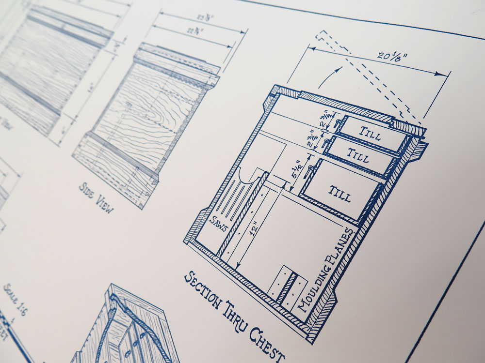
Chris Schwarz over at Lost Art Press contacted me back in February to see if I would be interested in doing a hand drawing in a late 19th / early 20th century style for a limited-edition poster to commemorate the 5th anniversary of his excellent book, The Anarchist Tool Chest. I was more than happy to agree to the assignment not only because I consider the book to be a classic, (Schwarz has been a leader in not only creating a hand tool renaissance among woodworkers but creating a whole new philosophy in the way we look at furniture and the process of creating it) but I was also excited to do a drawing entirely in pencil., something I hadn’t done for quite a while.
Except for the occasional quick sketch, it’s rare I don’t do a drawing now on anything except the computer. After digging out my good pencils and tools and some good vellum from storage, (the new stuff is made for plotters not pencils and gives horrible results when you try to erase something), I made a test drafting just to refresh my pencil skills as well as brush up on my hand lettering technique.
As I began to layout the drawing I suddenly began to realize both the differences and advantages of hand drafting over CAD:
1 – There are no in-your-face interruptions such as email, instant messaging, software update notices, news alerts, etc.
The process of creating a working drawing has been hi-jacked by software. There is this fallacy, particularly among those who don’t draw, that the computer is doing the bulk of the work. This is patently false. The computer is just a fancy pencil. It can give the veneer of respectability to a drawing if you don’t know what you are looking at, but the document is worthless if the operator does not understand the basics of creating a working drawing. Also, the process of creating a construction drawing happens to a great extent in your head, not in the computer. A lot of the work on the screen is preceded by a good deal of mental gymnastics, which is why set designers hate to be interrupted. Stop us in process and it will take 10 to 15 minutes to return to the zone where the true work gets done.
When you are drawing with a pencil you are in a completely different mental space that requires you to constantly visualize the object in your mind. This not only makes you work in a much deeper state of concentration but forces you to think many more steps ahead in the process of breaking the object down into what needs to be drawn to communicate its complexities.
2 – You have to think differently about the drawing.
The draftsperson is no longer spending brain power on software or hardware concerns. There is also the endless-zoom mentality where the operator does not have a realistic idea of the scale of the elements. The ability to zoom it 10,000 percent on a document is what leads to prints in which the dimensions and notes are virtually unreadable unless you’re using a magnifying glass. There is also an economy in a hand drawing that is absent from a CAD drawing. You only show what is important for that sheet.
Also a line is what you say it is. With CAD and 3D modeling there is this expectation of perfect scalability throughout the model. That may be a good thing if you are designing a high-rise where there are dozens of other engineers and companies involved but for set design it adds a layer of unnecessary work.
Where you were once chastised for drawing too many brick details on a facade, I’ll regularly get a digital model where every fastener is completely detailed with threads. This is why during the pre computer days it was considered that a good working rate for a draftsperson was a sheet a day, while the rate for most modern computerized Art Departments is calculated at 3 to 7 days per sheet. We used to fear that the computer would make things so much more efficient that less people would be needed. Just the opposite happened. Where a typical feature film used to have 4 to 10 Set Designers, on bigger shows now, there will be as many as 30.
Proof for final offset prints. photo by Chris Schwarz
Detail of nice crisp detail of the poster by Steamwhistle Letterpress. Photo by Chris Schwarz
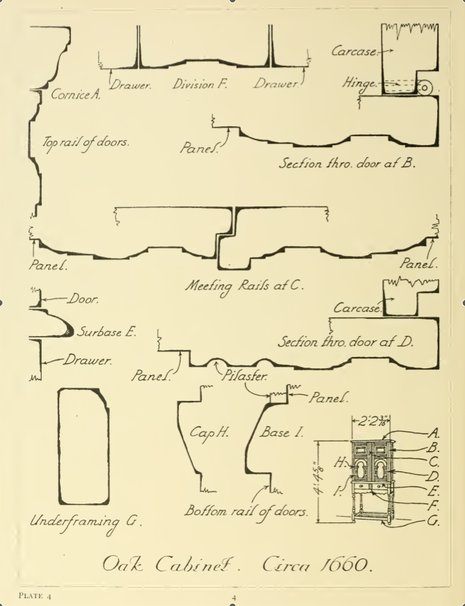
“There is a tendency among those accustomed to the large-scale of moulding detail on exterior work in wood or stone to make their mouldings on furniture and interior woodwork too large. The full-size furniture moulding so carefully drawn by Mr. Warne should be of the utmost service not only to furniture designers but to students of architecture and interior decoration.”
“This book covers many different types of English furniture; bedsteads, bookcases, bureaus, cabinets, chests, cupboards, chairs and others. This book illustrates cover this book covers molding details on English furniture from about 1574 to 1820 molding is the method adopted by the cabinetmaker to give definition to the lines of his work and the sections of molded detail very very much as one style has succeeded another through the oak, walnut, mahogany and satinwood periods of English furniture the workings of moldings was then so laborious that the craftsman use them with greater restraint and obtained more pleasing effects by their use than is frequently the case today when profusion often eliminates interest.”
H. P. Shapland, 1923
E.j. Warne’s book, Furniture Mouldings, is still one of the best resources on 16th to 19th century British furniture. Almost never out of print, copies can be had for as little as $1.
Until you get a print copy, you can download a digital scan of the book below. Scanned from an ex library copy, there are a number of damaged pages but you can get a good idea of the scope of the book.