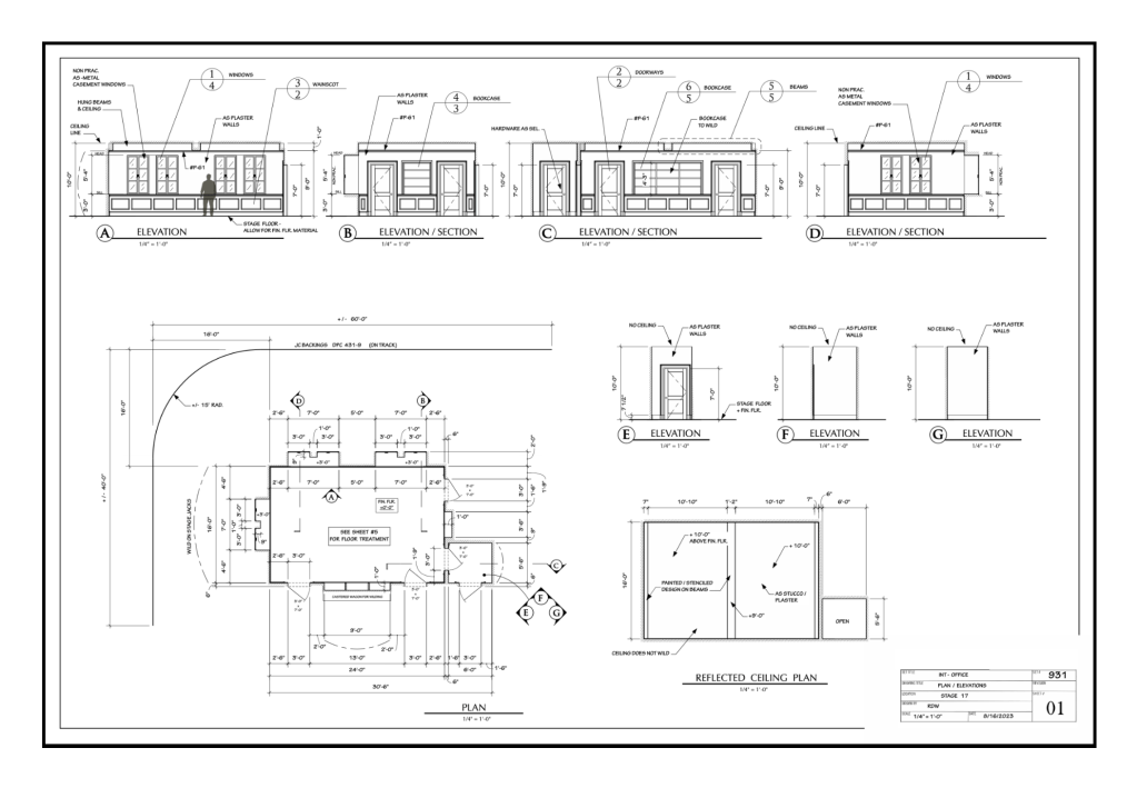
On construction drawings they are noted as an FSD, an abbreviation for Full Size Detail. You need them to visually describe exactly how something is to be built, whether it’s a built-up moulding profile or a complicated mechanical detail.
Here is an example of a typical situation where an FSD is needed. Note the red arrow pointing to a detail bubble that reads, ” FSD – 8A”. This is noting a sub-detail of a window detail labeled as #8.
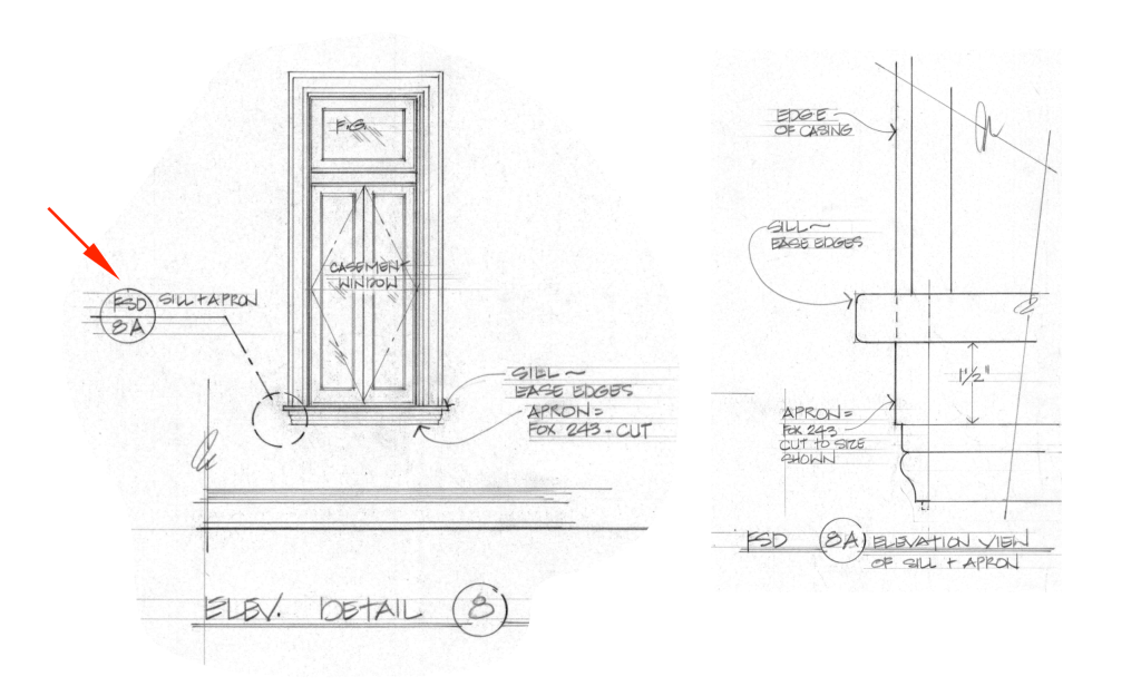
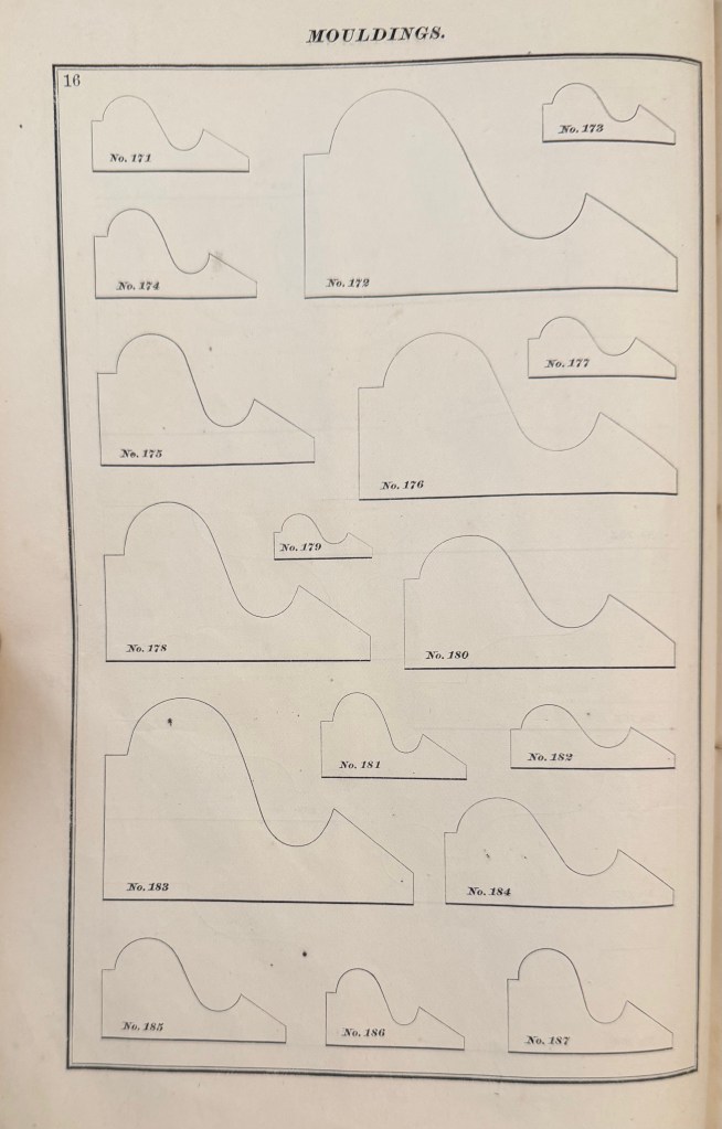
The detail calls out a window sill apron mould with the moulding profile number and a note that the moulding is “cut”. This means that rather than being used as-is, the moulding needs to be altered in some way. This level of detail is impossible to read on the elevation which is drawn at 3/4″= 1′-0″.
The FSD beside it shows how the moulding is to be placed in relation to the other window parts as well as shows that the plinth of the moulding profile is to be cut down to 1 1/2″. Unless you don’t care how the window ends up looking, you need to include FSD drawings if you have specific details in mind.
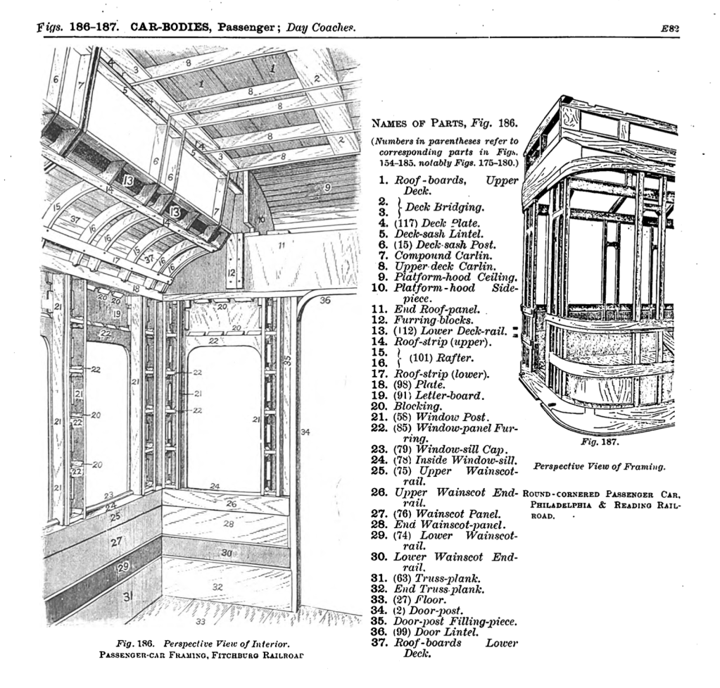
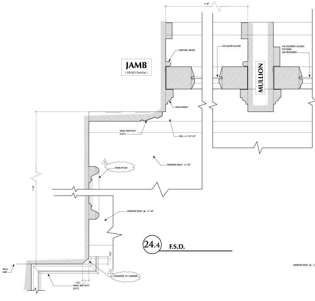
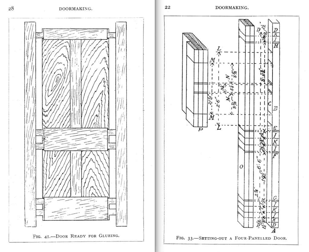
Here is another FSD through a window jamb. This drawing shows the jamb thickness, sash thicknesses and widths, the moulding profiles, architrave, and panel moulds. An FSD is needed for this complicated level of period details.
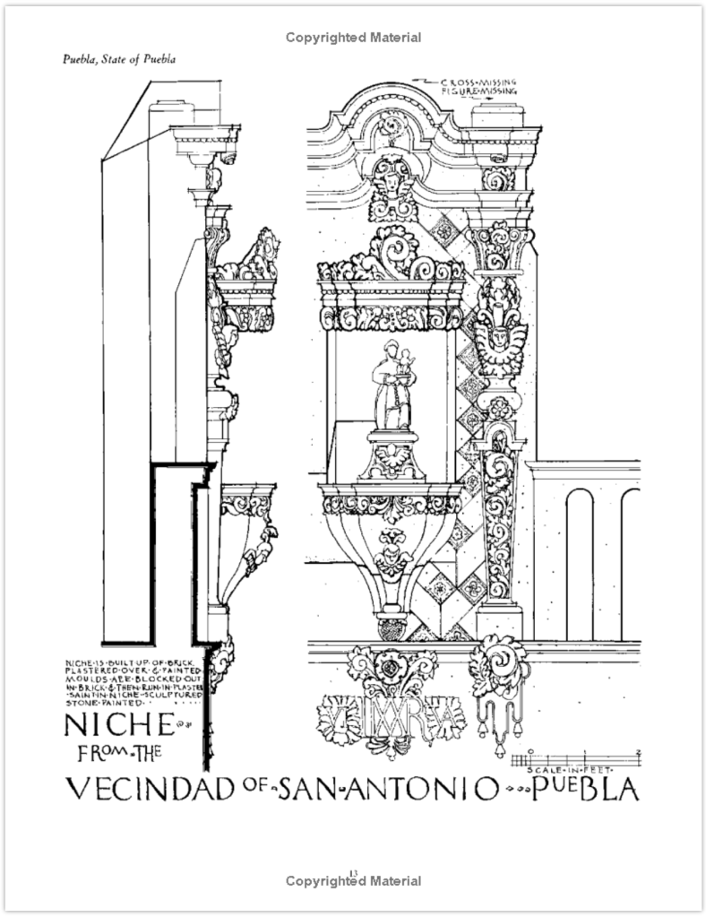
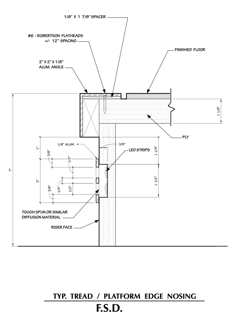
Below is an FSD of a vertical section through a platform riser. Here you can see notes as to materials, fasteners, and electrical lighting effects. Again, it’s impossible to communicate this level of detail in a smaller scale of drawing. You may encounter some situations where you can get by with a half-scale or half full-size drawings, but these aren’t recommended if a full size detail is possible.
A note on dimensioning: You’ll notice that in the section through the window jamb that there are few dimensions. Only the distances where the drawing contains a ‘broken’ wall line are dimensioned. This is traditional, as the prints were originally made as a direct contact print and the set designer was sure that the prop makers could scale from the drawing and get correct measurements. This was the point of a full-size, as you’ll see below.
Once CAD became the standard, and you couldn’t be sure that the print was made at 100%, and people began to work from prints that were smaller than intended, there was more assurance in completely dimensioning even an FSD. This is for the Art Director on a show to make a call on.
Shop Drawings & Story Sticks
There’s nothing new about the concept of full size drawings. It’s a technique that’s thousands of years old.
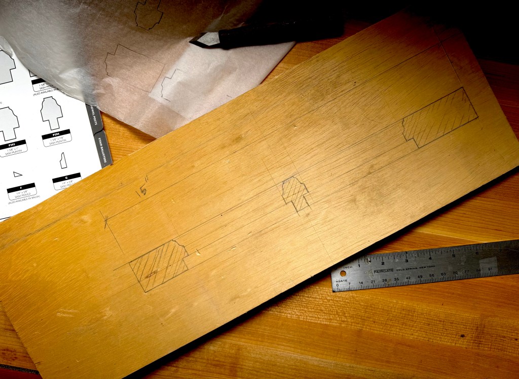
When I was a prop maker, we were trained to create shop drawings for things like mouldings, windows, and doors. On television shows there is not often time to do full size details of every set element and it often fell to us to create a shop drawing to ensure accuracy when laying out the pieces for a built object, especially a window. Nothing sucks as bad as inserting window sash into a frame and finding out the meeting rails are off by a quarter inch.
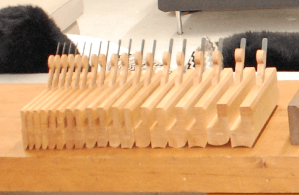
In the best case, a full size section has been drawn and you can either pull dimensions off the drawing or glue one to a piece of door skin to cut a template out on a bandsaw.
Traditionally jointers, carpenters, and stone carvers created their own story sticks or setting-out rods to be sure that their cuts were accurate, or full size patterns to check the true size of their work piece.
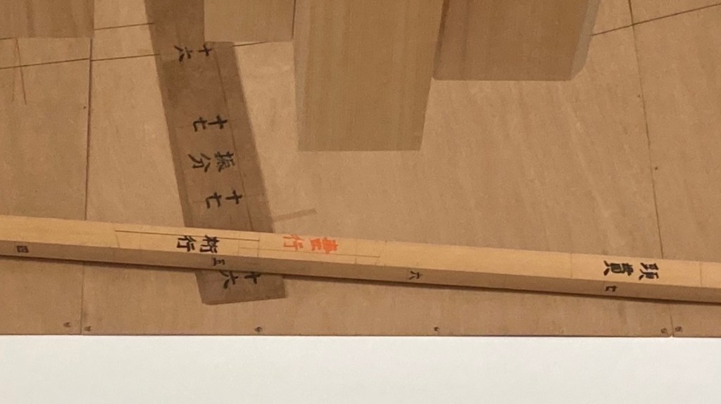
In traditional Japanese house construction, the master carpenter would lay out all the major dimensions for a house on a master story rod called a Kensao. This was like a blueprint on a stick and would be referred to for all questions about construction measurements or additions to the structure. When the house was completed, the rod was kept in the eaves under the roof of the building.
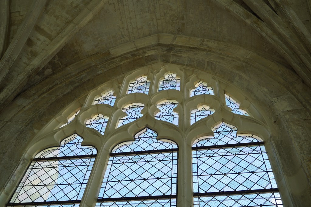
In the Middle Ages and the Gothic period, stone building details were laid out in full size on a tracing floor, a floor that had a smooth layer of plaster applied to it on which the details were laid out with a large compass and straight edges that the stonemasons referred to for each separate element to make sure that they would fit together.
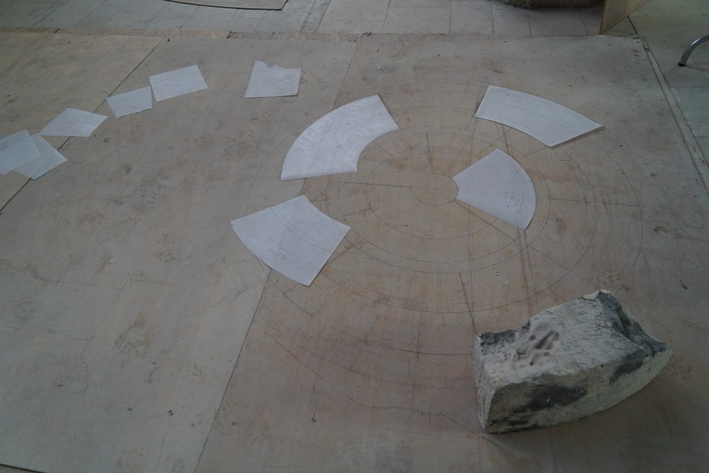
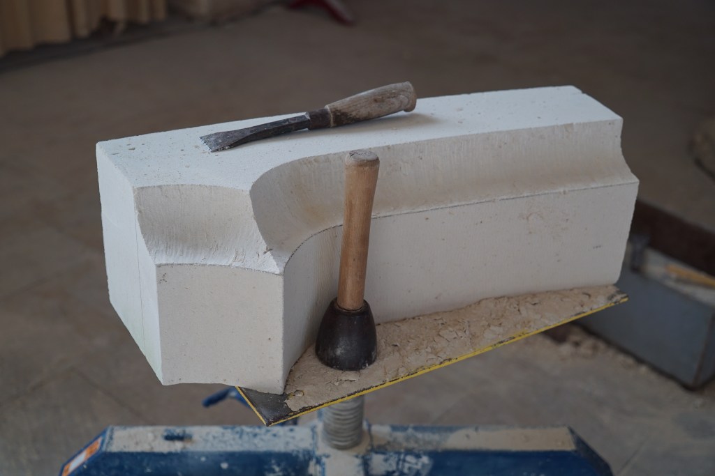
I was able to watch some stonemasons in France repair the windows of a medieval church and saw their modern day version of the original process. The design was drawn out full size on thin plywood sheets. This pattern was transferred to separate patterns on thin plastic which were then used to trace the outline onto the stone itself.
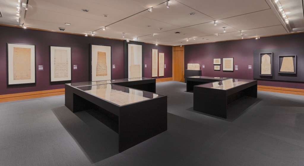
Production Designer Sarah Knowles recently told me about a new exhibition at The Met in New York City. Entitled Gothic by Design: The Dawn of Architectural Draftsmanship, the show includes over 90 original pieces that span from the 13th to the 16th century. On now though July 19.
Many of these pieces were meant to be presentation artwork to show the sponsor what the final building would look like, but there are several construction drawings in the gallery show.
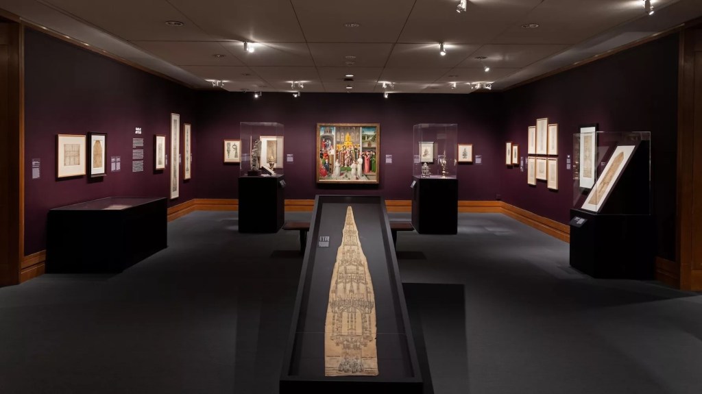
One of the drawings s a plan and developed stair stringer for the Saint Stephens Cathedral in Vienna. The stairs are shown in a painting by artist Rudolf von Alt in 1841.
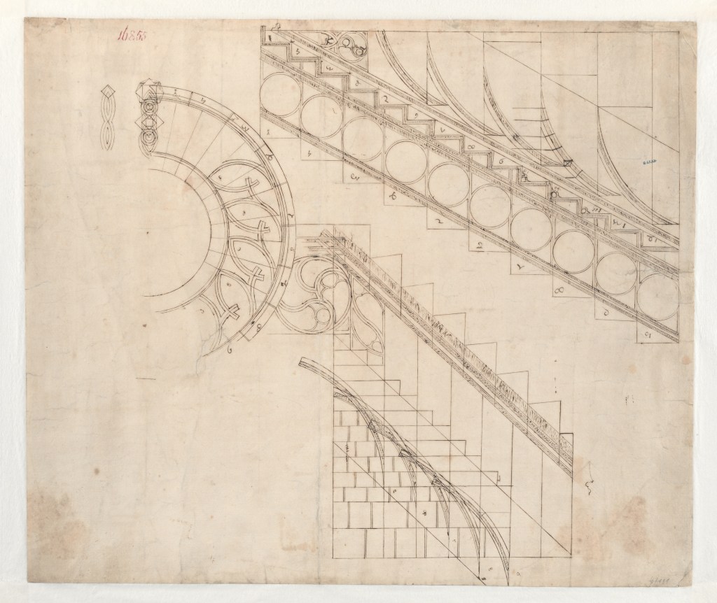

The one full-size detail is of a vaulting detail from the Chapel of Saint Catherine in Vienna.
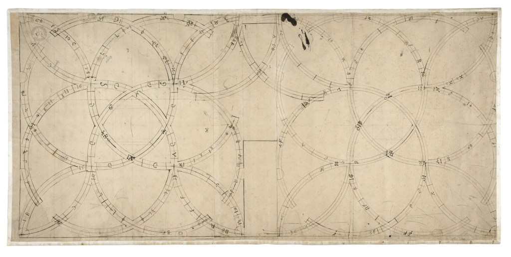
Similar to the plastic sheet patterns that the French stonemasons use today, the stonemasons of the period would make a pattern on paper for each of the stone sections.
One drawing in the collection is of the entire vault pattern with each of the pieces numbered.
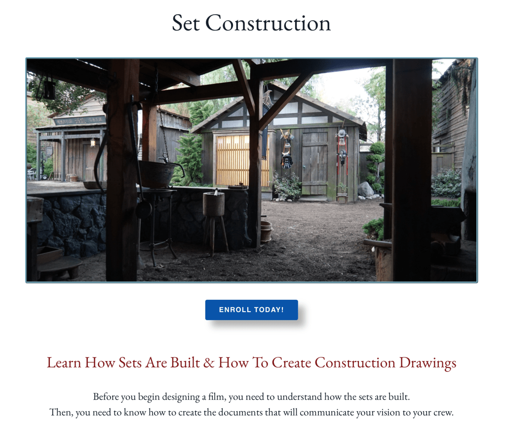
If you are interested in learning more about set drawings and construction, this class on Set Construction offers detailed information about set construction, videos of basic flat and scenery construction, and 3D models of standard scenery pieces that will work in most 3D modeling programs.
The class includes a full set of drawings for a typical set, including 3/4″ details and FSDs.