It can be tricky to identify or specify a particular wood if you’re not very knowledgable about working with it. There are hundreds of different species available and even though a small number of those are in common usage in the construction trade, narrowing it down to the ideal look you want can be frustrating.
For many years a Production Designer was able to just hand a Scenic Painter a photograph and the artist would “grain” the surface to match any kind of wood they wanted. With the loss of painters who are trained in “graining”, it has become more common to find a laminated material which matches their choice or to use actual wood veneer that matches the reference.
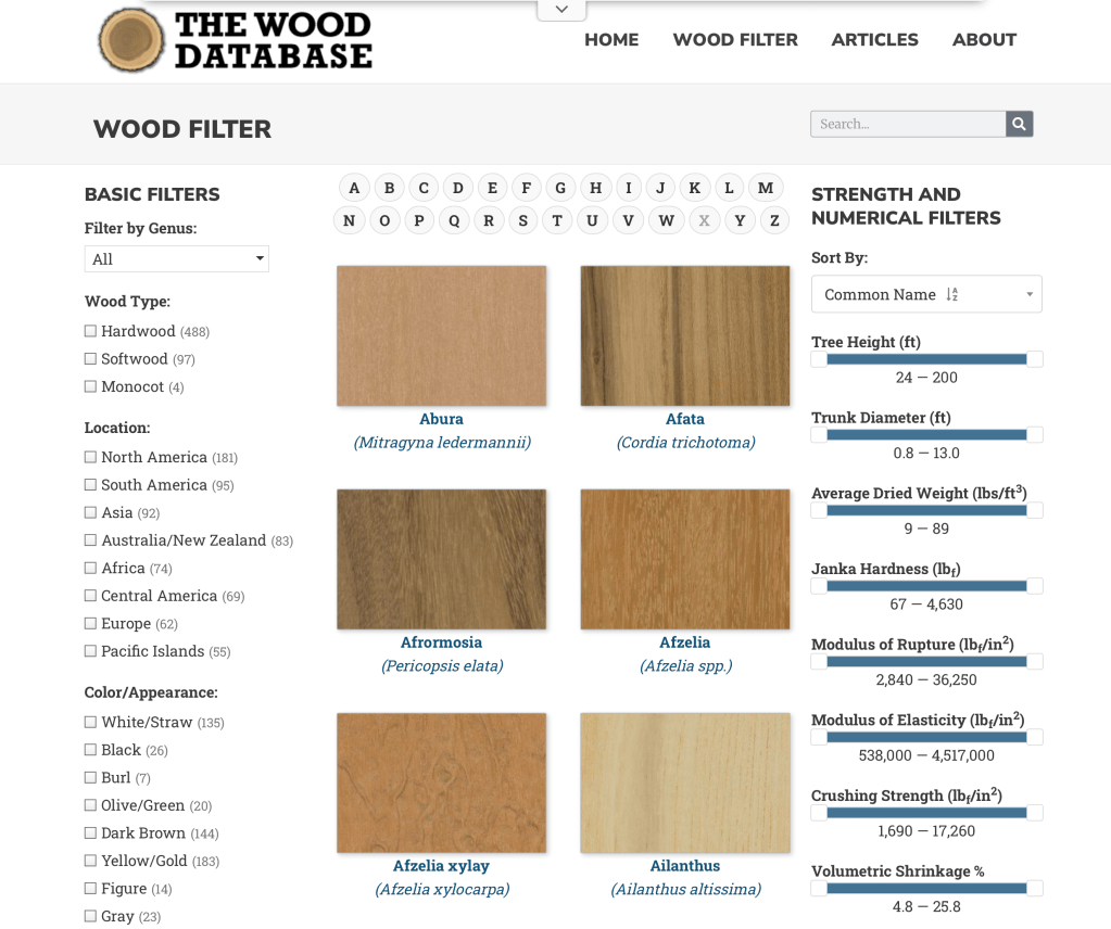
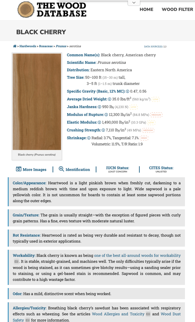
One website that I’ve found recently is a very good starting point to locate a match to a reference photo you might have or select a wood species based on your preferences of shade, color, or grain.
The Wood Database was created by Eric Meier in 2007 and now includes images and data for over 600 different wood species. You can search by name, type, location, appearance, and several other catagories.
Each species entry has a color photo of the wood showing grain pattern (depending on the cut orientation) as well as the scientific data as to hardness and shrinkage rates.
The information is also available in hardback book form, which can be ordered from the site, which features the data on over 350 wood types, including large color images of each species.
Another good reference is a book called What Wood Is That? by Herbert Edlin. The book explains basic wood characteristics and details 40 common wood types. It also includes 40 actual wood samples so that you can see a real-life sample of the types outlined.
The actual wood samples that are in What Wood Is That?
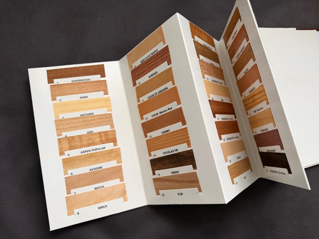
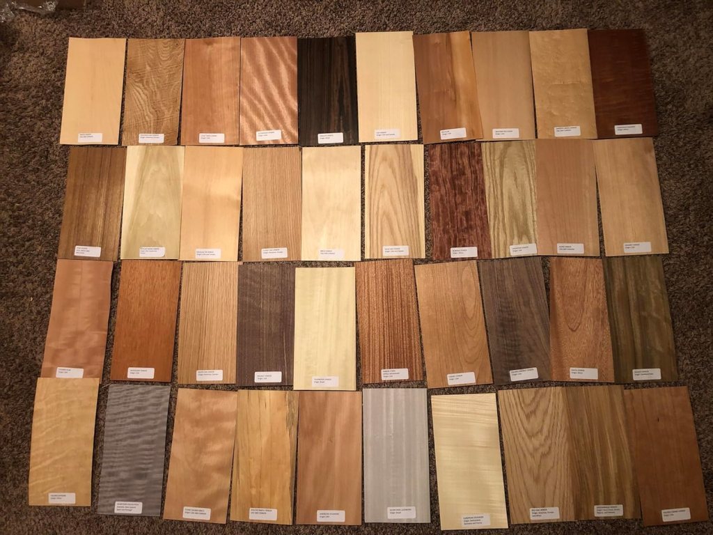
For larger wood samples to look at, I’d suggest getting a set of veneer samples like the ones below. You can find sets like the one below from various venders on Amazon. Be sure that you get a set that have labels attached for easy identification. With these, you have a piece large enough ( they are usually about 6″ x 12″) to be able to try different stains, finishes, or age to your liking.
One of the reasons that I wrote the Wrand Film Glossary was to record many of the obscure film and entertainment industry terms that get passes down orally but are never recorded.
Art department and set construction lingo is usually not included in the typical film glossary, and “Double dap” is one of those odd terms that you will hear used by Prop Makers* but have probably never had it explained.
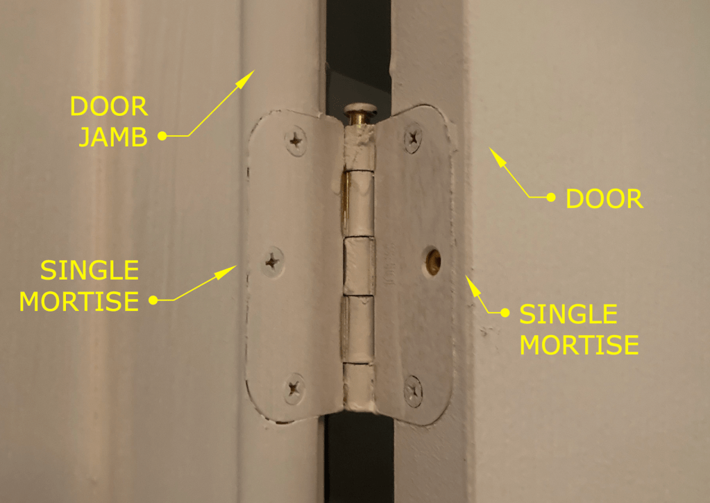
The term refers to how the hinges of a door on a stage set are to be installed. Normally the installation of hinges for a door involves creating mortises in the door stile and the jamb that match the thickness of the hinge leaves. That’s referred to as a “single dap” installation. (Note: this is specifically for doors in North America or the UK. Many Continental European doors are half-overlay and don’t use the type of leaf hinges that are standard here.)
Typical hinge installation – referred to as a Single Dap
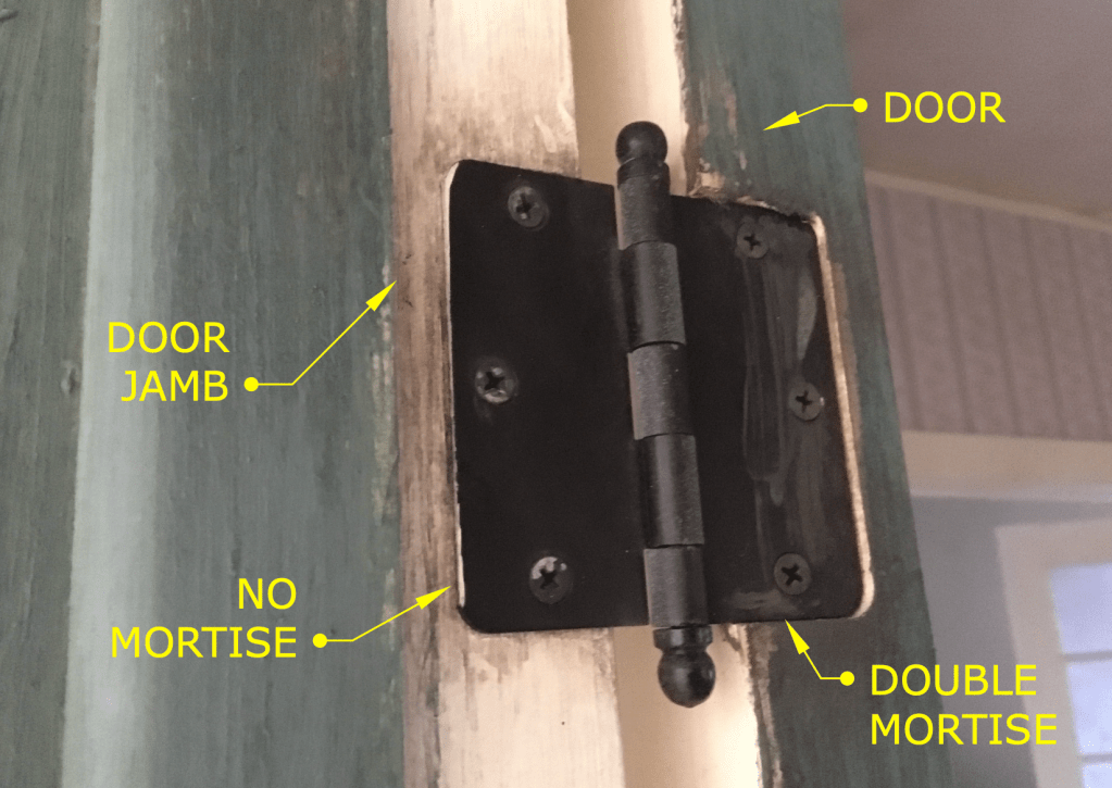
A “double dap” installation involves creating a mortise in the door which is twice as deep as usual and not making a mortise in the jamb, as shown below.
Example of a Double Dapped hinge
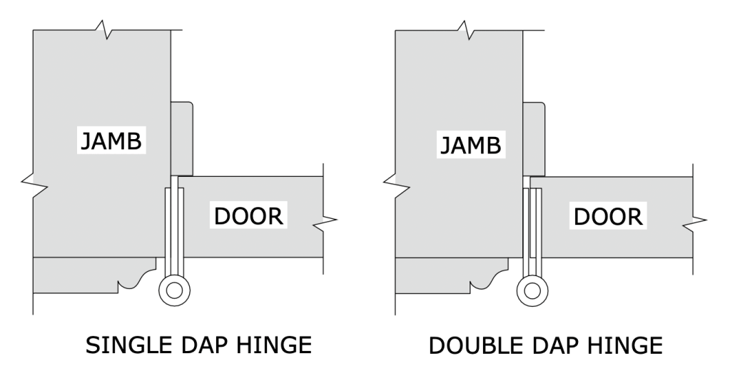
The diagram below is a side-by-side plan view showing both types of installation.
So what’s the purpose of this? Well, this is something that is more typical on sets for a broadcast show than on sets for a feature film.
One advantage is speed. We tend to build sets at a pretty brisk pace, sometimes building an entire set over a weekend. For example, if you have a set with six doors, that means you need to install 18 hinges, which means routing 32 mortises. With a double dap installation you cut that number in half.
Another advantage is if you are redressing a set and need to change out the door of an opening for a different door. With a standard installation, you will need to patch and fill and re-rout three mortises. Instead you just need to fill some screw holes.
This is also the case if you need to change the swing direction of a door at the last moment. (Good luck prying off and repositioning that door stop.)
Double dapping has fallen out of favor lately. Production Designers don’t like the look of it for one thing. (Along with Phillips head screws on a period hinge!) They tend to stick out particularly when the hinges are a contrasting color from the jamb or if the wood is painted a light color and the hinges have a dark laquer/black finish. In some instances this condition can either visually hide the extra mortise depth or accentuate it.
Also, notice the round corners on the hinges in the photos. Round corner hinges are a 20th century invention to speed up production. Once machinery, i.e. routers, was being used for mortising, it became a lot faster to create hinges with leaves that didn’t require squaring off the mortise corners as was necessary for period, square hinges. Round corner hinges come in 1/4″ and 5/8″ radius corners, so be aware of what radius size they are if you’re choosing hinges for a door that has already been mortised.
Note: Prop Maker is a designation for a union stage carpenter in Los Angeles to differentiate them from a ‘civilian’ carpenter. They are trained it building theatrical scenery of all types and historical periods and specialize in creating scenery for film productions. They are more similar to cabinet makers than a typical carpenter and are skilled in construction techniques and methods that would baffle most people outside the entertainment industry.
Jeesh, it’s been ten years since my last gift guide and I’m getting it out a little late this year, but some of the same items are still here on the list, mainly the classic tools and books that never become obsolete, (like a lot of software programs do).
I don’t receive any money from these recommendations. These are books and tools that I own and use often.
My Must-Have Tools For Film Designers
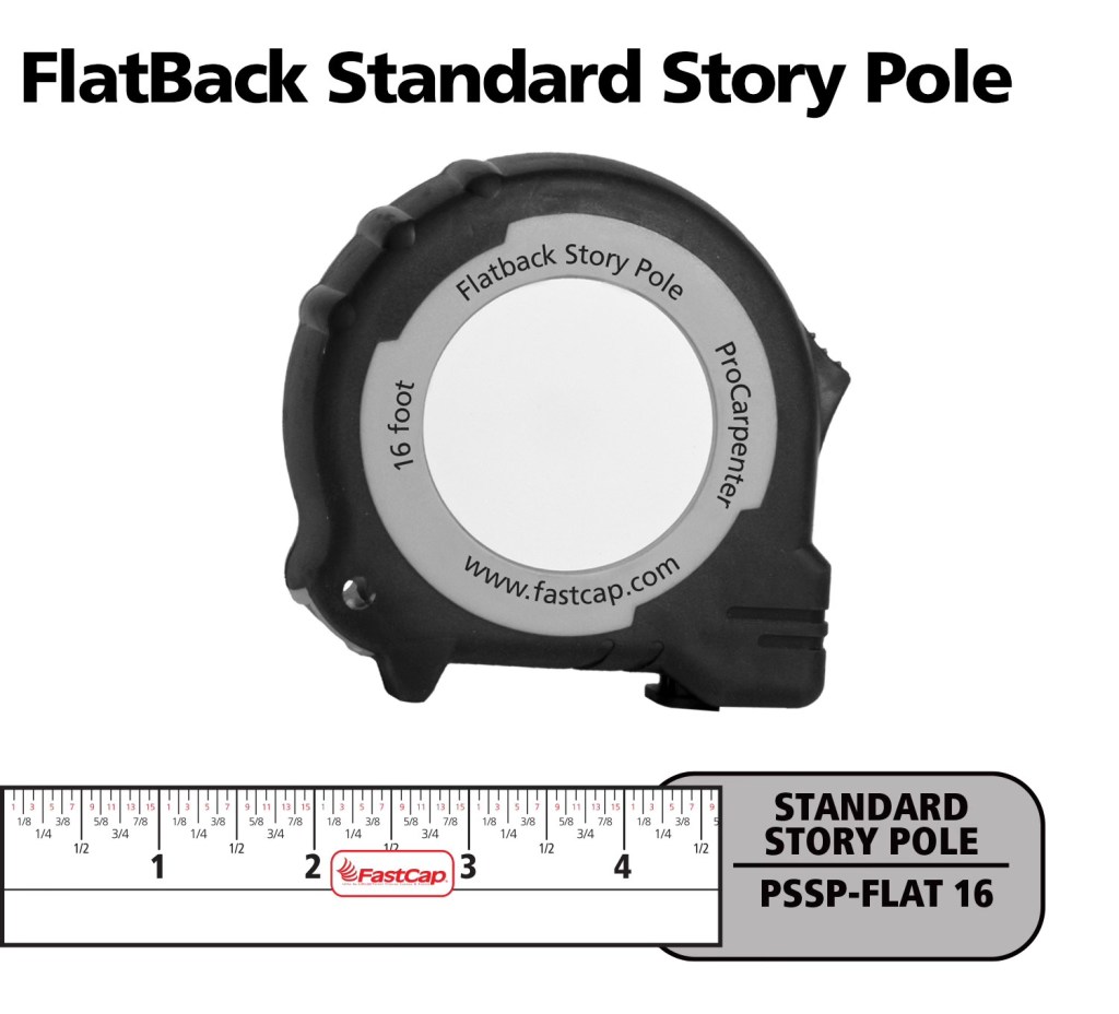
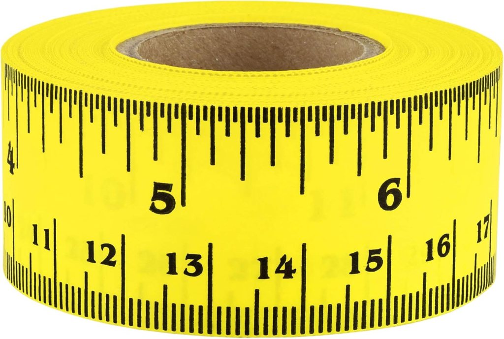
FastCap Flat Back Tape – You can not only measure round or curved surfaces but it has a blank area to write on for use as a story pole. – $10.00
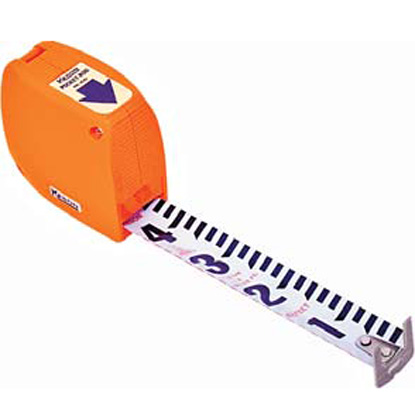
Keson Pocket Rod– These are so essential for site surveys that I have four of them. They come in Architect and Engineer models. – $20.00
6″ Digital Calipers – Like these, there are many manufactures. (Avoid any priced under $20.00.) – Must-have tool for doing photo scaling (see article) – about $24.00
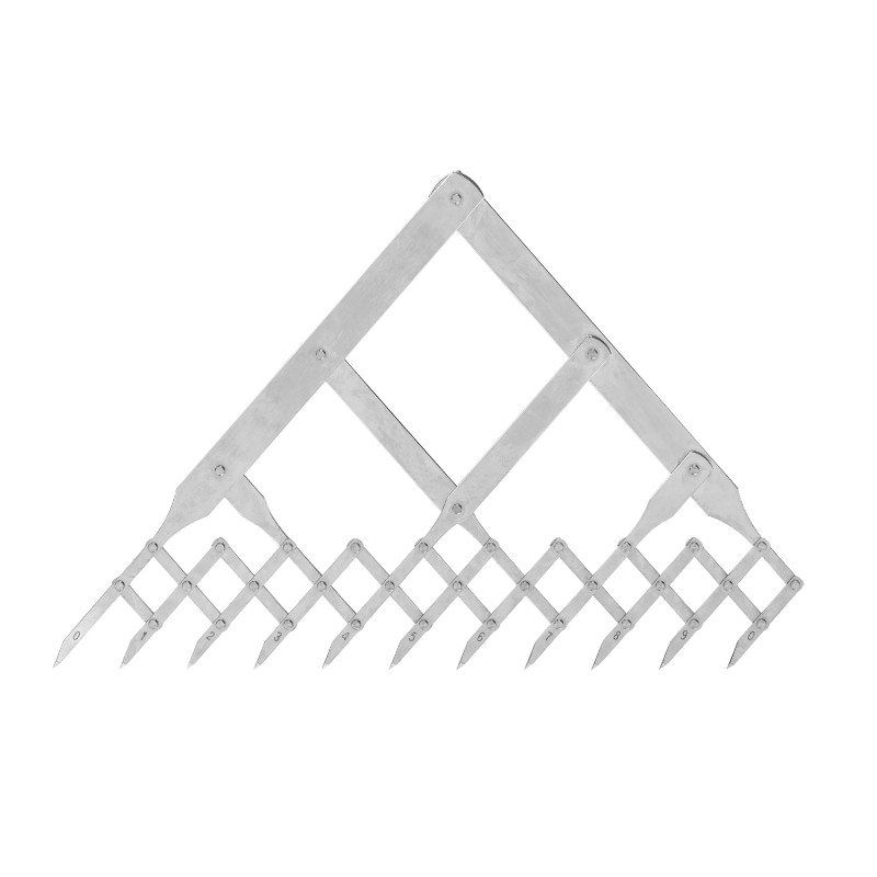
Equal Space Dividers – great for not only photo scaling but for designing in general. They run the gamut in price from these to these. $220 to $24.00
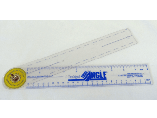
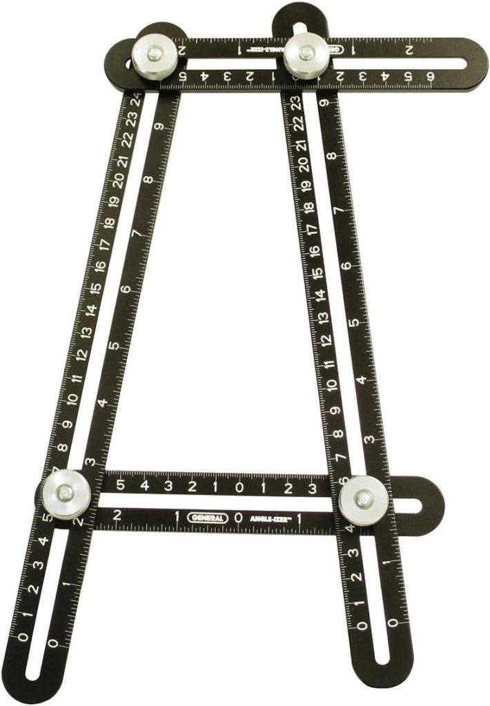
True Angle – Multi-use tool for measuring and transferring angles. lightweight. – 12″ -$16.00
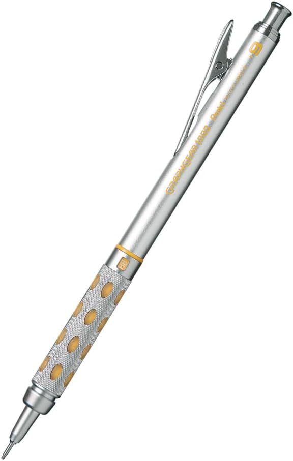
GraphGear 1000 – Mechanical pencils, my new favorite brand. These are great because the barrel sleeve retracts into the pencil to protect it. Comes in .3, .4, .5, .7, and .9mm leads. About $9.00
Compass – So many to choose from, (and a lot of crappy ones are in the mix). This one is a good all-around basic, practical compass that will last a while. $14.00
Still my favorite design and furniture book publisher. Here are my recommendations:
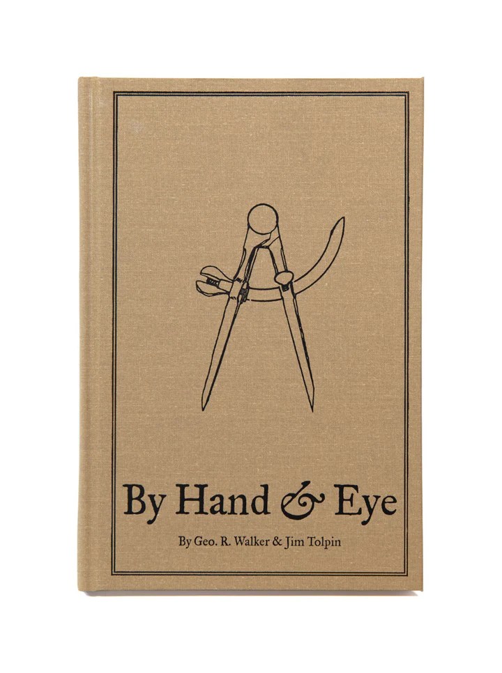
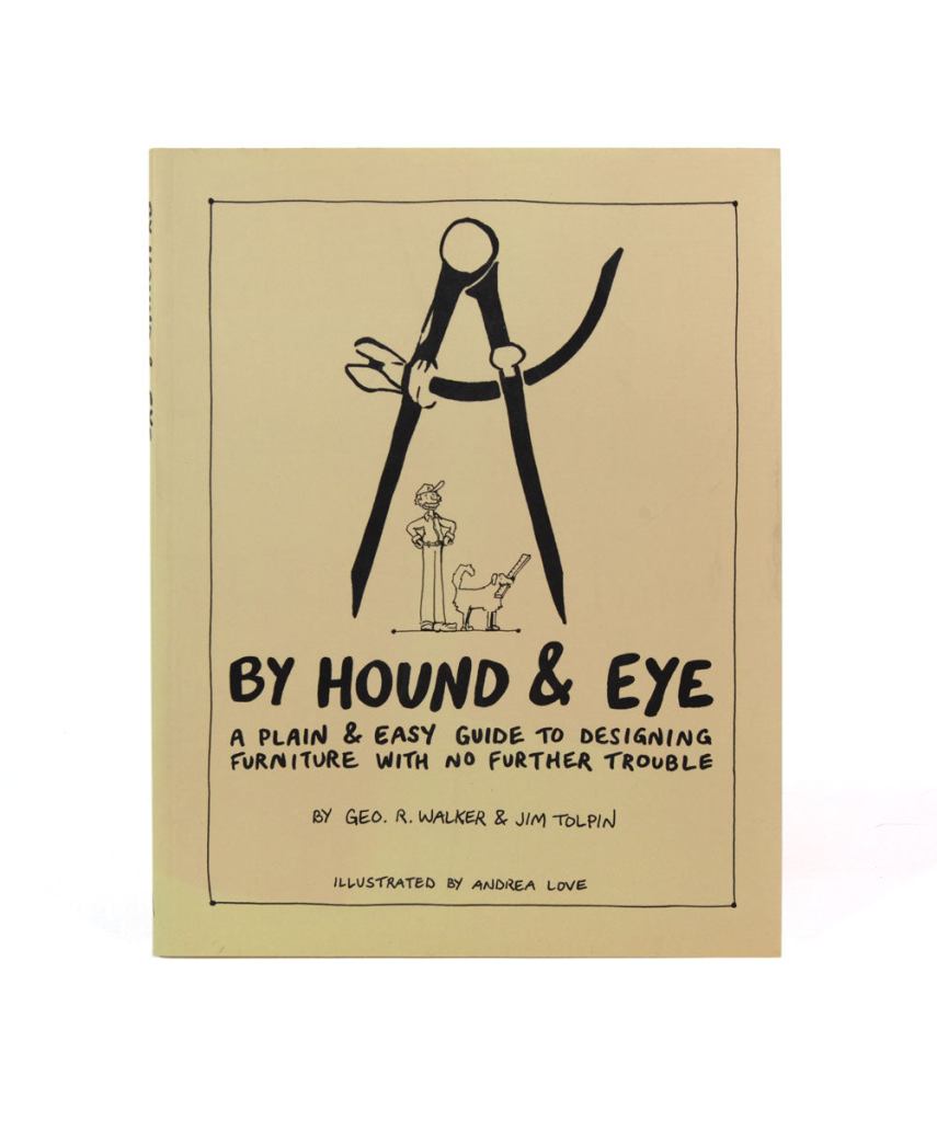
By Hand & Eye – $51.00. Another gem from Lost Art Press, this is probably one of the best design books written in the last 100 years. It outlines the world of design without a rule and using only dividers and proportional methods. I covered this in a previous post and always recommend it. Buy this and a good pair of second hand dividers from Ebay and you will completely change the way you think about design.
By Hound & Eye – $31.00. A companion workbook to By Hand & Eye.
A Field Guide To American Houses – Virginia Savage McAlester
Stair Builders Handbook – T.W. Love
Backstage Handbook – Paul Carter
American Cinematographers Manual – ASC Press
The VES Handbook of Visual Effects – VES Society
Designer Drafting For The Entertainment World – Patricia Woodbridge
The Classical Orders Of Architecture – Robert Chitham
Illustrated Cabinet Making – Bill Hylton
Styles Of Ornament – Alexander Speltz
McKay’s Building Construction – W.B. McKay
Neufert – Architects’ Data – Granada Publishing
Geometry Of Design – Kimberly Elam
Really, Really Last Minute Gifts
When you realize you’ve really screwed up and forgotten someone and have no time to run to the store, much less order anything, you can always gift a good app.
Log onto the Apple or Android store and gift your so-important-you-forgot-about-them friend one of these apps and your reputation will be saved:
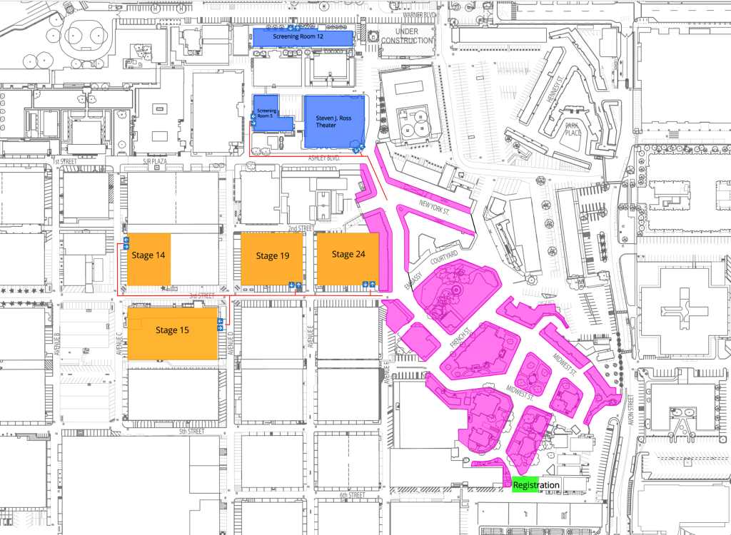
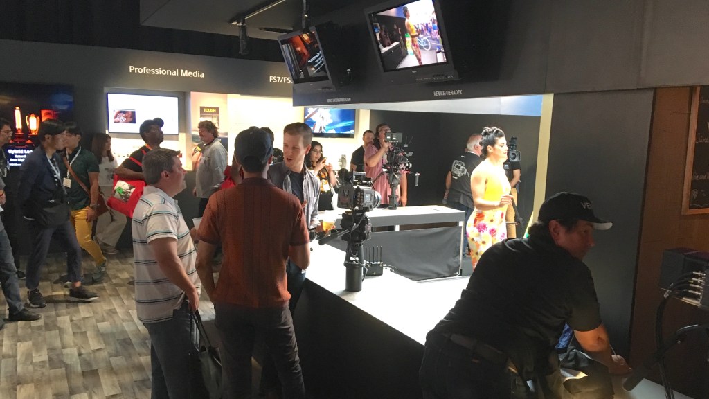
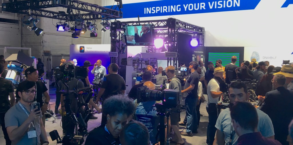
The Cine Gear Expo will be held at Warner Bros Studios from June 7th to the 9th this year after a long run in past years at Paramount Studios.
The event has finally returned to its pre-pandemic size and has been a must-attend event for cinematographers, gaffers, and technicians in the entertainment industry for some time.
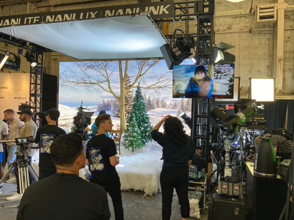
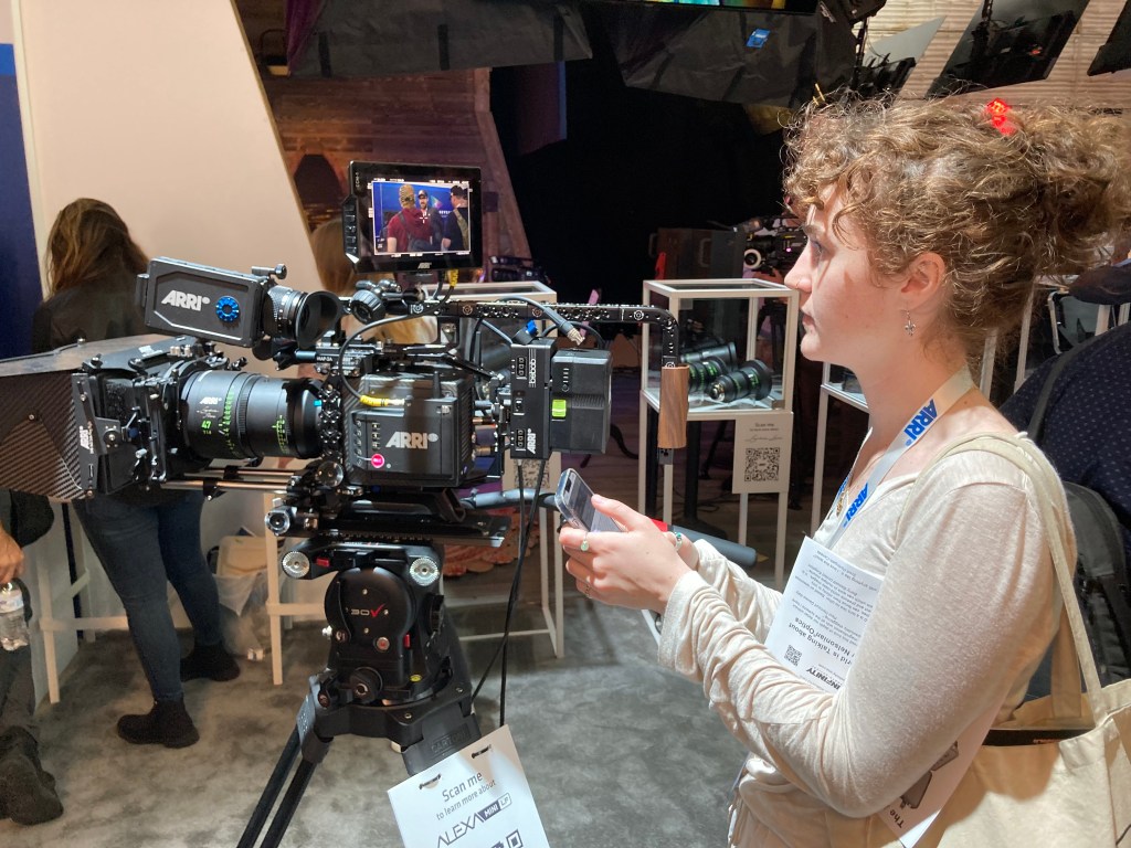
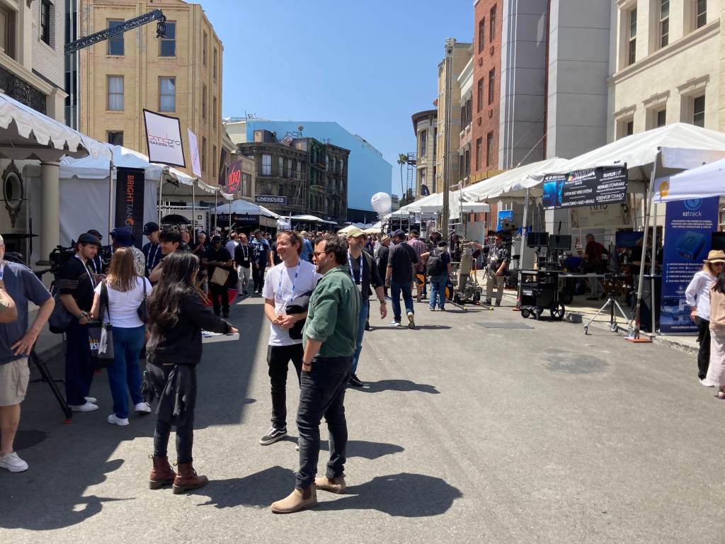
This year’s event will feature exhibits, demonstrations, and presentations by over 250 vendors as well as special seminars and master classes. The exhibition area will fill most of the Warner Studios backlot area as well as stages 14, 15, 19, and 24.
The Reasons You Should Go
Maybe you’re not that interested in camera or lighting equipment, so you’re wondering why you should bother attending. You may not be excited right now by the latest in what the new technology has to offer but you should be, because it affects your job whether you want to believe it or not.
The technological leaps that have been made in the last few years in LED lighting and new digital camera sensors alone have transformed filmmaking and, by proximity, the way stage sets are perceived, shot, and expected to perform.
You ignore camera and lighting technology at your own career’s peril.
There are hundreds of vendors there who are very eager to help you understand what their products are and how they work. You really shouldn’t be intimidated if you aren’t familiar with the basics, they are there to educate you in the new ways of making ‘pictures’.
Think of it as a free weekend film class where the ‘instructors’ are eager to answer any questions you might have. Think of the times you’ve been curious or baffled by the terms a DP is tossing around and being afraid to admit that you have no idea what they’re talking about.
At the expo, you’ll not only get to see the latest cameras up close, but you can operate them too. The next time you want to play with a new Arri or Sony, it’ll cost you $800 or more in daily rental fees, plus insurance. Here you can see them all, in one place, and talk to people who are experts in everything about them. You will never see so many cameras and lenses in one place anywhere else.
You’ll also see the latest in lighting, new LED volumes, digital screens, cranes, and specialty equipment.
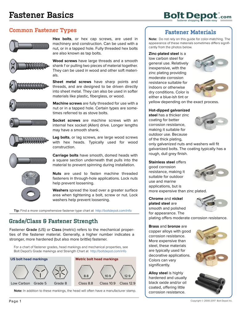
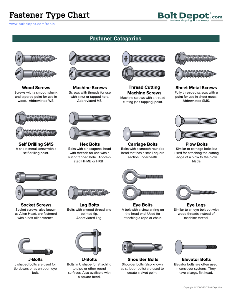
Hardware and fasteners are usually a conundrum for most people. Unless you grew up with a dad who liked to fix things or had a preternatural attraction to hardware stores (ok, guilty as charged), you are probably at some point confused about specifying or discussing specifics when it comes to connection thingies.
I’m always on the lookout for ways to simplify the explanations and it gets harder as more and more types of fasteners get added to the possibilities pile.
If you really want to just go down the rabbit hole of fastener options, all you have to do is dive into the online catalogue at McMaster-Carr, purveyor of all things industrial.
But if you just want a simple, easy-to-understand diagram, go over to BoltDepot.com. It’s a family-owned hardware company in Massachusetts and specializes in fasteners.
They’ve put together a 32 page PDF of basic fastener terminology that includes full-size print out of fasteners so you can see the exact size you’re looking for, which will alleviate a trip to a Home Depot to wander through the haphazard hard department, trying to find someone to help you figure out what you need (don’t waste your time).
You will also have a lot better time getting some personalized customer service at Bolt Depot than you will from the other giant hardware suppliers.
Until now, no one has created a class that explains cameras to designers.
You’ll not only learn the technical information that will help you understand the mechanic of cameras and optics, but you’ll learn how they capture your scenery and how they can affect your design decisions.
Image: Warner Bros Studios
As a film designer you must understand how cameras capture and record images, because that’s how the audience sees and experiences your work.
Few if any film design schools include optics as part of the curriculum leaving film designers with a huge disadvantage when working with the cinematographer on a new project. The information in this course will help you create effective and believable sets that help the camera tell the film’s visual story as successfully as possible.
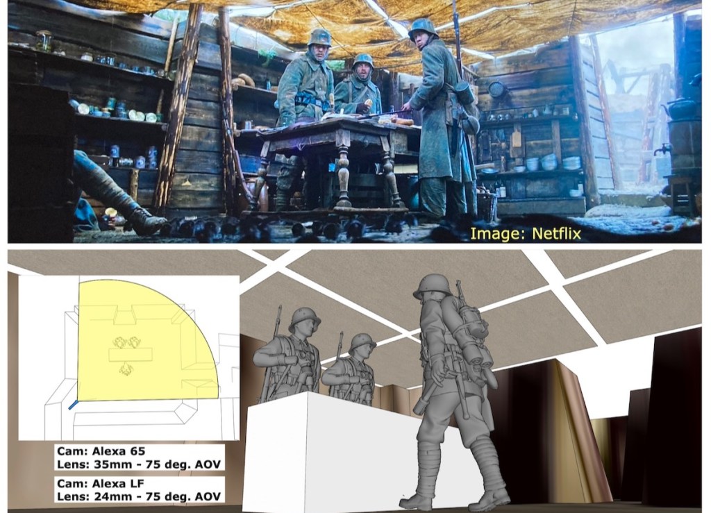
Image: Netflix
With this course, you will be able to discuss the camera requirements for your sets with the cinematographer and visual effects supervisor and not be excluded from important decisions that affect your designs. It will further your knowledge for a successful career in the Art Department as a set designer, art director, or production designer.
What you’ll learn in this course:
Cameras – Film vs. Digital
Lenses – spherical vs. anamorphic, prime vs. zoom
Specialty lenses – lenses and attachments that solve tricky shooting issues
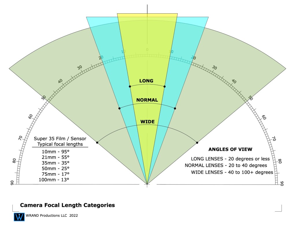
Understanding focal lengths
Understanding depth-of-field
Aperture settings – F-stops vs. T-stops
Dynamic range – over and under exposure comparisons
Lighting – color temperature, typical lighting styles
The Inverse square law of lighting
The basics of optics for in-camera effects such as foreground miniatures and forced perspective sets.
Understanding color grading vs. color correction, and digital intermediates or D.I.’s
Why is resolution important? Understanding the race for more pixel depth.
User Manual – you’ll get a manual with both text and diagrams that explains the concepts of the course for later reference
You will also get access to the weekly Community Lounge where you can get questions answered and meet other members of the film community.
In addition, I’ve included a special section that analyzes a number of the shots from the new German film, “All Quiet On The West Front” (Im Westen Nichts Neues). which won Oscars for both Best Cinematography and Best Art Direction in 2023.
With 3D model recreations of some of the sets and locations, I’ll discuss why certain shots were difficult to get and how they achieved them. I’ll also discuss how physical locations and built sets can sometimes make shooting problematic and how careful pre-planning can avoid frustrating situations during production.
That’s a typical question I get from people when I tell them my job title. People assume many different things, based on what they’ve heard from others, or read in a magazine. And most of the time they have an incorrect idea about my job description.
It’s not their fault, really. Our industry does a lousy job of explaining job titles in the entertainment world. They just leave it up to people outside the business to figure it out for themselves. It doesn’t help that the same jobs sometimes have different titles depending on what part of the U.S. you’re in, much less what part of the world you’re talking about. Many people who now work in the entertainment industry had never heard of the Art Department or knew that film design was a career option until after they had finished college.
I received an email from Bruno Anselmo, a Set Designer in Brazil. He was curious to know how our job descriptions might differ even though we have the same job title. His background is both in theater and film and video so I’m sure he experiences the same confusion with people he meets who aren’t familiar with the film industry. (Bruno, tell me if I’m wrong here.)
The job title ‘Set Designer’ means different things here depending on the end-product. In the professional theater field, the Set Designer is the lead artist for the creation and implementation of the visuals for a stage production. In the film and television industry, this role as head of the visual aesthetics of a project is given the title ‘Production Designer’.
To make matters even more confusing, the title ‘Production Designer’ is a department head title, not an actual job description. All Production Designers in the professional film and television entertainment industry are Art Directors. The Production Designer title is given to the head of the Art Department, and this title must be approved by the Art Directors Guild for shows which are produced under the union contract.
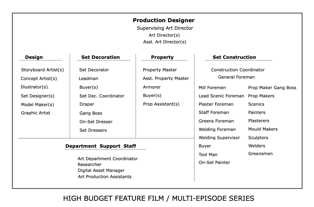
Let’s look at a typical Art Department:
Some will argue Set Decoration is a separate department as the Set Decorator works in tandem with the Production Designer rather than as a sub-department. In some cases and projects this may be true, the Set Decorator is absolutely a major contributor and an influence on the look of a film. But still, this department is under the Art Department umbrella and the winner of an Academy Award for Art Direction goes to the Set Decorator as well as the Production Designer.
You’ll see that the Set Designer designation is in the table above in the ‘Design’ category. I usually tell people that a Set Designer in the film industry is a close approximation to an architect in an architectural firm. They are in charge of creating the working drawings that are used by the Construction Department to construct the stage sets and scenery that is used at a location.
Traditionally the Set Designer position was a starting point for Art Directors but this is not always the case. Some Art Directors come from set decoration or a scenic artist position.
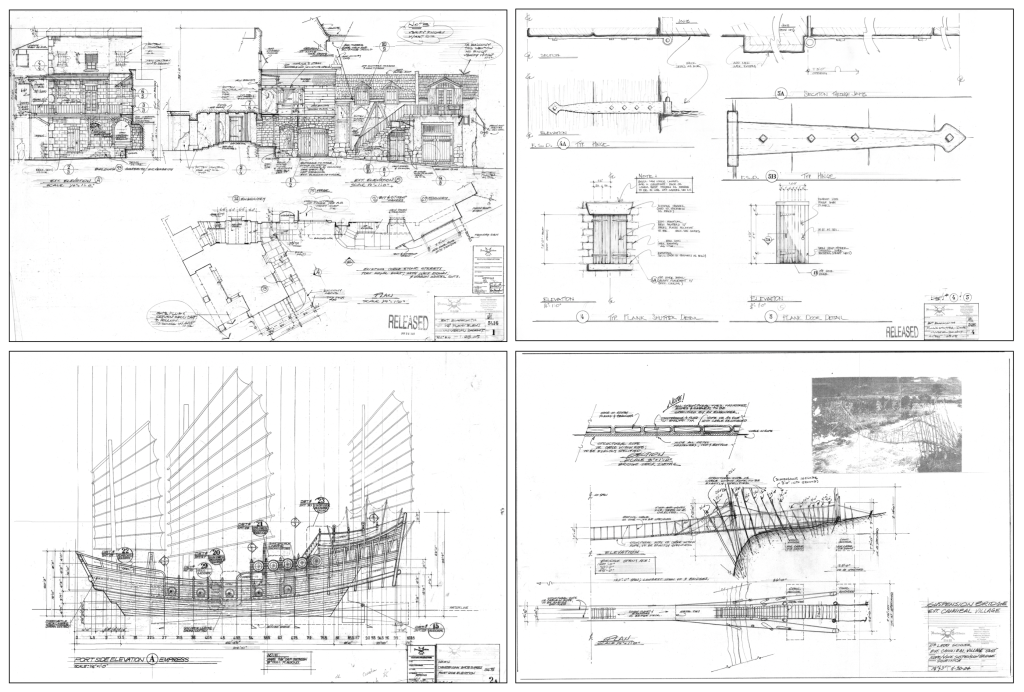
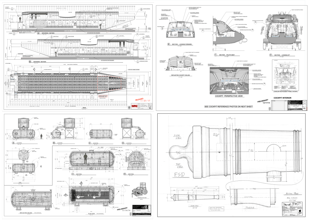
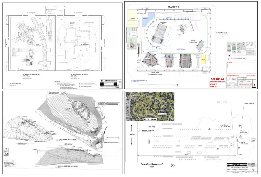
Here’s a general list of what a set designer in the entertainment industry, i.e. film and television, is responsible for creating:
Surveying locations and creating accurate as-built drawings.
Construction drawings of stage sets; plans & elevations, scale detail drawings, FSD’s (full size details). These may be architectural or mechanical in nature.
Working drawings of any period of architecture as well as fantasy or futuristic/science fiction designs.
Working drawings of organic elements: topographic maps, terrain creation, volcanoes, mine shafts, caves or subterranean features, other planets.
Working drawings of vehicles: automobiles, aircraft, ships or marine craft of any period.
Working drawings for furniture and props.
Working drawings for special effects shots.
Director Plans, stage plans, and location layouts.
Dimensional study models of paper and wood as well as 3D digital models with photorealistic textures and other elements like furniture or vehicles.
Architectural Drawings. Images: HBO, NetflixFuturistic & Science Fiction. Images: Paramount PicturesPeriod & Fantasy subjects. Images: Walt Disney PicturesVehicles & Props. Images: Warner Bros., Touchstone PicturesLocation Builds. Images: Universal PicturesStage & Location Plans Images: HBO, Walt Disney Pictures
As you can see, probably the biggest difference between a set designer and an architect or an interior designer is that over the course of a career you’ll get to design and draw things that no one in either of the other two professions would if their career lasted 300 years. Instead of worrying about building code or structural concerns, your main focus is making sure the final result looks fantastic. The design is the main focus, not an afterthought.
So, what skills do you need as a set designer? Well, one of the big plusses for me and for most people that work in the industry is that you will never stop learning. You won’t be stuck drawing reflected ceiling plans the rest of your life. It will be a constant learning process.
If you want to design vehicles as well as architecture then you can. If you ONLY want to design vehicles, you can. Many people develop a specialty and primarily just do the type of design that they like best. It’s a never-ending smorgasbord of design possibilities. After having done over 80 films, there are still things I’d like to create that I haven’t yet done.
So, what are the primary skills you need? I’d start with this list:
The ability to draft – You have to know how to create proper working drawings and unlike fine art drawing, anyone can learn how to draft. It can be exacting because precision is important. But, as they say, it isn’t brain surgery. You can learn it.
Camera basics – We design scenery, not permanent buildings. We design for a camera. I tell people that basically, we create beautiful reflectors. A film is a record of light particles that have bounced off of people and scenery and passed through a glass lens. Making it look good is the main objective. Understanding lenses and how they work is a big part of successfully designing stage sets.
Architecture & proportion – You’ll never know everything, but knowing the basics of building history is a must. You’ll be drawing details of doors, windows, stairways, and furniture. You’ll specify hardware, mouldings, plaster details and finishes. There is very little that we order from a catalogue. Almost everything is custom made by studio craftspersons.
Set Construction – Understanding how sets are built and knowing correct nomenclature is a key part of being able to draw studio sets. A lot of our drawings are similar to architectural drawings but there are some big differences between them. The layout styles, nomenclature and notation have more in common with theatrical and 1920’s architectural drawings.
Also, you’ll need to understand basic physical special effects, how to create and lay out backings, both painted and photo backings, know how to create scale drawings from photographs and artwork, understand visual effects requirements, and do location surveying.
The list seems overwhelming but remember, you will learn a lot of these things on the job. You just need the basics and a good portfolio to get your foot in the door.
You’ll need to be proficient with computer software. There will probably be one program that you will do most of your work in and that will be a personal preference. Unlike architecture, there is not a standard program that we use, so you may work on a project with many people using a wide variety of programs.
Currently, in the U.S., the most-used software programs for set design are Vectorworks, Sketchup, Rhino, Blender, Modo, Autocad, Moment Of Inspiration, Z-brush, Solidworks, and a few others like Photoshop, V-Ray and Twin Motion for renders.
Don’t try to learn them all. Software diversity is great but it’s better to get really good a just one or two.
There are a lot of choices of film schools in the country, but if that is the route you choose you’ll have to check to be sure that they have a course in film design or a Production Design track. Many schools don’t.
If you are thinking about schools and looking for an alternative to a four year program, we offer specific classes in set design that focus on the basic skills you need to get started.
Our 10-Week Set Design Fundamentals series is available on-line and is self-paced so you can progress on your own schedule. It is now on sale for 40% off until May 30, 2023.
First of all, this is not a paid ad. I’m getting nothing out of doing this post other than making people aware that they may be missing a big opportunity to take advantage of an event where they can learn a lot about the state of current and upcoming technology that is created specifically for the entertainment industry.
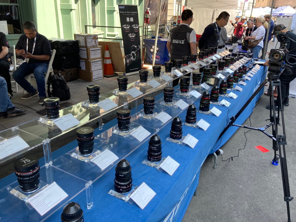
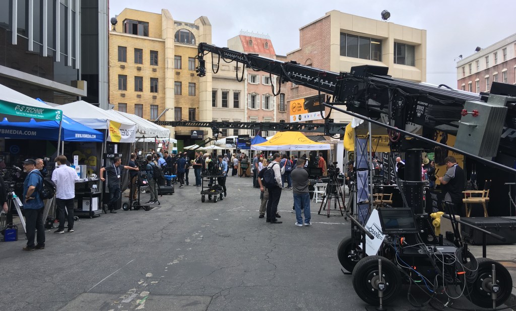
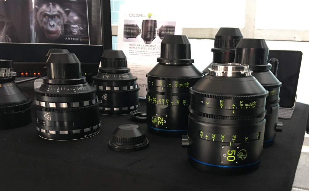
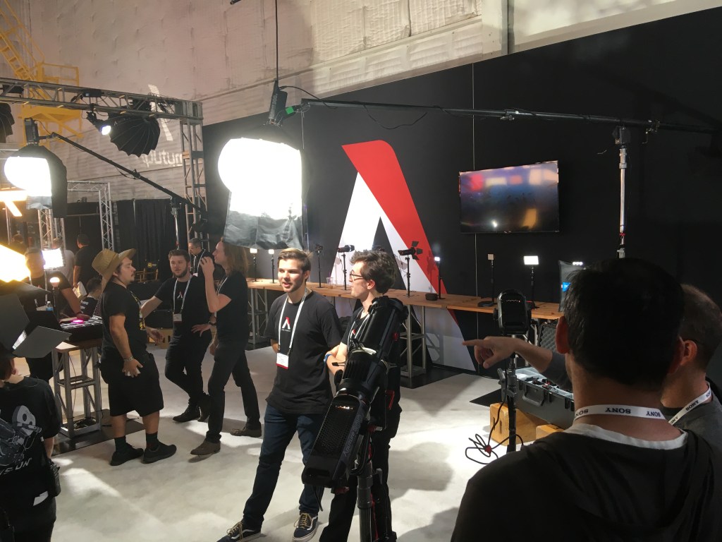
Cinegear is an annual expo that takes place in Los Angeles during the summer. This year it’s being held back at its usual spot on the Paramount Studios lot in Hollywood on June 1 – 4. (There was one in New York in March and there will be a slimmed down version in Atlanta in October). And, it’s free. Admission is now waived, you’ll just have to pay for parking in an adjacent structure.
Known mainly as a product expo for manufacturers and purveyors of cameras, lighting instruments and production equipment, the event is a perfect place for designers and art directors to find out about inventions and equipment that will affect their jobs now and in the future.
People who aren’t camera-savvy tend to be intimidated by the immense amount of hardware on display and assume that they have nothing to gain by spending a day looking at cameras and grip equipment.
Yes, it’s geared toward professional camera crews, but they don’t make you take a test at the gate. The vendors are more than happy to answer any and all questions about their merchandise, even ones that you think might be simplistic. There are also hands-on exhibits and master classes available to anyone.
Where else can you go and see (and play with) every available cinema camera that’s on the market? My daughter loves checking out those $60,000 cameras that she can’t yet afford to rent.
At the Panavision booth they’ll even put any vintage anamorphic lens you want on one of their cameras so you can see them in action.
And it’s not just cameras that are on display. Vendors of new LED lighting instruments, LED wall systems, backings, pre-visualization systems, etc., are eager to show anyone involved in the business what the possibilities are. LED lighting instruments keep getting better, brighter, and smarter. The new Arri LED panels, for instance, are set up to mimic any color temperature or lighting effect.
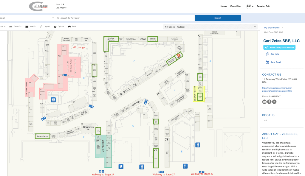
You can see a map of the vendor sites on their webpage, and you can create your own map to track booths you want to visit ahead of time if a fear of being overwhelmed by the size of the venue (nearly 200 vendors) is a concern. Vendor booths fill 5 sound stages and the entire backlot area.
Master classes are usually held on the last day and attendance quotas fill up quickly, so be sure and make a reservation in advance.
If you do go, save time by registering beforehand and skip the long line at the gate:
This years’s show should be well-attended. It’s been 4 years since the last show at Paramount. Last year there was a much scaled-down version at the Los Angeles Convention Center which was disappointing to say the least.
My preference for books is always a hard copy, but sometimes having easy access to the information is more important than having a physical book, especially when copies of the actual book are impossible to find or really expensive.
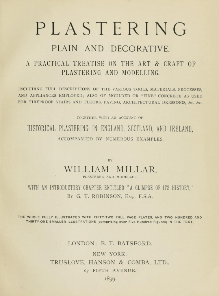
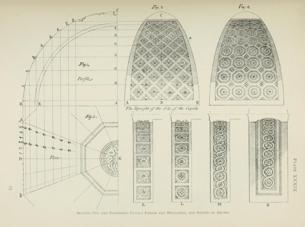
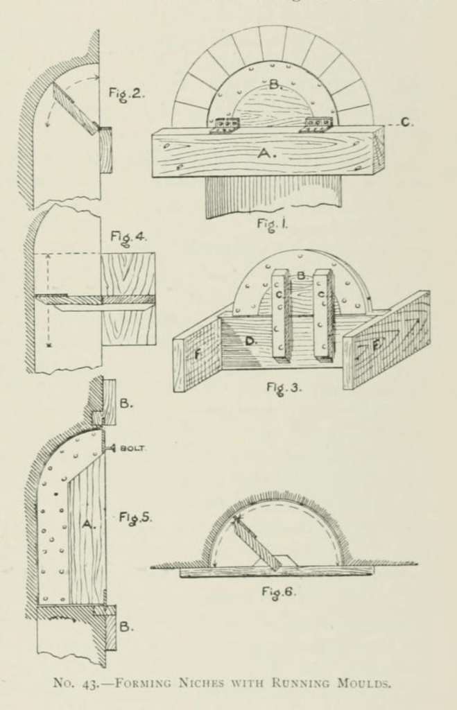
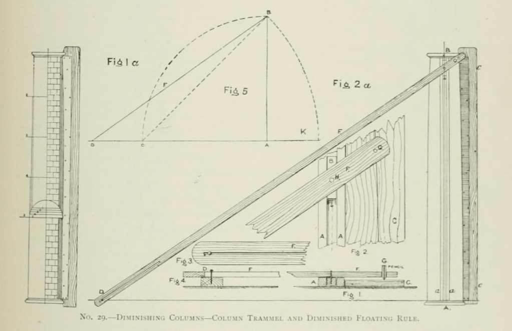
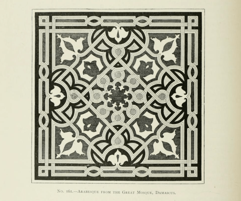
That’s the case with this book, Plastering Plain and Decorative. First published in 1890, the book has become known as “The Plasterer’s Bible”. Now out of print, except for the occasional third-party reprint, it went through four editions. It contains hundreds of black & white photographs and drawings which aren’t always of a very good quality with most of the modern reprints, usually because they are printed in a smaller size than the original quarto size and because the scan quality of the original images is bad.
On top of not being of a very good quality, they are also nearly as expensive as an original copy, which would be a better bet as those are stitched like a traditional book and not perfect-bound (glued edges) like all soft cover books are. I have seen so-so quality reprints go from anywhere from $100 to $300.
Fortunately there is an inexpensive (free) copy of the book online at the Internet Archive. This isn’t just a book of nice drawings and photos, this is a book written for crafts people. Besides the layout diagrams, there are drawings of the actual tools used to create complicated plaster elements and a huge list of plaster types as well as the ingredients and mixtures used to create them in various time periods, such as instructions on what type of animal hair to use in the staff pieces for strength. It is an early edition of the book and contains over 700 pages which is more than is included in later editions.
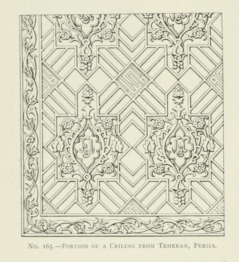
The book covers not just typical plasterwork but, sculpting, mold making, terra cotta work, scagliola, sgraffito, and composite decorations. Besides Western European techniques it examines designs and techniques from Japan, China, India, Persia and the Middle East.
There is also a section on concrete work such as staircases, sidewalks, road, roofs, fountains, and other decorative elements.
You can find the digital book here at The Internet Archive. There are a number of different digital files available for download with varying file sizes depending on the quality of the images you want to have available.
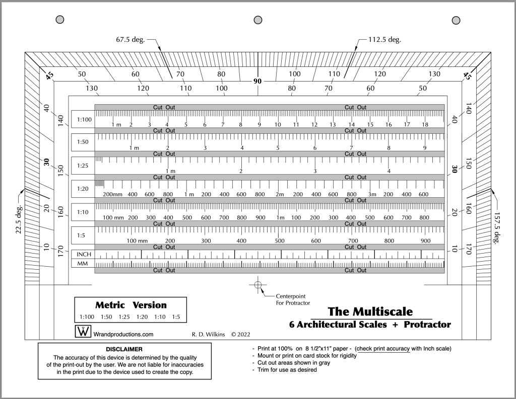
Last week I posted the Imperial version of a new tool I’ve updated recently. I promised I’d post the Metric version of the tool this week so here it is. You’ll find the Imperial version here if you missed the post.