What Is A “Double Dap” Hinge?

One of the reasons that I wrote the Wrand Film Glossary was to record many of the obscure film and entertainment industry terms that get passes down orally but are never recorded.

Art department and set construction lingo is usually not included in the typical film glossary, and “Double dap” is one of those odd terms that you will hear used by Prop Makers* but have probably never had it explained.

The term refers to how the hinges of a door on a stage set are to be installed. Normally the installation of hinges for a door involves creating mortises in the door stile and the jamb that match the thickness of the hinge leaves. That’s referred to as a “single dap” installation. (Note: this is specifically for doors in North America or the UK. Many Continental European doors are half-overlay and don’t use the type of leaf hinges that are standard here.)

Typical hinge installation – referred to as a Single Dap

A “double dap” installation involves creating a mortise in the door which is twice as deep as usual and not making a mortise in the jamb, as shown below.

Example of a Double Dapped hinge

The diagram below is a side-by-side plan view showing both types of installation.

So what’s the purpose of this? Well, this is something that is more typical on sets for a broadcast show than on sets for a feature film.

One advantage is speed. We tend to build sets at a pretty brisk pace, sometimes building an entire set over a weekend. For example, if you have a set with six doors, that means you need to install 18 hinges, which means routing 32 mortises. With a double dap installation you cut that number in half.

Another advantage is if you are redressing a set and need to change out the door of an opening for a different door. With a standard installation, you will need to patch and fill and re-rout three mortises. Instead you just need to fill some screw holes.

This is also the case if you need to change the swing direction of a door at the last moment. (Good luck prying off and repositioning that door stop.)

Double dapping has fallen out of favor lately. Production Designers don’t like the look of it for one thing. (Along with Phillips head screws on a period hinge!) They tend to stick out particularly when the hinges are a contrasting color from the jamb or if the wood is painted a light color and the hinges have a dark laquer/black finish. In some instances this condition can either visually hide the extra mortise depth or accentuate it.

Also, notice the round corners on the hinges in the photos. Round corner hinges are a 20th century invention to speed up production. Once machinery, i.e. routers, was being used for mortising, it became a lot faster to create hinges with leaves that didn’t require squaring off the mortise corners as was necessary for period, square hinges. Round corner hinges come in 1/4″ and 5/8″ radius corners, so be aware of what radius size they are if you’re choosing hinges for a door that has already been mortised.

Note: Prop Maker is a designation for a union stage carpenter in Los Angeles to differentiate them from a ‘civilian’ carpenter. They are trained it building theatrical scenery of all types and historical periods and specialize in creating scenery for film productions. They are more similar to cabinet makers than a typical carpenter and are skilled in construction techniques and methods that would baffle most people outside the entertainment industry.

Sometimes Unwanted Holes Aren’t So Bad

You’ve probably never thought about how sound can affect your stage set. Beyond trying to not create an environment that would drive the sound recordist mad, you usually don’t think about odd acoustic anomalies that might pop up that you never intended to happen. Like echoes.

Computer Hall set – Gattaca – Columbia Pictures 1997

Yeah, echoes will bite you in the ass if you’re not careful.

On the main set for the 1997 film Gattaca, just such an anomaly occurred, and it was the cinematographer who ended up saving the day.

And what does the cinematographer have to do with sound problems? Keep reading.

The Computer Hall set was designed by Production Designer Jan Roelfs and was inspired by the real-life location that he and Director Andrew Niccol chose for the film. The actual building chosen for the exterior of the Gattaca Aerospace Corporation was the Marin County Civic Center in California, designed by Frank Lloyd Wright. The art department flew to Marin and surveyed the interior details so that they could be matched for the set on stage, which was in a warehouse in Playa Vista.

The building they had leased made for an odd sound stage, but its size made it large enough to build the sets for the film in. There were the normal problems you deal with in a structure that was never designed to be a sound stage: support posts at regular intervals, a ceiling that is not nearly as high as those in an actual sound stage. On the plan below, you can see where the oval columns were designed to hide two of the building’s I-beam columns.

These are my drawings of the plan and elevations of the set with the areas of the sound problems circled.

(One note: on the title block, you’ll notice it reads “Eighth Day”. This was the original title of the film. In pre-production, the producers learned that there was a French movie of the same name that was going to be released, and a name change was required. The writer and director Andrew Niccol decided that he would create a new title using the four letters used to identify the nucleobases of DNA: GATC.)

Turns out, theater designers had known about the sound reflective effects of elliptical and parabolic ceilings for years, as most of the western world designed theaters in the mode of the typical Italian horseshoe layout plan.

A presentation at the 2017 International Congress On Sound was focused on this phenomenon.

In New York City’s Grand Central Station, there is a ‘whispering gallery’ or acoustic vortex. This is an architectural phenomenon created by a number of configurations, in this case, a vaulted ceiling in the subway entrance under the terminal. A person standing in one corner of the hall intersection can whisper into the corner and the sound travels over the curved surface of the ceiling and can be heard by a person standing in the opposite corner.

New York Grand Central Station

I discovered the echo one day when I was walking the set and stopped at the point in question. I saw a gnat and clapped my hands together to kill it. That’s when I heard the strange echo. Horrified, I clapped again and there was the same echo. I clapped a third time, just as Jan was walking through the set. He stopped and frowned. “Don’t do that!’, he said.

I think what was happening was that the area beneath the lower section of the ceiling of the set created a flutter echo, which was enhanced by the smooth ceiling surface. The two large skylights didn’t seem to affect this echo.

There was no carpeting or fabric to dampen the sound which would have eliminated this effect.

The solution came for the most part when the cinematographer, Slawomir Idziak, told us that he needed more practical lights in the set. This required creating dozens of new openings in the lower sections of the ceiling. These holes interrupted the acoustic waves and the echo disappeared. With the addition of the desks and the background actors, the sound reflection was minimal.

The photo below shows the original skylights in yellow, with the new lights circled in green.

The Art Of Technical Drawings

The look of construction drawings for film and television has changed a lot over the years, particularly now that most drawings are done digitally with computers rather than by hand.

While many current drawing styles now incorporate photo-textures, shadows, and icons to add life to drawings beyond what is typical of architectural drawings, it’s hard for them to match the aesthetics of hand drawings.

CAD drawing from 3D model – photo textures applied

Having started as a pencil draftsman I guess I do have a bit of a personal bias, but the unique style of each person on a hand-drafted drawing was immediately recognizable to people who knew their work.

Before digital illustrations and renders of 3D models, hand-drafted drawings had to serve as a design sales tool as well as instructions for scenery construction.

Here are some shots of a set design by Erich Kettlehut in 1923 for the UFA film, Die Nibelungen, for the scene where Siegfried kills the dragon.

The drawing was displayed as part of an exhibition of artwork from the UFA silent film period of the 1920s and 30s at the Los Angeles County Museum of Art in 2014. The drawing is from the collection of La Cinématiquè Française in Paris, France.

Note that the drawing not only provides a pictorial description of what the dragon should look like, but calls out dimensions, construction materials, how the action prop is to be operated, surrounding scenery requirements, and specific technical details of mechanical movements.

Technical drawing of the Dragon by Art Director Erich Kettelhut – ink and pencil on vellum
Kettelhut called out the length of the neck as well as the tension springs, framework, control cables and hoses required for the creatures fiery breath. He calls out “only rubber!” for the mouth area.
The size and depth of the recessed path required for the props operators.
drawing describing how each part of the dragon was to be operated by stagehands.
Note in red indicates that a telephone/communication system needs to be added to the prop for the crew.

The scene where Siegfried slays the dragon in Die Niebelungen from 1923

Here are a few more hand-drafted pencil drawings from more recent films:

Salem – drawing by William Ladd Skinner
Gangs Of New York – drawing by Luca Tranchino
Shazam – drawing by Greg Papalia
Haunted Mansion – drawing by Barbara Mesney
Haunted Mansion – full size detail of fireplace for the plasterers
Thor – drawing by Oli Goodier
Shazam – drawing by Stella Vaccaro
Disturbia – drawing by RD Wilkins
Haunted Mansion – drawing by Hugo Santiago
Baby’s Day Out – window detail

R.D. Wilkins

18 Design Reference Books You Should Have On Your Shelf (UPDATE)


design book montage_1

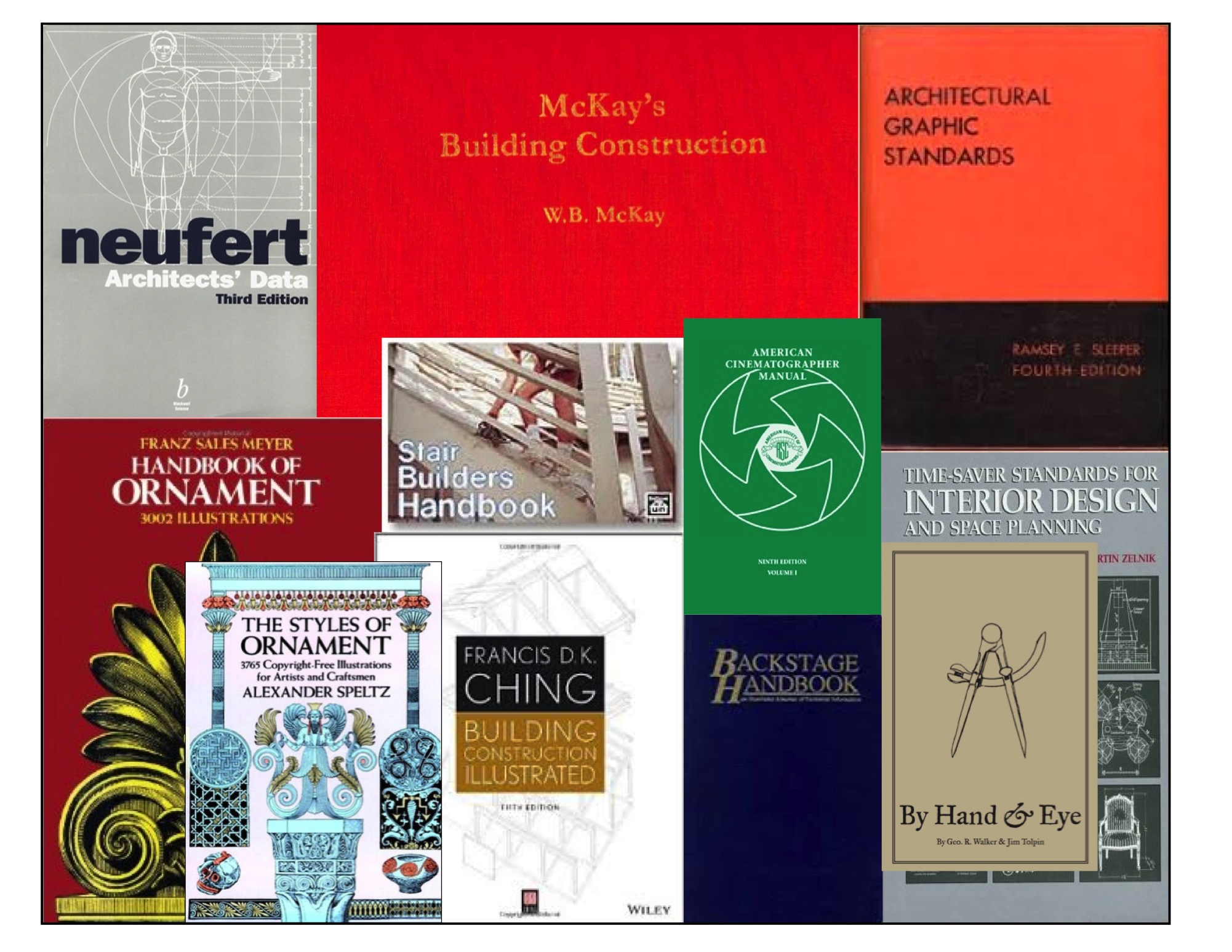
Ten years ago,  I wrote a post on 10 design books that I thought everyone should have. Looking at that list now, I think I need to expand on it by adding a few more to the list.

Here is my must-have list with sources:

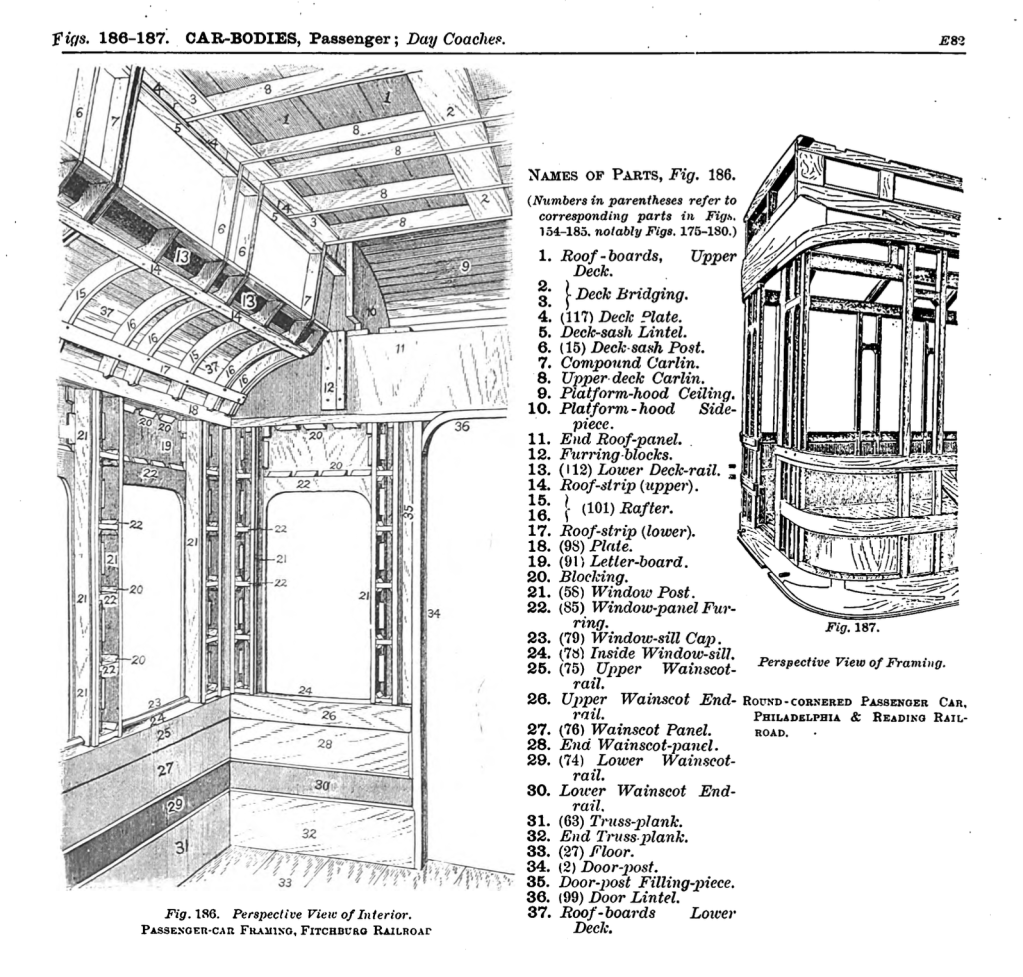
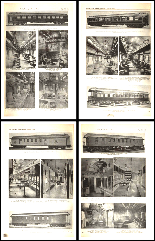
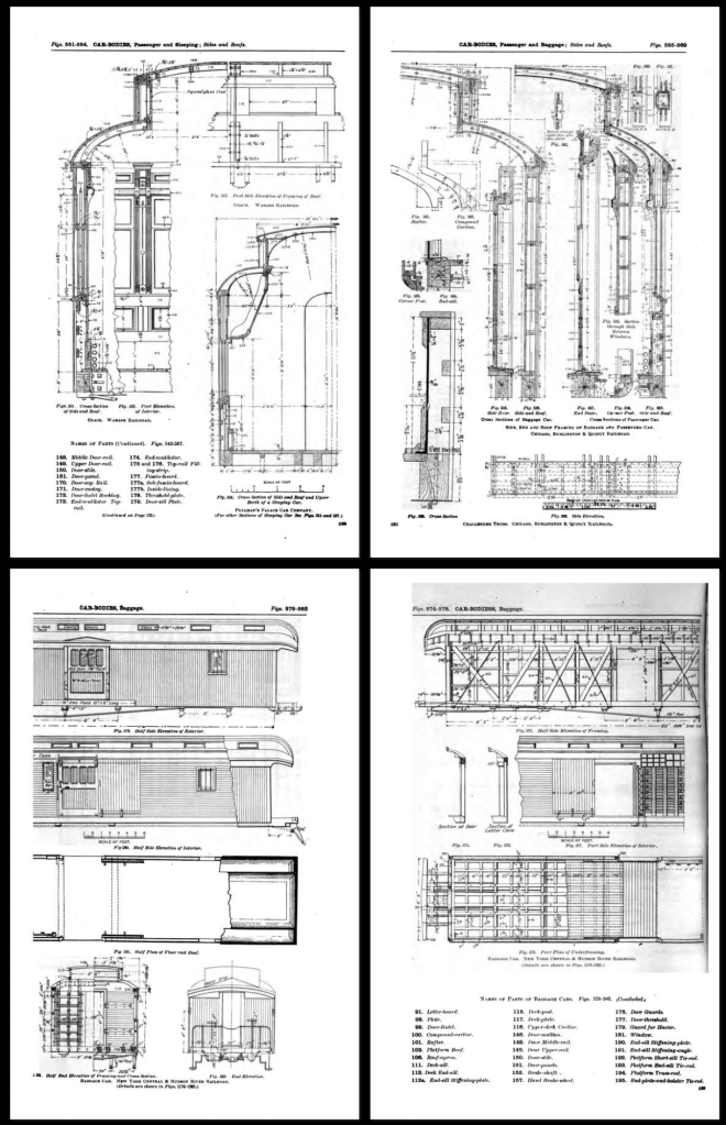
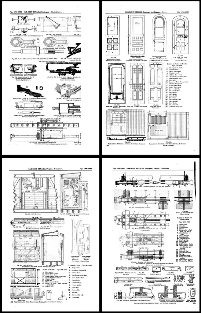
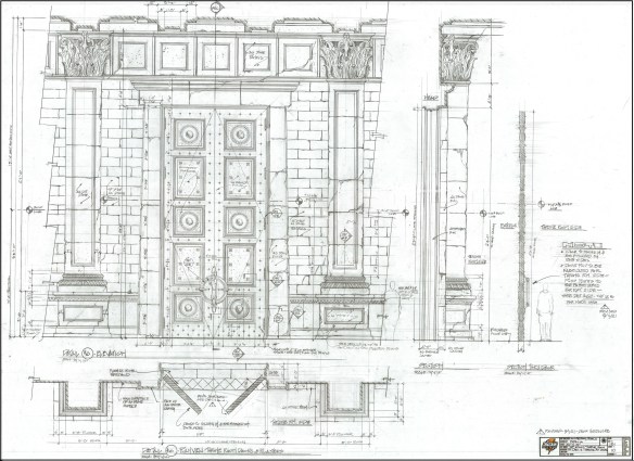
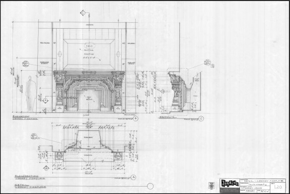
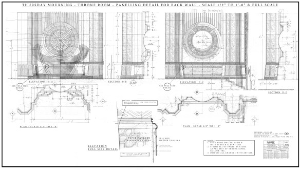
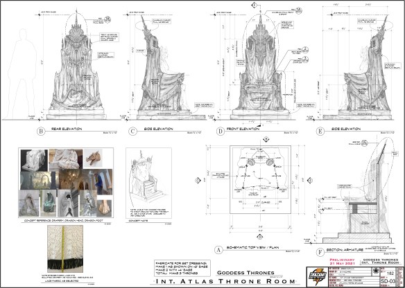
1. Architectural Graphic Standards – 5th Edition –

This was when the books were filled with great hand drawings and actually showed you in detail how things were built. There are lots of period details as well. Out of print for over 50 years, (at least in this edition) you can still find copies for anywhere from $20 to $200. The 3rd edition would be a suitable replacement. the first edition is also good to have and has been reprinted several times. Check Abebooks for copies. Not available digitally.

If you are in Great Britain, McKays is the closest equivalent, and is actually superior in a number of ways from our standpoint as set designers. On the Continent, an older copy of Neufert’s is a must. See this earlier post for details. Not available digitally.

___

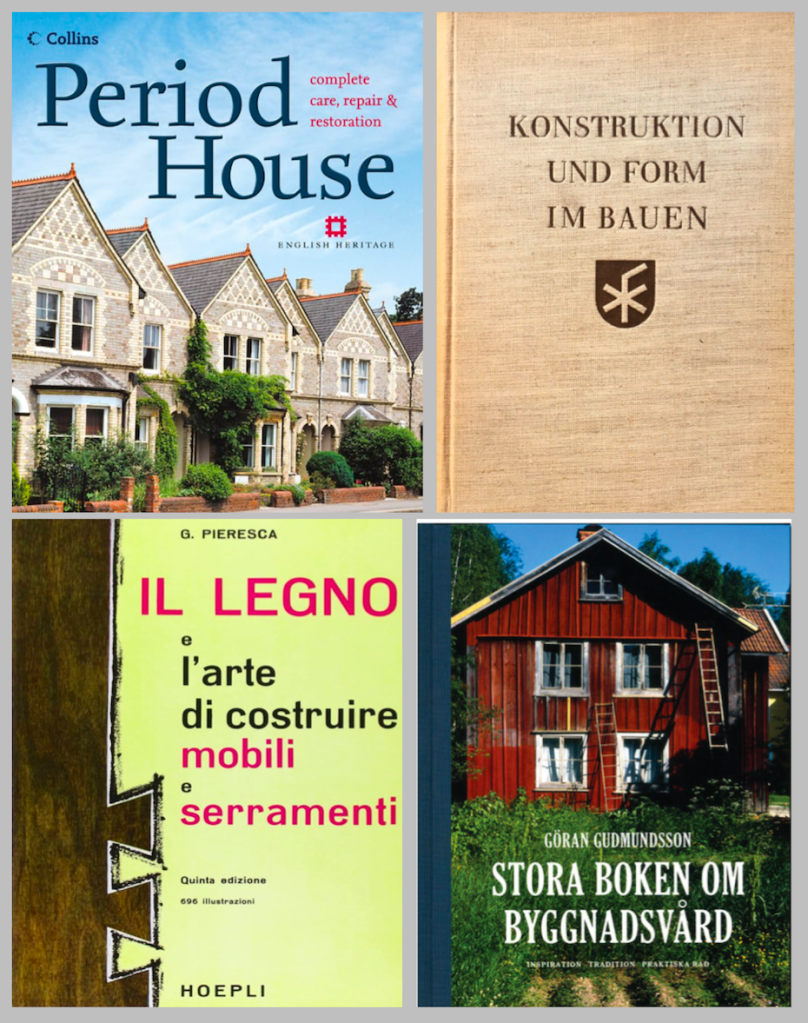
Another option in England is Period House, by Jackson & Day, which goes into extensive detail about common interior architectural elements for restorers. In Germany, the best book on period construction I’ve found is Konstruction Und Form Im Bauen, by Friedrich Hess. There are lots of very nice drawings and measured details. It’s long out of print but you can still find copies second-hand. In Sweden, an excellent book on traditional construction is Stora Boken Om Byggnadsvård, by Göran Gudmundsson. This is a current book and still in print. In Italy, a nice book on traditional construction techniques with detailed drawings is  Il Legno e L’arte Di Contruire Mobili e Serramenti. None are available digitally.

***********************************************************************

2. Time-Saver Standards for Interior Design and Space Planning, 2nd Edition.

This is the interior design complement to Architectural Graphic Standards and covers nearly every situation regarding building interiors. You can find used copies for around $50. There is a digital version available but it’s not only difficult to navigate because of the size of the book but at the price you’d be better off getting a hardback edition.

Another companion to this is a nice slim book that is for kitchen and bathroom standards in the U.S. The NKBA Kitchen & Bathroom Planning Guide was created to make common building codes and layouts available to designers in an easy to use format.

*********************************************************************

3. Styles Of Ornament – Alexander Speltz.  

Originally published in 1904, this book uses over 4000 drawings to illustrate 6000 years of historical design. As a general design reference I don’t think it has an equal. Architecture, furniture, text, carving, metalwork are all covered. A must-have. About $20 new.

The Handbook Of Ornament by Franz Meyer would be a close second. Available from a number of publishers for as little as $10. A digital version is available.

Low Budget Option- download the online PDF here.

******************************************************************

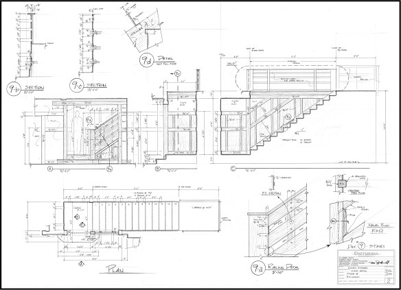
4. The Stair Builder’s Handbook – T.W. Love –

Not a design book, but a book of rise-and-run tables that make stair layout a breeze. Available from various sources for about $20.

Low Budget Option – download the PDF Common Sense Stairbuilding and Hand-railing. Skip the mind bending section on handrail layout and skip to page 99. Also, Stair building, which has a nice section on ornamental ironwork.

*******************************************************************

5. Backstage Handbook – Paul Carter.

Originally a technical manual for theatrical designers, the book is full of great information for film work as well. There are more details in this earlier post from several years ago. It is one of the most widely used books on stagecraft in the U.S. Available from Broadway Press for about $22. No digital version is available.

********************************************************************

6. Building Construction Illustrated – Francis Ching.

An excellent and thorough book about construction details including wood framing systems and masonry. About $46.

Low Budget Option – access the online PDF here of the 4th edition.

********************************************************************

7. The Classical Orders of Architecture – Robert Chitham

I think this is the best modern book around that deals with the classical architecture proportional system. This book was out of print for quite a while and fortunately is back in print. The new edition deals with the proportions for both metric and Imperial systems. Copies can be found for about $55.

Low Budget Option – Get the PDF of American Vignola by William Ware and The Five Orders by Vignola.

*********************************************************

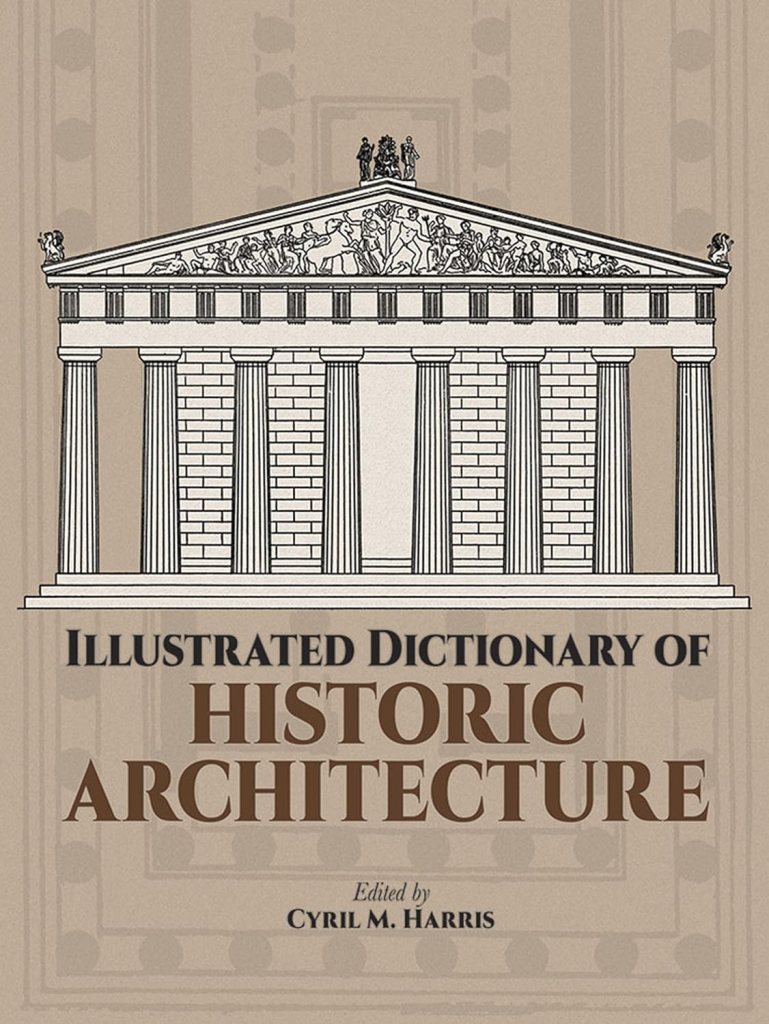
8. Illustrated Dictionary of Historical Architecture – Cyril Harris

With over 5000 terms and 2000 line drawings, this book covers architectural history from the ancient period to 20th century Modernism. Along with the European styles, it covers Japanese, Chinese, Indian, Islamic and Mesoamerican styles. About $35 from various sources.

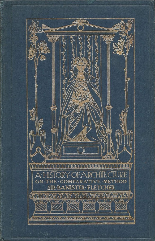
Another classic book in a similar vein is A History of Architecture On The Comparative Method, by Sir Banister Fletcher. This dense, fully-illustrated book covers the time periods from ancient times to the 20th century, focusing on Western culture. It was the most widely used general architecture reference book for decades.

Used copies are easy to find for around $20. A good scanned copy of the 1905 edition can be found in PDF form here for download. Avoid reprints. Most of them are badly scanned from originals and the fine details of the illustrations is lost. A 20th edition has been published in two volumes that comes in at over 1600 pages and includes new sections on cultural architecture from countries not fully represented in the original edition. This runs at around $250.

******************************************************************

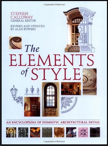
9. Elements Of Style – Edited by Stephen Calloway

This has been a standard Art Department reference manual for quite some time. Subtitles as “a practical encyclopedia of interior architectural details”, the book covers the periods from 1485 to modern day. Each chapter covers a different time period and is separated into thirteen sections which each feature an interior element, making it easy to cross reference similar elements from other time periods. The book includes over 3000 drawings and 1300 photographs to accompany the written analysis. In hardcover for around $75. Used editions can be found for as little as $20.

******************************************************************

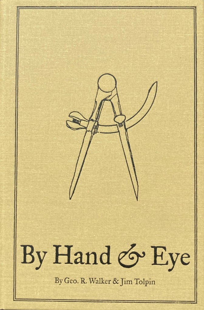
10. By Hand & Eye – George R. Walker & Jim Tolpin.

If you’re just starting out in set design this is one of the first books I’d tell you to buy. Bad proportions can ruin a design. This book will give you a solid understanding of proportion and keep you from making simple mistakes. You can download a sample chapter here. Also, I wrote a longer post on the book earlier. Walker and Tolpin are promising a workbook that will come out later this year based on the book’s concepts so look for that. Available from Lost Art Press for $51, hardbound. A PDF is available for $24.

*******************************************************************

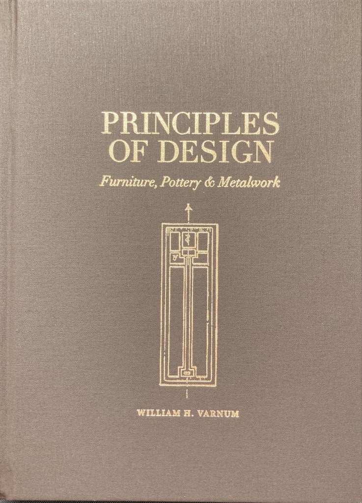
11. Principles Of Design – William Varnum

This is a recent reprint of a book published in 1916 under the title Industrial Arts Design. The book lays out the basics of design, with step-by-step rules for designing not just furniture but pottery and metalwork as well, with sections on enriching a surface with detail or hardware. The rules translate easily to architectural forms and will seem like obvious, common-sense choices once you are exposed to them. This hardback edition is the second run of a limited printing. By Lost Art Press at their website. Hard cover edition is $41.

*****************************************************************

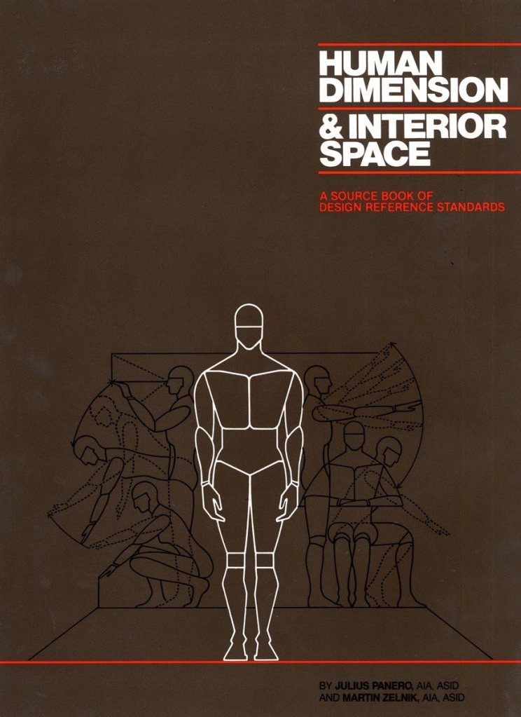
12. Human Dimension & Interior Space – Panero & Zelnik

This book explains the science of anthropometrics, which is the study of human body measurements on a comparative basis. Whether you are designing interior elements, furniture, or vehicles, this book will help you create those spaces with easy to read diagrams and charts that detail the huge disparity in shapes, sizes, and capabilities of the human form. The authors warn against designing for a ‘standard size’ human body which in fact, does not exist. New in hardcover at about $24. Digital versions are also available.

*****************************************************************

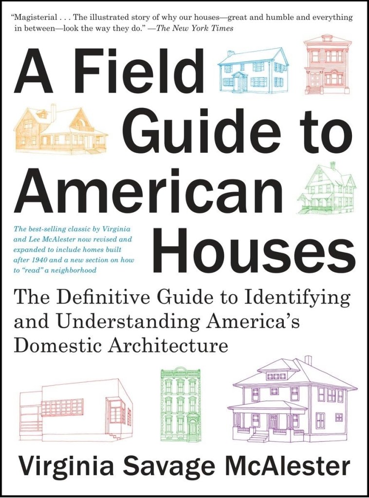
13. Field Guide To American Houses – Virginia Savage McAlester

Described as the “definitive guide to identifying and understanding American domestic architecture”, this book is considered an essential source for understanding the myriad of styles and elements that define American houses. With over 1000 drawings and photographs, the book separates the various styles into chronological categories and explains the details and accents that define each of them with clear, simple sketches. The second edition is about $24 in paperback.

****************************************************************

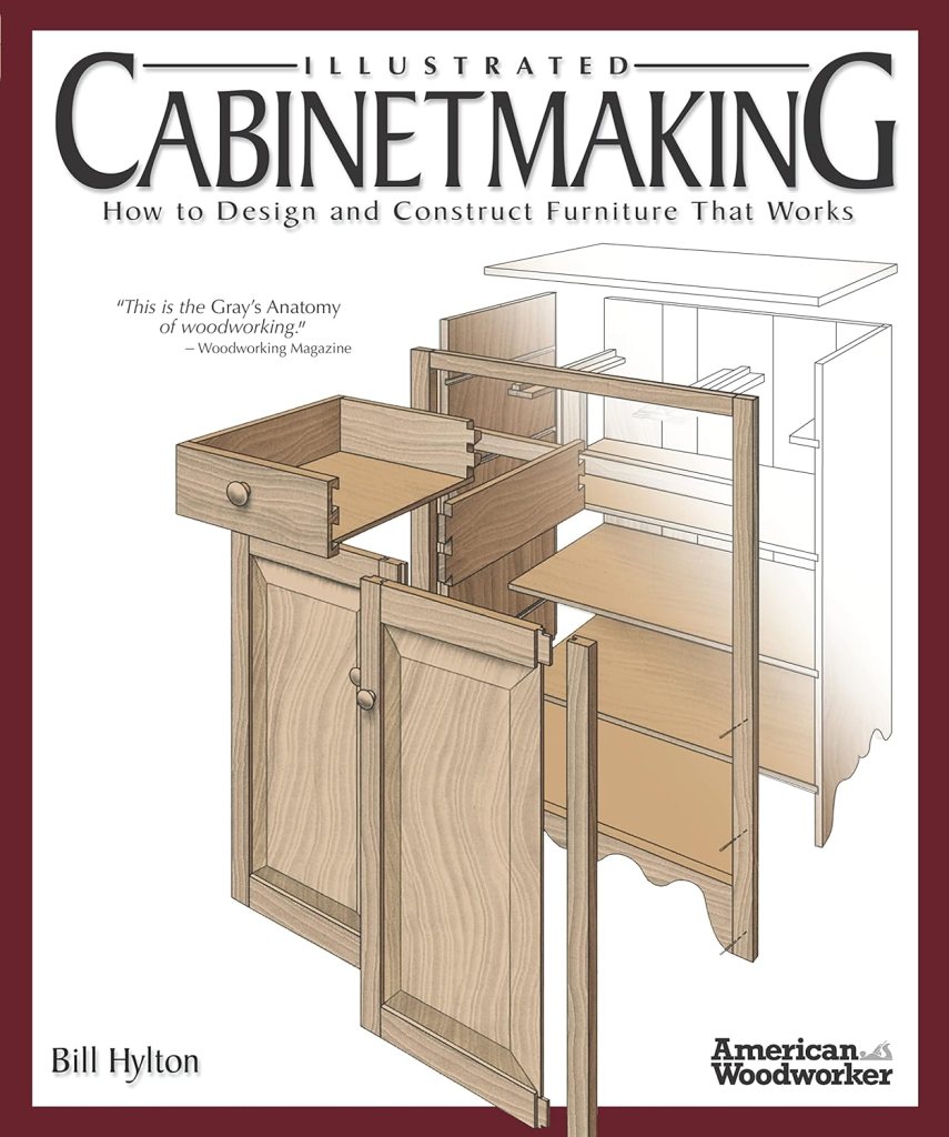
14. Illustrated Cabinetmaking – Bill Hylton

I covered this book in detail in an earlier post. One reviewer referred to this book as the Gray’s Anatomy of woodworking, and that’s a pretty accurate description. If you’re going to design furniture you need to understand how it’s built, and this book explains it with over 1300 color illustrations and exploded views of 90 different pieces of furniture from different time periods. There are sections on joinery, standard dimensions, and sources for construction drawings. Paperback editions are about $24. Digital editions are also available.

***************************************************************

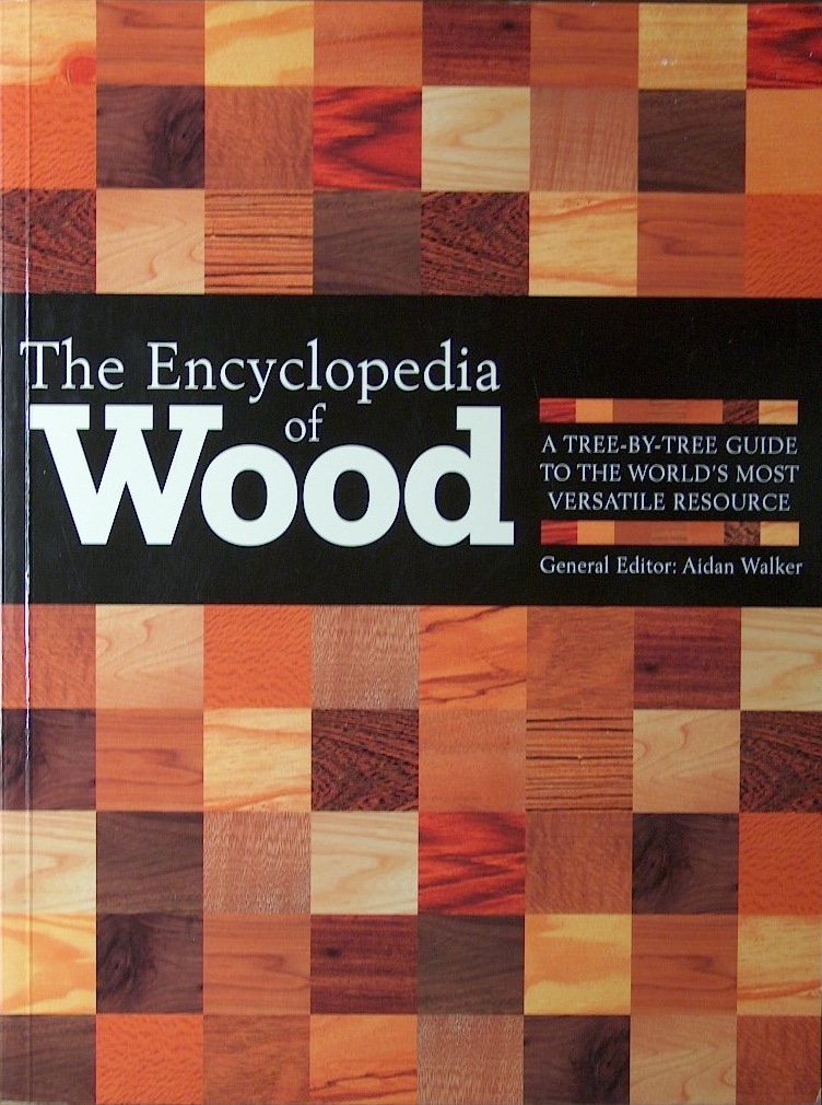
15. The Encyclopedia Of Wood – Aidan Walker, Editor

There are numerous books on tree identification but this one stands out to me because of the variety of wood that it covers and the large, clear color photographs of each of 150 species grain patterns and figure. There are also chapters on how wood is processed, what wood movement is, and how veneers and lumber are milled. In paperback for about $35.

***************************************************************

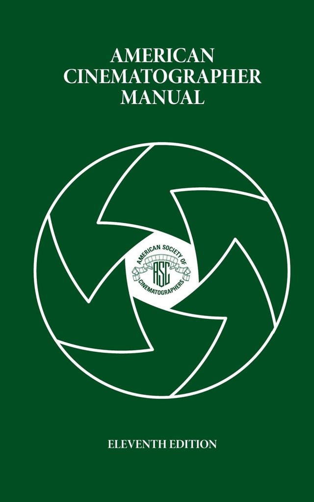
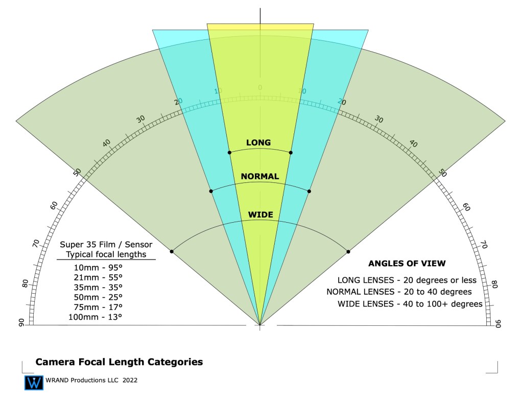
16. American Cinematographers Manual – American Society of Cinematographers

The new 11th edition will cost you about $120 in hardback and almost the same in it’s digital version through the iTunes and Android sites. Earlier used editions can be purchased for a third of the price of a new edition, but much of the latest technology isn’t in them. This is the go-to book for all things dealing with cameras and image capture. A lot of people will tell you you don’t need this. I’m sure you might also have a great career as a car designer without knowing anything about how cars work. Because when it comes down to it, all we’re really doing is designing big, pretty things to bounce light off of. Just remember, if the department names were based on physics we’d be the Light Reflector Design Department.

 *************************************************************

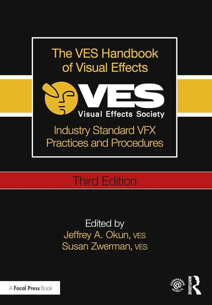
17. The VES Handbook Of Visual Effects – Okun & Zwerman, Editors

Published by the Visual Effects Society, this +1000 page book covers every type of visual effects shot you will encounter. From in-camera effects like miniatures and mechanical effects to green screen work, motion-tracking, LIDAR, tracking shots, LED wall stages, and everything in between. It’s the most complete book on visual effects that has been produced so far. Consider it to be a complementary reference to the American Cinematographers Manual. In paperback, the new third edition costs about $65.

***************************************************************

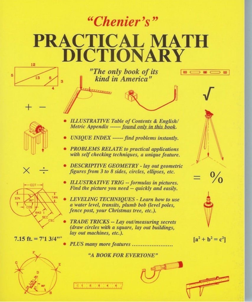
18. Chenier’s Practical Math Dictionary – Norman Chenier

This book is an odd duck in many ways but it has been a real time saver on a lot of occasions. There are sections on descriptive geometry, survey and layout techniques, solutions to common math problems, and other information that you’ll struggle to find anywhere else. In paperback, the latest edition is $26.

What Just Happened? The Psychology Of Film Scenery

“Every scene you will ever act begins in the middle. . . .” Michael Shurtleff

The casting director Michael Shurtleff wrote a book called “Audition”, which is a kind of roadmap for actors to use when preparing to try out for a part for a film or theatrical play. It lays out the basics of determining the psychological elements of a scene, even if the actor has only been given a single page from the script.

(An aside: if you really want to understand script breakdown, take an acting class. It will give you a new appreciation of actors too. Do that one better and go out for an audition, and then imagine doing that a dozen times a week for the rest of your career.)

One of the Guideposts in the book is titled, The Moment Before. Shurtleff explains that a scene always starts the middle of a situation. It’s the actors job to figure out what events came before, because a lot of times that information isn’t in the script. A general outline might be there but the small details are missing.

What just happened?

With films, a lot of the ‘personality’ of a set is the work of the Set Decorator. They give life to the structure of the scenery, and it’s a big reason why they share Oscar and Emmy awards with the Production Designer.

But you can only put so much lipstick and mascara on a goat, and if the sets ‘bones’ aren’t great, something big will be missing.

What does your set say about itself once the construction and paint crews are finished, before the set decoration crew even starts?

What happened in this room a week ago? A year ago? Twenty years ago? Was the house built before the development of modern plumbing? Do the mouldings indicate that it was built before electric power was available, and the “new” type of special moulding now hides the wires that snake along the baseboard and up corners of the room?

Once the set is dressed and filmed, are there elements that will stand out or tell a story about the “envelope” beyond the dressing?

When I look at empty houses I always look for the signs of past human lifetimes. Most buildings will survive 4 or more owners, or generations. They all have their scars from surviving their inhabitants; the bad remodels and additions that don’t match, bad repair jobs or damage that was never repaired.

I got to tour a historic house from the 1830’s that was built in the Greek Revival style and was shocked when I saw the front parlor room. The second owners wife was tired of the classical design and had the room renovated in the then-current 1890’s late Victorian “Eastlake” style. The contrast couldn’t have been more odd if they had redone the room in a Mid-Century Modern style.

The historical society who owned the house decided that the Victorian remodel of the room was part of the history of the building and voted to not return the room to its original configuration. It may have not been ‘true’ to the origins of the house but it defined the ‘human experience’ that the home had gone through. It was some of the ‘finger prints’ that its inhabitants had left behind.

This is a photo of a door in a friends families 900 year old Castello in Northern Italy. I wondered about the deep gouges in the upper panel and they told me that they were a remnant from several hundred years before during a hasty removal of a carved crest that hinted at support of a then out-of-favor monarch.

The details of a set don’t have to be that subtle. It could be a bricked up window, a stairway in an odd but obviously not original location. or maybe the wallpaper in a room is torn in one corner, revealing three other layers behind it, or there are scorch marks on the wooden kitchen floor in front of the stove where a red hot cast iron skillet was dropped.

The ‘character’ can certainly come from the paint and age that the scenics apply and sometimes there is even more you can add. One person told me about arriving on a stage set one day for a shoot in a period kitchen set to find the Production Designer Dean Tavolaris bending over the tile counter with a one pound can of Crisco shortening, rubbing handfuls of the stuff in the corners and between the sink and stove.

Actors will often create past stories of their characters for themselves to help them flesh out the role that will give them personal emotional substance to draw on for their portrayal. This is information just for themselves and a lot of times they don’t feel the need to share it with anyone else, but it gives their performance extra ‘bones’.

As a designer you can do the same with a set. You can create the environment’s past lives that may have nothing to do with the story in the script but it will give it a reality that will make it feel like it hasn’t just materialized suddenly out of thin air, which, as scenery, it pretty much has. We think of spacecraft as modern, sterile environments that don’t have much character. Star Wars changed all that with some spacecraft that were past their expiration date and bore the marks of abuse and mechanical failure. It made them more lifelike and less like machines.

Whether you share that ‘history’ with anyone else is entirely up to you, but if you can tie it into the story or at least make it an interesting part of the design, it can help you sell your ideas to a director who will most likely appreciate that you are bringing a depth to the film that they hadn’t thought about.

That work will come from really analyzing the script, and there isn’t always a lot of time to do that. But, you can learn shortcuts, and that’s a whole other blog article.

For starters, I suggest these: Audition, by Michael Shurtleff, and the chapter on script analysis in Directing Actors, the first book from my absolutely favorite directing teacher, Judith Weston.

New Release – Film Glossary For Film Designers

I wrote about this glossary over a year ago thinking that It was nearly ready for issue. It wasn’t.

After struggling with finding a publisher for hard printed copies, I gave up and decided to just release it as a downloadable Ebook. There were just too many hoops to jump through and I wanted to see it get out there into the world where it was more useful that just being a file on my computer.

The upside is that it kept getting bigger. And by the time I was ready to put it up on the platform, not only had the main glossary expanded but the appendix had grown from a half-dozen pages to 40. There’s a lot crammed in this book that doesn’t exist anywhere else.

The terms in the glossary itself have tags which place them in 28 different categories. This edition is aimed toward being a resource for film designers but anyone interested in film can benefit from this book.

Most of the over 1800 terms are directly film related and cover everything from job descriptions, to equipment terms, to crew slang, to sound stage etiquette, to up-to-date technical terms and descriptions. And for designers, there are many architectural and sound stage terms that aren’t in any other film glossary. No matter how long you’ve been in the business, there are terms in this book that you haven’t heard before.

The book is fully searchable and can be downloaded to your computer, your phone, or any device you wish. The current release price is $35.00.

Click the Download button below to get a 14 page sample of material in the glossary.

International Production Design Week – October 20 – 29

This is the first day of the International Production Design Week events that have been organized and curated by the Production Designers Collective, an international group of Production Designers whose mission is to be a hub for designers from around the world and to elevate the profession by bringing awareness and acknowledgment of the craft of art direction around the world to the public’s awareness.

The nine day series features nearly 200 seminars, exhibitions, meetups, tours, and lectures with acclaimed Production Designers from 27 countries. Some of the events are presented online for viewing from anywhere while others are held in specific sites for a live audience.

Here is the link to the schedule of events which is searchable by day, city, language, and event category.

https://productiondesignweek.org/program/

Here are some of the planned events. See the website for a full list of events.

Designing For The Camera – Understanding Cameras & lenses

New Master Class – Pre-Sale at 50% Off Until May 15

Until now, no one has created a class that explains cameras to designers.

You’ll not only learn the technical information that will help you understand the mechanic of cameras and optics, but you’ll learn how they capture your scenery and how they can affect your design decisions.

Image: Warner Bros Studios

As a film designer you must understand how cameras capture and record images, because that’s how the audience sees and experiences your work.

Few if any film design schools include optics as part of the curriculum leaving film designers with a huge disadvantage when working with the cinematographer on a new project.  The information in this course will help you create effective and believable sets that help the camera tell the film’s visual story as successfully as possible.

Image: Netflix

With this course, you will be able to discuss the camera requirements for your sets with the cinematographer and visual effects supervisor and not be excluded from important decisions that affect your designs. It will further your knowledge for a successful career in the Art Department as a set designer, art director, or production designer.

What you’ll learn in this course:

  • Cameras – Film vs. Digital
  • Lenses – spherical vs. anamorphic, prime vs. zoom
  • Specialty lenses – lenses and attachments that solve tricky shooting issues
  • Understanding focal lengths
  • Understanding depth-of-field
  • Aperture settings – F-stops vs. T-stops
  •  Dynamic range – over and under exposure comparisons
  • Lighting – color temperature, typical lighting styles
  • The Inverse square law of lighting
  • The basics of optics for in-camera effects such as foreground  miniatures and forced perspective sets.
  • Understanding color grading vs. color correction,  and digital intermediates or D.I.’s
  • Why is resolution important? Understanding the race for more pixel depth.
  • User Manual – you’ll get a manual with both text and diagrams that explains the concepts of the course for later reference

You will also get access to the weekly Community Lounge where you can get questions answered and meet other members of the film community.

In addition, I’ve included a special section that analyzes a number of the shots from the new German film, “All Quiet On The West Front” (Im Westen Nichts Neues). which won Oscars for both Best Cinematography and Best Art Direction in 2023.

With 3D model recreations of some of the sets and locations, I’ll discuss why certain shots were difficult to get and how they achieved them. I’ll also discuss how physical locations and built sets can sometimes make shooting problematic and how careful pre-planning can avoid frustrating situations during production.

Sign Up Now

The $150 Forced Perspective Miniature – Part 2

A diagram showing the set shot at the widest angle with a 25mm lens.

( This is the second part of a previous blog entry -Read Part 1 here. )

When the work print arrived from the lab, I couldn’t get it up on the flatbed editing machine fast enough. These were the days when you didn’t know for at least 24 hours whether or not you had captured anything on the film stock, much less something that looked any good.

A miscalculation in an exposure setting wasn’t something you could see beforehand on a monitor. If you had flubbed up, it could mean jettisoning the whole scene altogether. Sometimes reshoots, like this one, were just impossible. It wasn’t for nothing that I was nervous. The first scene of the film would end up having to be reshot twice. Once because of a mislabeled neutral density filter and another because of a sloppy meter reading.

This was when you kept Pepto Bismol handy for the times when you finally saw your footage and realized you had just spend a lot of time and money on film and processing for nothing.

The print ran through the viewer and the scene appeared on the screen. It was just a single-light print but I was relieved. We got a good shot. The next scene looked good too, exposure wise. Still, there was something that bugged me.

Never Work With Children Or Animals, Or . . . .

Miniatures of static or physical objects is one thing, but shooting miniatures with natural elements is another thing altogether. Replicating rain, bodies of water, smoke, and fire are tricky.

It’s the reason most model ships for films are built at a large scale. The model for James Cameron’s Titanic is over 25 feet long. It was a true milestone when VFX artists were able to create believable water effects.

Making a fire look like a really big fire or making water behave naturally in a smaller scale usually requires over-cranking, shooting at a faster frame rate so when you slow it back down to 24 frames a second, it smooths out the movements to a speed that looks more believable to the eye.

Unfortunately combining over-cranked footage with in-frame live actors was beyond my capabilities. Today this whole problem could have been solved by a high school student with a green screen and Premier Pro editing software. Not a big deal. I was stuck with in-camera effects.

So, the fire effects weren’t quite up to my expectations but the fact I had gone for a bigger size (as in extensive) backing helped minimize the effect. The focal length of the lens helped too, along with the shallow depth of field.

Analyzing Different Set-ups

Diagram of camera set-up

How could I have improved the flame effect? Well, I could have built the facade at a larger scale. Below is a diagram showing the scale of the backing compared to a full size person.

On top of the backing is an icon of a person at the scale of the facade.

Below is an image of what the facade would have looked like at twice the scale size.

Angle of view on a 25mm lens
Angle of view on a 75mm lens

Yes, the flame effects would have been even more frightened real. The fire would have also been at the scale of an actual small house fire and without a lot of fire suppression in place, it would have been incredibly unsafe. The detail of the backing would have also needed to be much more realistic. I also was trying to capture a feeling of isolation, and the scale I used allowed me to portray the actress as being farther away from the fire than I would have been able to achieve given the size of the pond.

The fire burned itself out quickly. We went in and put out any remaining embers with a fire extinguisher and Hudson sprayers. I’m sure the firemen were even happier than I was that they got a good show and hadn’t had to drag their firehose through the mud, which would mean spending the rest of the evening cleaning firehose. And that, I can tell you, is really not a fun job.

The $150 Forced Perspective Miniature – Part 1

Forced perspective miniature during filming – Photo: Alan Derringer

The Challenge

My professor, Carl, looked at the scene list for my senior thesis film and furrowed his eyebrows. When I told him it was going to be an hour-long black & white film, set in the 1940’s in Eastern Europe, with dialogue in three different languages, he looked at me as if he wasn’t sure if I was being serious.

I assured him that I wasn’t kidding, and I knew that he was thinking it would probably be another overly-ambitious senior film that would never be finished.

He poked his finger at the page.

“So how do you plan on doing this scene?”, he said. “The fire-bombed city scene.”

Now this was the pre-computer, pre-digital, in-camera-effects-only period of filmmaking. Green-screen and blue-screen work was serious money. The only option other than in-camera effects was optical printing, and he knew I couldn’t afford that on a student film budget.

“A miniature”, I said. “A really big miniature”.

“Uh huh”, he said, with a look that told me he thought I didn’t have a clue as to what I was doing.

It took about three weeks to truck all the materials to the farm pond where I planned on filming the scene. When everything was finally at the site, we had accumulated over 200 discarded wood pallets, over 24 sheets of plywood of various types and random pieces of drywall and corrugated metal. Since all the materials were donated, I estimated that the final cost of the miniature was $150 based on the cost gas for the vehicles and fire accelerant, i.e. kerosine.

I’d staked out my camera position and estimated that I need a miniature that was about 130′ long to fill the frame from edge to edge when I was shooting with a medium length lens. I planned on a miniature scale of somewhere between 1:10 and 1:12.

My father and I would drag the plywood sheets close enough to the small house on the property to string an extension cord to jigsaw-out the +250 rough rectangle openings in the wood to simulate the windows of the buildings. Once they were staked in place, we stacked the hundreds of pallets behind the wall, just far enough away to keep the flames from setting the plywood on fire before I could finish filming.

When we were done stacking the pallets, we moved to the other side of the pond to look at the finished model.

It was really, really ugly.

There was no detail. No even a coat of paint on the raw wood. But I new that it would look good on film because I had three things going for me: a night shot, shallow depth of field, and black & white reversal film.

The Shoot

The night of the shoot I was nervous. Black & white reversal film is unforgiving. Instead of creating a negative, you’re creating a positive image. It’s like slide film for a cinema camera. Exposure-wise, you have about one f-stop of leeway as far as over or under exposure. You have about a 5 to 7 stop range from pure black to blown-out white. Beautiful contrast, no margin for error. Modern digital cameras, by comparison, will give you up to 15 stops of latitude. I had to re-shoot the opening sequence of the film twice because of a mislabeled ND filter that resulted in over-exposed footage.

This scene was a one-shot deal. There would be no reshoots. The five-person crew was in position.

I’d tried to do some test shots a few weeks before using a bonfire and my lighting plan, but the bonfire was not a good simulation for what would end up being 15-foot tall flames in the miniature.

I used the headlights of a car for the key light on the actress Liana. A fog machine, run by my cousin Greg, was positioned next to the car to give some depth to the background as well as to diffuse the illumination from the headlights. The Assistant Director, Jan, helped the actress into position in the water.

A pumper truck from the local fire department was positioned next to the pond. They showed up hoping to just see a good show, but were prepared for an interesting fire training exercise on the chance that the flames got out of hand.

Scale plan of miniature & camera position.

The Technical Info

If your eyes glaze over reading technical data, you can skip this section and go to the next. I’ll try to keep this paragraph brief, but there are people who like to know this info.

I shot the scene using a Bolex H-16, a 16mm film camera that is spring driven. You have to hand wind the drive mechanism with a crank. It has a three-lens turret with 16mm/f1.8, 25mm/f1.4, and 75mm/f1.9 lenses. The 16 had too wide of an angle of view, so I decided to use the 25mm for the wide shots and the 75mm for the close-ups.

The H-16 did not have an external magazine, meaning that I was confined to a 100 foot roll of film. There would be no time to reload once the fire was started. This would give me 2 1/2 minutes of shooting time. I figured that the prime “flame activity” once the fire was started would last from three to five minutes before the flames would have consumed the majority of the wood and the flames would start to lose their visual impact.

I planned to wait until the flames had reached a peak and then start shooting, getting the wide shots with the 25mm out of the way first, and then switching to the 75mm lens for the close-ups when the fire would still give me great reflections in the water but not have the intensity that it did in the wider shots.

The 25mm, focused at 16 feet away, and with an f-stop setting of about 2.8, would give me a depth of field of about 20 feet total. The Kodak Tri-X 7266 film stock had an ASA of 200, so I had to shoot almost at full aperture to have enough light on the actress. I spot metered several times from her face to the fire after it started before I was sure about my exposure. The f-stop spread convinced me that the front of the miniature would be solid black and out of focus, devoid of detail.

Plan of miniature shoot showing angle of view, focus distance, and depth of field range.

The Fire Is Lit

The pallets had been soaked with 5 gallons of kerosine a few hours earlier in the hope that the fire would spread evenly when lit but not explode the way I thought they would if we had used gasoline.

Only a few minutes after the fire is started, the flames are already subsiding in some areas.

When I gave the word to start the fire, it spread pretty quickly, but without a sudden burst of flame. Within a minute the flames were high above the top of the miniature and yelled for the soundman to start recording. I had rehearsed with Liana as to the sequence that we would follow and it went smoothly, without any stopping for head or tail slates.

The 100 foot roll ran through the camera quickly and when I heard the tail end run through the gate I knew I had better have gotten the scene. The flames were already far below the top of the facade.

Four weeks of work would translate into a minute of the finished film. The shooting schedule would continue for the next 8 months before we would be finished.

In Part 2, I’ll discuss what went right, what went wrong, and what I would do differently.