It can be tricky to identify or specify a particular wood if you’re not very knowledgable about working with it. There are hundreds of different species available and even though a small number of those are in common usage in the construction trade, narrowing it down to the ideal look you want can be frustrating.
For many years a Production Designer was able to just hand a Scenic Painter a photograph and the artist would “grain” the surface to match any kind of wood they wanted. With the loss of painters who are trained in “graining”, it has become more common to find a laminated material which matches their choice or to use actual wood veneer that matches the reference.
One website that I’ve found recently is a very good starting point to locate a match to a reference photo you might have or select a wood species based on your preferences of shade, color, or grain.
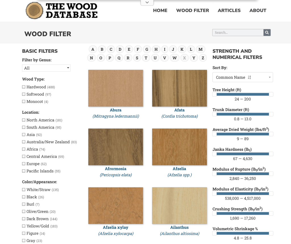
The Wood Database was created by Eric Meier in 2007 and now includes images and data for over 600 different wood species. You can search by name, type, location, appearance, and several other catagories.
Each species entry has a color photo of the wood showing grain pattern (depending on the cut orientation) as well as the scientific data as to hardness and shrinkage rates.
The information is also available in hardback book form, which can be ordered from the site, which features the data on over 350 wood types, including large color images of each species.
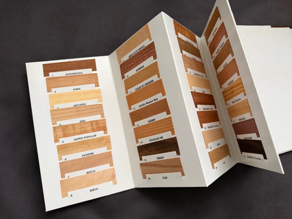
Another good reference is a book called What Wood Is That? by Herbert Edlin. The book explains basic wood characteristics and details 40 common wood types. It also includes 40 actual wood samples so that you can see a real-life sample of the types outlined.
The actual wood samples that are in What Wood Is That?
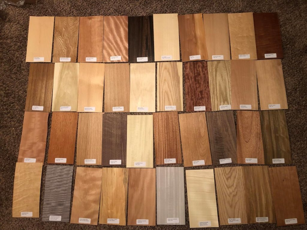
For larger wood samples to look at, I’d suggest getting a set of veneer samples like the ones below. You can find sets like the one below from various venders on Amazon. Be sure that you get a set that have labels attached for easy identification. With these, you have a piece large enough ( they are usually about 6″ x 12″) to be able to try different stains, finishes, or age to your liking.
Visualization skills are something anyone can learn. You just need to understand the basics of scale. Once you familiarize yourself with the basic scales that are used in design you can start to train your brain to correctly imagine anything and visualize it in an actual space.
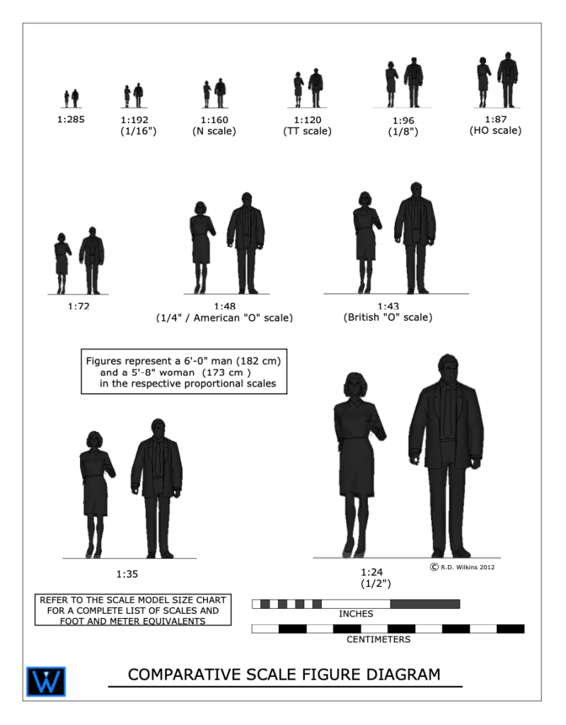
I created the diagram above for a blog article I wrote about model scale. The article was about choosing a proper scale for physical models rather than digital ones.
The article didn’t clearly explain what ‘scale’ is or how it’s used in technical drawings. It also didn’t explain the difference between a ‘scale unit equivalent’ and a ‘ratio’, or how to use scales to help you with visualize objects in your mind.
Drawing Scales
Drawing in scale is a way to clearly communicate the size of something, either physical or imagined, in a visual way to help the viewer understand the proportions and size of an object. Either on its own or in relation to other objects.
Some drawing scales are noted by using a measured unit and comparing it to a life-size unit, such as 1/4″ = 1′-0″, which is a popular scale for architectural drawings.
This means that 1/4″ as measured on the drawing is 1′-0″ in actual size.
On the diagram above you’ll see the use of scale ratios. Note the ratio of 1:48 has the 1/4″ scale in parenthesis. The ratio scales can be interpreted as dividing the full size unit into that number of divisions. If you divide 1 foot into 48 segments, each of those segments would be 1/4″ long. So, a drawing with a ratio of 1:96 would be the same as 1/8″=1′-0″. A scale of 1″=1′-0″ would be a ratio scale of 1:12, as there are 12 inches in a foot.
Look at your shoe. If you are an average size person, the length of your shoe is about 1 foot long (28 to 30cm if you use the metric system). If you wanted to draw the outline of the sole of your shoe in, let’s say 1/2″=1′-0″ scale, that would be an equivalent ratio of 1:24. 12 inches divided into 24 parts would each be 1/2″ long.
If you use the metric system you’re in luck. You don’t have to deal with a silly fractional system and you use a strictly ratio system for drawing scales.
Analog Is Best
A scale of 3/4″=1′-0″ is a very common scale for drawing architectural details, but not for designers who mainly work in the theater. Because of tradition, in the theatrical world, such as Broadway, the standard size of plans and elevations is 1/2″+1′-0″.
A detail of an elaborate doorway will obviously look much larger when drawn at the 3/4″ scale than at 1/2″ scale. If you are used to looking at details in one scale, the same details will look ‘wrong’ in the smaller or larger scale.
I worked with a designer who asked me to not draw details in 3/4″ scale because he was used to visualizing designs full-size while looking at them in 1/2″=1′-0″ scale. Seeing them in a larger scale was disconcerting for him while visualizing.
As far as visualizing in scale, seeing a drawing printed on paper is better than looking at it on a computer screen every time. In terms of viewing images on a computer screen, the screens will lie to you every second of every day, in all kinds of ways, particularly in regards to size comparisons.
Imagine you’re looking at a drawing of sofa that is drawn in 1/2″ scale, or 1:50 in metric, on a computer screen. On your desk is a drawing of a room plan in 1/4″ scale, or 1:25 in metric. If the sofa drawing was on paper you could easily convert the sofa in your mind to the smaller scale to imagine how it would fit in the room.
If the sofa drawing is on a screen, how can you be sure if the scale is correct? You can’t. Even if the software is telling you that the image is being presented in a scale that is true to the stated size, most people could not make the visual transformation unless they were very experienced in doing it.
The Packets
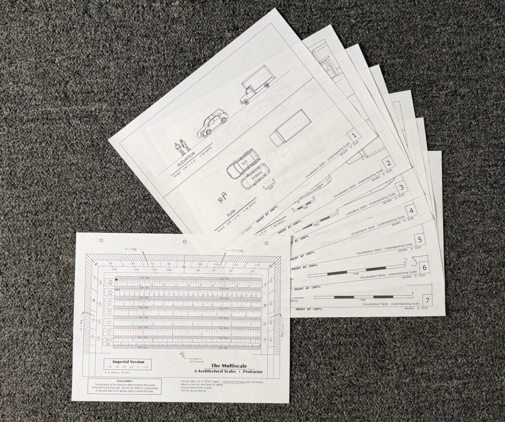
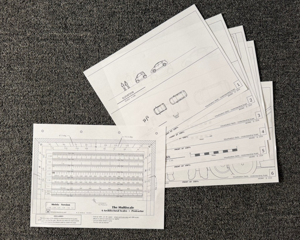
You can download the Visualization Chart packets from the links below. If you’re in the States, you want to download the packet marked “Imperial units”. If you’re anywhere else in the world that uses the non-fractional, uncomplicated, easy-to-use measuring system known as Metric, be sure to download that one.
The packet with Imperial /foot/inch scales contains 8 sheets with 5 scales: 1/8″, 1/4″, 1/2″, 3/4″, and 1″. There is also a copy of my Multiscale in the event that you don’t own an architects scale.
Print these all at 100% on letter size paper. Be sure that the print setting is at 100!
The metric packet contains 7 sheets in 4 scales: 1:100, 1:50,1:20, and 1:10. The seventh sheet is a Multiscale in metric. The Multiscale includes the 1:25 ratio which I didn’t include in the diagrams. That ratio doesn’t seem to be much used anymore. Let me know if that isn’t the case.
Print them all on A4 paper at 100%.
Using The Diagrams
Prepare The Multiscale
Print it out at 100% and check the lower scale markings against a known ruler or measuring tape to be sure it is printed correctly.
Cutout the gray areas for ease of measurement. You can also glue it to a piece of cardstock or a file folder to make it stiffer.
Exercise #1
Get familiar with the different scales. Examine the way objects look in the Plan view from above as opposed to the Elevation views from the sides. Does either view make the object, either the people or the vehicles seem different in scale?
How do they compare to each other? Place one scale sheet beside another and notice how the perceived distance caused by the smaller scales affects your perception of their proportions differently than the larger scales.
Exercise #2 – Thinking Vertically
Pick an object that’s relatively large in size such as a sofa, a piano, TV in your room. Now using the scale on the Multiscale, draw the object on the scale Elevation sheet next to the people or the vehicle.
Notice its proportion and size compared to the things on the sheet. Does it seem smaller or larger in comparison than what you visualized in your mind before to drew it?
Take a measuring tape and measure a wall of your bedroom or living room, and draw it in scale on a sheet or another piece of paper. Now look at a framed picture or mirror or wall hanging from another room or another location. Try to imagine it on your wall. measure the piece and draw it in scale on the scale wall drawing. How does it look? Does it take up the same space that you imagined it would when you visualized it on your wall?
Exercise #3 – Thinking Horizontally
Measure your bedroom or another space of your house. Now try to visualize one of the vehicles on the scale sheets appearing inside your house. Using the Plan view of the 1/4″ sheet or the 1:50, draw the floor plan of that room in the chosen scale using the Multiscale. Using pencil, you can draw the space right on the scale sheet. Does the vehicle fit in the space you measured? If it does, does the space around it seem to be the same as what you imagined, or is the space larger than what it feels like when you are standing in it?
Exercise #4 – The Teleporter In Your Head
Take the scale floor plan you’ve drawn of your room and go to a store where they have furnishings. Now look around at things like sofas, large TVs, or beds. Take a tape measure with you or use the measurements they provide at the store. Imagine them in the space.
Test your power of scale conversion by estimating the area of the floor the objects would take up. Draw them on the plan with a pencil. You will eventually be able to estimate foot or metric increments visually on a scale drawing. In 1:50, the width of the tip of a finger is about 1 meter in scale. In 1/4″ scale, the width of a finger is about 3 scale feet. The width of a thumb is 4 feet.
When you get home, test your guess. How close were you?
One of the reasons that I wrote the Wrand Film Glossary was to record many of the obscure film and entertainment industry terms that get passes down orally but are never recorded.
Art department and set construction lingo is usually not included in the typical film glossary, and “Double dap” is one of those odd terms that you will hear used by Prop Makers* but have probably never had it explained.
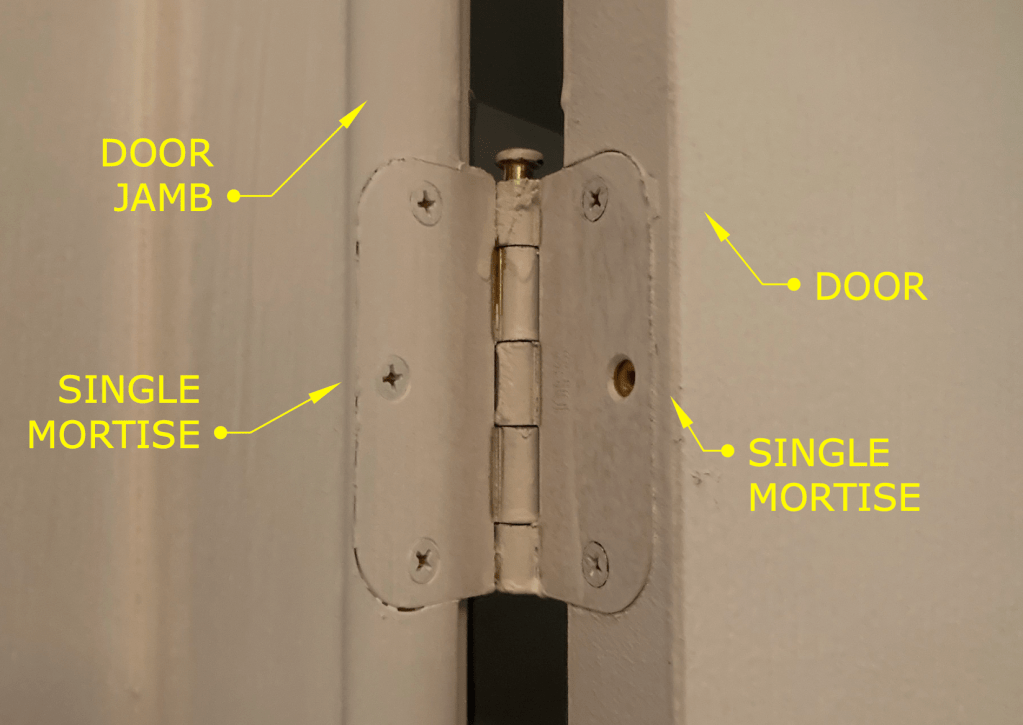
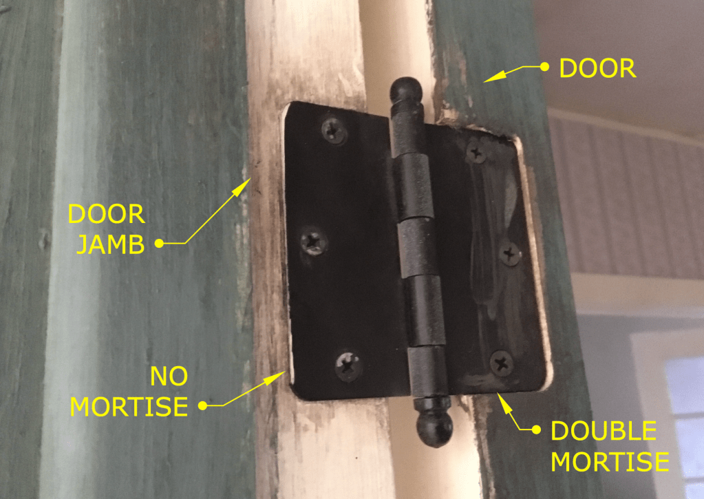
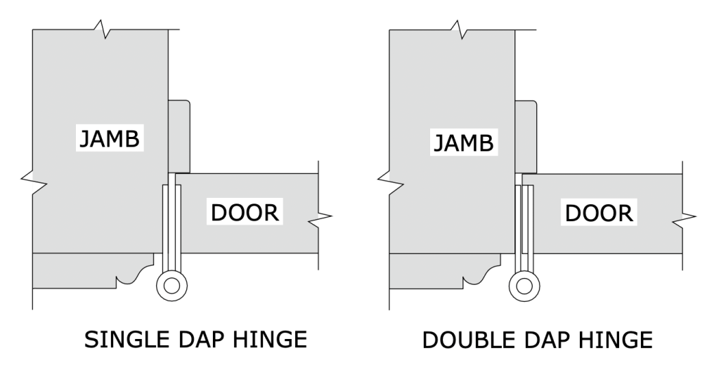
The term refers to how the hinges of a door on a stage set are to be installed. Normally the installation of hinges for a door involves creating mortises in the door stile and the jamb that match the thickness of the hinge leaves. That’s referred to as a “single dap” installation. (Note: this is specifically for doors in North America or the UK. Many Continental European doors are half-overlay and don’t use the type of leaf hinges that are standard here.)
Typical hinge installation – referred to as a Single Dap
A “double dap” installation involves creating a mortise in the door which is twice as deep as usual and not making a mortise in the jamb, as shown below.
Example of a Double Dapped hinge
The diagram below is a side-by-side plan view showing both types of installation.
So what’s the purpose of this? Well, this is something that is more typical on sets for a broadcast show than on sets for a feature film.
One advantage is speed. We tend to build sets at a pretty brisk pace, sometimes building an entire set over a weekend. For example, if you have a set with six doors, that means you need to install 18 hinges, which means routing 32 mortises. With a double dap installation you cut that number in half.
Another advantage is if you are redressing a set and need to change out the door of an opening for a different door. With a standard installation, you will need to patch and fill and re-rout three mortises. Instead you just need to fill some screw holes.
This is also the case if you need to change the swing direction of a door at the last moment. (Good luck prying off and repositioning that door stop.)
Double dapping has fallen out of favor lately. Production Designers don’t like the look of it for one thing. (Along with Phillips head screws on a period hinge!) They tend to stick out particularly when the hinges are a contrasting color from the jamb or if the wood is painted a light color and the hinges have a dark laquer/black finish. In some instances this condition can either visually hide the extra mortise depth or accentuate it.
Also, notice the round corners on the hinges in the photos. Round corner hinges are a 20th century invention to speed up production. Once machinery, i.e. routers, was being used for mortising, it became a lot faster to create hinges with leaves that didn’t require squaring off the mortise corners as was necessary for period, square hinges. Round corner hinges come in 1/4″ and 5/8″ radius corners, so be aware of what radius size they are if you’re choosing hinges for a door that has already been mortised.
Note: Prop Maker is a designation for a union stage carpenter in Los Angeles to differentiate them from a ‘civilian’ carpenter. They are trained it building theatrical scenery of all types and historical periods and specialize in creating scenery for film productions. They are more similar to cabinet makers than a typical carpenter and are skilled in construction techniques and methods that would baffle most people outside the entertainment industry.
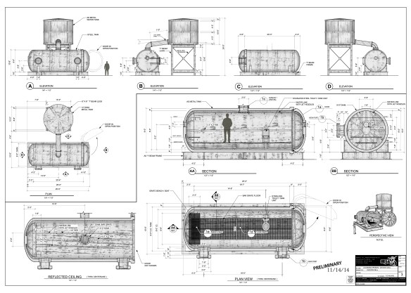
The look of construction drawings for film and television has changed a lot over the years, particularly now that most drawings are done digitally with computers rather than by hand.
While many current drawing styles now incorporate photo-textures, shadows, and icons to add life to drawings beyond what is typical of architectural drawings, it’s hard for them to match the aesthetics of hand drawings.
CAD drawing from 3D model – photo textures applied
Having started as a pencil draftsman I guess I do have a bit of a personal bias, but the unique style of each person on a hand-drafted drawing was immediately recognizable to people who knew their work.
Before digital illustrations and renders of 3D models, hand-drafted drawings had to serve as a design sales tool as well as instructions for scenery construction.
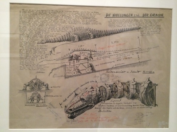
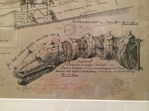
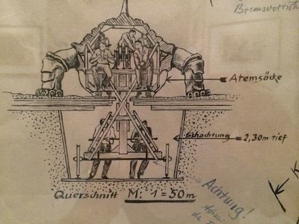
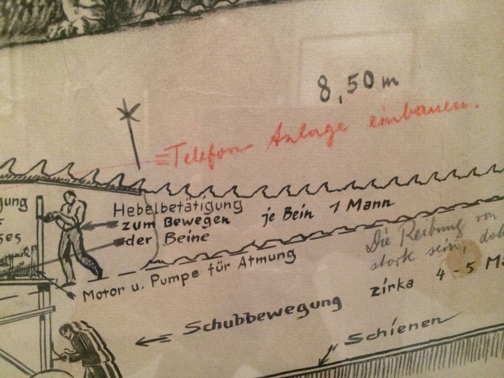
Here are some shots of a set design by Erich Kettlehut in 1923 for the UFA film, Die Nibelungen, for the scene where Siegfried kills the dragon.
The drawing was displayed as part of an exhibition of artwork from the UFA silent film period of the 1920s and 30s at the Los Angeles County Museum of Art in 2014. The drawing is from the collection of La Cinématiquè Française in Paris, France.
Note that the drawing not only provides a pictorial description of what the dragon should look like, but calls out dimensions, construction materials, how the action prop is to be operated, surrounding scenery requirements, and specific technical details of mechanical movements.
Technical drawing of the Dragon by Art Director Erich Kettelhut – ink and pencil on vellumKettelhut called out the length of the neck as well as the tension springs, framework, control cables and hoses required for the creatures fiery breath. He calls out “only rubber!” for the mouth area.The size and depth of the recessed path required for the props operators.drawing describing how each part of the dragon was to be operated by stagehands.Note in red indicates that a telephone/communication system needs to be added to the prop for the crew.
The scene where Siegfried slays the dragon in Die Niebelungen from 1923
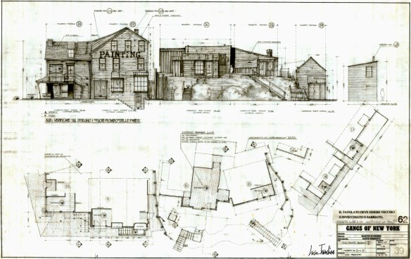
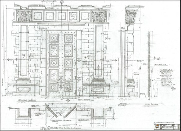
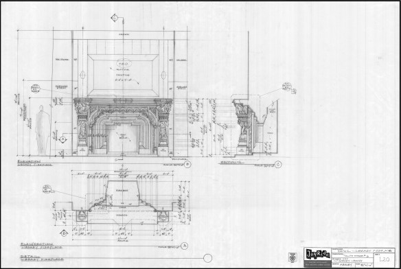
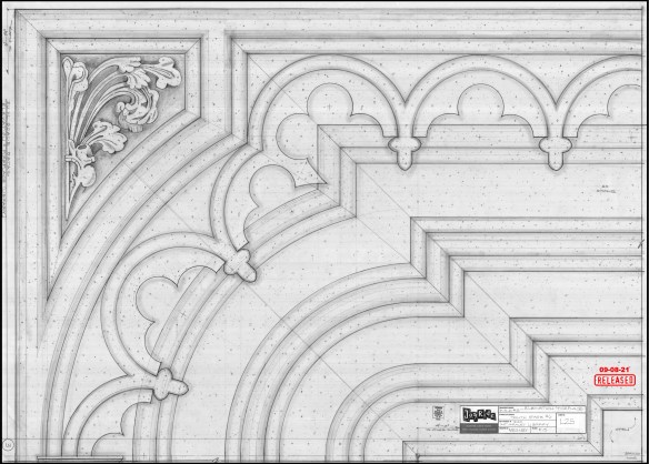
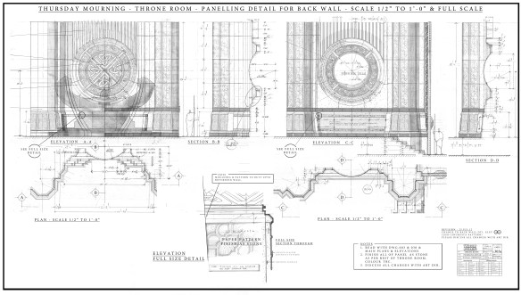
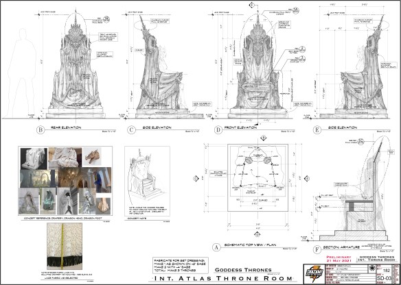
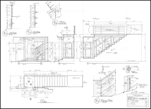
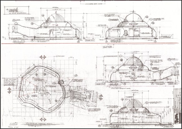
Here are a few more hand-drafted pencil drawings from more recent films:
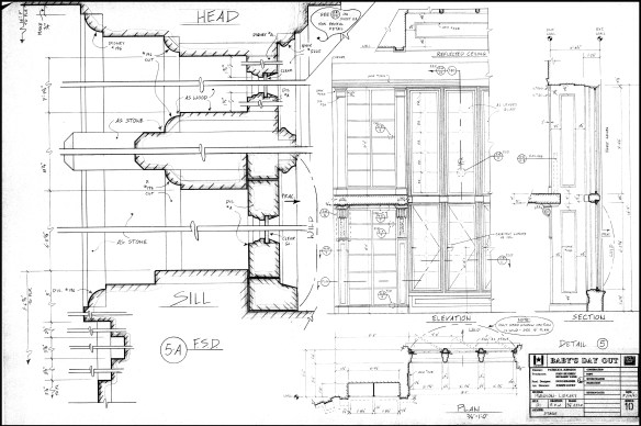
Salem – drawing by William Ladd SkinnerGangs Of New York – drawing by Luca TranchinoShazam – drawing by Greg PapaliaHaunted Mansion – drawing by Barbara MesneyHaunted Mansion – full size detail of fireplace for the plasterersThor – drawing by Oli GoodierShazam – drawing by Stella VaccaroDisturbia – drawing by RD WilkinsHaunted Mansion – drawing by Hugo SantiagoBaby’s Day Out – window detail
I was listening to the radio, looking out at the clouds and remembering the weather reports that David Lynch used to do each morning on NPR from his house on Mulholland Drive here in Los Angeles. It was at about that moment that I heard the announcement that he had passed away.
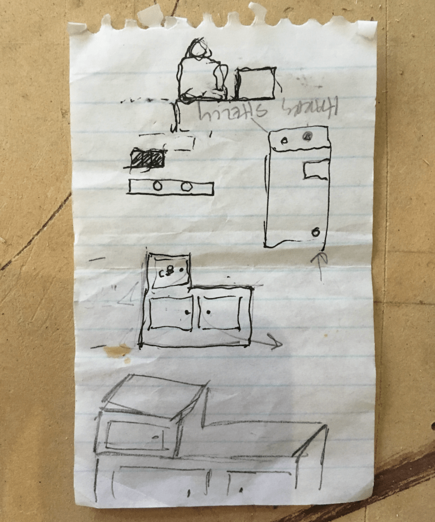
I’d been flipping through photos on my phone the day before when I found a shot of a crumpled piece of notepad paper. On it was a small sketch in black ink and pencil with some cryptic notes.
Years ago when I was working on a show on the Paramount Studios lot, I was walking through the mill when I saw a friend who waved me over to his work bench. He pulled a piece of paper from his tool bag and smoothed it out on the table.
I looked at it and squinted. “What is it?”, I asked him.
Sketch for set dressing by David Lynch
“It’s a sketch from David Lynch, he wants me to build it for a scene.” He described the conversation that had happened just a few minutes before. Lynch had come down from his office and searched him out, and conspiratorially explained to him what he needed for the scene the next day.
The sketch was of a small wooden storage unit that would fit between the front bucket seats of a van. He had explained to him in careful detail exactly what the unit had to do and the practical parts that were required to work in the scene.
“Where’s the construction drawing?”, I asked him, looking around at the plan bench. “This is it”, he said. When the Transportation Department delivered the van to the lot, he would measure the interior to see what size the box needed to be. Lynch trusted that he understood what it was he wanted and would follow through.
Suddenly everything I had heard about David from his early days at The American Film Institute was making sense. A common frustration for directors, particularly ones who are artists, is to have a last-minute idea and know that the normal steps you have to take through a film company hierarchy don’t always produce results as quickly as you want them to.
Instead of going to the Production Designer with his request, which would then get passed to an Art Director, who would then get a Set Designer to measure the vehicle, model the box for approval and then create a construction drawing, Lynch made a quick sketch and went directly to the guy who he knew would end up building it. Voila. Complex process streamlined.
In 1970, Lynch applied to The American Film Institute Conservatory by submitting a short film he had made and was offered the opportunity to attend as well as the money to make a short film he had planned for some time whose cost to produce was beyond his means.
He received a call from Tony Vellani, the director of the school, who offered him a place at the Conservatory and $7,200 to make the film.
At AFI, Lynch started work on a film called Gardenback, but was so frustrated in the process by what he felt were constant interference’s that he left at the beginning of his second year.
Vellani and others of the school administration felt that he was one of their best students and convinced him to come back by promising that he could finish his film without any more interference. He abandoned Gardenback and started on another film that would become the feature-length film, Eraserhead.
The poster for Eraserhead – Libra Films International 1977
Initially the concept for the film was opposed by several of the AFI administrators who felt that it veered too far from the typical Hollywood narrative film, but they finally relented when the dean, Frank Daniel, threatened to resign if they vetoed it. The story is said to be inspired by Lynches own fear of fatherhood and his experiences living in a crime-ridden neighborhood in Philadelphia while going to college. Shot over a period of nearly four years, the surreal horror film was initially panned by most critics but became a midnight movie cult favorite along with films like The Rocky Horror Picture Show.
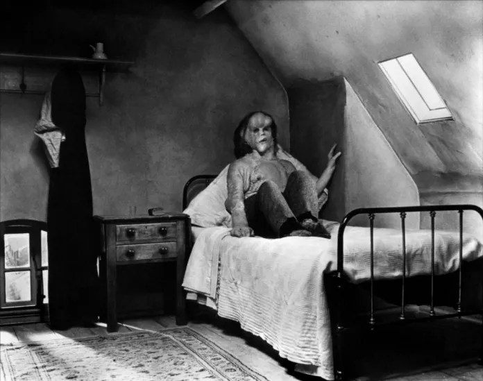
I knew the film led to his being tapped by Mel Brooks to direct The Elephant Man which was one of my favorites but I didn’t see it until years after Elephant Man had been released. At first I was shocked by how different they were in tone from each other but later I started to appreciate the mind that had imagined it and began to see threads of commonality.
Still from The Elephant Man – Paramount Pictures 1980
Vellani would often talk about Lynch when I was a Directing Fellow at AFI in the mid 1980s. He once told me that he considered David to be the most naturally gifted filmmaker he had ever met.
I had always heard that David didn’t like to talk about his films too much and brushed aside questions that required him to explain endings or motivations, which made me wonder how he had dealt with the AFI critique sessions.
The typical sequence of film projects at The American Institute Conservatory was that Directing Fellows made three films the first year. On the completion date the film is screened before the entire school for critique.
At the end of the screening, The director, writer and producer were seated at the front of the room with Tony Vellani who gave the director an intense look and asked, “What is the premise?” Your response was supposed to be a three or four word answer in the pattern of, “Blank leads to blank“, as in “Betrayal leads to tragedy”, condensing the dramatic structure of the story into as few words as possible. The film was judged primarily on how successfully you had fulfilled the goal of matching the final film to its premise.
Knowing of Lynch’s reported distaste for being pinned down on story points, I wondered how he maneuvered through this process when his film was critiqued at the school.
Vellani said that he had gone to Mexico and Davids invitation to visit him at the Churubusco Studios in Mexico City while he was shooting Dune. He described how he was trailed by an army of people. Producers, Art Directors, and ADs. He said he looked uncomfortable and distracted by this entourage and it reminded him of the early 70s at AFI when David was there shooting Eraserhead. They had taken over some stables near the Doheny Mansion in Beverly Hills where the conservatory was originally located and turned them into their stage space.
Tony had brought a group of AFI dignitaries and financial supporters to view the students in the process of making their films and he arrived with these guests, unannounced, to watch David shoot a scene. After a few knocks on the ‘stage’ door, it opened slightly and Lynch stuck his head out, surprised to see the group.
Vellani explained the reason for their visit and introduced the visitors. He said David listened politely and then said simply, “Sorry, it’s a closed set”, and shut the door.
Jeesh, it’s been ten years since my last gift guide and I’m getting it out a little late this year, but some of the same items are still here on the list, mainly the classic tools and books that never become obsolete, (like a lot of software programs do).
I don’t receive any money from these recommendations. These are books and tools that I own and use often.
My Must-Have Tools For Film Designers
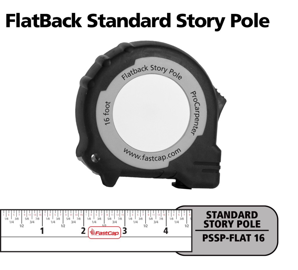
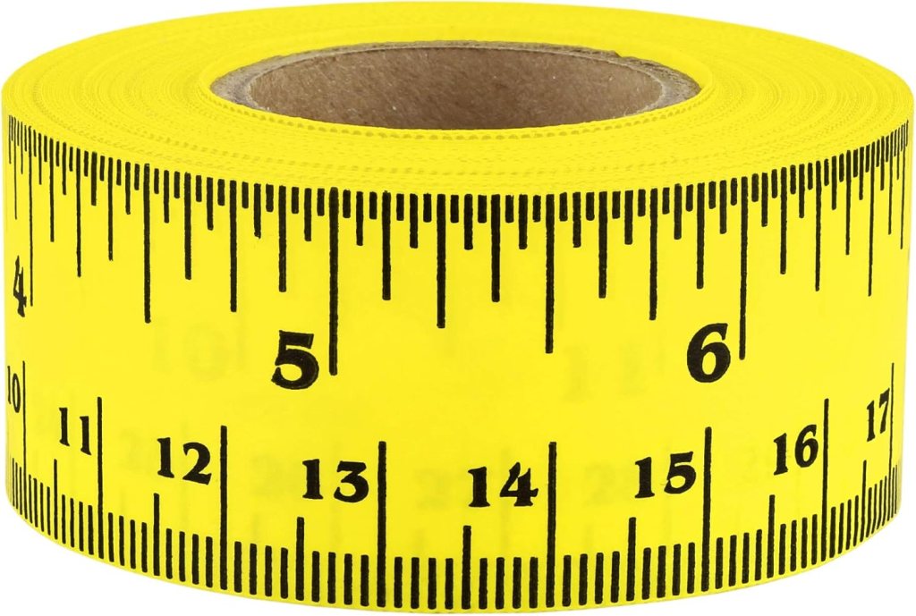
FastCap Flat Back Tape – You can not only measure round or curved surfaces but it has a blank area to write on for use as a story pole. – $10.00
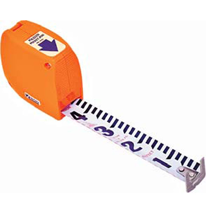
Keson Pocket Rod– These are so essential for site surveys that I have four of them. They come in Architect and Engineer models. – $20.00
6″ Digital Calipers – Like these, there are many manufactures. (Avoid any priced under $20.00.) – Must-have tool for doing photo scaling (see article) – about $24.00
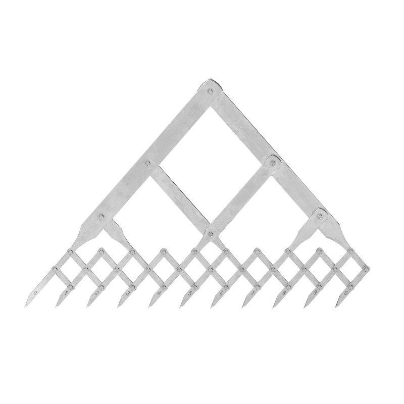
Equal Space Dividers – great for not only photo scaling but for designing in general. They run the gamut in price from these to these. $220 to $24.00
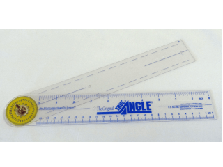
True Angle – Multi-use tool for measuring and transferring angles. lightweight. – 12″ -$16.00
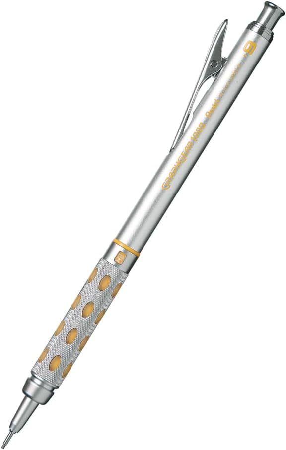
GraphGear 1000 – Mechanical pencils, my new favorite brand. These are great because the barrel sleeve retracts into the pencil to protect it. Comes in .3, .4, .5, .7, and .9mm leads. About $9.00
Compass – So many to choose from, (and a lot of crappy ones are in the mix). This one is a good all-around basic, practical compass that will last a while. $14.00
Still my favorite design and furniture book publisher. Here are my recommendations:
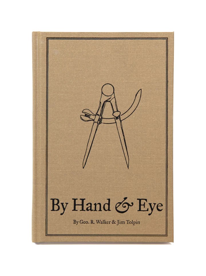
By Hand & Eye – $51.00. Another gem from Lost Art Press, this is probably one of the best design books written in the last 100 years. It outlines the world of design without a rule and using only dividers and proportional methods. I covered this in a previous post and always recommend it. Buy this and a good pair of second hand dividers from Ebay and you will completely change the way you think about design.
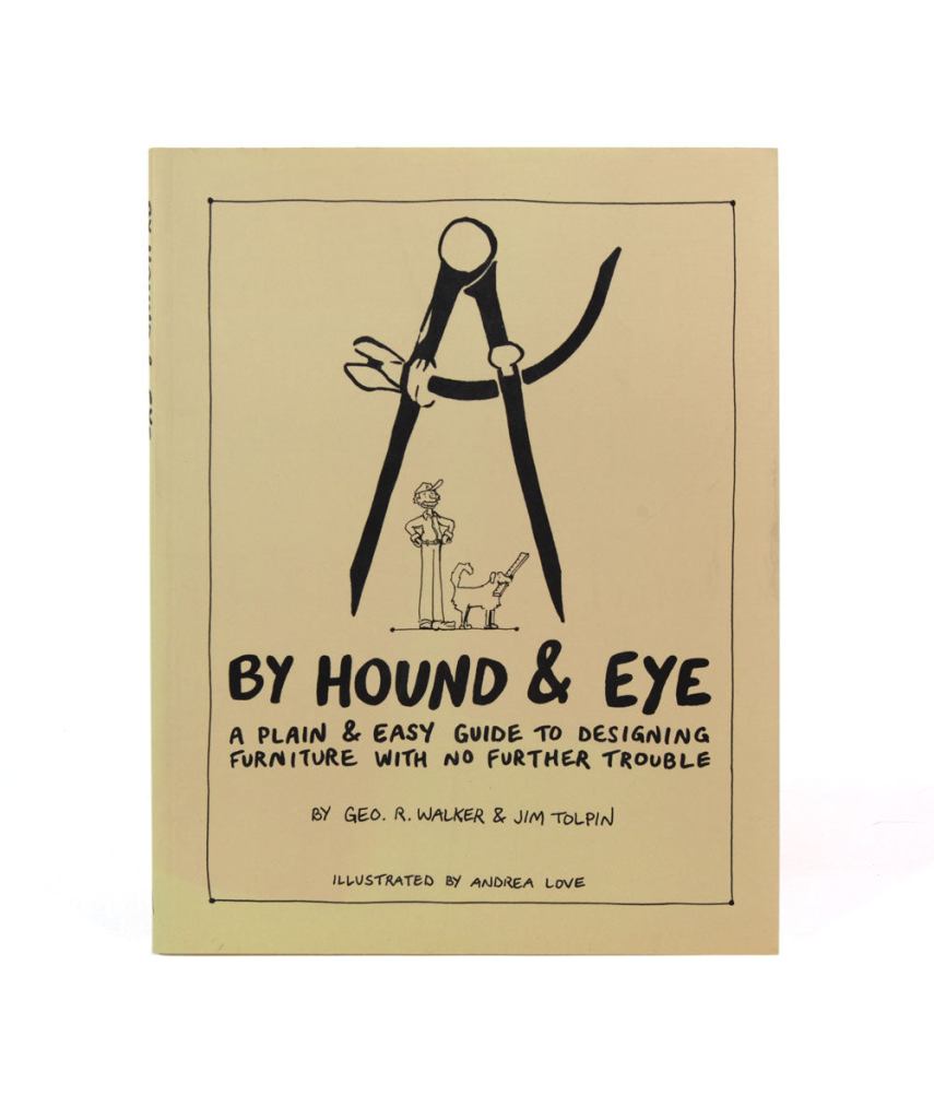
By Hound & Eye – $31.00. A companion workbook to By Hand & Eye.
A Field Guide To American Houses – Virginia Savage McAlester
Stair Builders Handbook – T.W. Love
Backstage Handbook – Paul Carter
American Cinematographers Manual – ASC Press
The VES Handbook of Visual Effects – VES Society
Designer Drafting For The Entertainment World – Patricia Woodbridge
The Classical Orders Of Architecture – Robert Chitham
Illustrated Cabinet Making – Bill Hylton
Styles Of Ornament – Alexander Speltz
McKay’s Building Construction – W.B. McKay
Neufert – Architects’ Data – Granada Publishing
Geometry Of Design – Kimberly Elam
Really, Really Last Minute Gifts
When you realize you’ve really screwed up and forgotten someone and have no time to run to the store, much less order anything, you can always gift a good app.
Log onto the Apple or Android store and gift your so-important-you-forgot-about-them friend one of these apps and your reputation will be saved:
“Every scene you will ever act begins in the middle. . . .” Michael Shurtleff
The casting director Michael Shurtleff wrote a book called “Audition”, which is a kind of roadmap for actors to use when preparing to try out for a part for a film or theatrical play. It lays out the basics of determining the psychological elements of a scene, even if the actor has only been given a single page from the script.
(An aside: if you really want to understand script breakdown, take an acting class. It will give you a new appreciation of actors too. Do that one better and go out for an audition, and then imagine doing that a dozen times a week for the rest of your career.)
One of the Guideposts in the book is titled, The Moment Before. Shurtleff explains that a scene always starts the middle of a situation. It’s the actors job to figure out what events came before, because a lot of times that information isn’t in the script. A general outline might be there but the small details are missing.
What just happened?
With films, a lot of the ‘personality’ of a set is the work of the Set Decorator. They give life to the structure of the scenery, and it’s a big reason why they share Oscar and Emmy awards with the Production Designer.
But you can only put so much lipstick and mascara on a goat, and if the sets ‘bones’ aren’t great, something big will be missing.
What does your set say about itself once the construction and paint crews are finished, before the set decoration crew even starts?
What happened in this room a week ago? A year ago? Twenty years ago? Was the house built before the development of modern plumbing? Do the mouldings indicate that it was built before electric power was available, and the “new” type of special moulding now hides the wires that snake along the baseboard and up corners of the room?
Once the set is dressed and filmed, are there elements that will stand out or tell a story about the “envelope” beyond the dressing?
When I look at empty houses I always look for the signs of past human lifetimes. Most buildings will survive 4 or more owners, or generations. They all have their scars from surviving their inhabitants; the bad remodels and additions that don’t match, bad repair jobs or damage that was never repaired.
I got to tour a historic house from the 1830’s that was built in the Greek Revival style and was shocked when I saw the front parlor room. The second owners wife was tired of the classical design and had the room renovated in the then-current 1890’s late Victorian “Eastlake” style. The contrast couldn’t have been more odd if they had redone the room in a Mid-Century Modern style.
The historical society who owned the house decided that the Victorian remodel of the room was part of the history of the building and voted to not return the room to its original configuration. It may have not been ‘true’ to the origins of the house but it defined the ‘human experience’ that the home had gone through. It was some of the ‘finger prints’ that its inhabitants had left behind.
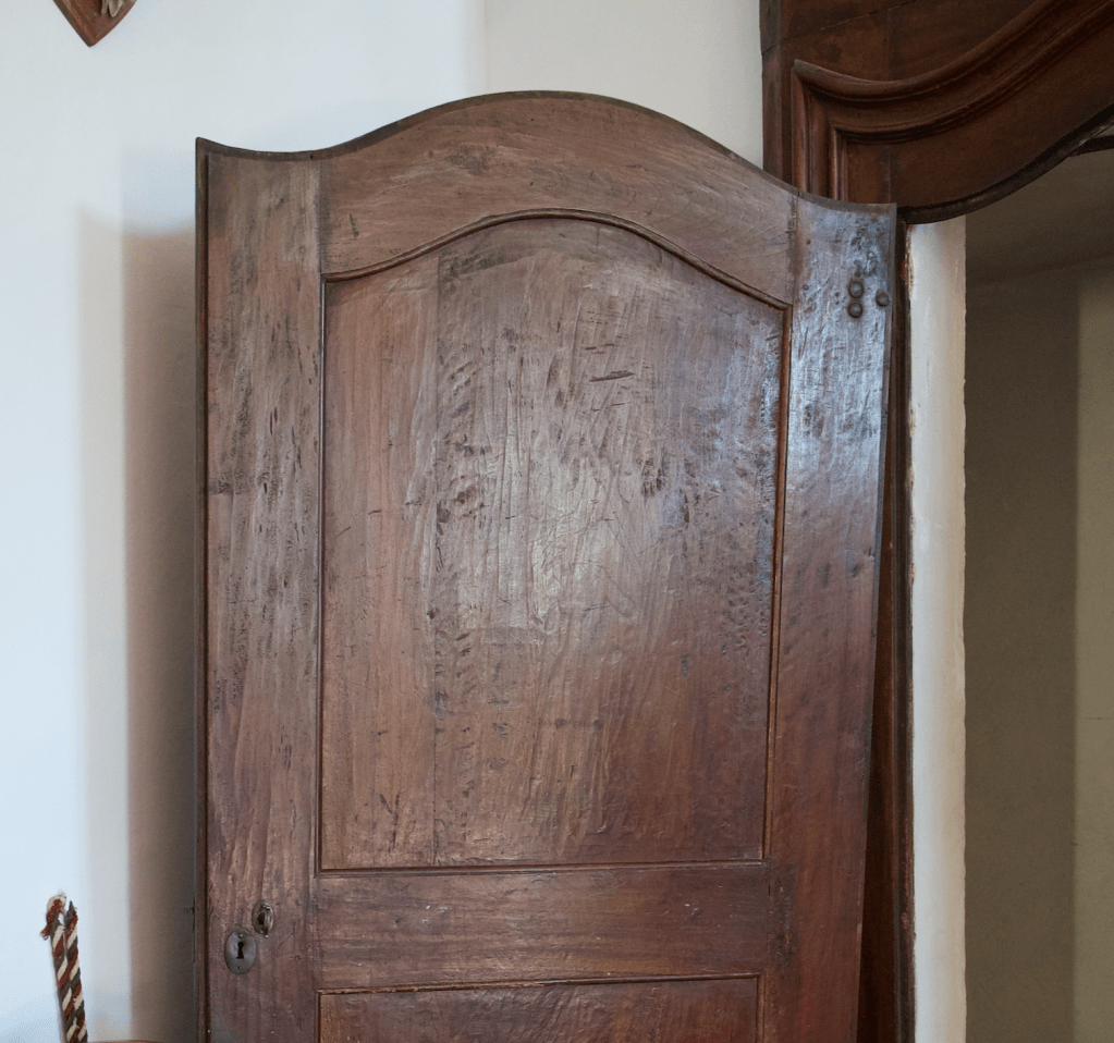
This is a photo of a door in a friends families 900 year old Castello in Northern Italy. I wondered about the deep gouges in the upper panel and they told me that they were a remnant from several hundred years before during a hasty removal of a carved crest that hinted at support of a then out-of-favor monarch.
The details of a set don’t have to be that subtle. It could be a bricked up window, a stairway in an odd but obviously not original location. or maybe the wallpaper in a room is torn in one corner, revealing three other layers behind it, or there are scorch marks on the wooden kitchen floor in front of the stove where a red hot cast iron skillet was dropped.
The ‘character’ can certainly come from the paint and age that the scenics apply and sometimes there is even more you can add. One person told me about arriving on a stage set one day for a shoot in a period kitchen set to find the Production Designer Dean Tavolaris bending over the tile counter with a one pound can of Crisco shortening, rubbing handfuls of the stuff in the corners and between the sink and stove.
Actors will often create past stories of their characters for themselves to help them flesh out the role that will give them personal emotional substance to draw on for their portrayal. This is information just for themselves and a lot of times they don’t feel the need to share it with anyone else, but it gives their performance extra ‘bones’.
As a designer you can do the same with a set. You can create the environment’s past lives that may have nothing to do with the story in the script but it will give it a reality that will make it feel like it hasn’t just materialized suddenly out of thin air, which, as scenery, it pretty much has. We think of spacecraft as modern, sterile environments that don’t have much character. Star Wars changed all that with some spacecraft that were past their expiration date and bore the marks of abuse and mechanical failure. It made them more lifelike and less like machines.
Whether you share that ‘history’ with anyone else is entirely up to you, but if you can tie it into the story or at least make it an interesting part of the design, it can help you sell your ideas to a director who will most likely appreciate that you are bringing a depth to the film that they hadn’t thought about.
That work will come from really analyzing the script, and there isn’t always a lot of time to do that. But, you can learn shortcuts, and that’s a whole other blog article.
For starters, I suggest these: Audition, by Michael Shurtleff, and the chapter on script analysis in Directing Actors, the first book from my absolutely favorite directing teacher, Judith Weston.
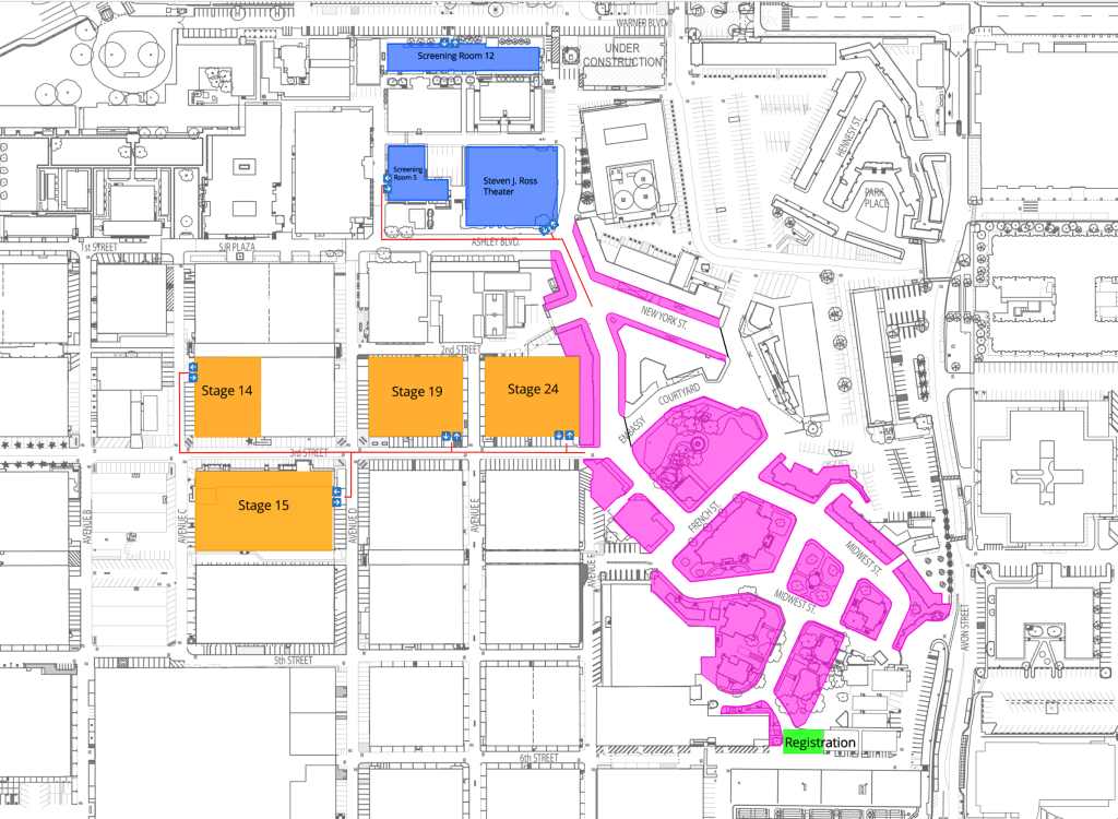
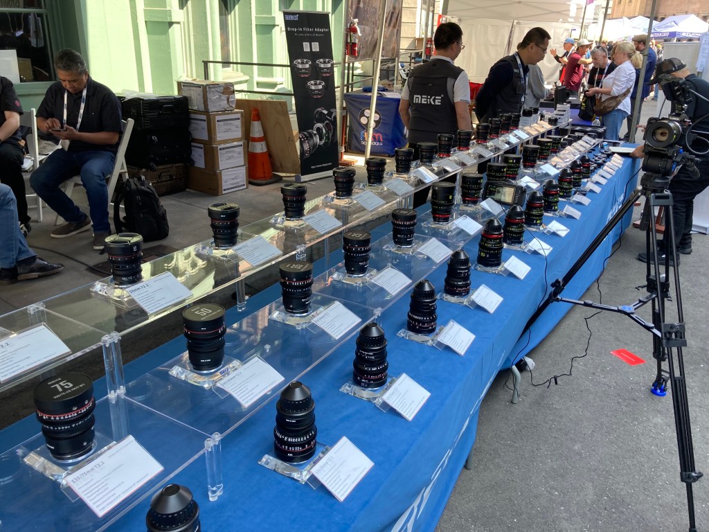
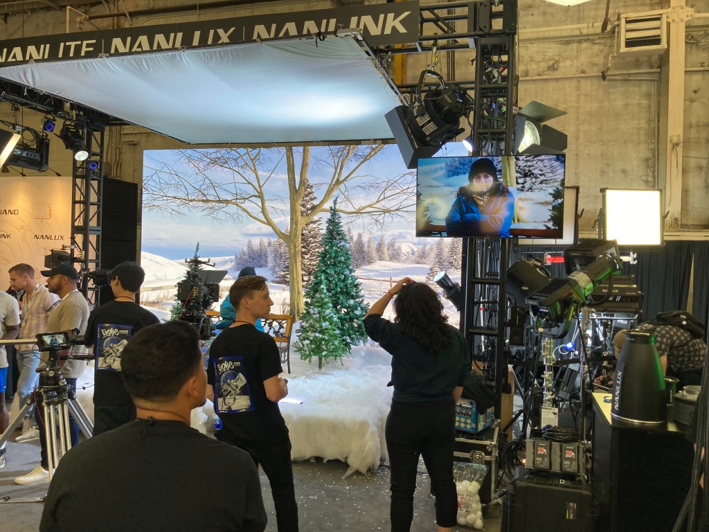
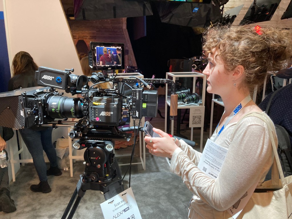
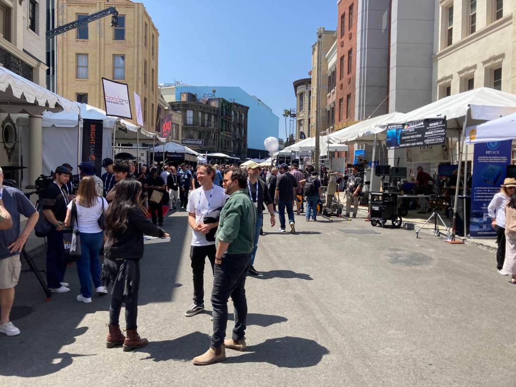
The Cine Gear Expo will be held at Warner Bros Studios from June 7th to the 9th this year after a long run in past years at Paramount Studios.
The event has finally returned to its pre-pandemic size and has been a must-attend event for cinematographers, gaffers, and technicians in the entertainment industry for some time.
This year’s event will feature exhibits, demonstrations, and presentations by over 250 vendors as well as special seminars and master classes. The exhibition area will fill most of the Warner Studios backlot area as well as stages 14, 15, 19, and 24.
The Reasons You Should Go
Maybe you’re not that interested in camera or lighting equipment, so you’re wondering why you should bother attending. You may not be excited right now by the latest in what the new technology has to offer but you should be, because it affects your job whether you want to believe it or not.
The technological leaps that have been made in the last few years in LED lighting and new digital camera sensors alone have transformed filmmaking and, by proximity, the way stage sets are perceived, shot, and expected to perform.
You ignore camera and lighting technology at your own career’s peril.
There are hundreds of vendors there who are very eager to help you understand what their products are and how they work. You really shouldn’t be intimidated if you aren’t familiar with the basics, they are there to educate you in the new ways of making ‘pictures’.
Think of it as a free weekend film class where the ‘instructors’ are eager to answer any questions you might have. Think of the times you’ve been curious or baffled by the terms a DP is tossing around and being afraid to admit that you have no idea what they’re talking about.
At the expo, you’ll not only get to see the latest cameras up close, but you can operate them too. The next time you want to play with a new Arri or Sony, it’ll cost you $800 or more in daily rental fees, plus insurance. Here you can see them all, in one place, and talk to people who are experts in everything about them. You will never see so many cameras and lenses in one place anywhere else.
You’ll also see the latest in lighting, new LED volumes, digital screens, cranes, and specialty equipment.
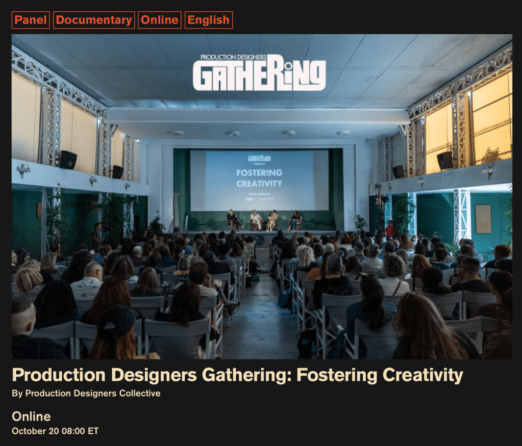
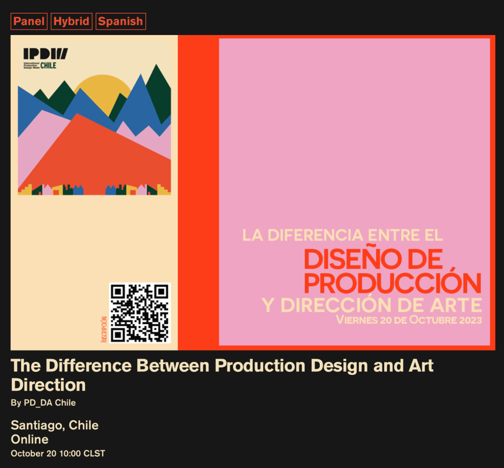
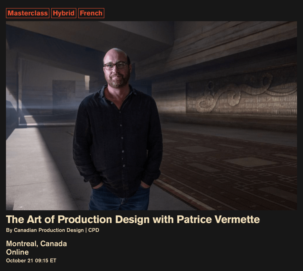
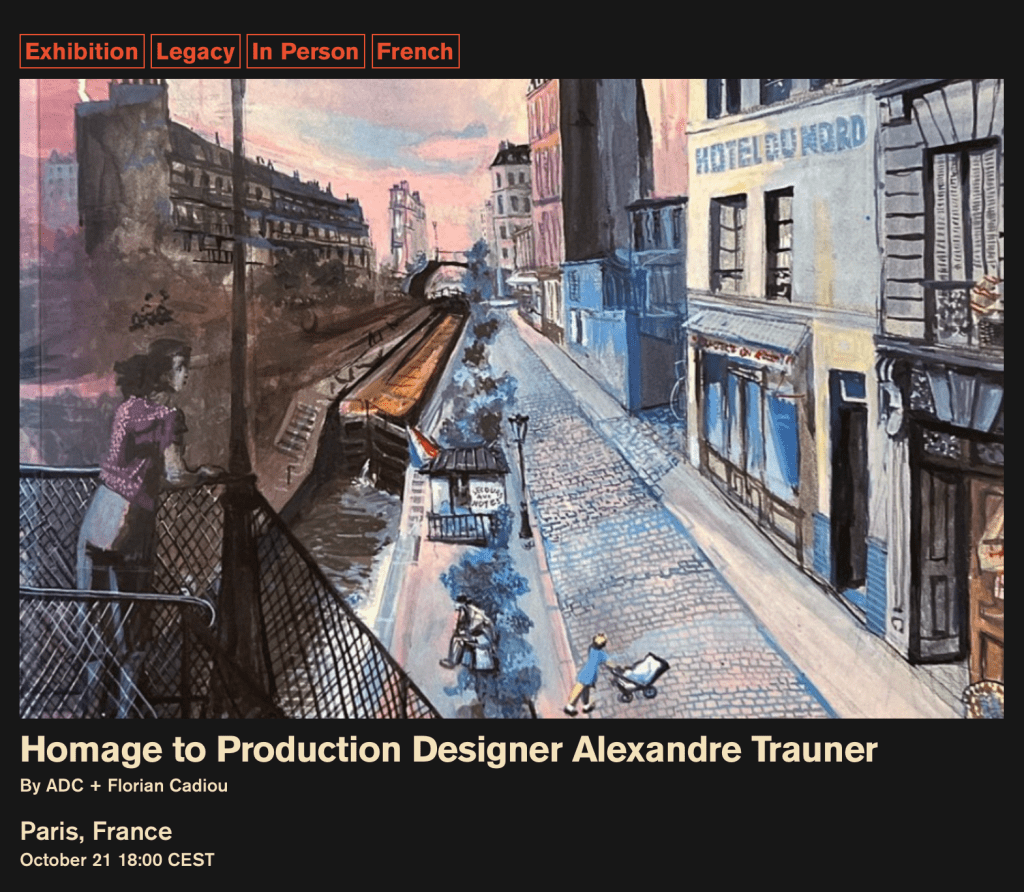
This is the first day of the International Production Design Week events that have been organized and curated by the Production Designers Collective, an international group of Production Designers whose mission is to be a hub for designers from around the world and to elevate the profession by bringing awareness and acknowledgment of the craft of art direction around the world to the public’s awareness.
The nine day series features nearly 200 seminars, exhibitions, meetups, tours, and lectures with acclaimed Production Designers from 27 countries. Some of the events are presented online for viewing from anywhere while others are held in specific sites for a live audience.
Here is the link to the schedule of events which is searchable by day, city, language, and event category.
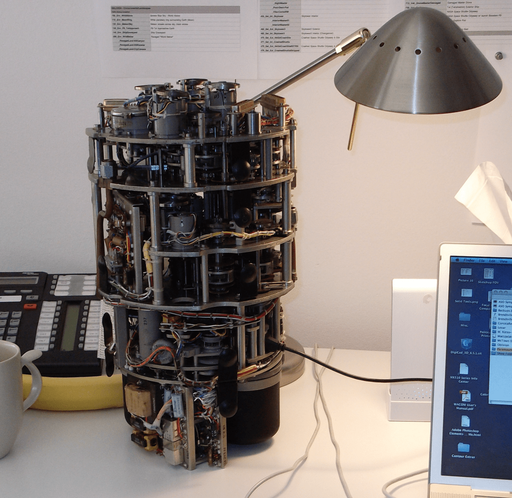
The Must-Have Desktop Device of The Future? Coming in 2028 – The all-in-one 100 Petabyte AI generator, espresso machine, and desk lamp.
The topic of AI-generated content has suddenly dominated the news, or at least as far as the entertainment business is concerned. The subject is certainly a factor in the recent Writer’s Guild strike that is now in progress as it’s one of the sticking points that caused negotiations with the studios and the producers to break down, and not without unrealistic concerns on the Guild’s part.
The discussions around AI-generated content have been percolating in the background for some time but only recently has it seemed that people are taking it seriously. At first, it was just educators who were worried about students using ChatGTP to generate papers or do tests for them. But now several fake Drake songs and a photographer winning a photo contest with an AI-generated picture have suddenly focused the public’s attention on the possibilities.
Photo: AI image by Boris Eldagsen
If the studios can eliminate or minimize writer’s contributions to story and script development, how long will it be before they eliminate actual designers from the process? Are Art Departments seeing their extinction on the horizon?
Twenty years ago the Film industry, at least from the Art Department’s perspective, looked askance at computers. They weren’t to be trusted. The secret fear was that once they became ensconced in the design part of the industry, a lot of work would evaporate. Once something ( a location, a set, a detail drawing) was committed to digital information, jobs would begin to evaporate. The exact opposite happened.
The idea that digital information is permanent, for one thing, is now hysterical. For another, the idea that they would reduce the need for individuals is also funny. The possibilities for design exploded. Now you could do many versions of versions in less time, create renders of drawings and models, create visual displays that would have been unthinkable before. The average size of Art Departments on most medium to larger films has doubled, sometimes even tripled. You need people to generate all that work and now that process is the norm. On one feature not long ago there were over twenty Set Designers and a dozen Illustrators where there would have been a third of that number before.
As for the permanence of digital information, that happens only with excellent human oversight. On one feature we were instructed to copy all of our files to two different external hard drives for safety and to ensure the files would be available for the film sequel. We assumed that by doing so we were pretty much insuring that we wouldn’t be working on said sequel.
A year later I got a call asking if I was available to work on the sequel. It seems that one of the hard drives had gone missing. The other one was located but wouldn’t be of any use. The person responsible for keeping it safe had decided that they needed to back up their music library, and rather than spend $50 on a new hard drive, had erased what I estimated to be over $1,000,000 worth of design work. We were all hired back to redraw what we had drawn once before.
Had the drawings been done on vellum, they could have just pulled the sheets out of the file and made new prints. Which medium is more ‘permanent’?
A recent article at the Center For Data Innovation website outlines the issues that people are commenting about when dealing with AI. The author, Daniel Castro, argues that people are worrying about the wrong issues when discussing AI.
He argues that while AI systems should certainly not be exempt from complying with intellectual property (IP) laws, they should also not be held to a higher standard than humans are when it comes to ‘artistic influence’, as it were. he argues that AL will create more opportunities for artistic creation and that training AL software with copywritten images is no different than what humans do when they are influenced by artwork and music when creating new work.
Ed Sheeran recently won a lawsuit brought against him for supposedly copying a Grammy-winning song by Marvin Gaye. Sheeran defended himself by noting that the same chord structure and melody he used in his song was common to hundreds of other songs which were similar but yet different.
The case was watched very carefully by the music industry as well as artists everywhere, as it would have had a huge stifling effect on music creation as well as future artistic work if Sheeran had lost.
Current laws do not make it illegal to create generative AI work that is similar to another piece of art or image, but they do prevent the creation of a work that is identical or nearly identical to another work. Of course that description of what constitutes as a copy has the danger of veering into a very subjective territory.
In his article Castro makes the point that rather than limit the pool of information that AI has access to in creating generative artwork, it is incumbent on policymakers to strengthen and enforce IP laws, which would protect artists in other ways as well.
There may be a time when a producer or director decides to “pre-design’ a show using AI technology. Architects and Interior Designers are using it now to create basic designs and floor plans. But I think its usefulness is limited. Without a deep knowledge of stage work, period design, an understanding of the story, technical knowledge and an artistic eye, much less personal aesthetics, drawing ability, and color sense, with generative AI you will basically have an interesting collage /scrapbook instead of a fully thought-out design.