Trains are one of those set pieces that don’t get used often anymore and reference for early period trains isn’t always easy to find. My train reference usually gets buried on a back shelf of my library and I have to unearth it when a design comes along that involves a train car or a scene that requires recreating railroad scenes.
These two books are the most complete that I’ve found when I need to create details for a train car build or most any other information on late 19th to early 20th century railroad systems.
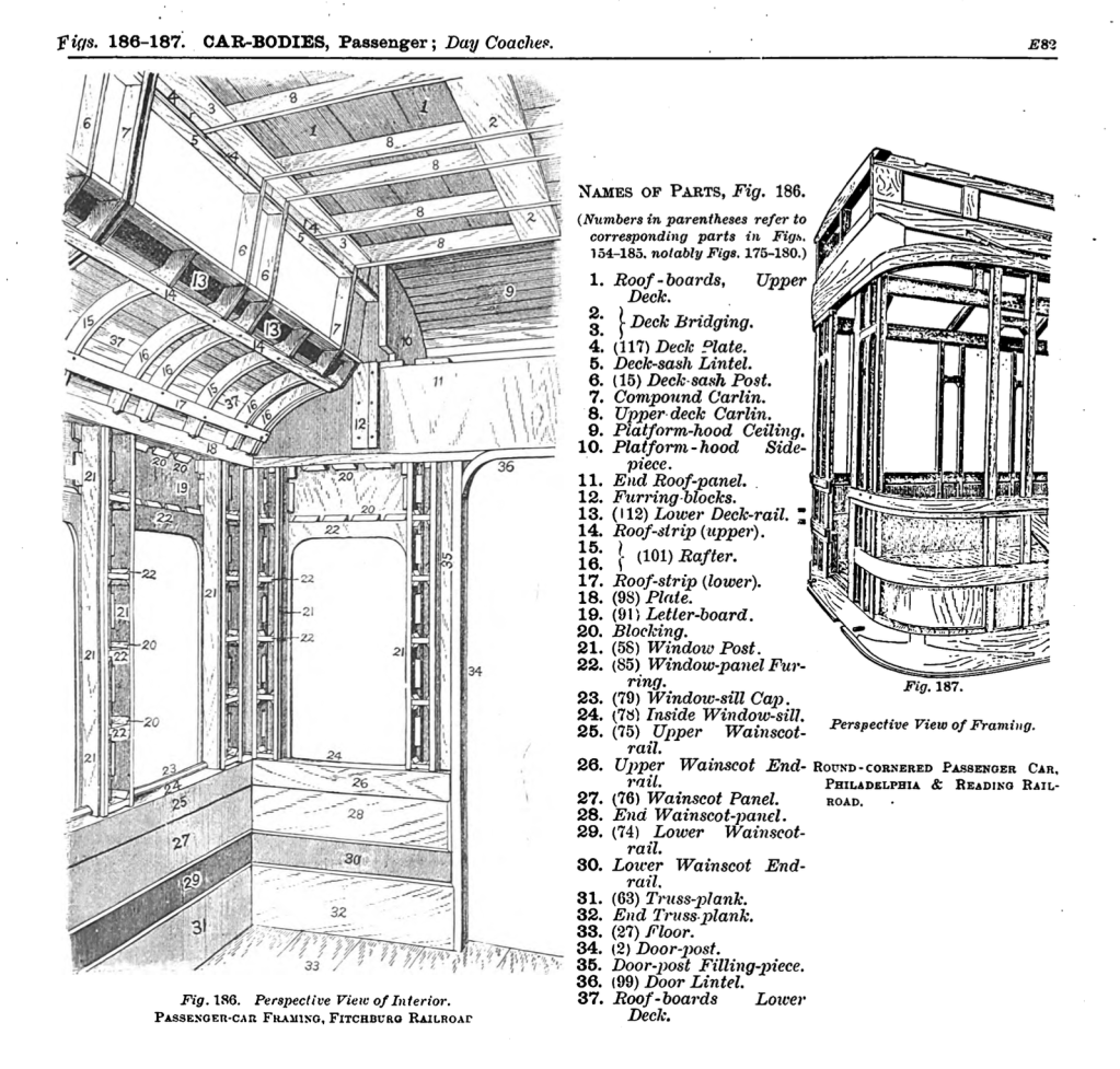
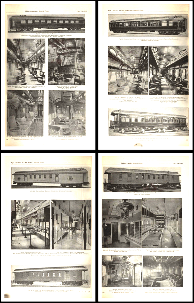
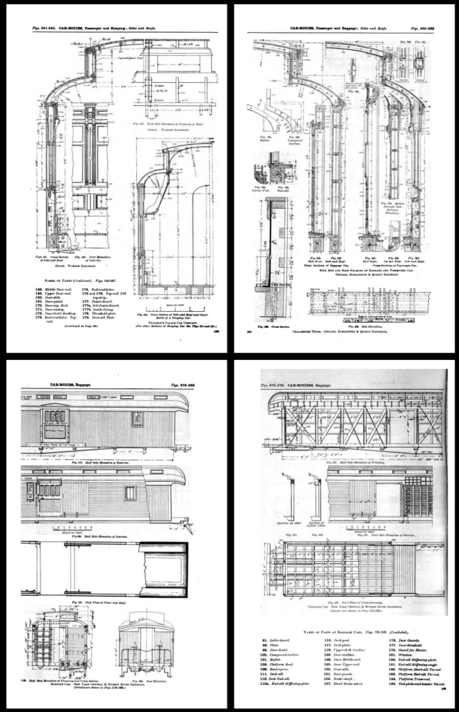
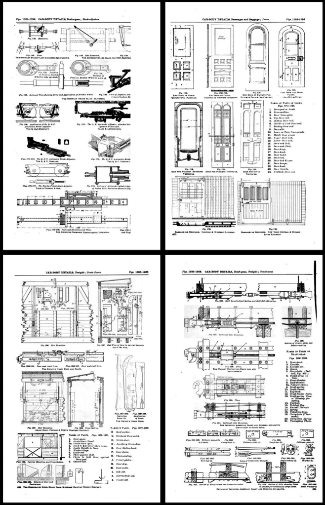
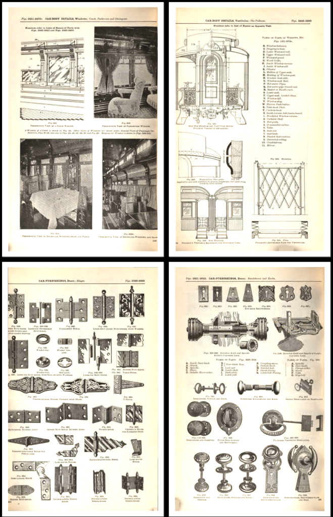
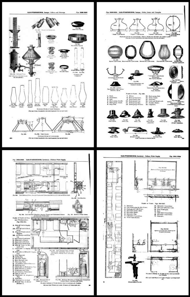
The first is The Car-Builders Dictionary, which is now in a digital format. It’s a 680 page book that includes pretty much anything I have ever needed to know about railroad cars of that period. The book includes a 200 page glossary as well as scale drawings and perspective views of almost all passenger and freight cars, including street cars, both American and English.
There are scale drawings, plans, and sections of cars to show construction and layout. There are also photographs of car interiors, and detailed illustrations of every part on the cars, both functional and cosmetic: seating, hardware, brake diagrams, truck construction, lighting, etc.
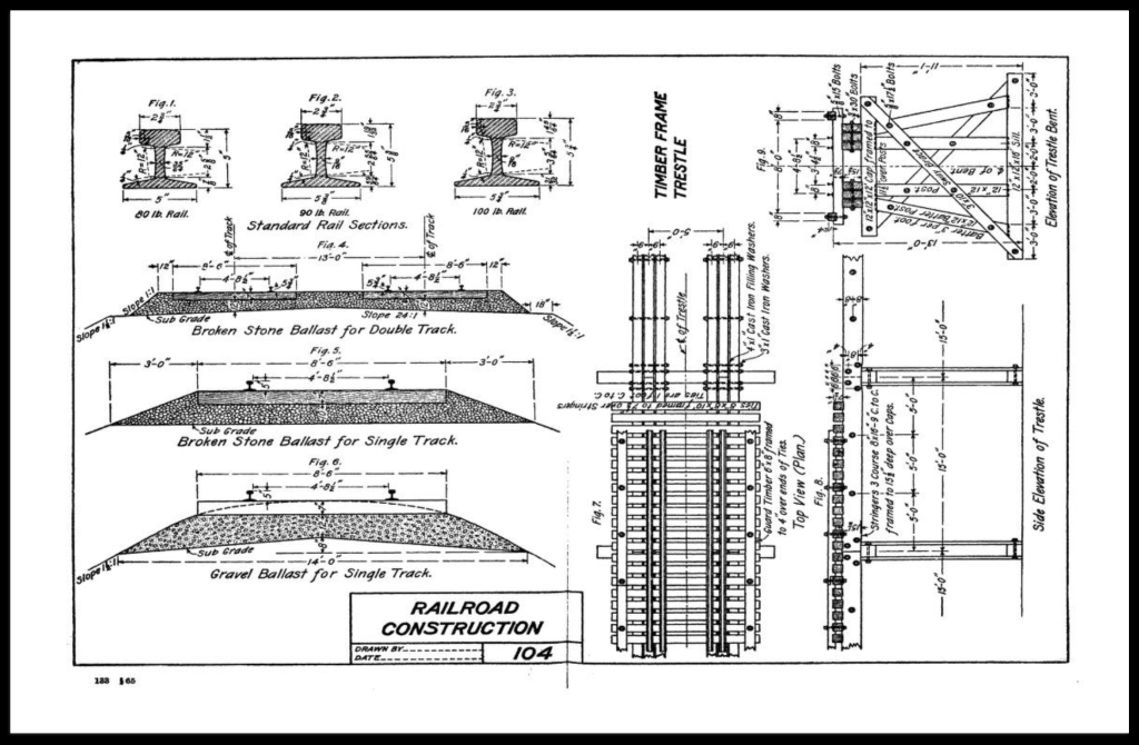
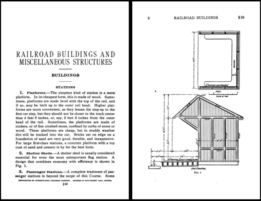
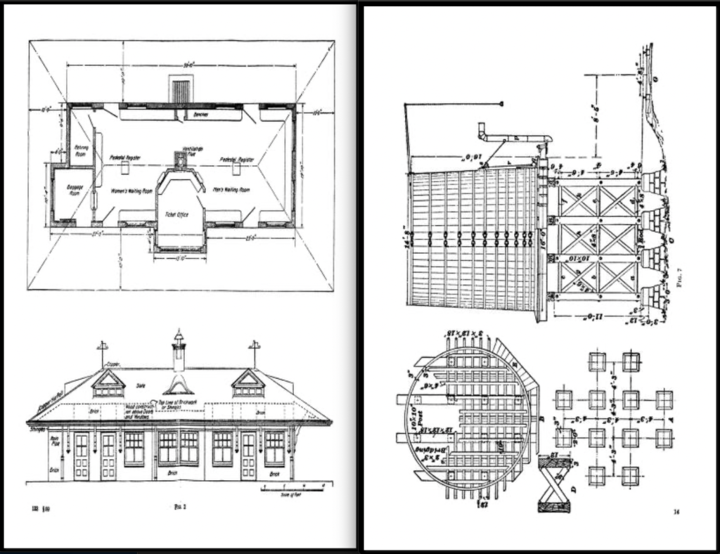
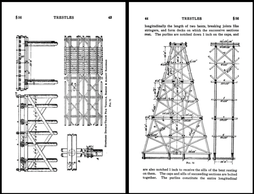
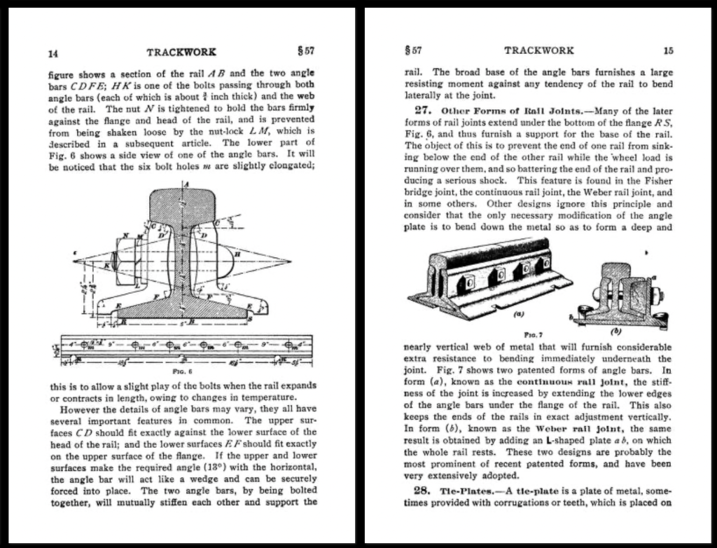
For everything else railroad related, I’d recommend the I.C.S. Reference Library, Vol. 133_Railroads, 1908. This is a 800+ page manual that covers the infrastructure of railroads, including track design and layout, covering standard track schematics, bridges, rail specs, buildings, service facilities, and sections on road and highway construction, and city surveying and survey drawings.
It can be tricky to identify or specify a particular wood if you’re not very knowledgable about working with it. There are hundreds of different species available and even though a small number of those are in common usage in the construction trade, narrowing it down to the ideal look you want can be frustrating.
For many years a Production Designer was able to just hand a Scenic Painter a photograph and the artist would “grain” the surface to match any kind of wood they wanted. With the loss of painters who are trained in “graining”, it has become more common to find a laminated material which matches their choice or to use actual wood veneer that matches the reference.
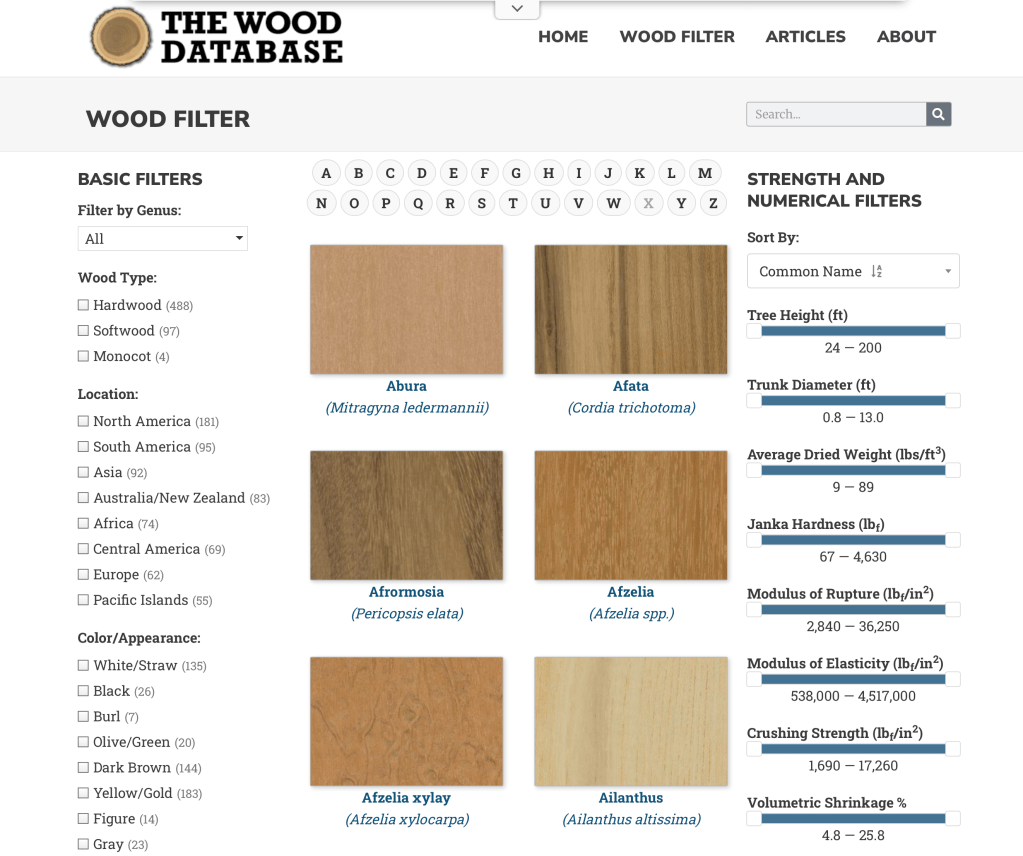
One website that I’ve found recently is a very good starting point to locate a match to a reference photo you might have or select a wood species based on your preferences of shade, color, or grain.
The Wood Database was created by Eric Meier in 2007 and now includes images and data for over 600 different wood species. You can search by name, type, location, appearance, and several other catagories.
Each species entry has a color photo of the wood showing grain pattern (depending on the cut orientation) as well as the scientific data as to hardness and shrinkage rates.
The information is also available in hardback book form, which can be ordered from the site, which features the data on over 350 wood types, including large color images of each species.
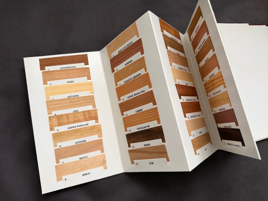
Another good reference is a book called What Wood Is That? by Herbert Edlin. The book explains basic wood characteristics and details 40 common wood types. It also includes 40 actual wood samples so that you can see a real-life sample of the types outlined.
The actual wood samples that are in What Wood Is That?
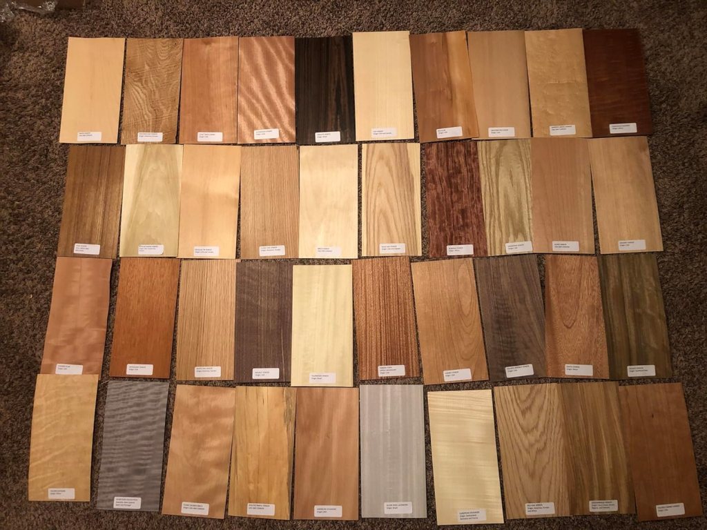
For larger wood samples to look at, I’d suggest getting a set of veneer samples like the ones below. You can find sets like the one below from various venders on Amazon. Be sure that you get a set that have labels attached for easy identification. With these, you have a piece large enough ( they are usually about 6″ x 12″) to be able to try different stains, finishes, or age to your liking.
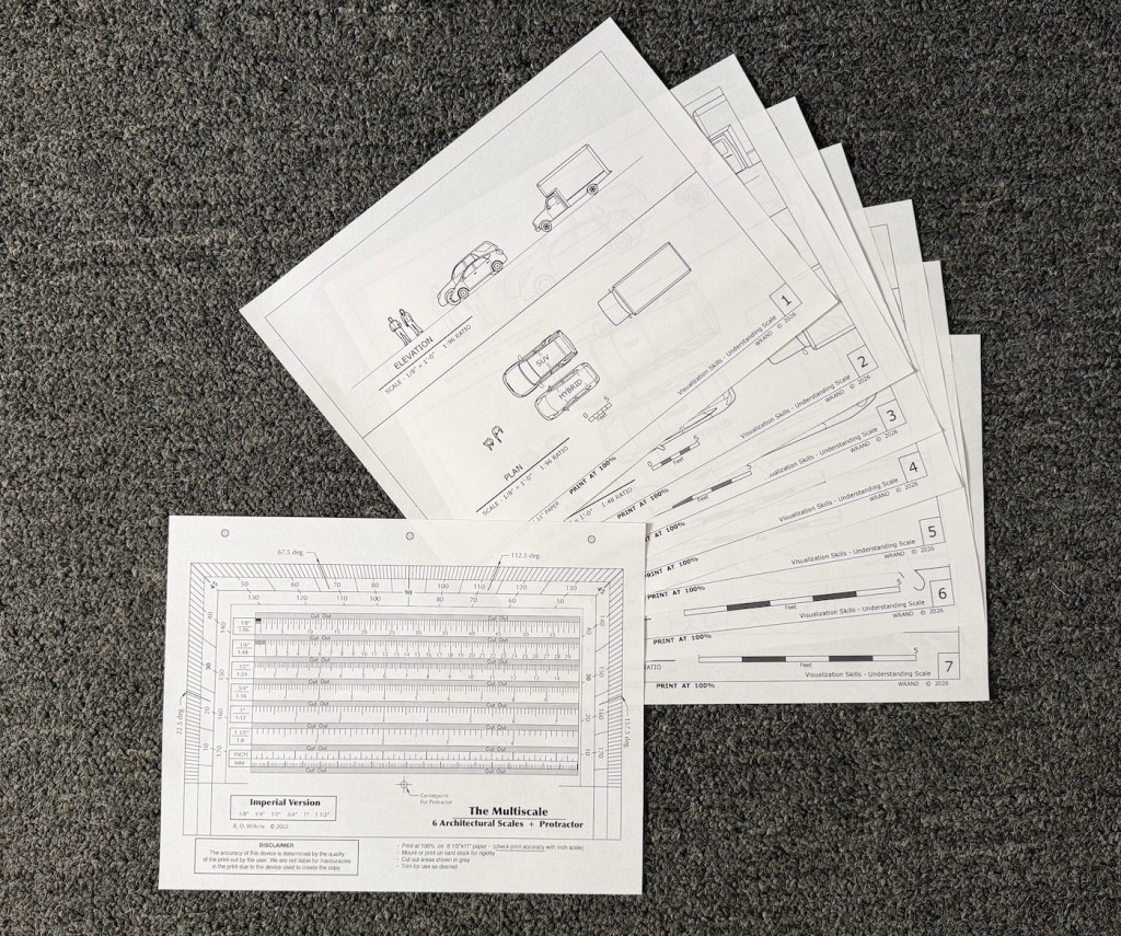
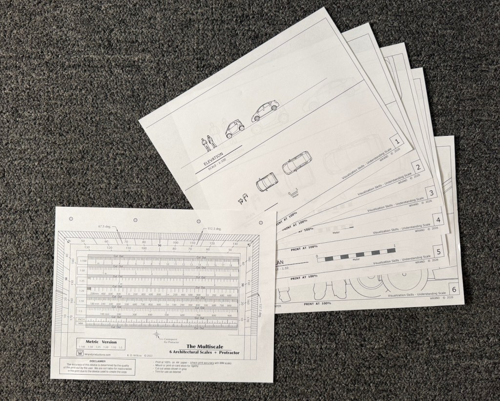
Visualization skills are something anyone can learn. You just need to understand the basics of scale. Once you familiarize yourself with the basic scales that are used in design you can start to train your brain to correctly imagine anything and visualize it in an actual space.
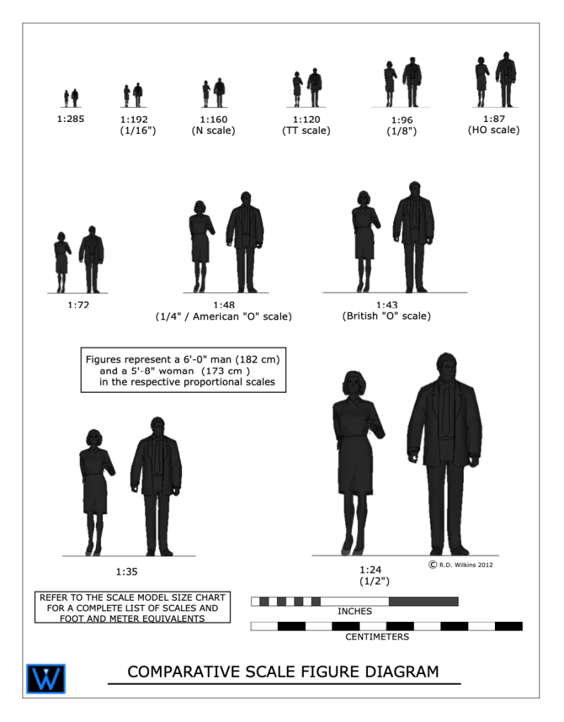
I created the diagram above for a blog article I wrote about model scale. The article was about choosing a proper scale for physical models rather than digital ones.
The article didn’t clearly explain what ‘scale’ is or how it’s used in technical drawings. It also didn’t explain the difference between a ‘scale unit equivalent’ and a ‘ratio’, or how to use scales to help you with visualize objects in your mind.
Drawing Scales
Drawing in scale is a way to clearly communicate the size of something, either physical or imagined, in a visual way to help the viewer understand the proportions and size of an object. Either on its own or in relation to other objects.
Some drawing scales are noted by using a measured unit and comparing it to a life-size unit, such as 1/4″ = 1′-0″, which is a popular scale for architectural drawings.
This means that 1/4″ as measured on the drawing is 1′-0″ in actual size.
On the diagram above you’ll see the use of scale ratios. Note the ratio of 1:48 has the 1/4″ scale in parenthesis. The ratio scales can be interpreted as dividing the full size unit into that number of divisions. If you divide 1 foot into 48 segments, each of those segments would be 1/4″ long. So, a drawing with a ratio of 1:96 would be the same as 1/8″=1′-0″. A scale of 1″=1′-0″ would be a ratio scale of 1:12, as there are 12 inches in a foot.
Look at your shoe. If you are an average size person, the length of your shoe is about 1 foot long (28 to 30cm if you use the metric system). If you wanted to draw the outline of the sole of your shoe in, let’s say 1/2″=1′-0″ scale, that would be an equivalent ratio of 1:24. 12 inches divided into 24 parts would each be 1/2″ long.
If you use the metric system you’re in luck. You don’t have to deal with a silly fractional system and you use a strictly ratio system for drawing scales.
Analog Is Best
A scale of 3/4″=1′-0″ is a very common scale for drawing architectural details, but not for designers who mainly work in the theater. Because of tradition, in the theatrical world, such as Broadway, the standard size of plans and elevations is 1/2″+1′-0″.
A detail of an elaborate doorway will obviously look much larger when drawn at the 3/4″ scale than at 1/2″ scale. If you are used to looking at details in one scale, the same details will look ‘wrong’ in the smaller or larger scale.
I worked with a designer who asked me to not draw details in 3/4″ scale because he was used to visualizing designs full-size while looking at them in 1/2″=1′-0″ scale. Seeing them in a larger scale was disconcerting for him while visualizing.
As far as visualizing in scale, seeing a drawing printed on paper is better than looking at it on a computer screen every time. In terms of viewing images on a computer screen, the screens will lie to you every second of every day, in all kinds of ways, particularly in regards to size comparisons.
Imagine you’re looking at a drawing of sofa that is drawn in 1/2″ scale, or 1:50 in metric, on a computer screen. On your desk is a drawing of a room plan in 1/4″ scale, or 1:25 in metric. If the sofa drawing was on paper you could easily convert the sofa in your mind to the smaller scale to imagine how it would fit in the room.
If the sofa drawing is on a screen, how can you be sure if the scale is correct? You can’t. Even if the software is telling you that the image is being presented in a scale that is true to the stated size, most people could not make the visual transformation unless they were very experienced in doing it.
The Packets
You can download the Visualization Chart packets from the links below. If you’re in the States, you want to download the packet marked “Imperial units”. If you’re anywhere else in the world that uses the non-fractional, uncomplicated, easy-to-use measuring system known as Metric, be sure to download that one.
The packet with Imperial /foot/inch scales contains 8 sheets with 5 scales: 1/8″, 1/4″, 1/2″, 3/4″, and 1″. There is also a copy of my Multiscale in the event that you don’t own an architects scale.
Print these all at 100% on letter size paper. Be sure that the print setting is at 100!
The metric packet contains 7 sheets in 4 scales: 1:100, 1:50,1:20, and 1:10. The seventh sheet is a Multiscale in metric. The Multiscale includes the 1:25 ratio which I didn’t include in the diagrams. That ratio doesn’t seem to be much used anymore. Let me know if that isn’t the case.
Print them all on A4 paper at 100%.
Using The Diagrams
Prepare The Multiscale
Print it out at 100% and check the lower scale markings against a known ruler or measuring tape to be sure it is printed correctly.
Cutout the gray areas for ease of measurement. You can also glue it to a piece of cardstock or a file folder to make it stiffer.
Exercise #1
Get familiar with the different scales. Examine the way objects look in the Plan view from above as opposed to the Elevation views from the sides. Does either view make the object, either the people or the vehicles seem different in scale?
How do they compare to each other? Place one scale sheet beside another and notice how the perceived distance caused by the smaller scales affects your perception of their proportions differently than the larger scales.
Exercise #2 – Thinking Vertically
Pick an object that’s relatively large in size such as a sofa, a piano, TV in your room. Now using the scale on the Multiscale, draw the object on the scale Elevation sheet next to the people or the vehicle.
Notice its proportion and size compared to the things on the sheet. Does it seem smaller or larger in comparison than what you visualized in your mind before to drew it?
Take a measuring tape and measure a wall of your bedroom or living room, and draw it in scale on a sheet or another piece of paper. Now look at a framed picture or mirror or wall hanging from another room or another location. Try to imagine it on your wall. measure the piece and draw it in scale on the scale wall drawing. How does it look? Does it take up the same space that you imagined it would when you visualized it on your wall?
Exercise #3 – Thinking Horizontally
Measure your bedroom or another space of your house. Now try to visualize one of the vehicles on the scale sheets appearing inside your house. Using the Plan view of the 1/4″ sheet or the 1:50, draw the floor plan of that room in the chosen scale using the Multiscale. Using pencil, you can draw the space right on the scale sheet. Does the vehicle fit in the space you measured? If it does, does the space around it seem to be the same as what you imagined, or is the space larger than what it feels like when you are standing in it?
Exercise #4 – The Teleporter In Your Head
Take the scale floor plan you’ve drawn of your room and go to a store where they have furnishings. Now look around at things like sofas, large TVs, or beds. Take a tape measure with you or use the measurements they provide at the store. Imagine them in the space.
Test your power of scale conversion by estimating the area of the floor the objects would take up. Draw them on the plan with a pencil. You will eventually be able to estimate foot or metric increments visually on a scale drawing. In 1:50, the width of the tip of a finger is about 1 meter in scale. In 1/4″ scale, the width of a finger is about 3 scale feet. The width of a thumb is 4 feet.
When you get home, test your guess. How close were you?
This is the first of a series of articles on the anatomy of architecture which focuses on construction details. Many of them are details that are now obsolete because of modern building methods or the evolution of designs due to changing tastes.
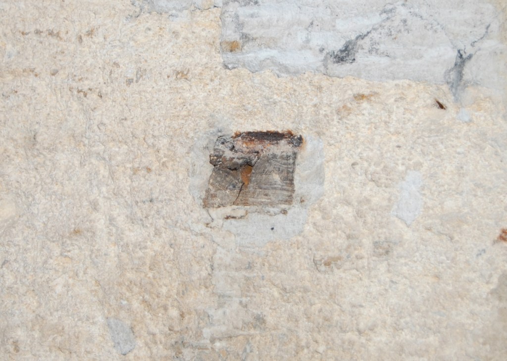
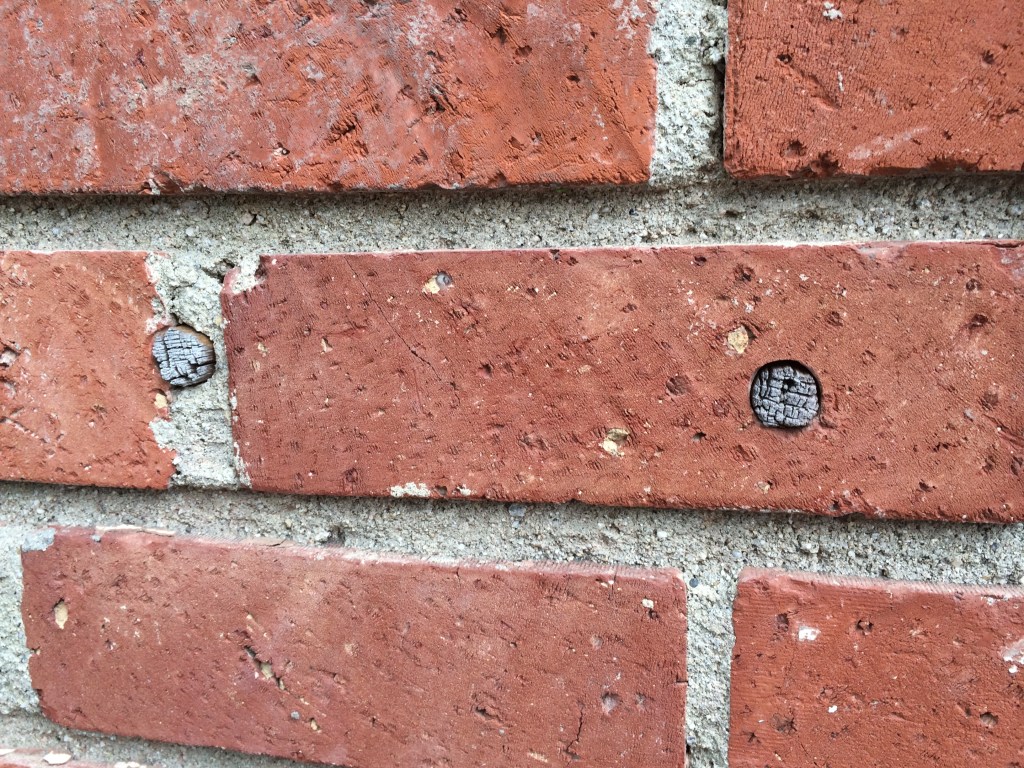
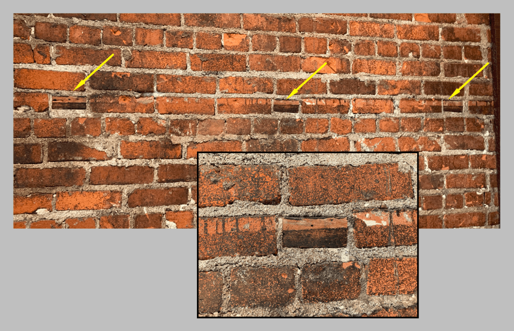
If you try to search for ‘wood bricks’ on the internet, you’ll probably come up with some strange answers. They were a standard feature of brick construction in the nineteeth century that went out of fashion for a number of reasons.
With masonry building construction there has always been the problem of attaching wood elements to stone or brick structures. This was often accomplished by inserting wood plugs into the wall surfaces as an attachment point for nails, or by driving nails into the mortar of joints.
A wood plug in a stone wall of a 17th century Paris hotel.From a 19th century builders manual showing the use of wood plugs for attaching a door frame.Wooden plugs in early 20th century brick.
The use of ‘wood bricks’ most likely evolved in England before spreading to America. Most building manuals of the period that mention their use suggest using well-seasoned hardwood billets set between the brick courses at intervals for a way of attaching the wood linings for doorways and window framing.
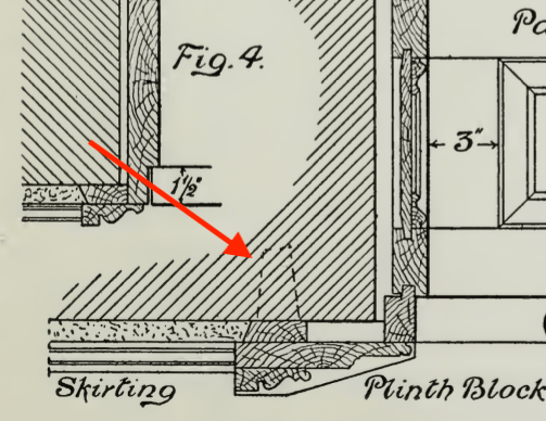
For narrower wall opening, this lining could consist of a single board like in the illustration below.
Use of a single plank as a door frame lining for a brick wall. Note that the wood bricks are also used to attach the grounds at the door frame for plasterwork. The architrave exhibits typical Neo-colonial profiles, while the bolection mould on the doors frame is a mould typical of Greek Revival houses, a quirked Greek ogee and bevel combined with a fillet and cove, topped with an astragal, fillet, and cove.
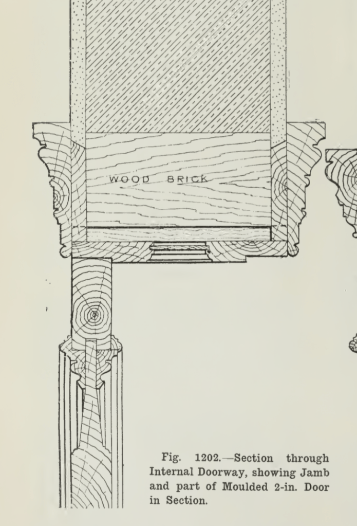
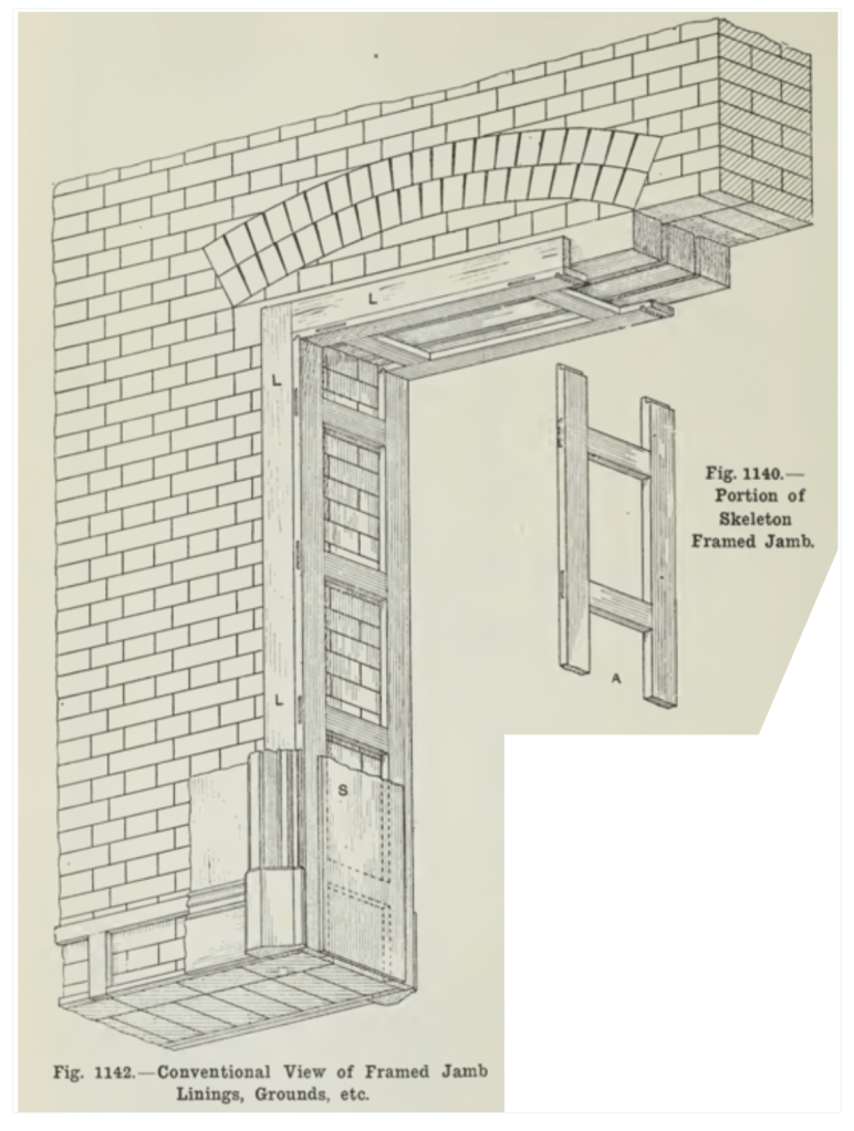
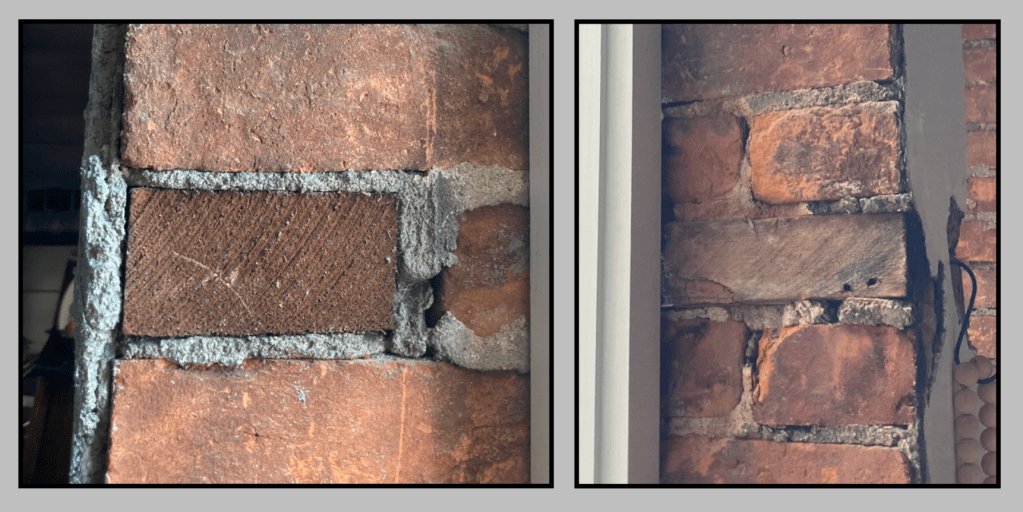
For larger openings in thicker walls, the wood bricks were made longer and the linings were made of several pieces of sawn and planed boards, assembled in what was called a skeleton framed jamb.
The skeleton frame is attached to the wood bricks as well as the wood lintel.
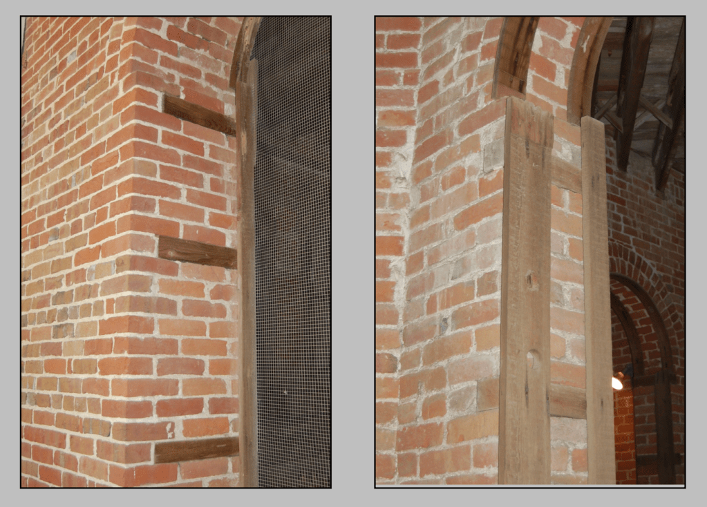
Early manuals show this framework to be mortised and tenoned similar to a frame for furniture, but some mid-ninteeth century examples in America have been observed to be simple vertical boards nailed to the wood bricks rather than a M&T frame. This method would have definitely cut down on the construction time.
The image on the left shows the wood bricks in place while the image on the right shows the vertical boards nailed to them to act as the arch frame lining. Notice the archway lining at the top with boards that have been kerfed at regular intervals to allow the wood to form to the brick archway without having to steam bend them.
Some turn-of-the-century buildings display a more haphazard approach to wood bricks where framing cut offs of softwood were used instead of hardwood, as in the photos below.
Softwood framing cut-offs used in place of hardwood.From an early 20th century building in Southern California. Wood bricks are set at 4′ from the floor. Most likely for a wanescot and chair rail.Long strips of wood inserted in the brick for attaching a paneled wall detail in a 1870’s rural school house.Two more examples of what appears to be framing lumber used as wood bricks.Pieces of what seems to be lath for plaster inserted into the mortar joints between bricks as an attachment point.An unusual sight I found on a building in the Mid-west. The exterior brick wall has eroded to the point that the wood bricks of a door frame have been exposed to the outside.
Jeesh, it’s been ten years since my last gift guide and I’m getting it out a little late this year, but some of the same items are still here on the list, mainly the classic tools and books that never become obsolete, (like a lot of software programs do).
I don’t receive any money from these recommendations. These are books and tools that I own and use often.
My Must-Have Tools For Film Designers
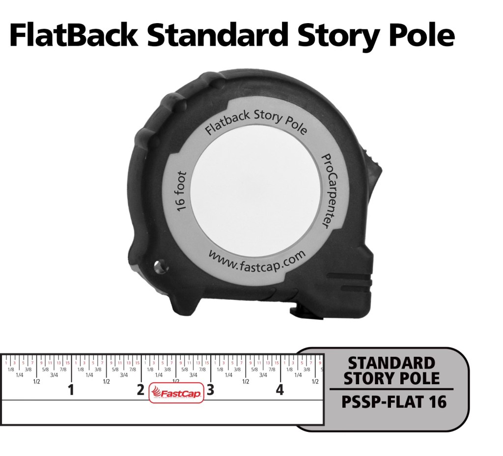
FastCap Flat Back Tape – You can not only measure round or curved surfaces but it has a blank area to write on for use as a story pole. – $10.00
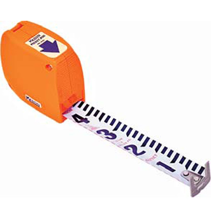
Keson Pocket Rod– These are so essential for site surveys that I have four of them. They come in Architect and Engineer models. – $20.00
6″ Digital Calipers – Like these, there are many manufactures. (Avoid any priced under $20.00.) – Must-have tool for doing photo scaling (see article) – about $24.00
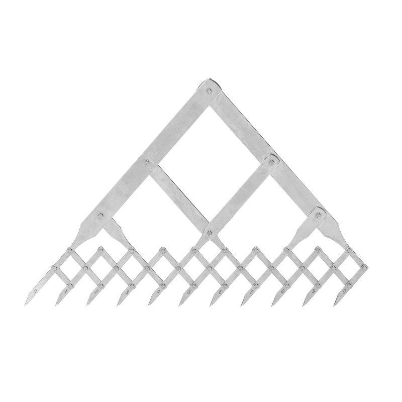
Equal Space Dividers – great for not only photo scaling but for designing in general. They run the gamut in price from these to these. $220 to $24.00
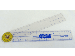
True Angle – Multi-use tool for measuring and transferring angles. lightweight. – 12″ -$16.00
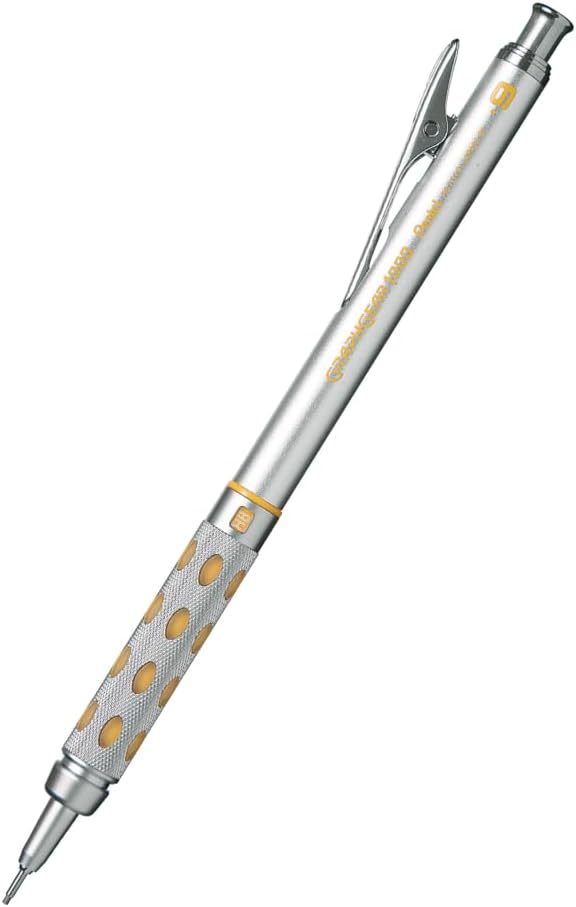
GraphGear 1000 – Mechanical pencils, my new favorite brand. These are great because the barrel sleeve retracts into the pencil to protect it. Comes in .3, .4, .5, .7, and .9mm leads. About $9.00
Compass – So many to choose from, (and a lot of crappy ones are in the mix). This one is a good all-around basic, practical compass that will last a while. $14.00
Still my favorite design and furniture book publisher. Here are my recommendations:
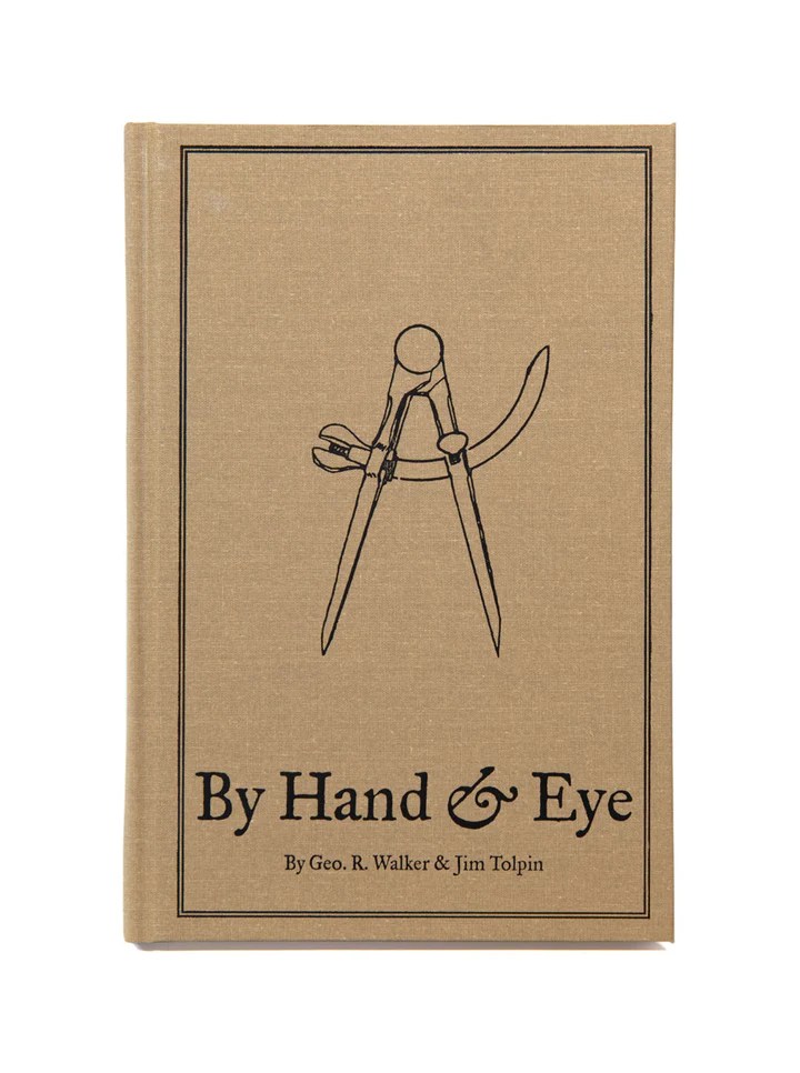
By Hand & Eye – $51.00. Another gem from Lost Art Press, this is probably one of the best design books written in the last 100 years. It outlines the world of design without a rule and using only dividers and proportional methods. I covered this in a previous post and always recommend it. Buy this and a good pair of second hand dividers from Ebay and you will completely change the way you think about design.
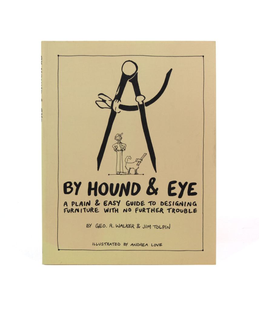
By Hound & Eye – $31.00. A companion workbook to By Hand & Eye.
A Field Guide To American Houses – Virginia Savage McAlester
Stair Builders Handbook – T.W. Love
Backstage Handbook – Paul Carter
American Cinematographers Manual – ASC Press
The VES Handbook of Visual Effects – VES Society
Designer Drafting For The Entertainment World – Patricia Woodbridge
The Classical Orders Of Architecture – Robert Chitham
Illustrated Cabinet Making – Bill Hylton
Styles Of Ornament – Alexander Speltz
McKay’s Building Construction – W.B. McKay
Neufert – Architects’ Data – Granada Publishing
Geometry Of Design – Kimberly Elam
Really, Really Last Minute Gifts
When you realize you’ve really screwed up and forgotten someone and have no time to run to the store, much less order anything, you can always gift a good app.
Log onto the Apple or Android store and gift your so-important-you-forgot-about-them friend one of these apps and your reputation will be saved:
Location surveys can be a unique experience. You never know what you’re going to have to deal with when you survey an unfamiliar location. One of the perks of being in the Art Department of a film or television series is that you get to see places that aren’t normally open to the public.
It could be a historic building, or a ship, or a military aircraft, or, it could be a place you’re familiar with but never really thought to look at close-up.
The Disneyland Haunted Mansion at 1:00 AM
A lot of times there are parameters that you have to work around to get all the information that you need. Usually these are limitations having to do with access to the location, either physical constraints or time limitations. You’ll do a lot of location surveys during your career. Often they will be a simple survey to determine a placement of a set piece or a simple drawing for a director’s plan for shot planning.
A deserted New Orleans square at midnight at Disneyland.
Other times you’ll have to do a detailed survey that involves recording a lot of measurements and taking photographic reference for either matching a location at another place or adding onto the existing structures.
I got a call in June of 2022 to work on the recent Disney film The Haunted Mansion, and was told that my first assignment was to survey the exterior of the Haunted Mansion ride at the Disneyland park in Anaheim. We would be building a replica of it on a studio backlot in Georgia.
I asked if they had a set of the original plans for reference and was told “no”. For reasons I was never able to understand, it was important that the film set look very close to the original mansion at the amusement park, but, we weren’t allowed to have a copy of the original drawings from 1962. If you can figure out the logic of that decision, please let me know.
I mentally put together a list in my head of the equipment that we’d need to do an accurate survey of the building but that was immediately discarded when I was told about the limitations of the scale of the survey. It would have to be done at night, after the park was closed to the public. I would have a park employee to help who would also provide a ladder. One of the construction foremen on the film would meet me there to help with the measuring.
Despite not having any drawings to use as a starting point, the survey was only authorized for one night, between the hours of 11pm and 3am.
This wasn’t the first time I’d had to do a survey in a ridiculously small amount of time, but it would be the first exterior survey that I’d done at night. Taking theodolite readings to determine heights in the dark would be fun.
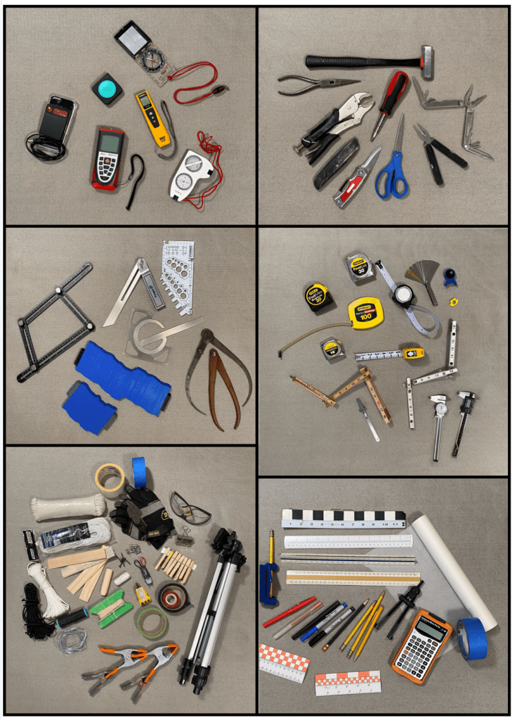
In the past, location surveys were usually scheduled several days to a week in advance and the persons involved were usually asked how much time they needed for the scout. This is rare now and it pays to have a fully-equipped bag of survey tools ready to go. You may have to survey a forest area for one scene and a complicated building interior for the next, so you need to have a wide range of tools in your kit.
This list ranges from simple measuring tapes to laser measuring tools, levels, transits and plumb bobs, simple compasses to digital theodolites and clinometers. a compact tripod is a plus. Profile gauges or moulding combs are a must-have.
Some of the items that are part of my survey tool kit.
The tools pictured above are just a sampling. My survey bag weighs in at over 20 pounds. You’ll notice some duplicated tools. This is intentional. When you have traveled a long distance to do a survey, sometimes across country, a tool that’s not working or dead batteries isn’t an acceptable excuse. Sometimes you have to improvise when you are confronted with a situation where the tools you usually use won’t fit the bill. I once had to find a rural hardware store open where I could buy the supplies to make a water level when the location that I was surveying made using a laser level impossible.
Pre-scout research is usually key to accomplishing a successful survey and I immediately looked for any reference that I could find online. I was sure that someone had to have uploaded some of the original drawings from the 1962 construction. It took some digging but I found the 1/8th inch scale elevations. Now I wouldn’t have to try to get overall heights but I still had a lot of details to record.
When I’m confronted with a tight time schedule I have a checklist:
1- Overall photographs with a collapsable surveyors rod in the shot so I can scale from the images later.
2- Detail photos using a small story stick so that those can also be used for photo-scaling. The photos are important as I know I will often run out of time and the photos are a visual record that can be referred to if I haven’t been able to get a hard measurement with a laser or tape.
3- Overall measurements; ceiling and soffit heights, other measurements that would be impossible to scale from photographs.
4- Details. Here I am as thorough with measurements as I can be as the time allows.
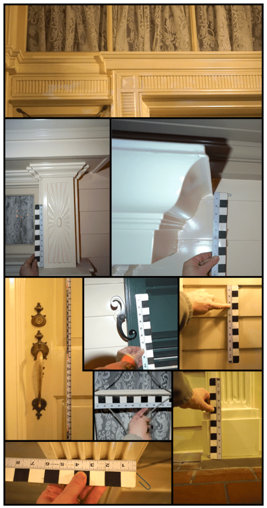
A photo of the front door of the haunted mansion with a surveyors rod in the picture for scale reference.A few of the hundreds of scaled photos that I took at the mansion to recreate the details for the backlot reproduction of the mansion in Georgia.
We covered the ground floor of the facade while we waited for a technician to get us to the balcony area. This is accessed only through a small door to the south side where you are immediately confronted with an 14′ tall, narrow ships ladder. We struggled to climb that with the equipment and set to work getting the details there.
The balcony of the Disneyland Haunted Mansion at 1:30 am. The photo was taken with a Sony A7S camera whose lowlight sensor makes the image seem like it was taken in daylight. In reality it was very dark and the ceiling details were not visible to our eyes.
In case you wondered, everything on the balcony is bolted, nailed, and glued down. No need to worry about wind carrying anything off.
As we started to record the second story area at about 1:30 am, all the lights around the mansion went out. Luckily we had headlamps in our kits and I had a Sony A7S camera whose incredible sensor makes photos look like they were taken in daylight.
We waited for a tech to take us to the roof to measure the cupola. He never arrived. Maybe the thought of crawling around on the roof in pitch darkness was the scariest thing about the house he could imagine.
3:00 am came sooner than I wanted it to, but I felt pretty certain that we had gotten the most important information.
Was it a spooky experience? The only thing I was afraid of was that the next day I would realize I’d missed a critical dimension.
Next post I’ll talk about how we integrated all that data into the backlot build. Hint- sometimes proportion is not your friend.
My preference for books is always a hard copy, but sometimes having easy access to the information is more important than having a physical book, especially when copies of the actual book are impossible to find or really expensive.
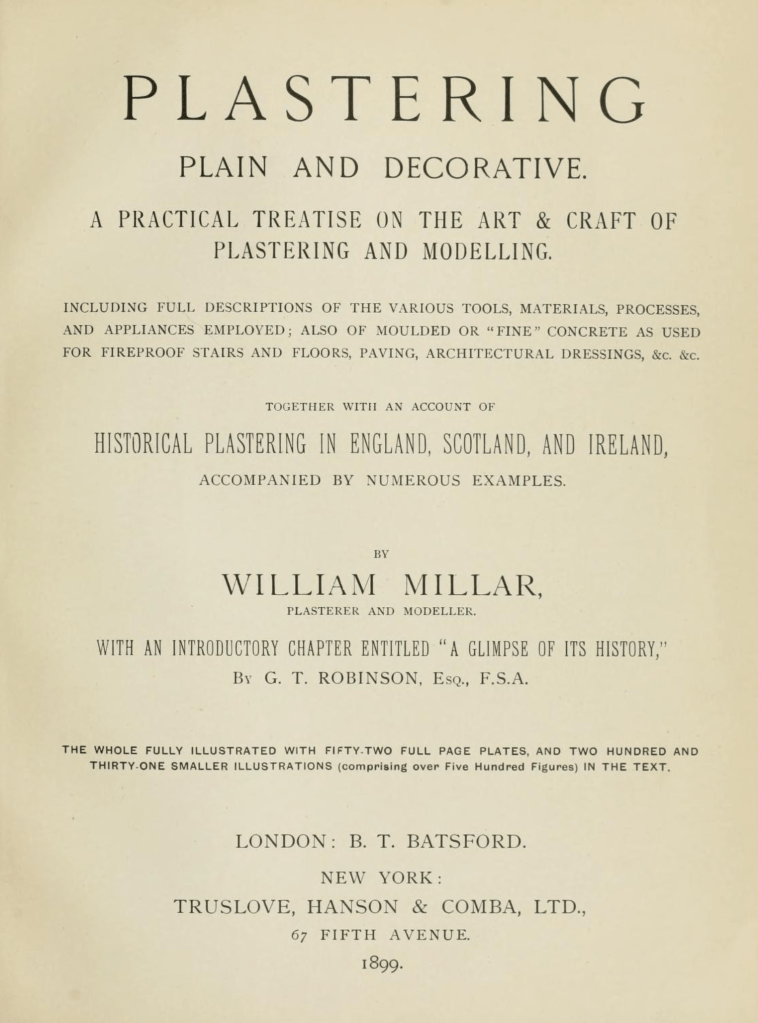
That’s the case with this book, Plastering Plain and Decorative. First published in 1890, the book has become known as “The Plasterer’s Bible”. Now out of print, except for the occasional third-party reprint, it went through four editions. It contains hundreds of black & white photographs and drawings which aren’t always of a very good quality with most of the modern reprints, usually because they are printed in a smaller size than the original quarto size and because the scan quality of the original images is bad.
On top of not being of a very good quality, they are also nearly as expensive as an original copy, which would be a better bet as those are stitched like a traditional book and not perfect-bound (glued edges) like all soft cover books are. I have seen so-so quality reprints go from anywhere from $100 to $300.
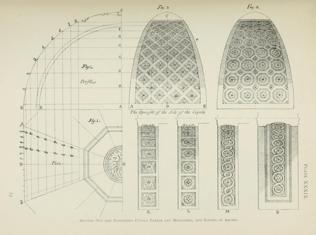
Fortunately there is an inexpensive (free) copy of the book online at the Internet Archive. This isn’t just a book of nice drawings and photos, this is a book written for crafts people. Besides the layout diagrams, there are drawings of the actual tools used to create complicated plaster elements and a huge list of plaster types as well as the ingredients and mixtures used to create them in various time periods, such as instructions on what type of animal hair to use in the staff pieces for strength. It is an early edition of the book and contains over 700 pages which is more than is included in later editions.
The book covers not just typical plasterwork but, sculpting, mold making, terra cotta work, scagliola, sgraffito, and composite decorations. Besides Western European techniques it examines designs and techniques from Japan, China, India, Persia and the Middle East.
There is also a section on concrete work such as staircases, sidewalks, road, roofs, fountains, and other decorative elements.
You can find the digital book here at The Internet Archive. There are a number of different digital files available for download with varying file sizes depending on the quality of the images you want to have available.
The Art Director’s Guild sponsored a book signing event at their gallery space in North Hollywood yesterday, with co-author Karen Maness on-hand to sign copies of the new book, The Art Of The Hollywood Backdrop.
The book is a cooperative project between the authors, Karen Maness and Richard Isackes and the Art Director’s Guild. With a focus on hand-painted rather than photographic backings, the book traces not only the history and development of backdrops through Hollywood films but the artists who have developed the techniques used and who have passed along that knowledge to successive generations of scenic artists.
The event was well attended by not only Guild members but by members of the Strang family and the Coakley family of J.C. Backings, the two families which have not only dominated the field in Hollywood but have been the biggest promoters and curators of the art form.
The Coakley family and fellow artists of J.C.Backings
Co-author Karen Maness graciously signed books all afternoon.
This is a big book, and I say that in every sense of the word. Larger than a quarto format at 11 x 14 inches, the hard-cover and cased edition is 352 pages long and weighs in at 13 pounds. Filled with crisp images of both black and white and full-color backings, the photos show the backings not only in a straight-on form but in the environment that they were meant for. It’s filled with stills from the original films as well as set stills showing them in relationship to the sound stages and the companion scenery.
This book will definitely appeal to film lovers who have very little understanding of film scenery and stagecraft as well as film professionals who have many films to their credit.
It is available for order through the publisher’s website and will soon make it’s way into bookstores. If you are still making that holiday gift list, this is definitely a book that will have huge appeal to anyone who loves movies. Read an excerpt here, and you can order the book here from Regan Arts.
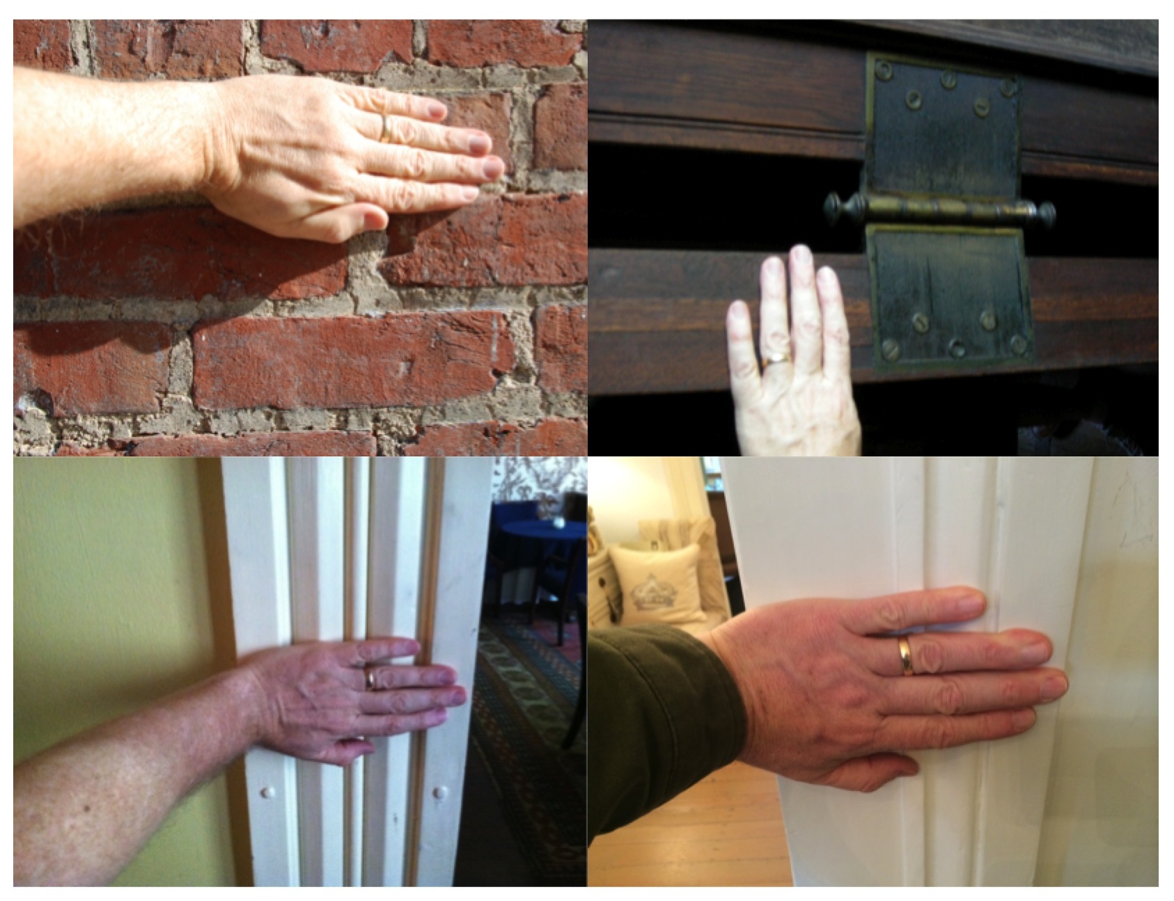
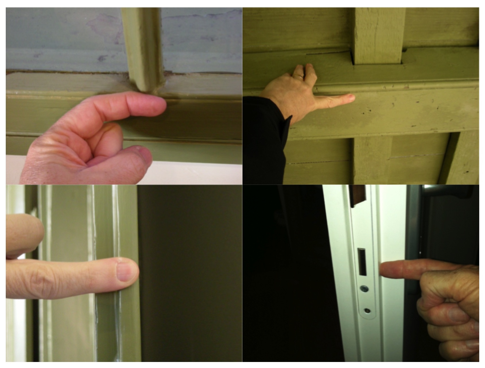
I like photographing architectural details. But they’re only really useful if I have a scale in the photo. Measurements written down in a journal somewhere are bound to get separated or lost and the photo won’t do me much good if I want to replicate the detail. I rarely carry a tape measure with me all the time and usually carry a small paper ruler in my wallet, but that often gets lost of left behind.
When those times occur where I need a scale in the photo, i just use my hand. It’s handy because it’s always with me, I know how big it is and I can always refer to it later when I’m scaling the photo. It’s my built-in story-stick.
The hand has been a measuring device for thousands of years and is still used as a measure of the height of horses in the U.S. and UK. The hand’s width was standardized at 4 inches by Henry VIII in the 16th century, the hand’s breadth, (just across the 4 fingers) at 3 inches, making the average finger width 3/4″.
The first joint or distal phalanx makes a handy scale for small details as well.
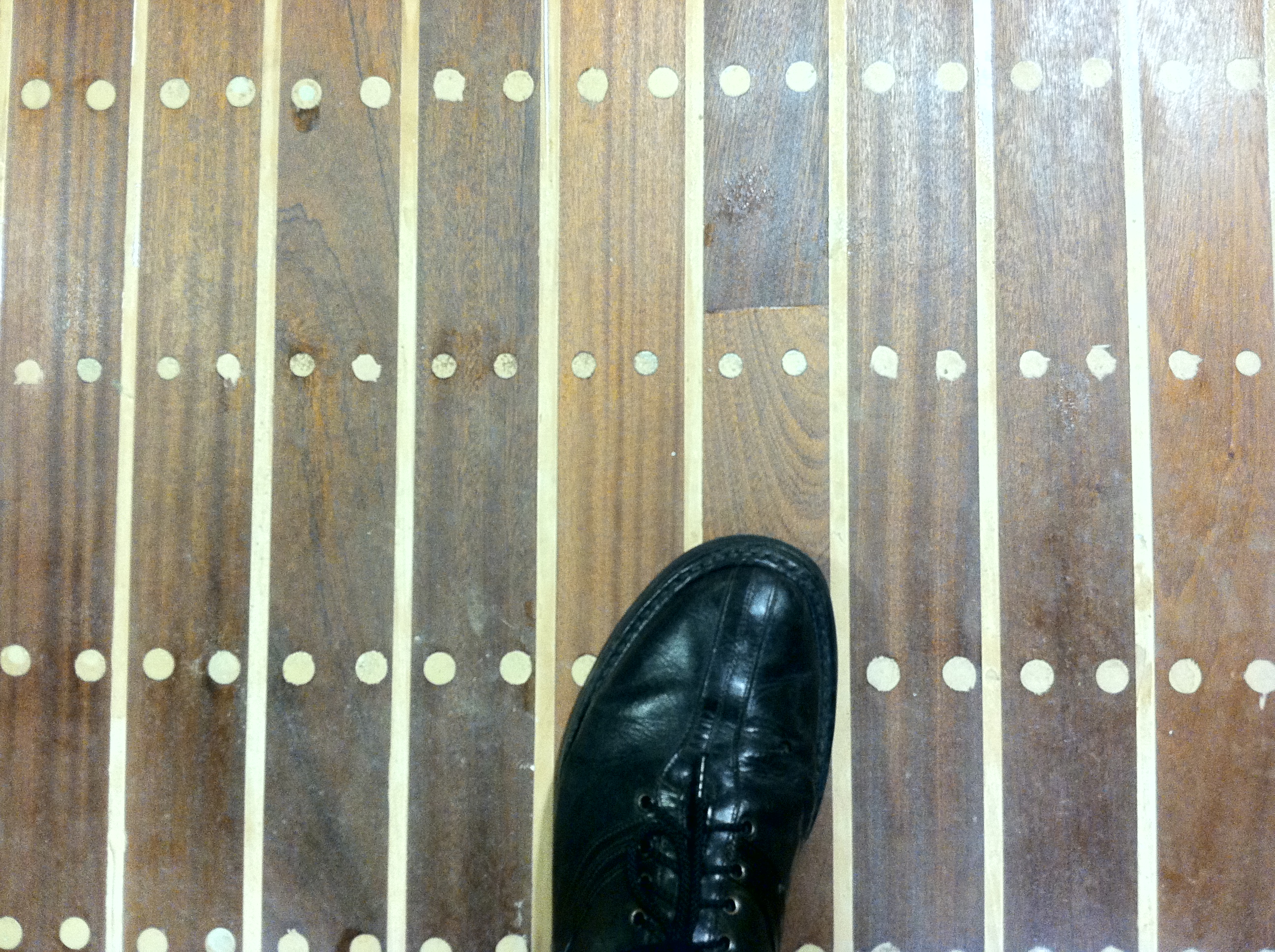
And don’t forget your shoe makes a good scale object too.
So what do you do with these? How do you translate these into working documents? Next time I’ll explain the basics of scaling from photos using dividers.
But in the mean time, this video by writer and woodworking instructor Jim Tolpin and animator Andrea Love gives a great intro into designing with hand and body proportions.
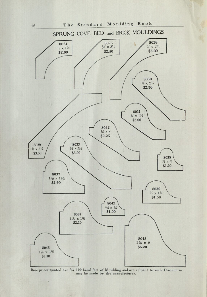
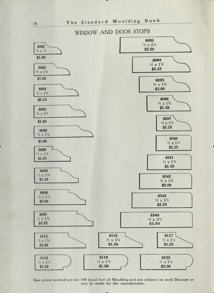
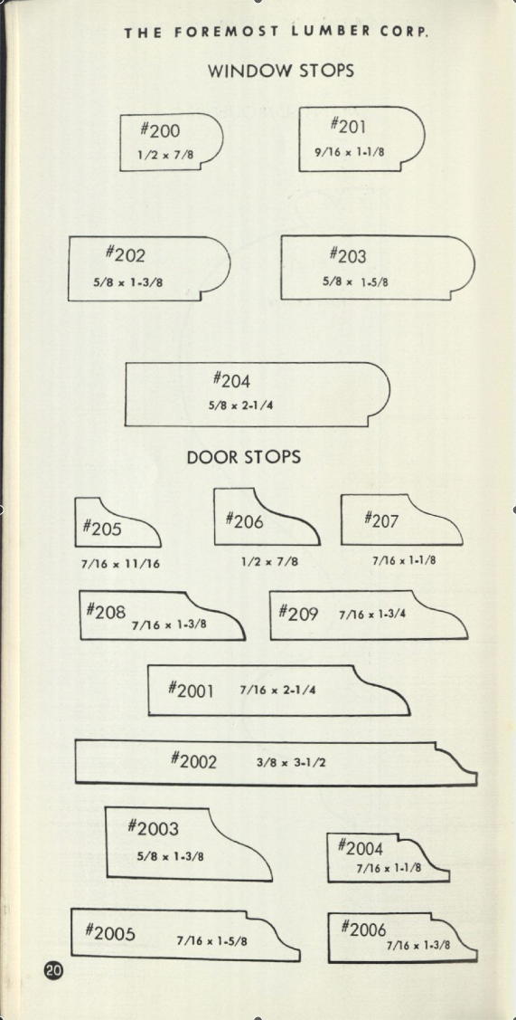
Chris Schwarz over at Lost Art Press posted a blog entry yesterday with links to three moulding catalogues you can download. The catalogues range from a 1938 catalogue using the old Universal system where the profile numbers were a fairly universal ( at least within the U.S.) numbering system called the 8000 system. The original numbering system begun in the mid 1800’s used a three digit number starting with 1. You can see how the inventory of stock moulds changed over the years as manufacturers offered fewer and fewer profiles. The mid 1800’s catalogues included over 600 different profiles which would dwindle to less than 50 in many catalogues in the early 1950’s.
Here’s three examples that show the slow loss of the variety of stock stop moulds, the first from the 1890’s catalogue, the second from a 1938 catalogue and the last from a booklet from the 1960’s.
stops from the 1890 Universal catalogue
Stop profiles from a 1938 catalogue
stop profiles from a 1960’s catalogue
You can read the blog article and download the catalogues at this link. Special thanks to Chris, Eric Brown and Thor Mikesell for sharing the research material.