In the first part of this article I mentioned that traditional hand tools could create a finish superior to their modern day counterparts. Rather than just expect you to take my word for it, I’ll show you the proof.
Traditionally the way to surface wood once it was cut to approximate size with a saw is by using various types of hand planes.

modern woodworking hand planes by Lie-Nielsen
Used for thousands of years the plane is believed to have been designed by the Romans. Basically it was a base of wood or metal which used a wedge to hold a piece of steel with a single-bevel cutting edge at a set angle to the cutting surface. Modern planes have a more refined system for controlling the cut but the basic layout of the tool is still the same.
For bulk planing it’s hard to beat a modern powered thickness planer but for some operations like fitting doors, which requires very careful trimming, the traditional hand plane excels in a number of ways. I thought I’d do a little test and compare the quality of the surface of some wood run through a power planer as compared to a hand plane.

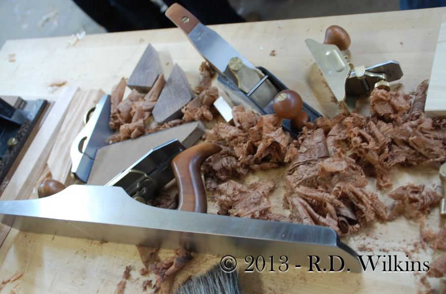
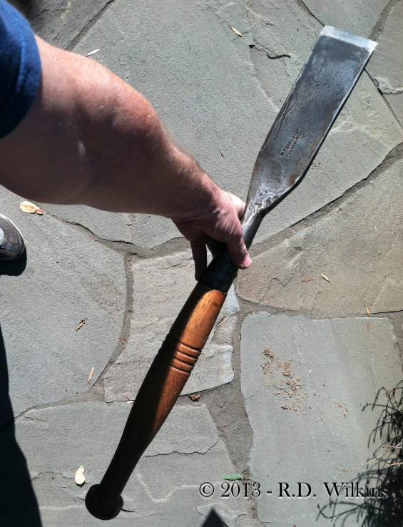
Lie-Neilsen block plane

the block plane in action
Here’s a block plane, which is great for quick jobs like fitting doors. This particular plane is an exceptionally good one made by Lie-Neilsen in Maine. The wheel on the rear allows you to adjust the depth of the cut even while planing by as little as a thousandth of an inch.
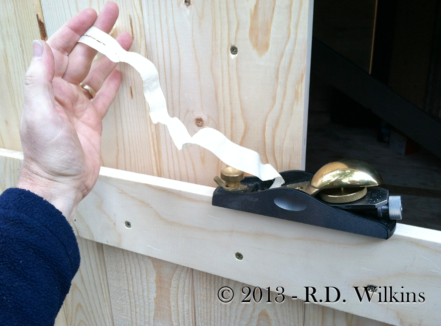
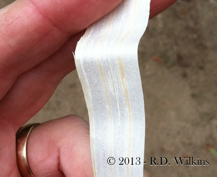
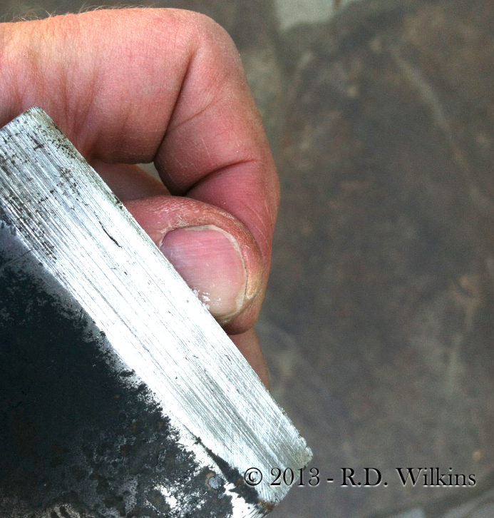
When the blade is set properly and the plane is held parallel to the wood, you get a beautiful, continuous strip of wood that comes off the work piece. Instead of sawdust from a modern power tool you get this lovely pile of curly shavings. The bottom photo is of the final plane shaving. It’s a few thou of an inch thick or about the thickness of a piece of 1000H vellum. It’s impossible to do that with a power tool.
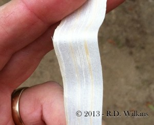
hand plane shaving about the thickness of drafting vellum
Look closely and you can see the individual wood cells. Great, you say, but who needs wood ribbon? Stay with me, I’m getting to my point.
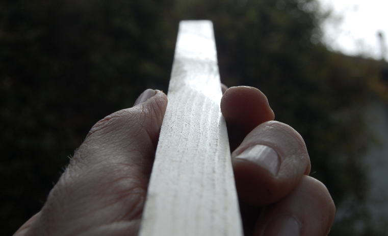
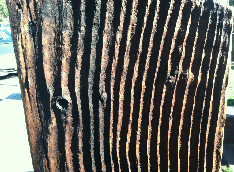
below is a piece of wood run through a power thickness planer with a new head.

Surface of wood after being run through a planer
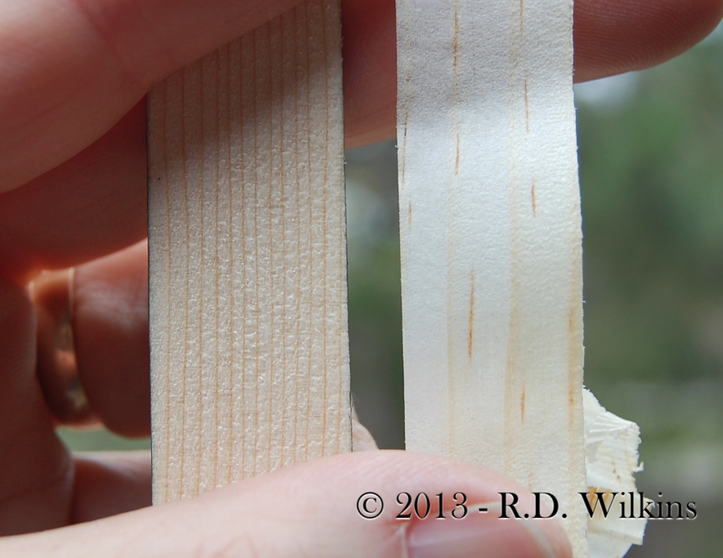
It looks pretty smooth, until you do a side-by-side comparison with the hand plane shaving. You can see below that the hand plane shaving is much smoother than the “fuzzy” appearance of the power planer sample. But why?
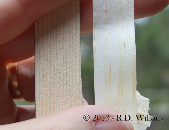
comparison of power planer cut (left) with a hand plane shaving (right)
The cutting head on the thickness planer looks like this:
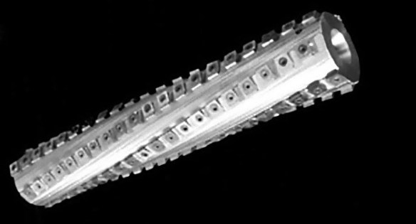
spiral cutter head for a thickness planer
Instead of a single blade that stays in continuous contact like the hand plane, the power plane’s cutter is made up of dozens of small knives that cut at thousands of revolutions a minute, which instead of one continuous cut creates a lot of this:
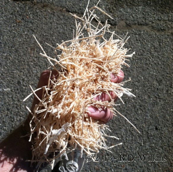
power planer shavings
Smoothing planes and card scrapers were used to create a finish as smooth as that created by modern tools using sandpaper. Sandpaper wouldn’t become used universally until the second half of the 19th century. Abrasive material, mainly fish skin, existed during that earlier period but was used mainly for the final polishing of a finish rather than as a way to surface wood like we do today as a replacement for planes.
One national woodworking magazine recently conducted a test, pitting a man with hand planes against another with a power sander to see which could finish a set of doors faster.The hand planes won, smoothing the pieces in less time than the sandpaper process which required sanding the pieces multiple times with different grits of sandpaper.
So why were planes replaced by sandpaper? Because you can hand a power sander to a complete novice and they will be able to get an acceptable finish with very little help. The use of hand planes requires the person to know how to use the tools as well as knowing how to sharpen and adjust them. Power tools have great advantages over hand powered tools when it comes to general output speed and during the industrial revolution they had another advantage; they allowed for the use of a fairly unskilled labor force. With power tools the real control is in the hands of the tool, not the operator. That’s why with power tools there is usually a lot of work involved in setting up or creating jigs to gain more control over the cutting process.
Because woodworking using had tools was labor intensive, and because prices for items like furniture was usually set by local organizations, only surfaces which were seen were finished to a highly smooth surface. here’s a photo of the underside of a table in the Chicago Art Institute. You can see the plane marks on the underside of the table top:
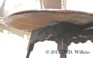
An easy way to tell if a piece of furniture is a period piece or a modern day reproduction is to run your hand along the back of the piece or the underside of a drawer. If it’s an antique it won’t be smooth.
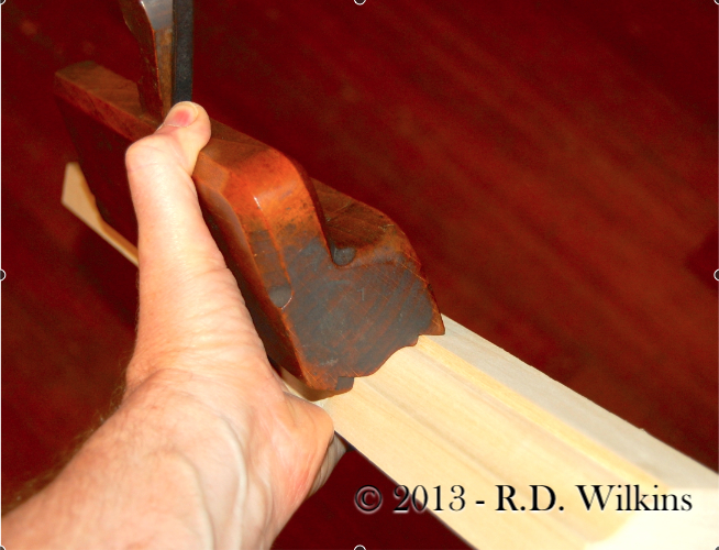
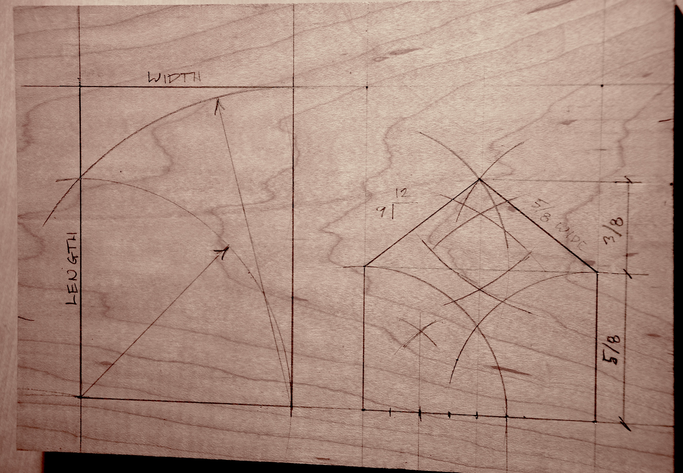
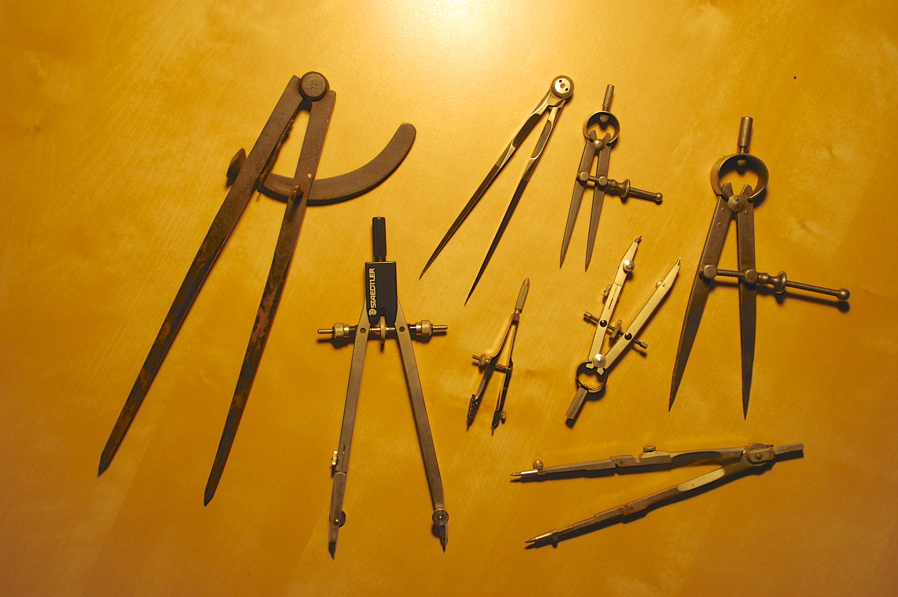
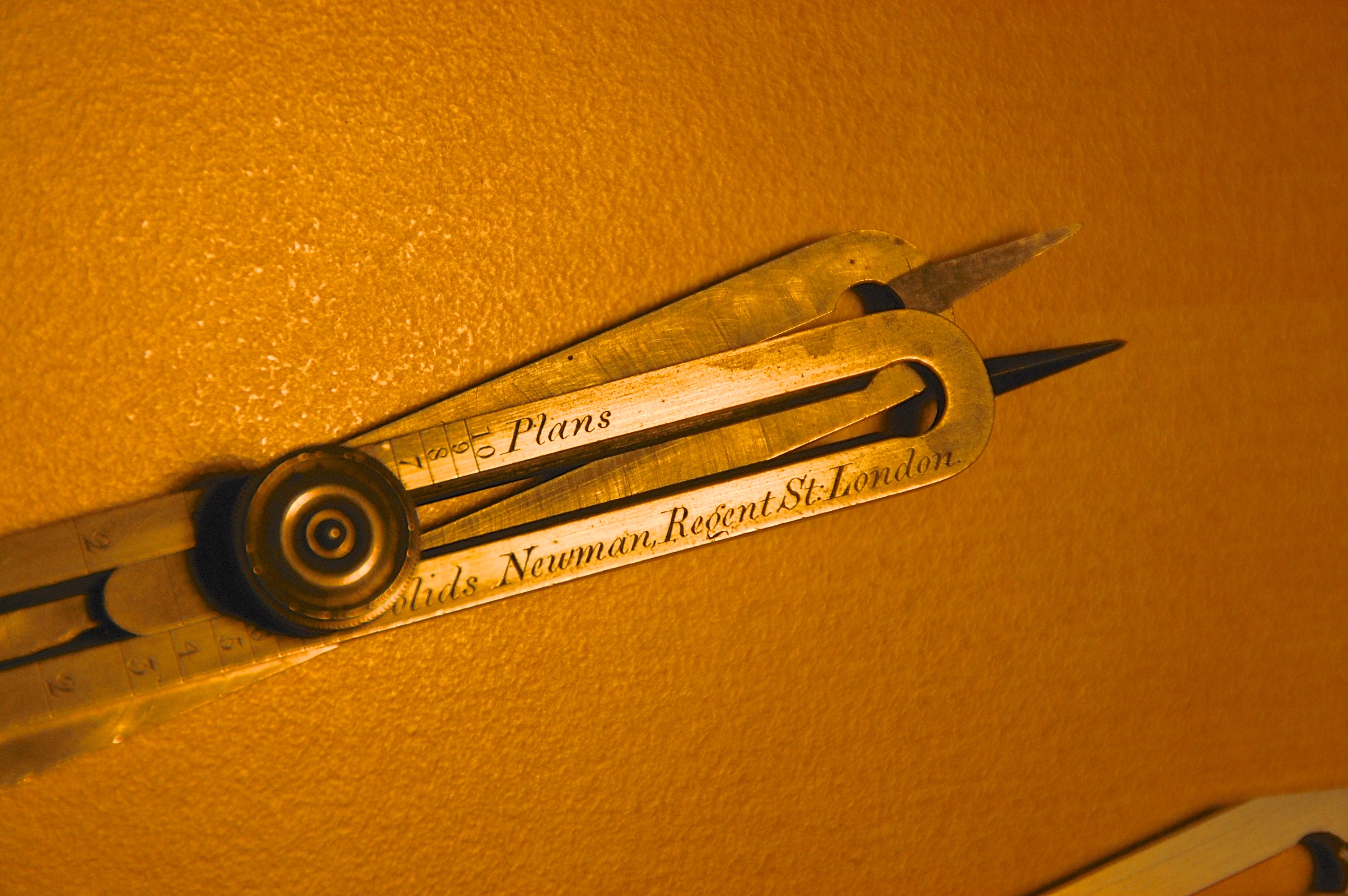
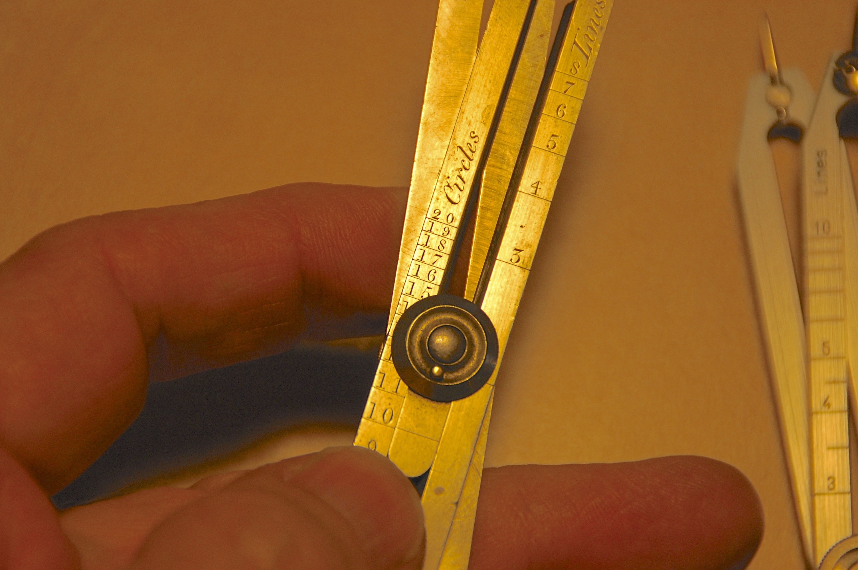
Traditional wood moldings were made much the same way but instead of a flat blade, the blade was cut in a reverse profile to the mould that was to be made. Here are two of the moulding planes from my collection. The oldest of the two, made in London over 250 years ago, still works perfectly once I tuned up the blade. You can see the results, a surface so smooth it doesn’t need to be scraped, much less sanded.
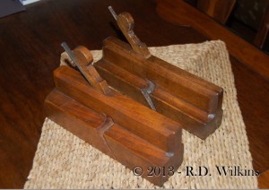
wood moulding planes

Cyma reversa cut with an 18th century moulding plane

Moulding plane and the profile it cuts
So, if the plane was developed by the Romans that should mean that woodworking before that time must have been pretty bad, right? Nope.
Take the Greeks. The Greek Trireme was as amazing ship for its time for a number of reasons.
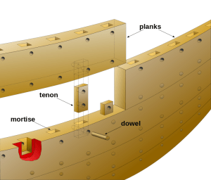
 In the ancient world ships were built in a completely different way that we think of them. Since around the 1st century ships have been built by making a framework first and then applying boards over the frame. In the ancient world ships were built hull-first., and only after that was a structural frame added for stability. The timber making up the hull was joined edge-to-edge with what is known as loose tenons. These were inserted into slots, or mortises and then pinned with dowels through holes drilled in the sides of the timbers to pull the two pieces together making a glue-less bond that didn’t require any kind of metal fasteners. The average small Greek ship had about 8000 of these tenons.
Greek ship construction – illustration by Eric Gaba
More modern wood ships had planks nailed to a wooden frame and then tarred rope, or caulking was hammered into the cracks between them to make them watertight. There is no indication the Greeks used any caulking in their ships, which means they were skilled enough with their tools, adzes and chisels, to make the joint between the edges of the planks tight enough that once the wood was exposed to water, the planks would swell together creating a watertight vessel. That’s some pretty amazing woodworking.
Of course this also means that not only was Noah a wiz with a mortise chisel, since a ship the size of the Ark must have contained some 100,000 tenons, but every modern recreation of it I’ve seen is completely wrong.