(Ed. note – This is the first in a series of interviews with Production Designers, discussing their first job experiences and earlier films in the entertainment industry.)
 Nigel Phelp’s career began in London where he was studying to be a fine artist. When his school grant ran out, he took a job as a storyboard artist. Not long after, he was introduced to Production Designer Anton Furst who hired him as a set illustrator for the film, Company Of Wolves. That film led to Furst hiring him to work on Stanley Kubrick’s Vietnam epic, Full Metal Jacket.
Commenting on the production years ago, Anton Furst related that Kubrick was happiest when he was shooting with a very small crew. Phelps revealed the reality of that preference.
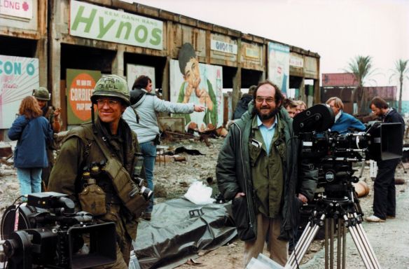
Stanley Kubrick with Matthew Modine on the set of Full Metal Jacket outside London. (Warner Bros.)
“Stanley was very fiscally responsible about the expenditures. He knew where every dollar was spent, so that meant that the Art Department was a very tiny group. There were only four people in the entire department which included a single draftsperson. We didn’t even have any PA’s. There were only a half dozen people in Production as well. We went three months without a construction manager because Stanley had heard that TV shows were able to build scenery much cheaper, so he wanted us to go around to scene shops in London that built sets for TV programs and commercials.”
“For the first three months our Art Department were two Land Rovers, each one towing a little Porta Cabin behind it that was about big enough to get two drawing boards in it. Since it was my first big feature I just figured that was what was typical for an Art Department.”
Hired initially as the Assistant Art Director, Phelps said Kubrick was very good to him and later gave him a bump to Art Director.
__________________________________________________________
Question – Where was the production located in London?
Nigel Phelps – “The center of production was Stanley’s house in north London, so our shooting radius was within 40 miles from that point. Most of the film was shot at the Beckton gasworks, except for the ending. For the ending scene, they built a set back at the studio, at Pinewood.”
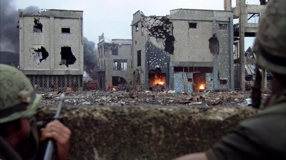
The main set, the shelled city of Hue, was recreated at the defunct Beckton Gas Works outside London, England where the company was free to dress and add to the existing ruins. (Warner Bros.)

Beckton Gas Works
Q. – Who was the Set Decorator on the film?
N.P. – “Stanley wouldn’t let us have a Set Decorator. We had to do the buying ourselves over the weekends in our free time. When it became obvious that we weren’t going to be able to shop the entire movie from London markets, he let us send a buyer, Barbara Drake, out to Thailand for a few weeks, and she filled two shipping containers and sent them back to England. So that’s how low-tech the decorating process was.”
Q. –So there was never a Set Decorator on the picture?

The gas works “Hue” set displaying the palm trees imported from Morocco. (Warner Bros.)
“No, just set dressers and a prop master. Stanley made a deal with the Belgian Army to get the tanks we used. And Stanley did this personally, as he was the producer on the film. We got a load of palm trees from Morocco and they drove them up through Spain and France.”
Q. – Did you have a researcher on the film?
N.P. – “For research, we only had about three or four books and they were on old China. That’s all we could find in England. But Stanley had a couple hundred black and white 8 x 10’s from the U.S. State Department and that was the bulk of our research. I was the only person in the art department who had actually been to Southeast Asia. We did have some good technical advisors because there were quite a few Vietnamese refugees in London at the time.”
Q.- When you were working with Stanley, did he have very specific ideas about what he wanted to shoot or did he look to you to feed him images or ideas?
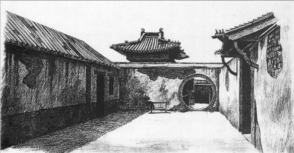
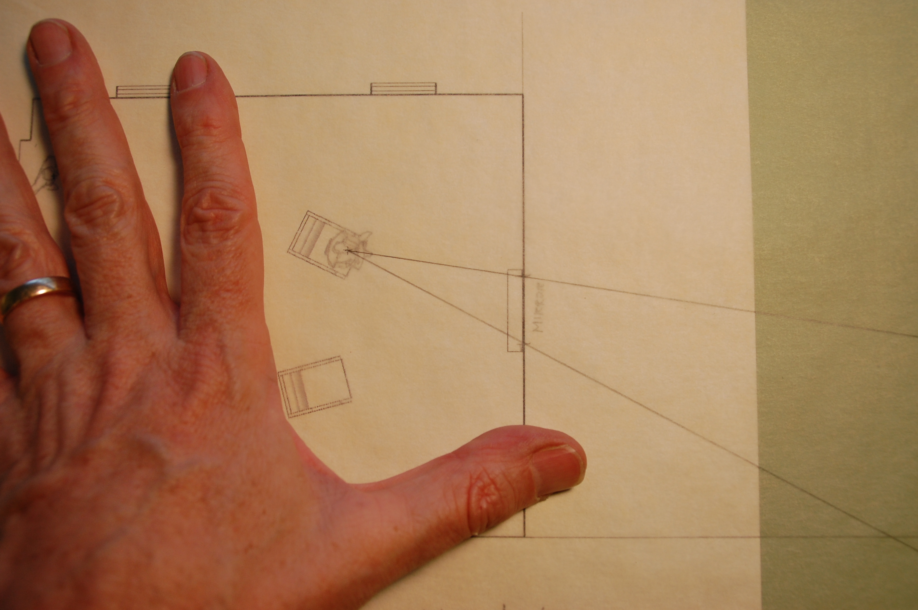
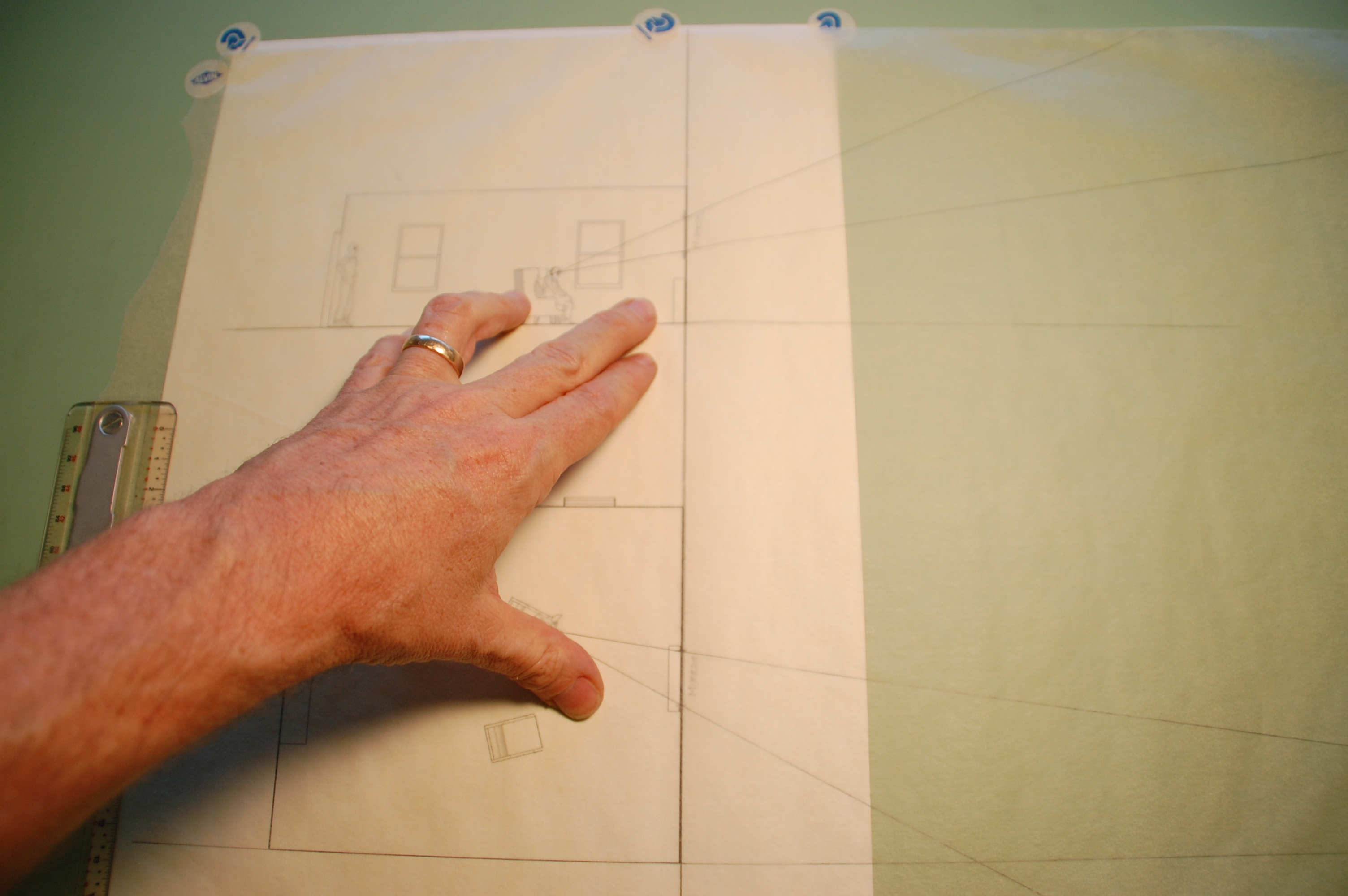
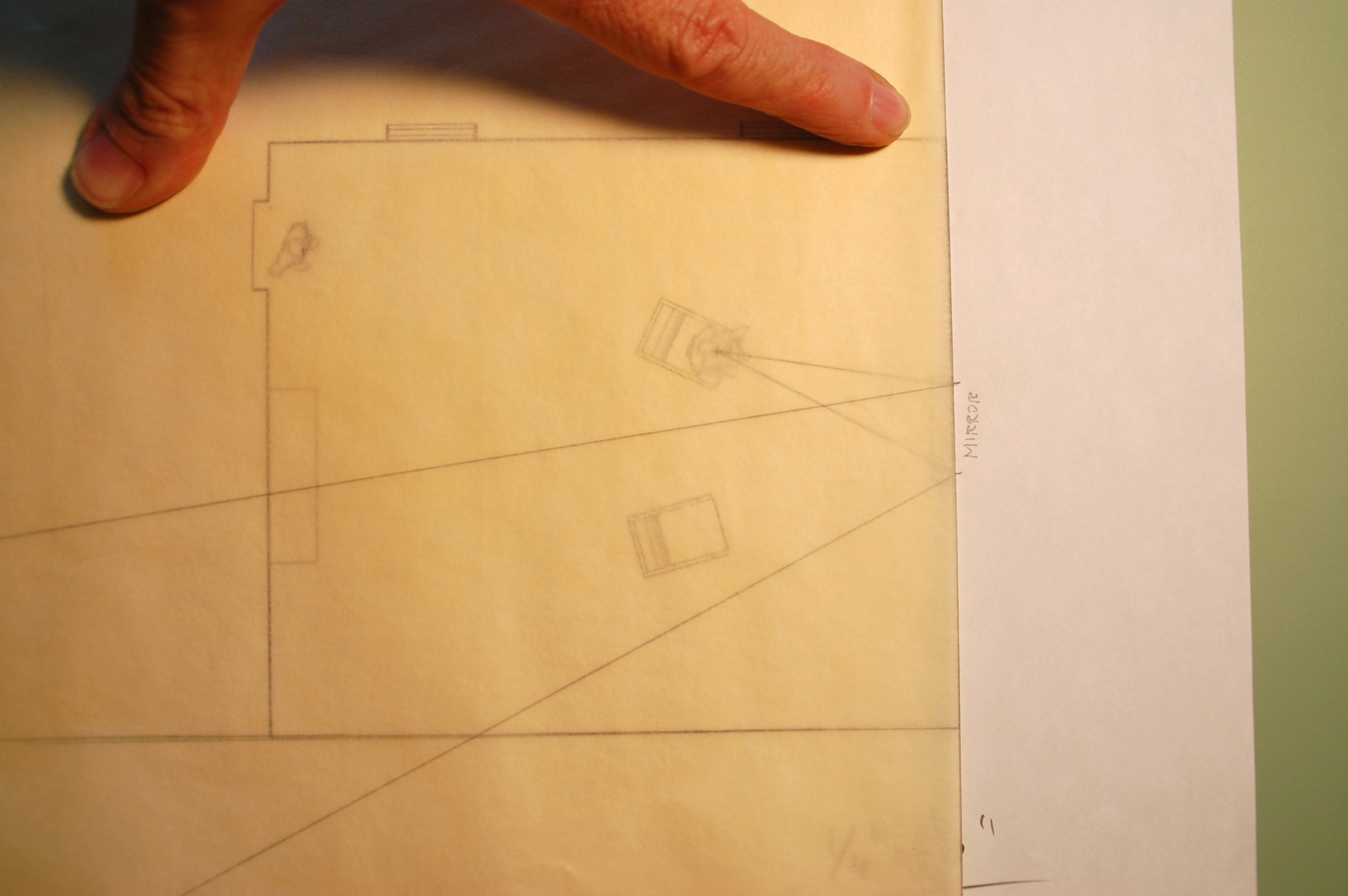
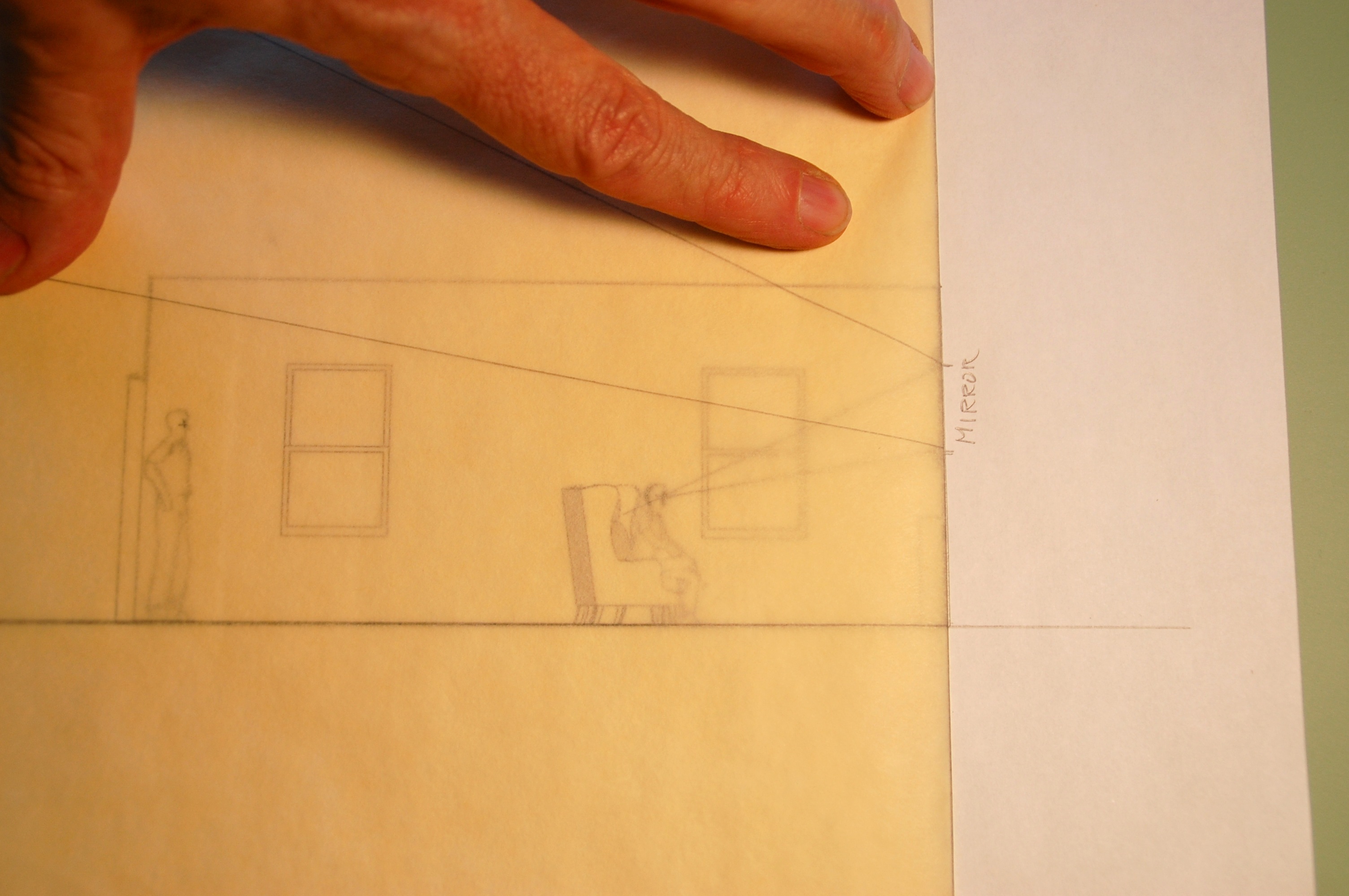
Sketch of the courtyard set for Kubrick by Nigel Phelps

Lusthog Squad / Pagoda Courtyard set (Warner Bros)
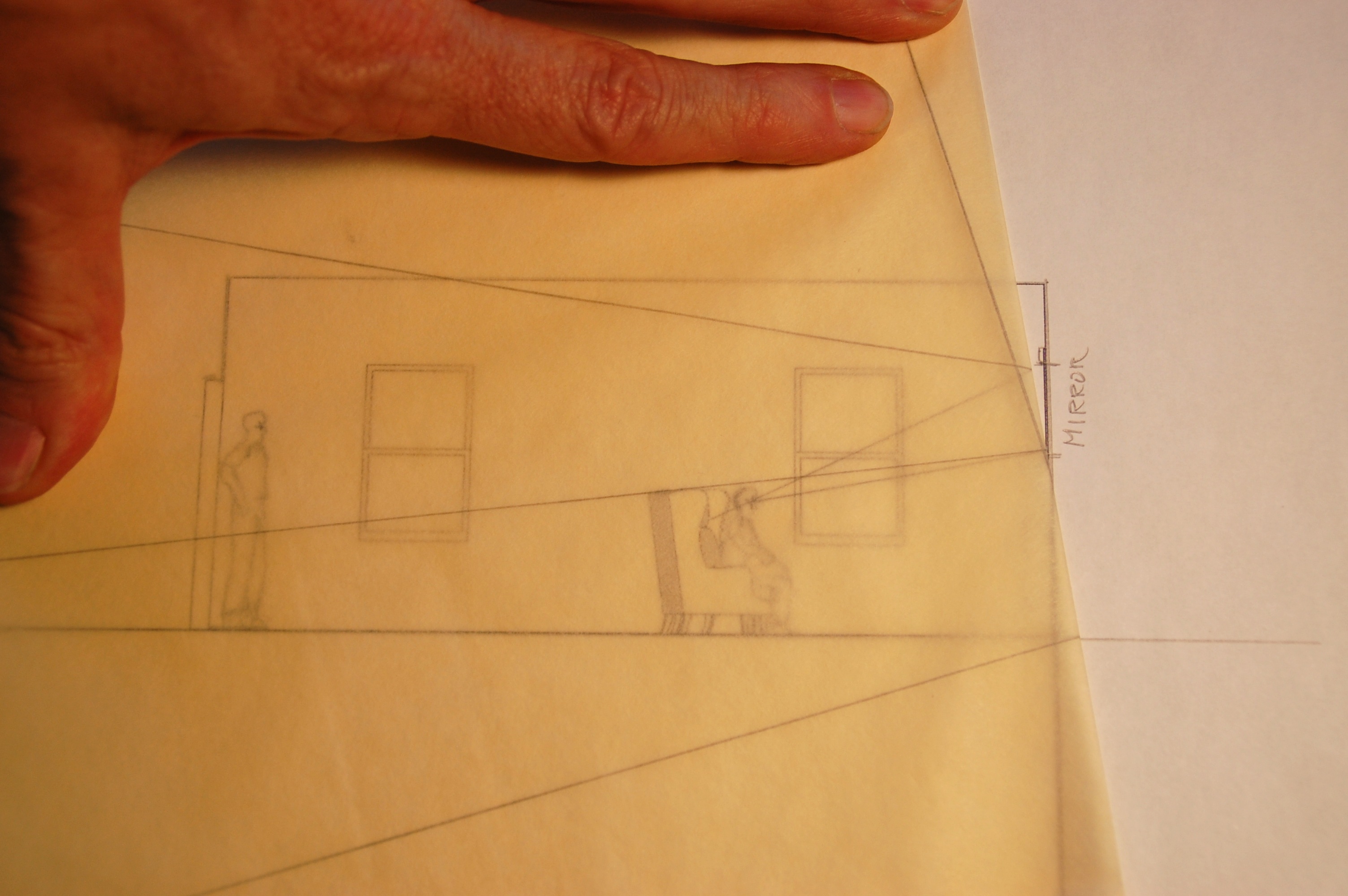
N.P.- “It was a bit of both. Stanley did have a few photos, like the one of the courtyard, and he just wanted them duplicated as accurately as possible. When you did any sketches or concept drawings he would look at them and want to know how far away things were in the picture, how tall walls were, he was absolutely thinking about things as if he were seeing them through a lens. So not knowing how to do lens projection at the time I had to figure out a way to do that for myself, so that when I drew a perspective sketch I could work backward and draw a little plan and elevations to show him what the actual sizes that it would be.

Photo of U.S. Marine Corps base gate set in London.

Phelp’s illustration of army base gate for film set.
And then after you made the sketches, we’d make a model and then that would be photographed and you’d make 20-inch black and white prints of the photos and that’s what Stanley would really look at. He wasn’t very trusting of sketches.
Q. –What scale would you build the models in?
N.P. – “There were a lot of models. Mainly they were 1/4” or 1/2” scale.

Hue street scene set

Notes on building on a budget: “What you’re seeing here is the entire build for the Hue scene.
There were just four shops in the foreground. There was no reverse scenery at all.
The background scenery ended to the left and there was nothing beyond the Billboards to the right.” Nigel Phelps (Warner Bros)
Q. – How did you manage to work with such a small crew?
N.P. – “If I remember correctly, we worked six-day weeks. But on Sunday we were also expected to go to London markets to look for any set dressing.”
Q. –I’m still amazed you did that picture with such a small Art Department, even working a seven-day week.
N.P. -“The demands weren’t the same then. You weren’t expected to produce nearly as much artwork as you are now. It was a completely different level. Now you’re expected to do artwork and models of everything, with jam on it. But back then you didn’t. You didn’t do endless options and you didn’t do concepts of all the sets either. There were just a lot fewer people involved in the process than there are now. I wish I’d known then what a unique experience it was. I took it all for granted. It was an amazing process.”
Q.- Now, the Gotham set for that first Batman movie was huge. How many people did you have in that art department?

Phelp’s initial concept drawing for Flugelheim Museum
N.P. – “I think there were about a dozen of us. Three or four full-time draftsmen, and another few for part of the film and a P.A. (production assistant). We didn’t have Art Department Coordinators at that time (in the business). I worked for the same Production Designer, Anton Furst, on Batman, and we didn’t do illustrations for all the sets on that film either. I was the concept artist for all of the sets and I did the sketches for all of the matte paintings as well. Julian Caldow did the vehicles. There were only two versions of the Batmobile ever drawn. And they were the same except one had a roof and one didn’t, sort of emulating the original TV show vehicle.”

Drawing of Flugelheim Museum interior

Flugelheim Museum set under construction

Panorama of finished backlot set. Gotham City Hall and Flugelheim Museum. Cathedral steps in the background.

Gotham City Hall plate and matte painting design
”But I have to tell you that Judge Dredd (1995) was even a bigger than the one we did on Batman. It was massive. It was also the first time that I had worked with concept artists, and amazingly, this group are still some of my closest friends; Matt Codd, Simon Murton, Julian Caldow, Chris Cunningham, and storyboard artist Robbie Consing.
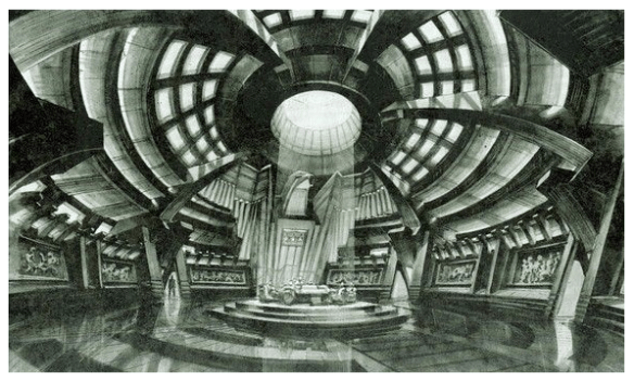
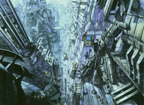
Illustration by Simon Murton
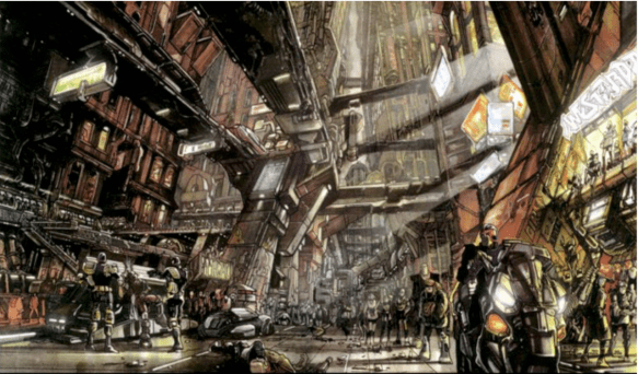
Judge Dredd / Lower Megacity One (Matt Codd)
Judge Dredd / Mid Megacity One (Matt Codd)
[Ed. note – Sylvester Stallone had insisted on constant script changes to make it more comedic. He was not thrilled with the end result but he and story creator John Wagner regularly praised the production design and the sets. Judge Dredd was Phelps’ first feature as Production Designer].
Q. –I wanted to ask you about the Trojan Horse on Troy (2004), I thought that design was brilliant, because you usually see it created as this finely crafted giant piece of sculptural furniture that would have taken years to build, and your version was this massive, somber effigy made from destroyed ships ribs, and it actually looked as if it had been hastily built from battlefield debris. It was so evocative of the whole story.
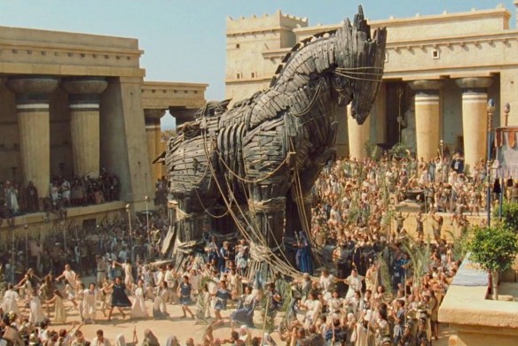
 N.P. – That was really the result of a collective design, The inspiration for that was a picture someone had given me a sculpture of a gorilla. that had been made out of rubber tires, and it was beautiful and expressive, and it occurred to me that that would be the right direction to take for the design of the horse, to take abstract shapes and fashion it from discarded ship parts. It ended up being about 40 feet tall.
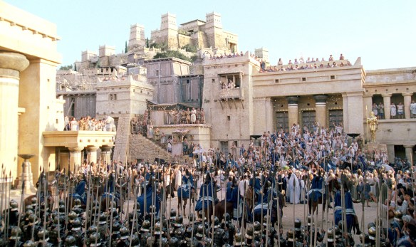
Q. –That (Troy) was a massive set too. Were the buildings and temples on the far hills forced perspective miniatures? Surely those weren’t full size.
N.P. -Oh yeah, those were full size. That was a huge set. The studio wanted us to shoot as much as we could in Malta. We had found a great location in Morocco but it was dangerous to go there. So, we found a location in Mexico, at Cabo San Lucas which was amazing because it had these huge sand dunes that came right down to the ocean, and so we built a couple of massive sets there. So the streets of Troy behind the gates was done in Malta, but the actual gates and the walls of the city were built in Cabo San Lucas.”
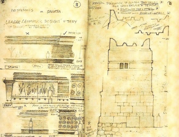
Some of Phelp’s sketches of Troy
The Troy set that was built in Malta
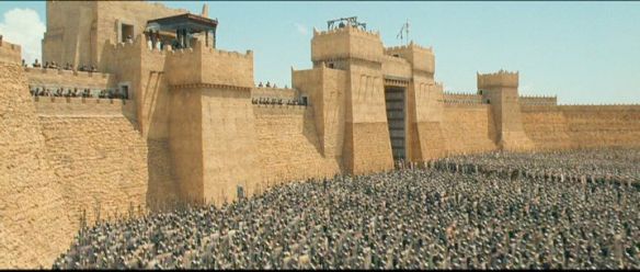
The company built over 400 feet of gates and adjoining walls at the Cabo San Lucas location. A hurricane destroyed a large part of the set which had to be rebuilt to complete shooting. (Warner Bros)
“We had greensmen working for six months to dress the battlefield and clear it of scrubby undergrowth.”
R. D. Wilkins