The Art Of Technical Drawings

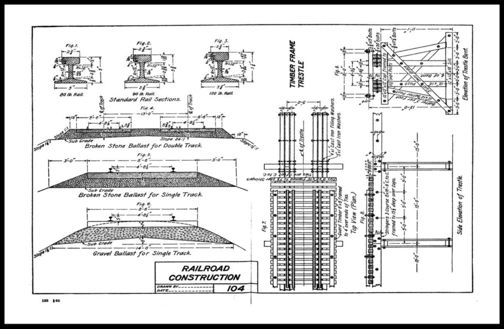
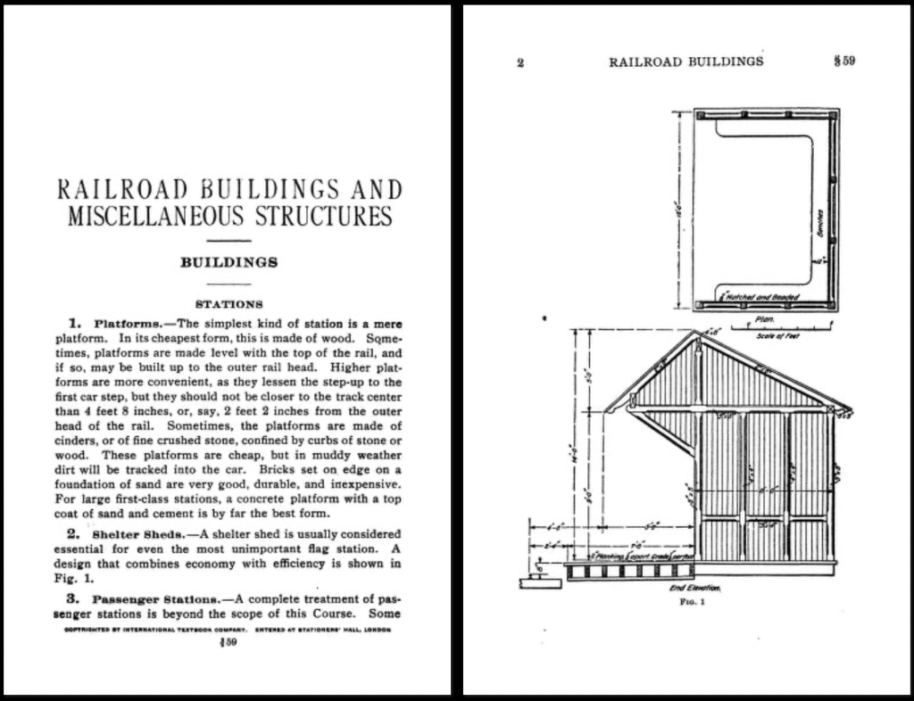
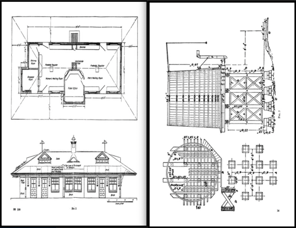
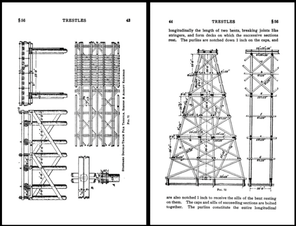
The look of construction drawings for film and television has changed a lot over the years, particularly now that most drawings are done digitally with computers rather than by hand.

While many current drawing styles now incorporate photo-textures, shadows, and icons to add life to drawings beyond what is typical of architectural drawings, it’s hard for them to match the aesthetics of hand drawings.

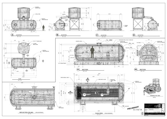
CAD drawing from 3D model – photo textures applied

Having started as a pencil draftsman I guess I do have a bit of a personal bias, but the unique style of each person on a hand-drafted drawing was immediately recognizable to people who knew their work.

Before digital illustrations and renders of 3D models, hand-drafted drawings had to serve as a design sales tool as well as instructions for scenery construction.

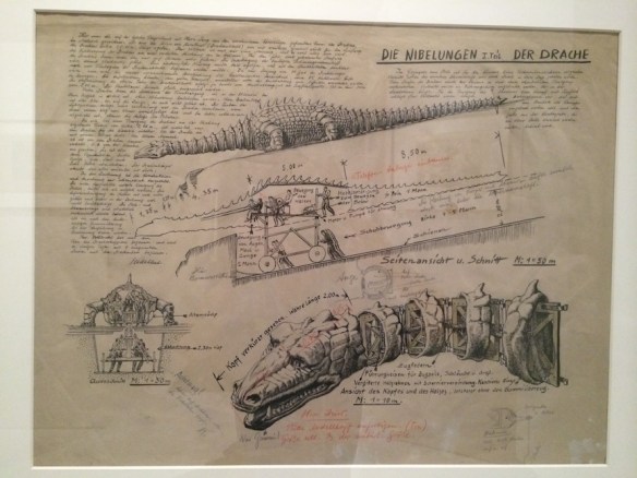
Here are some shots of a set design by Erich Kettlehut in 1923 for the UFA film, Die Nibelungen, for the scene where Siegfried kills the dragon.

The drawing was displayed as part of an exhibition of artwork from the UFA silent film period of the 1920s and 30s at the Los Angeles County Museum of Art in 2014. The drawing is from the collection of La Cinématiquè Française in Paris, France.

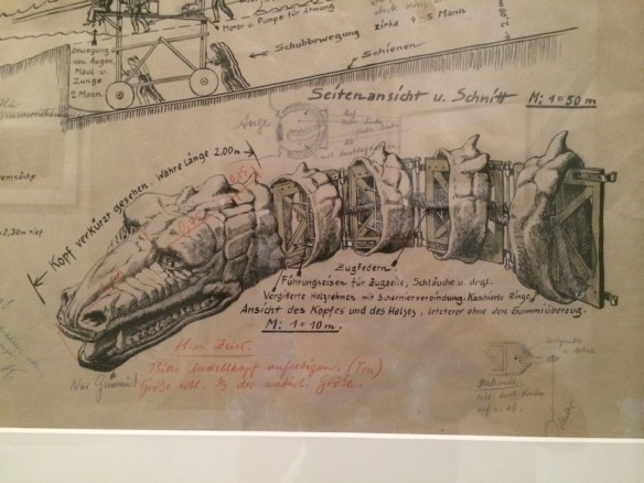
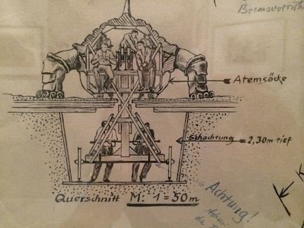
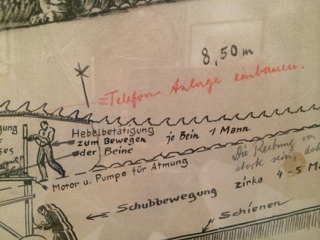
Note that the drawing not only provides a pictorial description of what the dragon should look like, but calls out dimensions, construction materials, how the action prop is to be operated, surrounding scenery requirements, and specific technical details of mechanical movements.

Technical drawing of the Dragon by Art Director Erich Kettelhut – ink and pencil on vellum
Kettelhut called out the length of the neck as well as the tension springs, framework, control cables and hoses required for the creatures fiery breath. He calls out “only rubber!” for the mouth area.
The size and depth of the recessed path required for the props operators.
drawing describing how each part of the dragon was to be operated by stagehands.
Note in red indicates that a telephone/communication system needs to be added to the prop for the crew.

The scene where Siegfried slays the dragon in Die Niebelungen from 1923

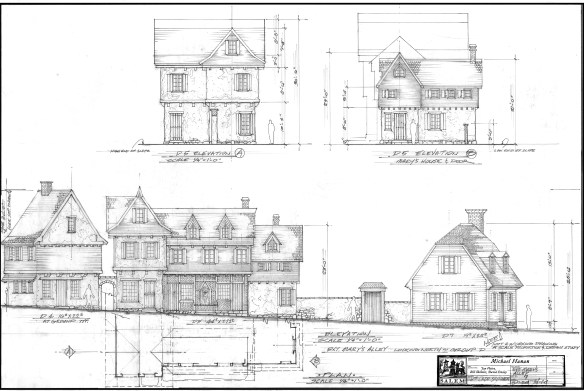
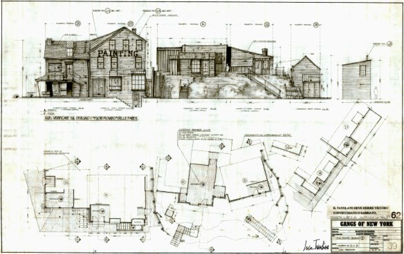
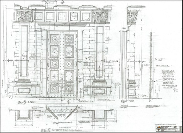
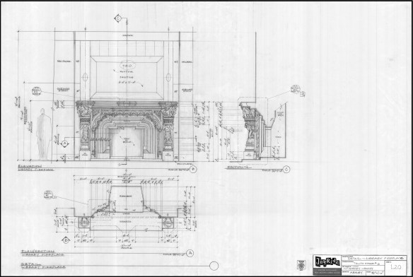
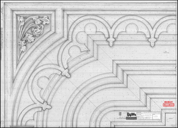
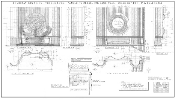
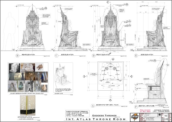
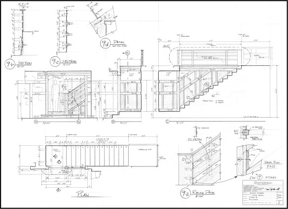
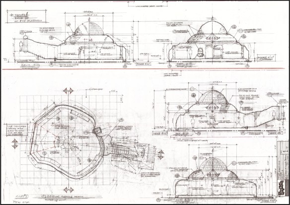
Here are a few more hand-drafted pencil drawings from more recent films:

Salem – drawing by William Ladd Skinner
Gangs Of New York – drawing by Luca Tranchino
Shazam – drawing by Greg Papalia
Haunted Mansion – drawing by Barbara Mesney
Haunted Mansion – full size detail of fireplace for the plasterers
Thor – drawing by Oli Goodier
Shazam – drawing by Stella Vaccaro
Disturbia – drawing by RD Wilkins
Haunted Mansion – drawing by Hugo Santiago
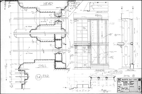
Baby’s Day Out – window detail

R.D. Wilkins

18 Design Reference Books You Should Have On Your Shelf (UPDATE)


design book montage_1

Ten years ago,  I wrote a post on 10 design books that I thought everyone should have. Looking at that list now, I think I need to expand on it by adding a few more to the list.

Here is my must-have list with sources:

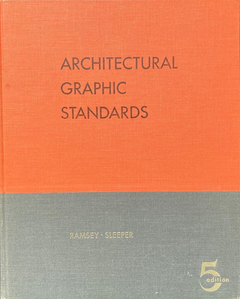
1. Architectural Graphic Standards – 5th Edition –

This was when the books were filled with great hand drawings and actually showed you in detail how things were built. There are lots of period details as well. Out of print for over 50 years, (at least in this edition) you can still find copies for anywhere from $20 to $200. The 3rd edition would be a suitable replacement. the first edition is also good to have and has been reprinted several times. Check Abebooks for copies. Not available digitally.

If you are in Great Britain, McKays is the closest equivalent, and is actually superior in a number of ways from our standpoint as set designers. On the Continent, an older copy of Neufert’s is a must. See this earlier post for details. Not available digitally.

___

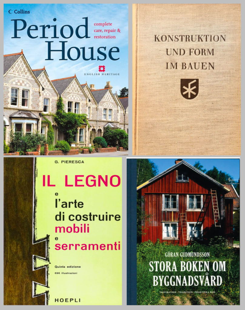
Another option in England is Period House, by Jackson & Day, which goes into extensive detail about common interior architectural elements for restorers. In Germany, the best book on period construction I’ve found is Konstruction Und Form Im Bauen, by Friedrich Hess. There are lots of very nice drawings and measured details. It’s long out of print but you can still find copies second-hand. In Sweden, an excellent book on traditional construction is Stora Boken Om Byggnadsvård, by Göran Gudmundsson. This is a current book and still in print. In Italy, a nice book on traditional construction techniques with detailed drawings is  Il Legno e L’arte Di Contruire Mobili e Serramenti. None are available digitally.

***********************************************************************

2. Time-Saver Standards for Interior Design and Space Planning, 2nd Edition.

This is the interior design complement to Architectural Graphic Standards and covers nearly every situation regarding building interiors. You can find used copies for around $50. There is a digital version available but it’s not only difficult to navigate because of the size of the book but at the price you’d be better off getting a hardback edition.

Another companion to this is a nice slim book that is for kitchen and bathroom standards in the U.S. The NKBA Kitchen & Bathroom Planning Guide was created to make common building codes and layouts available to designers in an easy to use format.

*********************************************************************

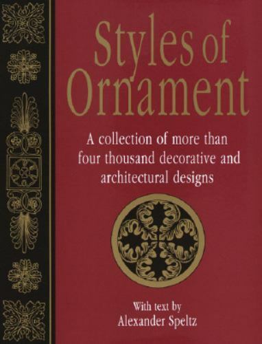
3. Styles Of Ornament – Alexander Speltz.  

Originally published in 1904, this book uses over 4000 drawings to illustrate 6000 years of historical design. As a general design reference I don’t think it has an equal. Architecture, furniture, text, carving, metalwork are all covered. A must-have. About $20 new.

The Handbook Of Ornament by Franz Meyer would be a close second. Available from a number of publishers for as little as $10. A digital version is available.

Low Budget Option- download the online PDF here.

******************************************************************

4. The Stair Builder’s Handbook – T.W. Love –

Not a design book, but a book of rise-and-run tables that make stair layout a breeze. Available from various sources for about $20.

Low Budget Option – download the PDF Common Sense Stairbuilding and Hand-railing. Skip the mind bending section on handrail layout and skip to page 99. Also, Stair building, which has a nice section on ornamental ironwork.

*******************************************************************

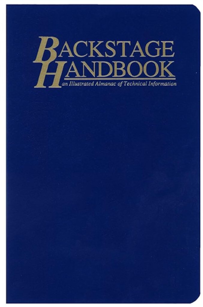
5. Backstage Handbook – Paul Carter.

Originally a technical manual for theatrical designers, the book is full of great information for film work as well. There are more details in this earlier post from several years ago. It is one of the most widely used books on stagecraft in the U.S. Available from Broadway Press for about $22. No digital version is available.

********************************************************************

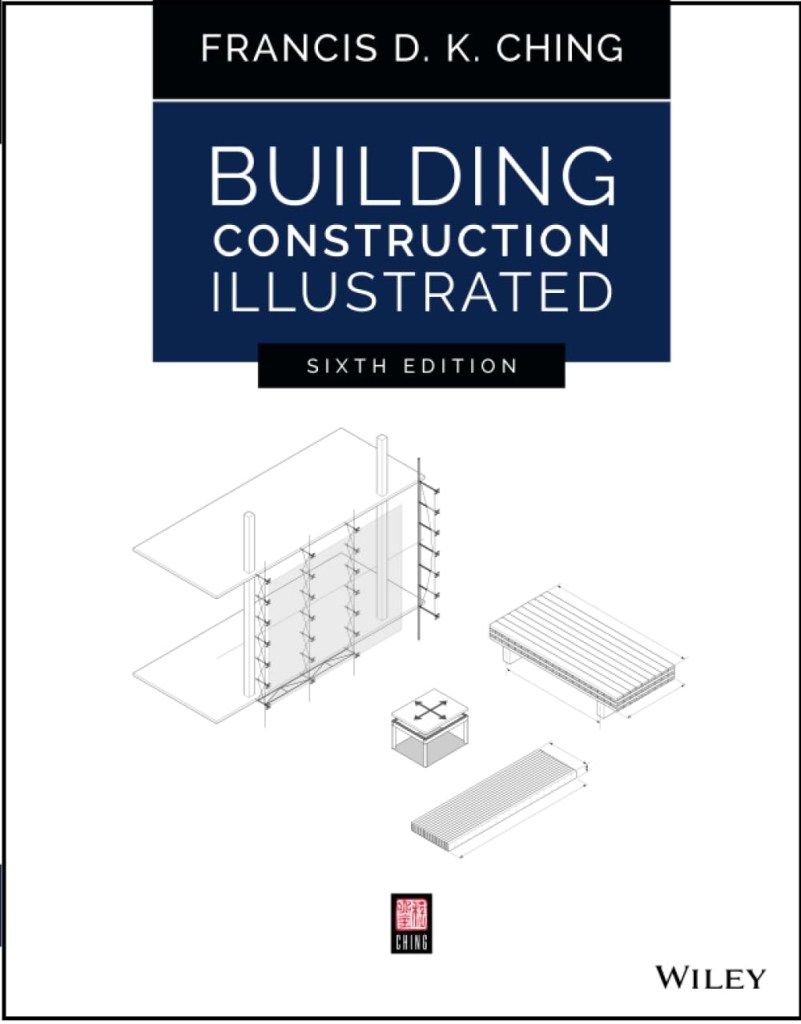
6. Building Construction Illustrated – Francis Ching.

An excellent and thorough book about construction details including wood framing systems and masonry. About $46.

Low Budget Option – access the online PDF here of the 4th edition.

********************************************************************

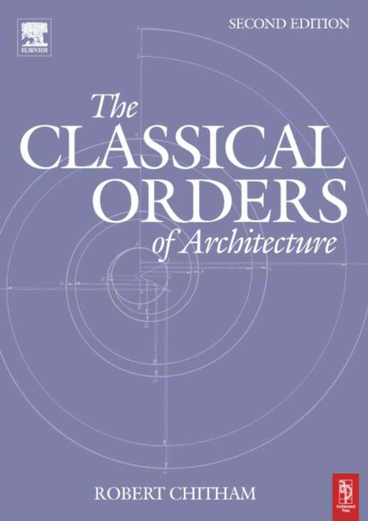
7. The Classical Orders of Architecture – Robert Chitham

I think this is the best modern book around that deals with the classical architecture proportional system. This book was out of print for quite a while and fortunately is back in print. The new edition deals with the proportions for both metric and Imperial systems. Copies can be found for about $55.

Low Budget Option – Get the PDF of American Vignola by William Ware and The Five Orders by Vignola.

*********************************************************

8. Illustrated Dictionary of Historical Architecture – Cyril Harris

With over 5000 terms and 2000 line drawings, this book covers architectural history from the ancient period to 20th century Modernism. Along with the European styles, it covers Japanese, Chinese, Indian, Islamic and Mesoamerican styles. About $35 from various sources.

Another classic book in a similar vein is A History of Architecture On The Comparative Method, by Sir Banister Fletcher. This dense, fully-illustrated book covers the time periods from ancient times to the 20th century, focusing on Western culture. It was the most widely used general architecture reference book for decades.

Used copies are easy to find for around $20. A good scanned copy of the 1905 edition can be found in PDF form here for download. Avoid reprints. Most of them are badly scanned from originals and the fine details of the illustrations is lost. A 20th edition has been published in two volumes that comes in at over 1600 pages and includes new sections on cultural architecture from countries not fully represented in the original edition. This runs at around $250.

******************************************************************

9. Elements Of Style – Edited by Stephen Calloway

This has been a standard Art Department reference manual for quite some time. Subtitles as “a practical encyclopedia of interior architectural details”, the book covers the periods from 1485 to modern day. Each chapter covers a different time period and is separated into thirteen sections which each feature an interior element, making it easy to cross reference similar elements from other time periods. The book includes over 3000 drawings and 1300 photographs to accompany the written analysis. In hardcover for around $75. Used editions can be found for as little as $20.

******************************************************************

10. By Hand & Eye – George R. Walker & Jim Tolpin.

If you’re just starting out in set design this is one of the first books I’d tell you to buy. Bad proportions can ruin a design. This book will give you a solid understanding of proportion and keep you from making simple mistakes. You can download a sample chapter here. Also, I wrote a longer post on the book earlier. Walker and Tolpin are promising a workbook that will come out later this year based on the book’s concepts so look for that. Available from Lost Art Press for $51, hardbound. A PDF is available for $24.

*******************************************************************

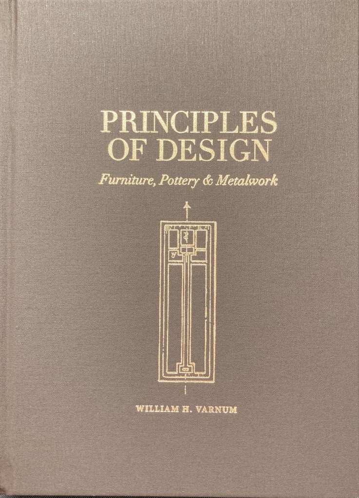
11. Principles Of Design – William Varnum

This is a recent reprint of a book published in 1916 under the title Industrial Arts Design. The book lays out the basics of design, with step-by-step rules for designing not just furniture but pottery and metalwork as well, with sections on enriching a surface with detail or hardware. The rules translate easily to architectural forms and will seem like obvious, common-sense choices once you are exposed to them. This hardback edition is the second run of a limited printing. By Lost Art Press at their website. Hard cover edition is $41.

*****************************************************************

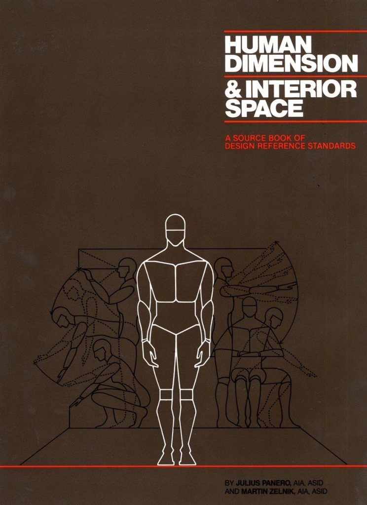
12. Human Dimension & Interior Space – Panero & Zelnik

This book explains the science of anthropometrics, which is the study of human body measurements on a comparative basis. Whether you are designing interior elements, furniture, or vehicles, this book will help you create those spaces with easy to read diagrams and charts that detail the huge disparity in shapes, sizes, and capabilities of the human form. The authors warn against designing for a ‘standard size’ human body which in fact, does not exist. New in hardcover at about $24. Digital versions are also available.

*****************************************************************

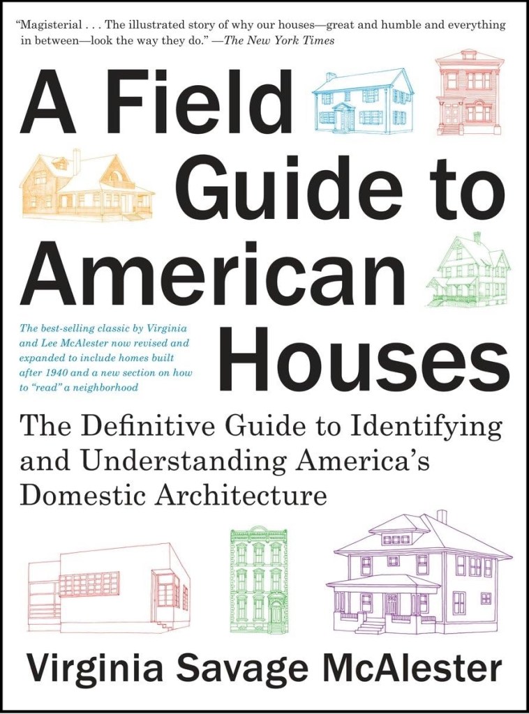
13. Field Guide To American Houses – Virginia Savage McAlester

Described as the “definitive guide to identifying and understanding American domestic architecture”, this book is considered an essential source for understanding the myriad of styles and elements that define American houses. With over 1000 drawings and photographs, the book separates the various styles into chronological categories and explains the details and accents that define each of them with clear, simple sketches. The second edition is about $24 in paperback.

****************************************************************

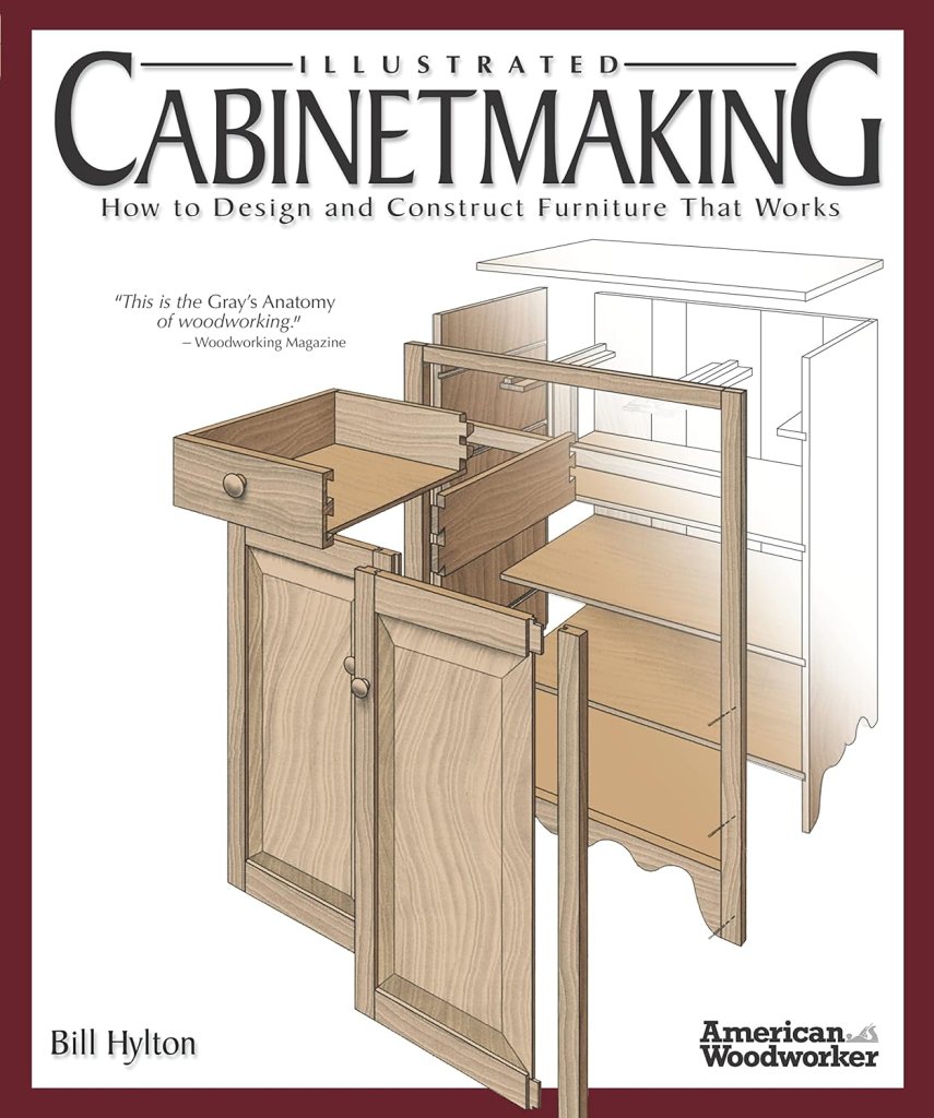
14. Illustrated Cabinetmaking – Bill Hylton

I covered this book in detail in an earlier post. One reviewer referred to this book as the Gray’s Anatomy of woodworking, and that’s a pretty accurate description. If you’re going to design furniture you need to understand how it’s built, and this book explains it with over 1300 color illustrations and exploded views of 90 different pieces of furniture from different time periods. There are sections on joinery, standard dimensions, and sources for construction drawings. Paperback editions are about $24. Digital editions are also available.

***************************************************************

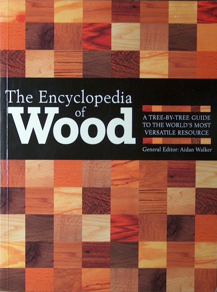
15. The Encyclopedia Of Wood – Aidan Walker, Editor

There are numerous books on tree identification but this one stands out to me because of the variety of wood that it covers and the large, clear color photographs of each of 150 species grain patterns and figure. There are also chapters on how wood is processed, what wood movement is, and how veneers and lumber are milled. In paperback for about $35.

***************************************************************

16. American Cinematographers Manual – American Society of Cinematographers

The new 11th edition will cost you about $120 in hardback and almost the same in it’s digital version through the iTunes and Android sites. Earlier used editions can be purchased for a third of the price of a new edition, but much of the latest technology isn’t in them. This is the go-to book for all things dealing with cameras and image capture. A lot of people will tell you you don’t need this. I’m sure you might also have a great career as a car designer without knowing anything about how cars work. Because when it comes down to it, all we’re really doing is designing big, pretty things to bounce light off of. Just remember, if the department names were based on physics we’d be the Light Reflector Design Department.

 *************************************************************

17. The VES Handbook Of Visual Effects – Okun & Zwerman, Editors

Published by the Visual Effects Society, this +1000 page book covers every type of visual effects shot you will encounter. From in-camera effects like miniatures and mechanical effects to green screen work, motion-tracking, LIDAR, tracking shots, LED wall stages, and everything in between. It’s the most complete book on visual effects that has been produced so far. Consider it to be a complementary reference to the American Cinematographers Manual. In paperback, the new third edition costs about $65.

***************************************************************

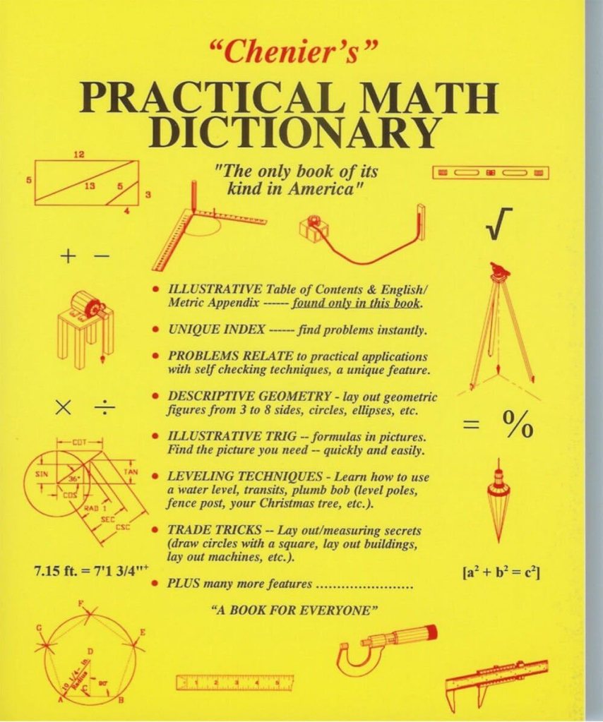
18. Chenier’s Practical Math Dictionary – Norman Chenier

This book is an odd duck in many ways but it has been a real time saver on a lot of occasions. There are sections on descriptive geometry, survey and layout techniques, solutions to common math problems, and other information that you’ll struggle to find anywhere else. In paperback, the latest edition is $26.
What Just Happened? The Psychology Of Film Scenery

“Every scene you will ever act begins in the middle. . . .” Michael Shurtleff

The casting director Michael Shurtleff wrote a book called “Audition”, which is a kind of roadmap for actors to use when preparing to try out for a part for a film or theatrical play. It lays out the basics of determining the psychological elements of a scene, even if the actor has only been given a single page from the script.

(An aside: if you really want to understand script breakdown, take an acting class. It will give you a new appreciation of actors too. Do that one better and go out for an audition, and then imagine doing that a dozen times a week for the rest of your career.)

One of the Guideposts in the book is titled, The Moment Before. Shurtleff explains that a scene always starts the middle of a situation. It’s the actors job to figure out what events came before, because a lot of times that information isn’t in the script. A general outline might be there but the small details are missing.

What just happened?

With films, a lot of the ‘personality’ of a set is the work of the Set Decorator. They give life to the structure of the scenery, and it’s a big reason why they share Oscar and Emmy awards with the Production Designer.

But you can only put so much lipstick and mascara on a goat, and if the sets ‘bones’ aren’t great, something big will be missing.

What does your set say about itself once the construction and paint crews are finished, before the set decoration crew even starts?

What happened in this room a week ago? A year ago? Twenty years ago? Was the house built before the development of modern plumbing? Do the mouldings indicate that it was built before electric power was available, and the “new” type of special moulding now hides the wires that snake along the baseboard and up corners of the room?

Once the set is dressed and filmed, are there elements that will stand out or tell a story about the “envelope” beyond the dressing?

When I look at empty houses I always look for the signs of past human lifetimes. Most buildings will survive 4 or more owners, or generations. They all have their scars from surviving their inhabitants; the bad remodels and additions that don’t match, bad repair jobs or damage that was never repaired.

I got to tour a historic house from the 1830’s that was built in the Greek Revival style and was shocked when I saw the front parlor room. The second owners wife was tired of the classical design and had the room renovated in the then-current 1890’s late Victorian “Eastlake” style. The contrast couldn’t have been more odd if they had redone the room in a Mid-Century Modern style.

The historical society who owned the house decided that the Victorian remodel of the room was part of the history of the building and voted to not return the room to its original configuration. It may have not been ‘true’ to the origins of the house but it defined the ‘human experience’ that the home had gone through. It was some of the ‘finger prints’ that its inhabitants had left behind.

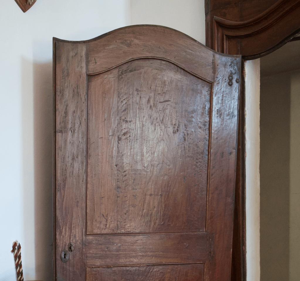
This is a photo of a door in a friends families 900 year old Castello in Northern Italy. I wondered about the deep gouges in the upper panel and they told me that they were a remnant from several hundred years before during a hasty removal of a carved crest that hinted at support of a then out-of-favor monarch.

The details of a set don’t have to be that subtle. It could be a bricked up window, a stairway in an odd but obviously not original location. or maybe the wallpaper in a room is torn in one corner, revealing three other layers behind it, or there are scorch marks on the wooden kitchen floor in front of the stove where a red hot cast iron skillet was dropped.

The ‘character’ can certainly come from the paint and age that the scenics apply and sometimes there is even more you can add. One person told me about arriving on a stage set one day for a shoot in a period kitchen set to find the Production Designer Dean Tavolaris bending over the tile counter with a one pound can of Crisco shortening, rubbing handfuls of the stuff in the corners and between the sink and stove.

Actors will often create past stories of their characters for themselves to help them flesh out the role that will give them personal emotional substance to draw on for their portrayal. This is information just for themselves and a lot of times they don’t feel the need to share it with anyone else, but it gives their performance extra ‘bones’.

As a designer you can do the same with a set. You can create the environment’s past lives that may have nothing to do with the story in the script but it will give it a reality that will make it feel like it hasn’t just materialized suddenly out of thin air, which, as scenery, it pretty much has. We think of spacecraft as modern, sterile environments that don’t have much character. Star Wars changed all that with some spacecraft that were past their expiration date and bore the marks of abuse and mechanical failure. It made them more lifelike and less like machines.

Whether you share that ‘history’ with anyone else is entirely up to you, but if you can tie it into the story or at least make it an interesting part of the design, it can help you sell your ideas to a director who will most likely appreciate that you are bringing a depth to the film that they hadn’t thought about.

That work will come from really analyzing the script, and there isn’t always a lot of time to do that. But, you can learn shortcuts, and that’s a whole other blog article.

For starters, I suggest these: Audition, by Michael Shurtleff, and the chapter on script analysis in Directing Actors, the first book from my absolutely favorite directing teacher, Judith Weston.

Why I Love The Pencil

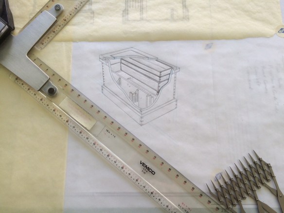
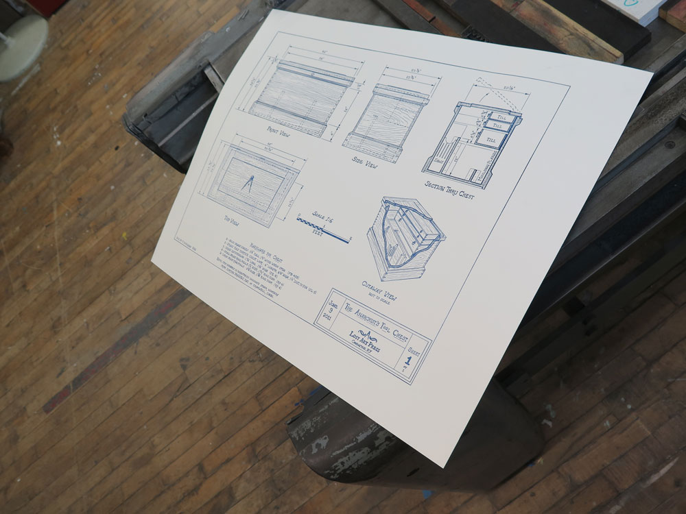
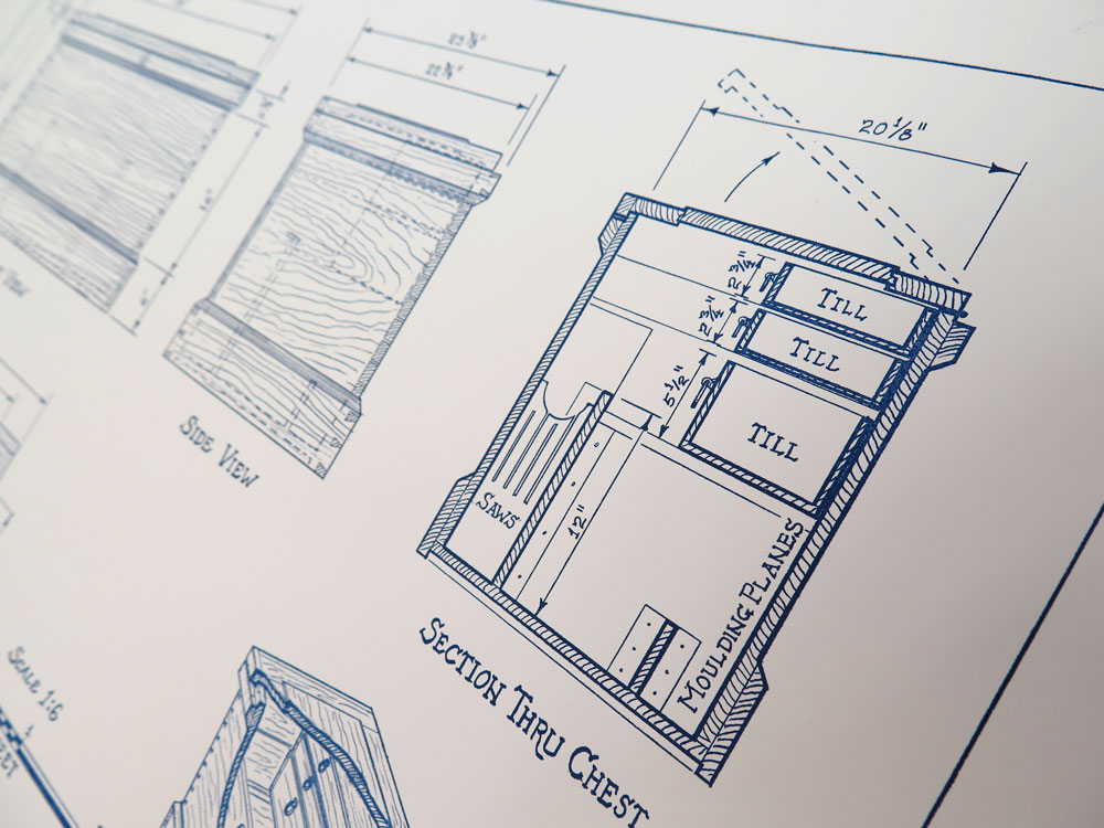
Chris Schwarz over at Lost Art Press contacted me back in February to see if I would be interested in doing a hand drawing in a late 19th / early 20th century style for a limited-edition poster to commemorate the 5th anniversary of his excellent book, The Anarchist Tool Chest. I was more than happy to agree to the assignment not only because I consider the book to be a classic, (Schwarz has been a leader in not only creating a hand tool renaissance among woodworkers but creating a whole new philosophy in the way we look at furniture and the process of creating it) but I was also excited to do a drawing entirely in pencil., something I hadn’t done for quite a while.

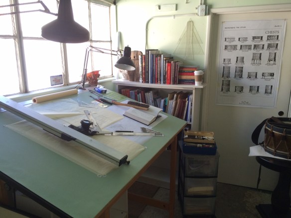
Except for the occasional quick sketch, it’s rare I don’t do a drawing now on anything except the computer. After digging out my good pencils and tools and some good vellum from storage, (the new stuff is made for plotters not pencils and gives horrible results when you try to erase something), I made a test drafting just to refresh my pencil skills as well as brush up on my hand lettering technique.

IMG_9422

As I began to layout the drawing I suddenly began to realize both the differences and advantages of hand drafting over CAD:

1 – There are no in-your-face interruptions such as email, instant messaging, software update notices, news alerts, etc.

The process of creating a working drawing has been hi-jacked by software. There is this fallacy, particularly among those who don’t draw, that the computer is doing the bulk of the work. This is patently false. The computer is just a fancy pencil. It can give the veneer of respectability to a drawing if you don’t know what you are looking at, but the document is worthless if the operator does not understand the basics of creating a working drawing. Also, the process of creating a construction drawing happens to a great extent in your head, not in the computer. A lot of the work on the screen is preceded by a good deal of mental gymnastics, which is why set designers hate to be interrupted. Stop us in process and it will take 10 to 15 minutes to return to the zone where the true work gets done.

When you are drawing with a pencil you are in a completely different mental space that requires you to constantly visualize the object in your mind. This not only makes you work in a much deeper state of concentration but forces you to think many more steps ahead in the process of breaking the object down into what needs to be drawn to communicate its complexities.

FullSizeRender

2 – You have to think differently about the drawing.

The draftsperson is no longer spending brain power on software or hardware concerns. There is also the endless-zoom mentality where the operator does not have a realistic idea of the scale of the elements. The ability to zoom it 10,000 percent on a document is what leads to prints in which the dimensions and notes are virtually unreadable unless you’re using a magnifying glass. There is also an economy in a hand drawing that is absent from a CAD drawing. You only show what is important for that sheet.

Also a line is what you say it is. With CAD and 3D modeling there is this expectation of perfect scalability throughout the model. That may be a good thing if you are designing a high-rise where there are dozens of other engineers and companies involved but for set design it adds a layer of unnecessary work.

Where you were once chastised for drawing too many brick details on a facade, I’ll regularly get a digital model where every fastener is completely detailed with threads. This is why during the pre computer days it was considered that a good working rate for a draftsperson was a sheet a day, while the rate for most modern computerized Art Departments is calculated at 3 to 7 days per sheet. We used to fear that the computer would make things so much more efficient that less people would be needed. Just the opposite happened. Where a typical feature film used to have 4 to 10 Set Designers, on bigger shows now, there will  be as many as 30.

Proof for final offset prints. photo by Chris Schwarz

Proof for final offset prints. photo by Chris Schwarz

Detail of nice crisp detail of the poster by Steamwhistle Press. Photo by Chris Schwarz

Detail of nice crisp detail of the poster by Steamwhistle Letterpress. Photo by Chris Schwarz

The print is being offset printed by Steamwhistle Letterpress in Newport, KY. Only 1000 of the prints will be made and copies will be available on the Lost Art Press website.

Here is a video Chris made at the shop while the first prints were coming off the Vandercooke press.


Letterpress Print Run from Christopher Schwarz on Vimeo.


The Digital Bookshelf – Furniture Mouldings

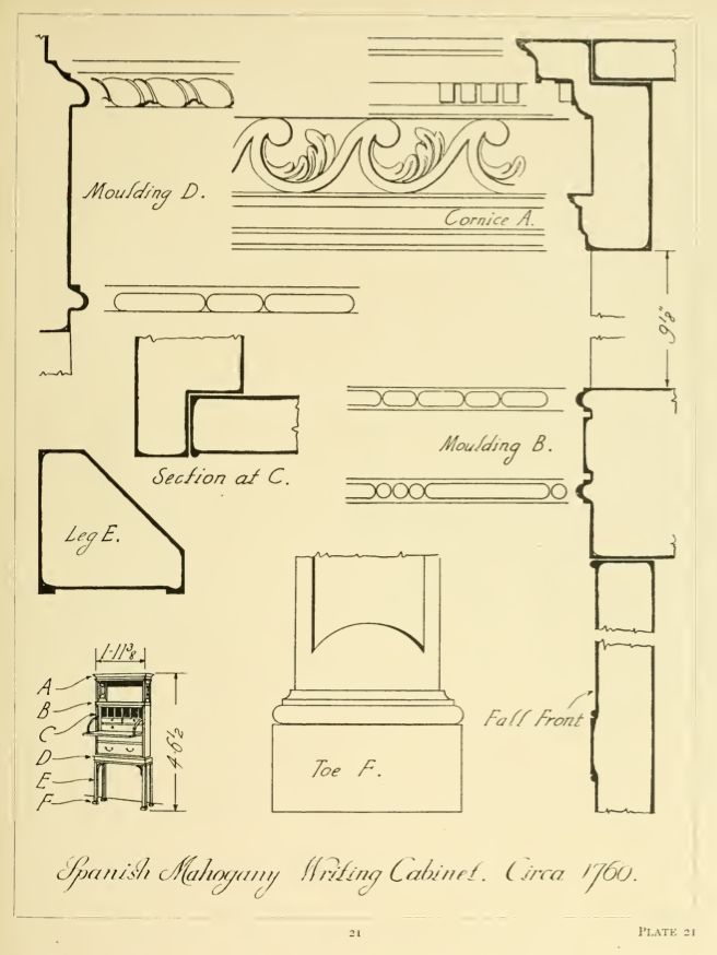
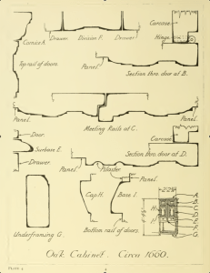
“There is a tendency among those accustomed to the large-scale of moulding detail on exterior work in wood or stone to make their mouldings on furniture and interior woodwork too large. The full-size furniture moulding so carefully drawn by Mr. Warne should be of the utmost service not only to furniture designers but to students of architecture and interior decoration.”

plate 21_warne


plate 4_warne


“This book covers many different types of English furniture; bedsteads, bookcases, bureaus, cabinets, chests, cupboards, chairs and others. This book illustrates cover this book covers molding details on English furniture from about 1574 to 1820 molding is the method adopted by the cabinetmaker to give definition to the lines of his work and the sections of molded detail very very much as one style has succeeded another through the oak, walnut, mahogany and satinwood periods of English furniture the workings of moldings was then so laborious that the craftsman use them with greater restraint and obtained more pleasing effects by their use than is frequently the case today when profusion often eliminates interest.”

H. P. Shapland, 1923


E.j. Warne’s book, Furniture Mouldings, is still one of the best resources on 16th to 19th century British furniture. Almost never out of print, copies can be had for as little as $1.

Until you get a print copy, you can download a digital scan of the book below. Scanned from an ex library copy, there are a number of damaged pages but you can get a good idea of the scope of the book.

FurnitureMoulding_EJWarne_1923


– R.D. Wilkins


3 Methods Of Scaling From Photographs


photo-6In February I posted an article about using your hand in photographs as a scale reference but didn’t go into how you extract that information once you have a copy of your photos. Here are three methods, two analog and one digital, that you can use to figure out hard dimensions from objects in photos.

Equal Space Dividers

Once you have had some practice, this is the fastest method of the three, even faster that the digital method and you can use them right off a photo from a book or even a smart table screen. If you don’t have a set of equal dividers, also called 10 point dividers, you can buy a new pair for between $250 and $300 from various sites such as this one, or this one . They sometimes show up on Ebay but plan to pay around $75 to $100 for a used set.

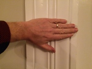
In this photo of a 1840’s Greek revival casing, we’ll scale the actual size using the hand in the photo as a reference nomen.

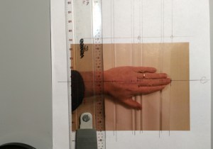
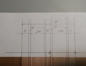
IMG_6890The first thing you’ll want to do is draw lines outlining the sides and edges of the moulding details, then you’ll draw a centerline through your scale, whether it’s a hand or tape measure. Then draw a line parallel to this at the top of the picture crossing the outlines. Now continue the lines perpendicular to this new datum line so that they are parallel which eliminates the perspective/foreshortening effect of the photo. Then mark a known distance on the original centerline, in this case it’s the distance from the tip of the middle finger to the end crease which is 3 3/4″.

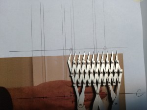
IMG_6886Now transfer these two points to the new datum line at the top of the photo. With the dividers, open them along this datum line allowing the distance between each point to equal 1/2″. They can represent any distance you want them to, but 1/2″ works best for this example. This means that 7 1/2 spaces will equal 3 3/4″ scale inches along the new datum.


IMG_6887Once you have these marks set, carefully move down to the bottom of the page and mark the distance at the first and last point. As each space represents 1/2″, the distance over the width of the dividers is a scale 5″ along the nomen line. For accuracy you’ll want to continuously check the spacing of the dividers against this ‘master’ to be sure you haven’t changed the setting. Most dividers are manufactured with fairly ‘tight’ joints but you can easily bump them while you’re working and throw off the setting.


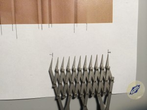
IMG_6891Now we have a scale to measure the spacing between each of the line extensions above the top nomen line. You can mark the distance at the middle point and reduce the spacing of the dividers to equal 1/4″ in scale and so forth. I came up with an 8″ width, which when I checked the casing with an actual measuring tape, found it to be in reality 7 7/8″ to 7 15/16″. Not bad, well within the accuracy of most applications.


Digital Calipers

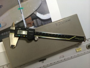
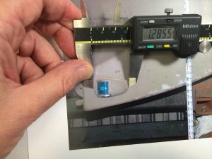
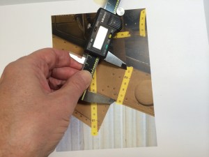
mutoh digital calipersThis method is not only more accurate than the equal space dividers but is a cheaper method as well, just not as fast at first. I have a set of Mitutoyo digital calipers which run about $180, but you don’t need anything that accurate. You’re going to be dealing with nothing finer than a thou of an inch and even that’s pushing it. A $12 pair like these are more than adequate, in fact this $9 cheap plastic pair are even better as the sharp points on the jaws of the better calipers will rip the crap out of the surface of the page of a book or the emulsion of an enlargement. They’re a lot safer to use when you’re scaling off a computer screen as well! They all have the ability to be set for decimal inches or metric.

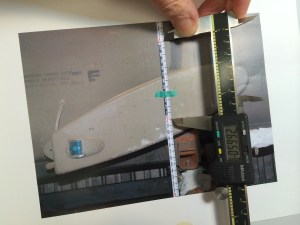
IMG_7157The nomen in this photo is a Keson Pocket Rod, a retractable builder’s survey pole, ( don’t know if it comes in a metric version) if you don’t have one, get one right now. You’ll wonder how you got by without it. With a graduated scale in the photo it’s easy to find a correct scale. Turn the calipers on, squeeze the jaws together and zero out the reading. then you just set the jaws between a one foot increment and record the reading.

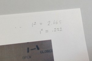
IMG_7158In this example 1 foot equals 2.665 inches. Divide this number by 12 and you come up with .222 inches equaling 1″ in the photo. Record these numbers for reference at the top of the photo. Remember that this equivalent will only be accurate over the whole area of the photo if you have been careful to make sure your camera was perpendicular to your subject matter.

IMG_7159


I could go into allowing for foreshortening and lens distortion calculations but that would take an entire chapter of a book.


IMG_7161There are other options to the survey pole or tape measure. Richard Mays introduced me to graduated adhesive tape on a movie several years ago and it’s a great tool. You can put several pieces within the frame and you’ll quickly see if you have  foreshortening issues. Art Director Jim Wallis has provided a manufacturer and source for ordering some for your kit. Or this one, Or this source for both imperial and metric with story pole writing space.

Photo Scaling With Sketchup

I know there are a number of ways to scale from photos digitally but if you pla
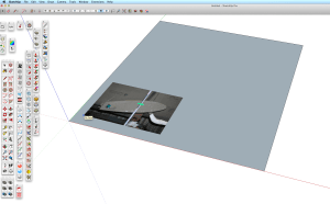
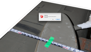
n to do any 3D modeling with them, Sketchup is a good place to start.Screen Shot 2015-04-09 at 4.36.35 PM

In Sketchup you’ll create a horizontal face and import your photo using file/import. Be sure to import the image as a texture. Stretch the image to fill the face and click. The image will tile itself over the face, so just trim  the excess repeated images.


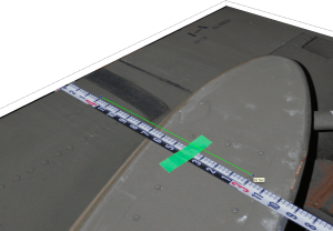
Create a Group and double-click to open it for editing. This is an especially important stepScreen Shot 2015-04-09 at 4.38.50 PM if you already have other object or images in your model file. With the Pencil tool you’ll draw a line along your nomen marking out a specific distance, in this case 12″. the longer the line the more accurate your scaling will be.


With the ruler tool, measure this line from one end to the other. Ignore what it tells you theScreen Shot 2015-04-09 at 4.38.50 PM length is. Type the length you want it to be which will appear in the Value Control Box in the lower right corner of the window. When you hit return , a box will appear asking you if you want to resize the object. Click ‘Yes’ and the object will shrink/grow to the correct size and your photo image will now be at full size scale.

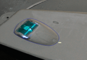
Screen Shot 2015-04-09 at 4.39.50 PM


Now you can trace any area you like and the tape tool will give you a correct length, Screen Shot 2015-04-09 at 4.42.54 PMproviding you are measuring in the same focal plane as the nomen. Obviously if you are measuring something in the foreground or background the measurement will be off, which is why you need lots of survey photos  if your subject is complicated,


–  R.D. Wilkins


Protected by Copyscape Original Content Check

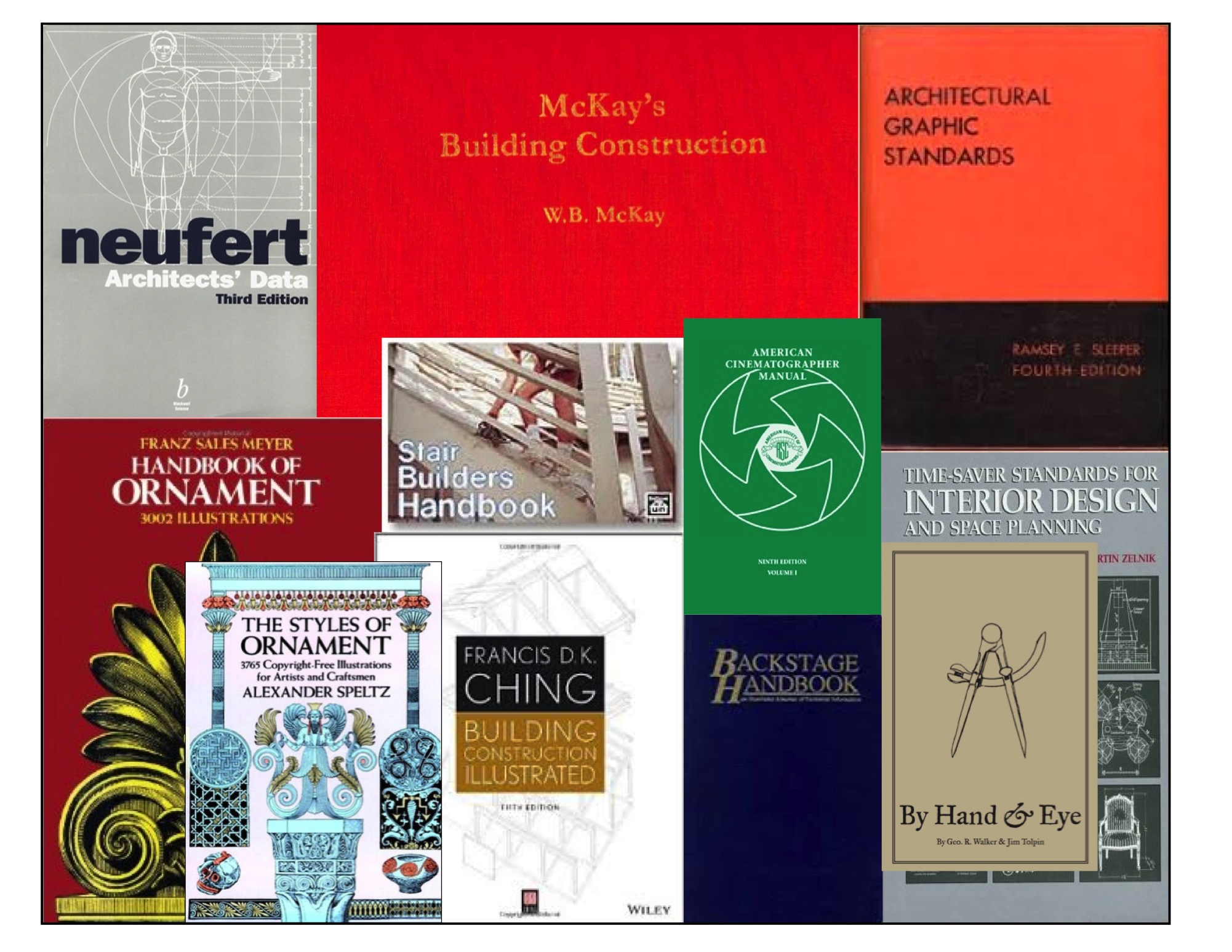
10 Design Reference Books You Should Have On Your Shelf


design book montage_1

I think I’ve already made it clear that you just can’t have too many books, especially ones on design and architecture. But it’s also a real pain dragging a lot of them around with you from job to job and it becomes a bigger job to keep track of them once they’re out of your house. So, I try to only take books to my current workplace that I either don’t have a digital version of or just really need to have close at hand.

If I had to limit myself to just 10 books, these would be the books I’d take to start a job.

Here is my must-have list with sources:

1. Architectural Graphic Standards – 5th Edition – This was when the books were filled with great hand drawings and actually showed you in detail how things were built. Lots of period details as well. Out of print for over 50 years (at least in this edition) you can still find copies for anywhere from $20 to $200. The 3rd edition would be a suitable replacement. the first edition is also good to have and has been reprinted several times. Check Abebooks for copies. Not available digitally.

If you are in Great Britain, McKays is the closest equivalent, and is actually superior in a number of ways from our standpoint as set designers. On the Continent, an older copy of Neufert’s is a must. See this earlier post for details. Not available digitally.

In Germany, the best book on period construction I’ve found is Konstruction Und Form Im Bauen, by Friedrich Hess. There are lots of very nice drawings and measured details. Long out of print but you can still find copies second-hand. In Sweden, an excellent book on traditional construction is Stora Boken Om Byggnadsvård, by Göran Gudmundsson. This is a current book and still in print. Neither are available digitally.

2. Time-Saver Standards for Interior Design and Space Planning, 2nd Edition. This is the design complement to Architectural Graphic Standards and covers nearly every situation regarding building interiors. You can find used copies for around $75. There is a digital version available but it’s not only difficult to navigate because of the size of the book but at the price you’d be better off getting a hardback edition.

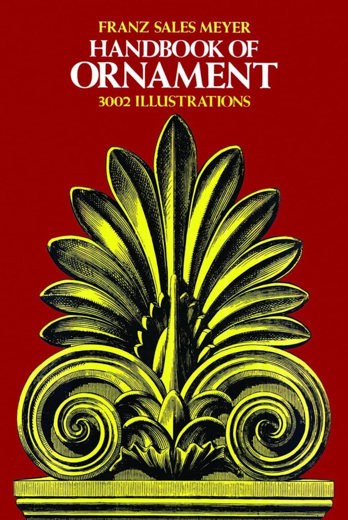
3. Styles Of Ornament – Alexander Speltz.  Originally published in 1904, this book uses over 4000 drawings to illustrate 6000 years of historical design. As a general design reference I don’t think it has an equal. Architecture, furniture, text, carving, metalwork are all covered. A must-have. (Handbook Of Ornament by Franz Meyer would be a close second.) Available from a number of publishers for as little as $10. A digital version is available.

Low Budget Option- download the online PDF here.

4. The Stair Builder’s Handbook – T.W. Love – Not a design book per se, but a book of rise and run tables that make stair layout a breeze. Available from Contractor Resource for about $18.

Low Budget Option – download the PDF Common Sense Stairbuilding and Hand-railing. Skip the mind bending section on handrail layout and skip to page 99. Also, Stair building, which has a nice section on ornamental ironwork.

Also, In April a new book will be out called  Simply Stairs – The Definitive Handbook for Stair Builders, by Mark Milner, published by Whittles Publishing in London for £25. Pre-release information on the book makes it look very promising.

5. Backstage Handbook – Paul Carter. Originally a technical manual for theatrical designers, the book is full of great information for film work as well. There are more details in this earlier post from several years ago. Available from Broadway Press for about $22. No digital version is available.

6. American Cinematographers Manual – The new 10th edition will cost you about $80 in hardback and almost the same in it’s digital version through the iTunes and Android sites. There’s a free pdf of the 7th edition here, but much of the latest technology isn’t in it. This is the go-to book for all things dealing with cameras and image capture. A lot of people will tell you you don’t need this. I’m sure you could also have a great career as a car designer without knowing anything about how cars work. Because when it comes down to it, all we’re really doing is designing big, pretty things to bounce light off of. Just remember, if the department names were based on physics we’d be the Light Reflector Design Department.
7. Building Construction Illustrated – Francis Ching. An excellent and thorough book about construction details including wood framing systems as well as masonry. About $30. No digital version is available.

Low Budget Option – access the online PDF here.

8. The Classical Orders of Architecture – Robert Chitham. I think this is the best modern book around that deals with the classical architecture proportional system. This book was out of print for quite a while and fortunately is back in print. The new edition deals with the proportions for both metric and Imperial systems. Used copies can be found for about $45.

Low Budget Option – Get the PDF American Vignola by William Ware and The Five Orders by Vignola. Also, download the very nice PDFs on classical architecture from the The Institute of Classical Architecture & Art.

9. Illustrated Cabinetmaking – Bill Hylton. I covered this book in an earlier post. If you want or need to know basic furniture design and how furniture goes together this is the book you’ll want to refer to. It’s been referred to as the Grey’s Anatomy of furniture building. Full of exploded drawings of many kinds of pieces. Available from Fox Chapel Publishing for $24.95.

10. By Hand & Eye – George R. Walker & Jim Tolpin. Just because this is number 10 on the list doesn’t mean it’s the least important. In fact if you’re just starting out in set design this is the first one I’d tell you to buy. Most bad designs are caused by bad proportions. This book will give you a solid understanding of proportion and keep you from making simple mistakes. You can download a sample chapter here. Also, I wrote a longer post on the book earlier. Walker and Tolpin are promising a workbook that will come out later this year based on the book’s concepts so look for that. Available from Lost Art Press for $38, hardbound.

Low Budget Option – Cut back on the Starbucks for a couple days and buy a digital version for $18. The mental stimulation might be just as good as the caffeine and it’ll be a lot healthier too.

So what have I missed? There are other books I could list these are the best. What’s on your shelf? What books would you say are ‘Must Haves’?

Share your titles with the rest of us. Let me know the important titles I’ve missed here, I’m sure there are a lot. As an incentive, everyone who posts book suggestions goes into a drawing at the end of the week for a free digital version of By Hand & Eye.

C’mon, give us your list.


Historical Moulding Catalogues For Download


1938 moulding

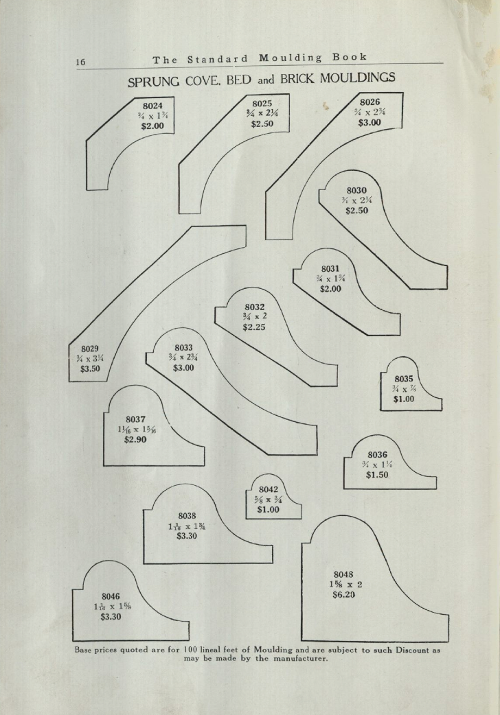
Chris Schwarz over at Lost Art Press posted a blog entry yesterday with links to three moulding catalogues you can download. The catalogues range from a 1938 catalogue using the old Universal system where the profile numbers were a fairly universal ( at least within the U.S.) numbering system called the 8000 system. The original numbering system begun in the mid 1800’s used a three digit number starting with 1. You can see how the inventory of stock moulds changed over the years as manufacturers offered fewer and fewer profiles. The mid 1800’s catalogues included over 600 different profiles which would dwindle to less than 50 in many catalogues in the early 1950’s.

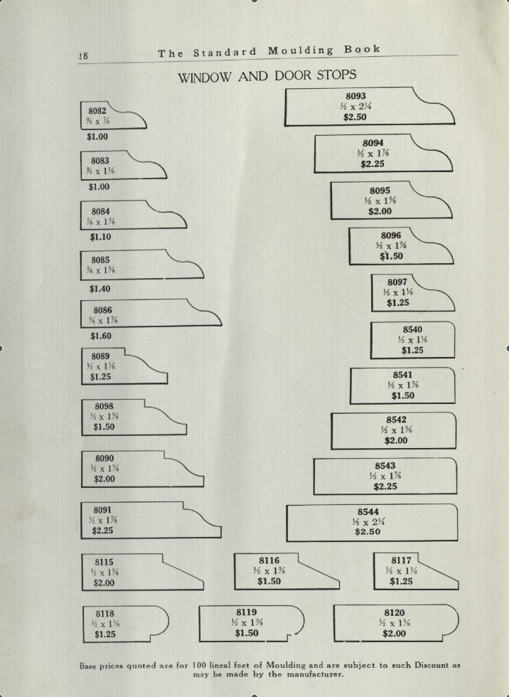
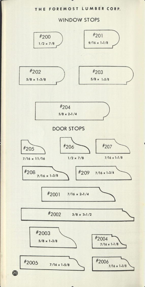
Here’s three examples that show the slow loss of the variety of stock stop moulds, the first from the 1890’s catalogue, the second from a 1938 catalogue and the last from a booklet from the 1960’s.


stops from the 1890 Universal catalogue

stops from the 1890 Universal catalogue

Stop profiles from a 1938 catalogue

Stop profiles from a 1938 catalogue

stop profiles from a 1960's catalogue

stop profiles from a 1960’s catalogue

You can read the blog article and download the catalogues at this link. Special thanks to Chris, Eric Brown and Thor Mikesell for sharing the research material.

The HMS Bounty And The Blockbuster That Was Never Made

The Bounty in 2010. photo by Ebyabe

On October 29, as Hurricane Sandy bore down on the U.S. east coast, a distress call went out to the Coast Guard from the crew of the HMS Bounty. The ship was four days into a bid to avoid the ship being destroyed in harbor by the storm. The captain had decided that the best way to save the ship was to go to sea and sail around the hurricane. Now being swamped by 30 foot waves, the crew was forced to abandon ship. The captain and one of the crew were lost at sea before the remainder of the crew were rescued by Coastguard helicopters. Hours later I saw a photo of the ravaged ship as it went down, its’ mast tops shredded and its’ yards torn away.

The HMS Bounty goes down off the coast of North Carolina. Photo by Petty Officer 2nd Class Tim Kuklewski/ /U.S. Coast Guard via Getty Images

I looked at it and remembered climbing the shroud lines up to the main mast top and looking out to sea almost exactly 18 years before while surveying the ship for a film. It was to be a remake of the classic Errol Flynn pirate film, Captain Blood, and it would have been the most expensive film made to date. But the films fortunes were as bad as those of the Bounty turned out to be.

The HMS Bounty’s Rebirth

The ship was commissioned by MGM in 1960 for the 1962 film Mutiny On The Bounty starring Marlon Brando. Built in Nova Scotia, it was the first large vessel built using original ship’s plans. To make allowances for shooting and to hold a larger crew, the ship’s deck length was increased from nearly 91 feet to 120 feet with the beam, masting and rigging increased in proportion to the new hull length. Once the film was completed, the studio had planned on burning the ship but Brando protested and the Bounty ended up in Florida. It went through several owners before Ted Turner bought the ship and in 1993 donated it to an educational foundation where it was sent to a new home port in Falls River, Massachusetts.

dock in 1994

Bounty in dry dock in 1994

When we went to survey her in 1994, she was on the rails in dry dock, a number of her futtocks were in need of replacement but we were assured the work would be completed in time for filming. Three of us crawled all over the ship the entire day, taking measurements, hundreds of photographs and video to document the existing structure for as-built drawings. Since the story of Captain Blood takes place in the 1680’s, over 100 years before the original Bounty, the ship was to be converted to an earlier vessel which meant applying a different stern, rigging and bow.

The ship still had most of it’s original fittings including the brick oven and the hand grained paneling below deck. Other than the repairs on the futtocks, she seemed still intact after over 30 years of sailing.

View from the main mast top. Photo- R.D. Wilkins

View from the main mast top. Photo- R.D. Wilkins

The Bounty's brick oven. photo - R.D. Wilkins

The Bounty’s brick oven. photo – R.D. Wilkins

The crew mess area. photo - R.D. Wilkins

The crew mess area. photo – R.D. Wilkins

hand-grained partitions below deck. photo-R.D. Wilkins

hand-grained partitions below deck. photo-R.D. Wilkins

Survey photo of the fore bits. photo - R.D. Wilkins

Survey photo of the fore bits. photo – R.D. Wilkins

The great wheel and binnacle. photo - R.D. Wilkins

The great wheel and binnacle. photo – R.D. Wilkins

View of the stern from the main top. photo - R.D. Wilkins

View of the stern from the mizzen top. photo – R.D. Wilkins

Drawing done from survey measurements in 1994. R.D. Wilkins

Drawing done from survey measurements in 1994. R.D. Wilkins

Period rigging details

Period rigging details for Bounty conversion.

Captain Blood Sails Again

Back in Los Angeles, design work proceeded under the leadership of Production Designer William Creber, who had been nominated for Oscars three times before. The Set Decorator was Eddie Fowlie, David Lean’s right-hand man who had done props and sometimes effects as well for the classic films, Lawrence of Arabia, and fulfilled five different roles on Doctor Zhivago as well as other films. When asked by the studio which credit he wanted for Zhivago, he first replied he didn’t care but decided on a special effects credit since it had involved the most work. He later wished he had picked another title since the effects were so good they were virtually ignored. It appeared to all that the film was made in snow in winter when it was actually shot in Spain, with thousands of tons of cheap marble dust used as snow. The beautiful winter ice palace interior was actually carefully applied paraffin. He had come out of retirement to do the picture, leaving his home in Spain. We were all a bit in awe of both of them, particularly Eddie given his pedigree with Lean. The director had just had his last film explode at the box-office and was the hot ticket in town. The scripts scribes were equally hot commodities and had recent successes of their own.

The plan was to do a remake of the popular Errol Flynn film from 1935, even though the common thought at the time was that pirate movies didn’t make money, (Jerry Bruckheimer would prove this wrong a few years later.) Popular yes, profitable no, This was mainly because of the cost involved in making them. Besides being a period film, it would involve creating a huge 17th century battle, creating at least four different period sailing ships and recreating a large section of the town of Port Royal. The initial projected budget suggested that it would be possibly the most expensive film made to date. That being the case, there were only a few stars that the studio was willing to gamble their money on, and the first choice was Arnold Schwarzenegger.

Proposed artwork for a promotional poster for the film.

Proposed artwork for a promotional poster for the film.

I was eager to quiz Eddie about his time with David Lean but he seemed a bit aloof and obviously did not suffer fools gladly. So, I thought I would offer something he would find useful. I brought in a rare out-of-print set of books from my library of which part was an inventory of ships of the period. One section listed every piece of equipment you could find aboard with illustrations and measured drawings, a Set Decorators dream. He looked up at me over the top of his glasses when I entered his office. “Eddie, I thought these might be a good reference for you”, I said as I laid the books open in front of him.

His jaw dropped slightly as he silently thumbed through them for several minutes. Without looking up he said, “Where did you get these wonderful books?” Then he said it reminded him of how he had done the props for Lawrence Of Arabia. He had an illustrator do a drawing of each piece he needed. The he posted them on his wall and would bring the various local artisans to his office, point to the drawings and indicate how many he needed.

I realized why you could never make a film like Lawrence today the same way and why the Art Departments of the period were so small. Today something like a camel’s saddle would be drawn in multiple versions by several illustrators, modeled in Rhino or Modo by as many as three different set designers, rendered, redesigned, remodeled, re-rendered, finally approved by the director, and only then would a set of working drawings be made. Eddie just found a person who understood what it was he wanted, gave him a sketch and told him how many he needed. But this was a time when directors hired people they trusted and let them do their job. They understood that THEIR job was defining the story and script and concentrated on camera placement and performance and didn’t involve selecting drawer hardware.

After that Eddie would chat about he times with Lean in the afternoons at tea time, which didn’t involve tea for Eddie, who preferred beer. He’d found a local shop in Santa Monica that carried imported beer, so each day when we’d walk to lunch, ( those were the days when we actually stopped for a proper lunch and didn’t eat hunched over our desks ) we would buy him two cans of his favorite beer.

drawing for 18 pounder cannon tubes. At over 9 feet long, these were even shorter than the largest guns.

Drawing for 18 pounder cannon tubes. At over 9 feet long, these were even shorter than the largest guns to be made.

drawing of gun equipment

drawing of gun equipment

One day one of the producers was talking about the ship cannons and I showed him a mock-up of the cannon shot for the large 32 pounder cannon. He frowned as he took the 6 1/2 inch diameter ball and said it seemed puny. I walked him around the corner to where I had taped a full size silhouette of the gun that fired it, which was over 10 feet long and more than 4 feet high. He was shocked. It was then that I made the mistake of mentioning that the opening battle scene was based on a real battle, the Battle of Sedgemore in 1685. He looked surprised and said, “you’re kidding?” I said that not only was that based on history but the main character was also based on a real man named Henry Pitman. “That’s fantastic!” he said. I’m sure in his head he could see that sought-after card ‘based on a true story’ in the title sequence at the front of the film.

This revelation caused a lot of excitement and they asked me to do a little presentation for the director and producers about the real events behind the film. A few days later when I began the presentation, the enthusiasm quickly died. As I told them the real story it became readily apparent that serious liberties had been taken in Sabatini’s original book and worse, the events portrayed in the script didn’t match the real story either. The carefully crafted battle scene that took place at night in the swirling snow had actually happened in the middle of July where heatstroke would have been more a likelihood than frostbite.

It was then that I realized two important truths about the film industry;

1. – Working on a film about a subject you know a lot about is usually a very frustrating and ultimately disappointing experience.

2. – If someone, other than the Production Designer, says they want to know what it really was or looked like, it doesn’t necessarily mean they’ll change what they already have in their mind.

Most people just want research that is going to confirm or validate what they already have in the script or the image they have in their head. Maybe that’s human nature but it’s the same reason composers hate the temp music used during editing. After months of hearing a tune connected to a picture the director will end up wanting something “just like that tune”. It’s almost routine for a director to question a designer’s design choice by demanding to see research. And then when the image which validates the design is produced, the director will insist, “well, I still want my version instead.” Research that doesn’t validate their own ideas is worse than useless to them because it just points out their own ideas are many times based more on Hollywood clichés than reality.

Everything was proceeding nicely when we be can to hear rumblings that Schwarzenegger was thinking about pulling out of the movie. It was rumored that he had an extended ski trip planned that conflicted with the schedule. Someone else suggested that he was worried he would look ridiculous in 17th century knee breeches. For whatever the reason, a week later it was confirmed that he had pulled out of the picture. The momentum slowed to a crawl. With a picture this large, particularly a picture partly shot at sea, the weather plays a large role. If the schedule was pushed we would be into hurricane season in the tropics and that was something the studio didn’t want to contemplate. Another actor would have to be found and fast.

Because of the estimated budget, the studio sent a list of just five other actors that they considered to be enough of a box office draw to make the film feasible. I leave it to you to guess who those five were. As the week went by, each actor on the list passed until there was just one who had yet to decide.

In my naiveté, I had regularly been collating and forwarding research from my library that I though would be useful but never got a response about it. As each script revision happened it became apparent that it was being tailored to Arnold’s action hero persona with ever greater feats of daring and super-human agility. That last Friday, I got a call from the director’s assistant. She asked if I could send her additional copies of the all the research I’d been sending over to the director saying that the originals had been ‘lost’. The director was scheduled to leave on a plane for Paris that evening and wanted to take the research with him. It turns out the actor who was the film’s last hope was interested, but only if it was going to be a historically motivated picture. I wasn’t sure how they were going to explain why the script was so different from the research.

I don’t think I need to tell you what the actor’s decision was.

The Best Chair You’ve Never Heard Of

On campaign during the Boer War, 1900. Major-General R. Pole-Carew , right, is seated in a Roorkhee campaign chair. National Army Museum, London

It’s all our fault. America and India, that is. When the British Empire was at it’s height of power it was sending troops to three continents. It would have been an extreme hardship for the officers, gentlemen in a class above that of the common soldier, to have traveled to these far-off places without the comforts and trappings that they were used to at home.

That meant that the campaign tents that were pitched in the American wilderness and the jungles of India had to be filled with proper furniture. Soon the best furniture makers in London, including Thomas Chippendale were turning out pieces which were designed specifically for, well, camping. To maintain the prestige of the British Army the furniture they brought with them had to be practical, portable and stylish.

A suite of Victorian walnut campaign furniture from 1863. From the book British Campaign Furniture by Nicholas Brawer

These were more than just a few choice pieces which were tossed into a cart. Some officers, when ordering their camp furnishings at the British Crown’s expense, selected nearly 50 pieces including beds, chests, writing tables,  bookcases and chamber pot holders. The size of some of the tents they inhabited while on campaign would have rivaled the size of the average room in a fine country estate. Not to mention the caravan of wagons and horses necessary to carry it all from place to place.

I first learned about campaign furniture while I was working on The Patriot in 1999. We reproduced some Georgian campaign chairs like the one below and I was struck by the ingenuity of the design. Some of the comfort may have been compromised but not the style. Sure the stretchers were flat and mostly featureless but the overall lines were there.

George III caned mahogany folding chair, 18th century. Christopher Clark Antiques, Ltd., Glos., England

Three years later I came across Nicholas Brawer’s book, British Campaign Furniture 1740 – 1914. It still remains, amazingly, the only book on the subject. Brawer explains that the real explosion in campaign furniture came after the Napoleonic Wars, when a brisk increase in travel both on the continent and abroad created a huge market for portable and functional furniture.

In 1899, the British Army experienced an entirely new type of war. The Boer War in South Africa changed the way people thought about modern conflict and the idea of a ‘Gentleman’s War’ was gone. The over-designed and over-stuffed campaign furniture of the Victorian Era was unpractical for the new hit-and-run tactics which demanded something lighter and more austere. The Roorkhee Chair came out of this need for a chair that was both simple and still robust enough to stand rough treatment. Weighing between 11 and 13 pounds, the chair was usually covered in canvas with leather straps for arms and easily broke down for travel. The design also had the advantage of allowing the chair to sit with all four feet level no matter how uneven the ground was. The name of the designer is lost to history, but the chair was named in honor of the Indian Army Corps of Engineers in Roorkhee, India.

Roorkhee chair fitted with canvas seat and back. From British Campaign Furniture by Nicholas Brawer.

Chair disassembled for travel

another style of leg

Victorian Mahogany campaign chair from the 1870’s. The ancestor of the Rorrkhee chair, it wasn’t as robust even though it could break-down as well. The pieces were carefully numbered to match their corresponding pieces to make assembly easy for anyone.

Unfortunately Brawer’s book has been out of print for years, so if you find a copy you should grab it. There are reproductions being made including some very nice ones by Lewis Drake & Associates.

If you’re handy with tools, you can try making your own. Christopher Schwarz, contributing editor at Popular Woodworking Magazine, and living patron saint to hand tool woodworkers everywhere, has done an article on making a Roorkhee you can find here. And you can download his Sketchup model of the chair here.