Location surveys can be a unique experience. You never know what you’re going to have to deal with when you survey an unfamiliar location. One of the perks of being in the Art Department of a film or television series is that you get to see places that aren’t normally open to the public.
It could be a historic building, or a ship, or a military aircraft, or, it could be a place you’re familiar with but never really thought to look at close-up.

A lot of times there are parameters that you have to work around to get all the information that you need. Usually these are limitations having to do with access to the location, either physical constraints or time limitations. You’ll do a lot of location surveys during your career. Often they will be a simple survey to determine a placement of a set piece or a simple drawing for a director’s plan for shot planning.
Other times you’ll have to do a detailed survey that involves recording a lot of measurements and taking photographic reference for either matching a location at another place or adding onto the existing structures.
I got a call in June of 2022 to work on the recent Disney film The Haunted Mansion, and was told that my first assignment was to survey the exterior of the Haunted Mansion ride at the Disneyland park in Anaheim. We would be building a replica of it on a studio backlot in Georgia.
I asked if they had a set of the original plans for reference and was told “no”. For reasons I was never able to understand, it was important that the film set look very close to the original mansion at the amusement park, but, we weren’t allowed to have a copy of the original drawings from 1962. If you can figure out the logic of that decision, please let me know.
I mentally put together a list in my head of the equipment that we’d need to do an accurate survey of the building but that was immediately discarded when I was told about the limitations of the scale of the survey. It would have to be done at night, after the park was closed to the public. I would have a park employee to help who would also provide a ladder. One of the construction foremen on the film would meet me there to help with the measuring.
Despite not having any drawings to use as a starting point, the survey was only authorized for one night, between the hours of 11pm and 3am.
This wasn’t the first time I’d had to do a survey in a ridiculously small amount of time, but it would be the first exterior survey that I’d done at night. Taking theodolite readings to determine heights in the dark would be fun.
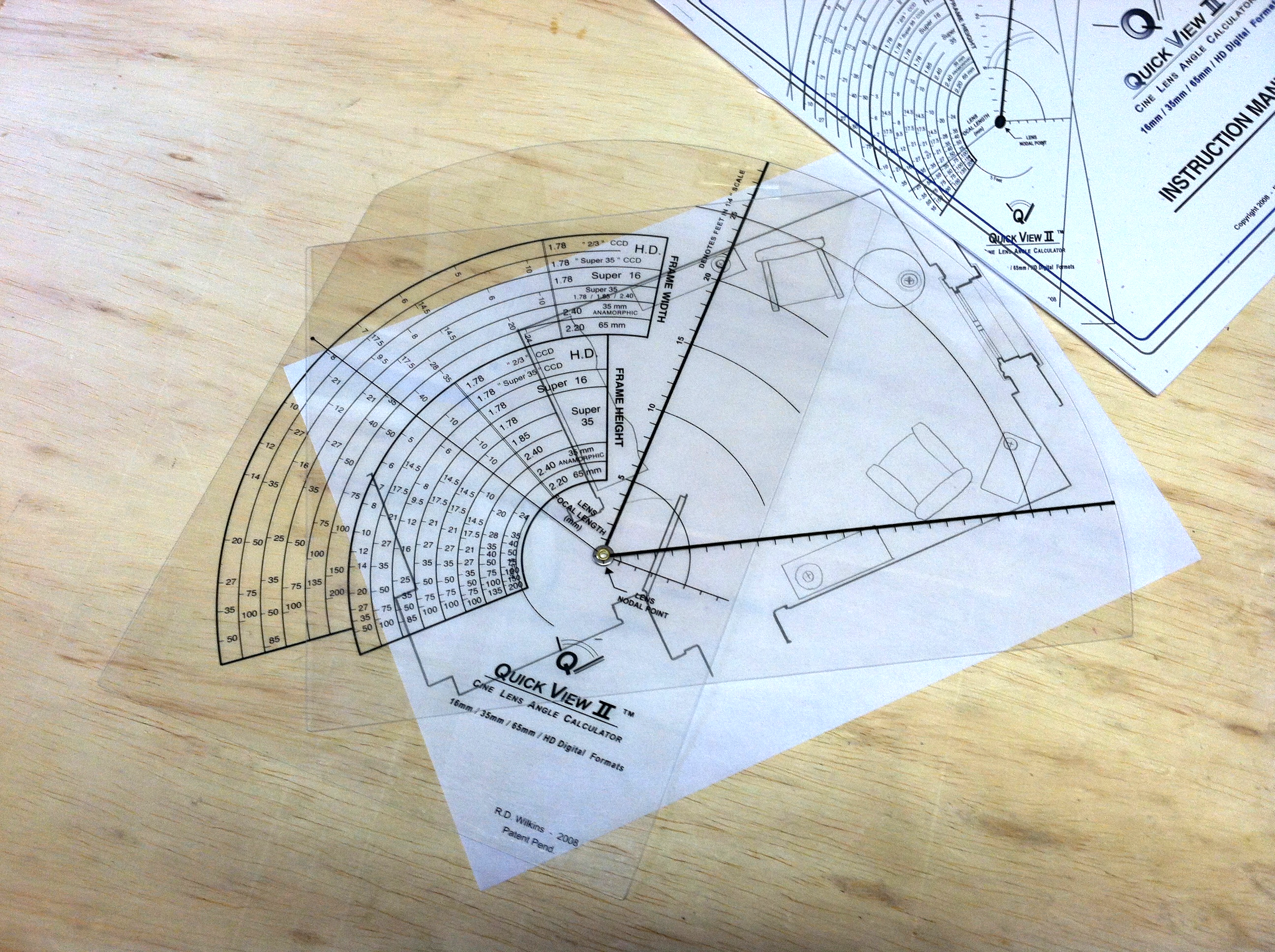
In the past, location surveys were usually scheduled several days to a week in advance and the persons involved were usually asked how much time they needed for the scout. This is rare now and it pays to have a fully-equipped bag of survey tools ready to go. You may have to survey a forest area for one scene and a complicated building interior for the next, so you need to have a wide range of tools in your kit.
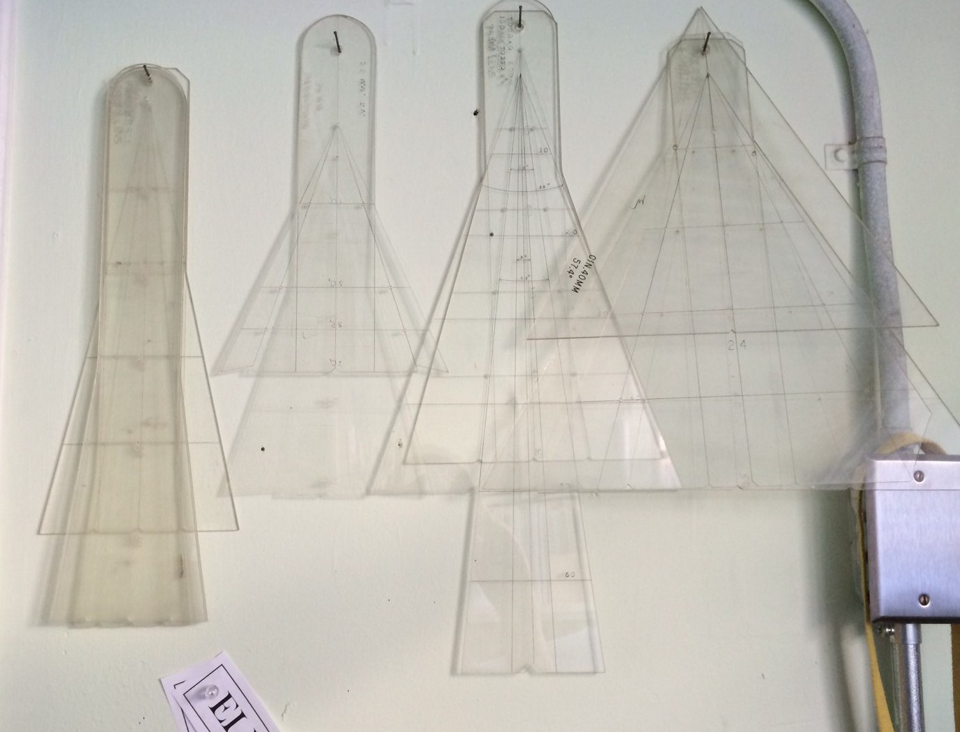
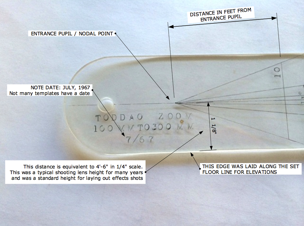
This list ranges from simple measuring tapes to laser measuring tools, levels, transits and plumb bobs, simple compasses to digital theodolites and clinometers. a compact tripod is a plus. Profile gauges or moulding combs are a must-have.
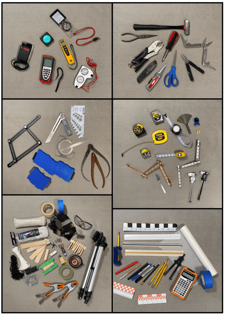
The tools pictured above are just a sampling. My survey bag weighs in at over 20 pounds. You’ll notice some duplicated tools. This is intentional. When you have traveled a long distance to do a survey, sometimes across country, a tool that’s not working or dead batteries isn’t an acceptable excuse. Sometimes you have to improvise when you are confronted with a situation where the tools you usually use won’t fit the bill. I once had to find a rural hardware store open where I could buy the supplies to make a water level when the location that I was surveying made using a laser level impossible.
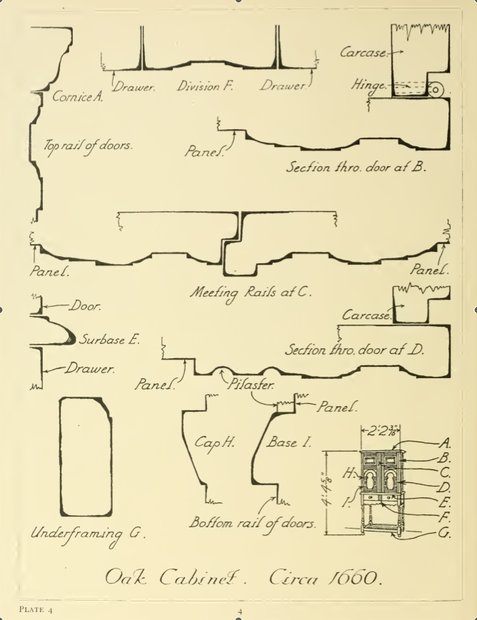
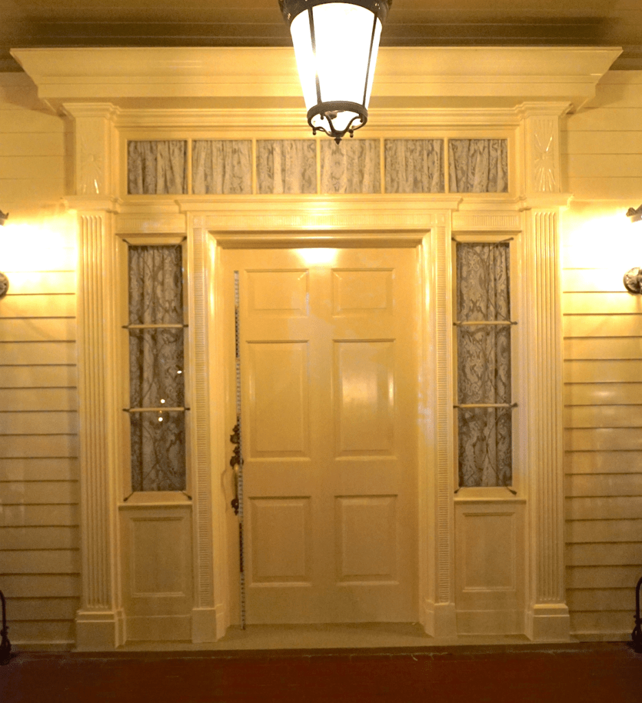
Pre-scout research is usually key to accomplishing a successful survey and I immediately looked for any reference that I could find online. I was sure that someone had to have uploaded some of the original drawings from the 1962 construction. It took some digging but I found the 1/8th inch scale elevations. Now I wouldn’t have to try to get overall heights but I still had a lot of details to record.
When I’m confronted with a tight time schedule I have a checklist:
1- Overall photographs with a collapsable surveyors rod in the shot so I can scale from the images later.
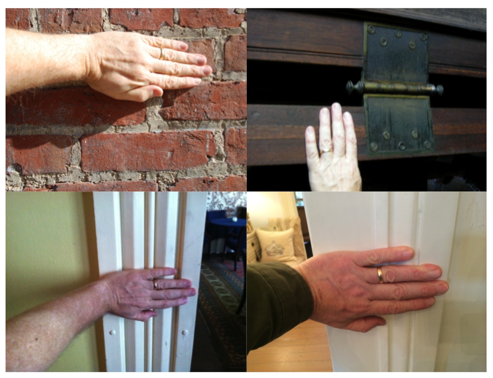
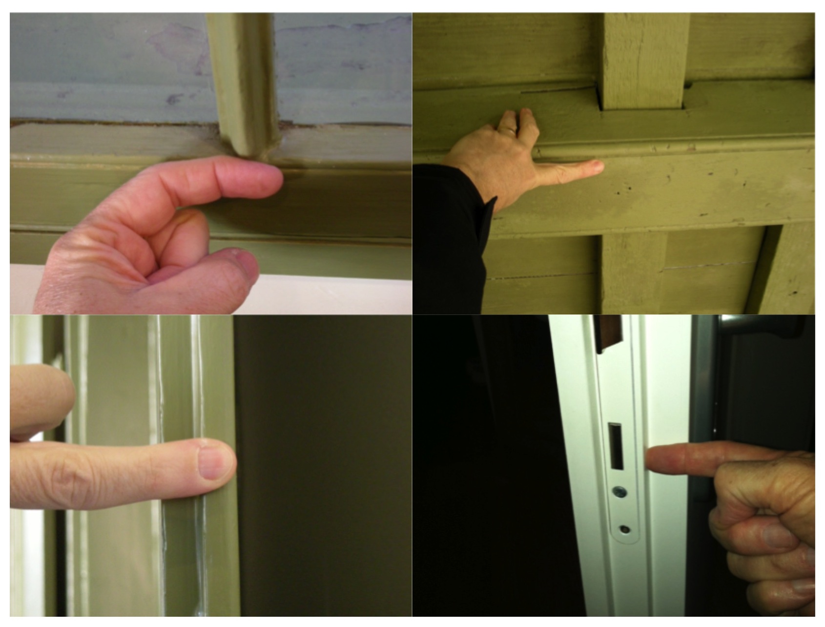
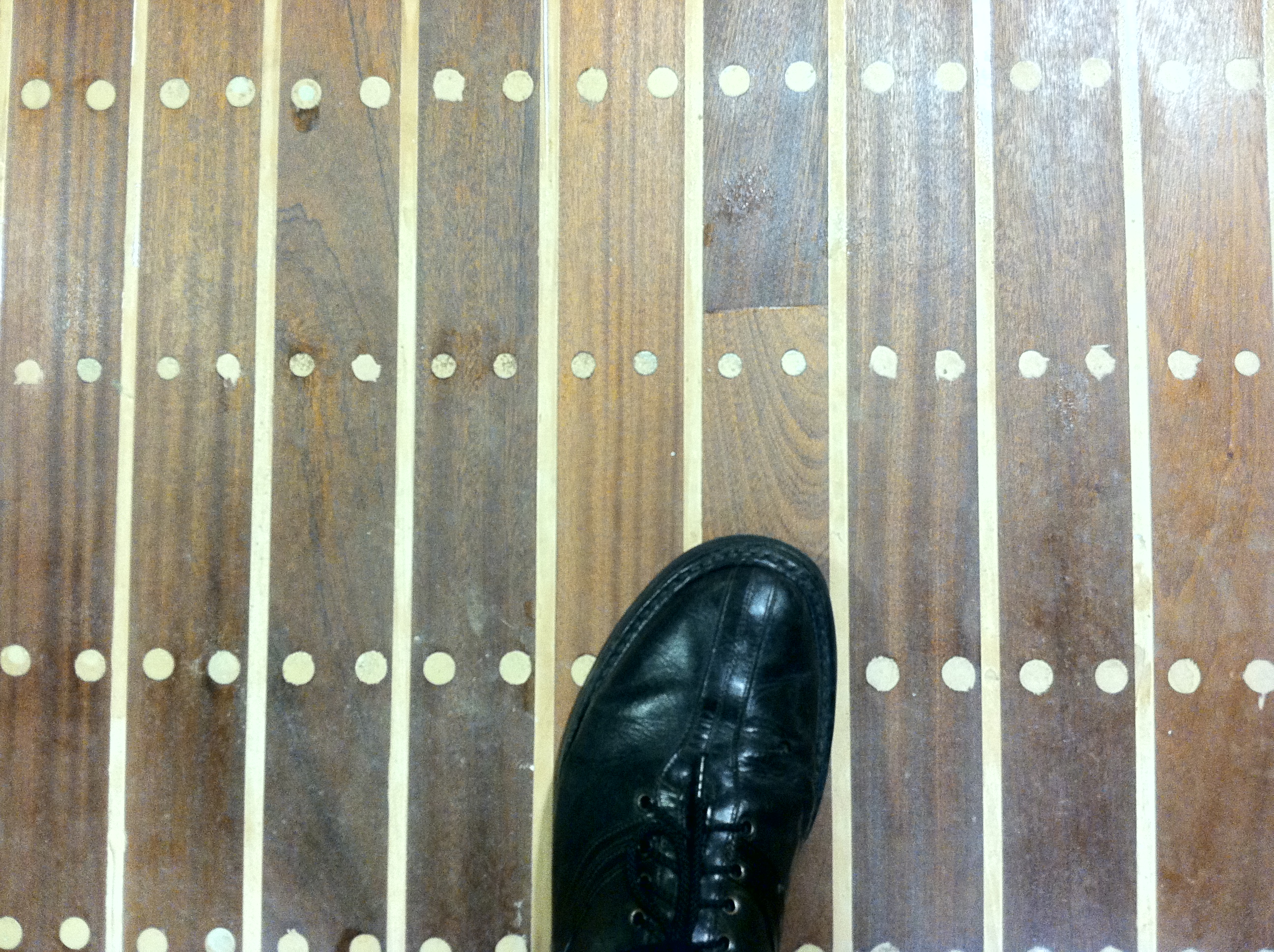
2- Detail photos using a small story stick so that those can also be used for photo-scaling. The photos are important as I know I will often run out of time and the photos are a visual record that can be referred to if I haven’t been able to get a hard measurement with a laser or tape.
3- Overall measurements; ceiling and soffit heights, other measurements that would be impossible to scale from photographs.
4- Details. Here I am as thorough with measurements as I can be as the time allows.
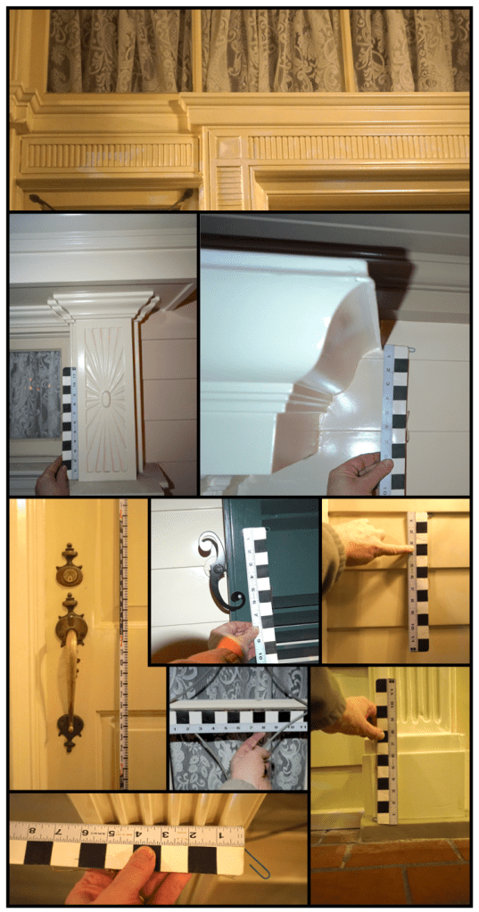
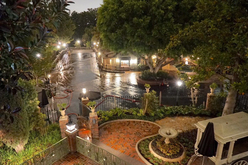
We covered the ground floor of the facade while we waited for a technician to get us to the balcony area. This is accessed only through a small door to the south side where you are immediately confronted with an 14′ tall, narrow ships ladder. We struggled to climb that with the equipment and set to work getting the details there.
In case you wondered, everything on the balcony is bolted, nailed, and glued down. No need to worry about wind carrying anything off.
As we started to record the second story area at about 1:30 am, all the lights around the mansion went out. Luckily we had headlamps in our kits and I had a Sony A7S camera whose incredible sensor makes photos look like they were taken in daylight.
We waited for a tech to take us to the roof to measure the cupola. He never arrived. Maybe the thought of crawling around on the roof in pitch darkness was the scariest thing about the house he could imagine.
3:00 am came sooner than I wanted it to, but I felt pretty certain that we had gotten the most important information.
Was it a spooky experience? The only thing I was afraid of was that the next day I would realize I’d missed a critical dimension.
Next post I’ll talk about how we integrated all that data into the backlot build. Hint- sometimes proportion is not your friend.